How to Build a Winter Sports Gallery Wall That Looks Intentional
A prescriptive guide to arranging skiing, snowboarding and mountain prints into a wall that actually looks considered.

Most winter sports gallery walls fail for the same reason: people buy four prints they like, hang them roughly equidistant, and call it done. A gallery wall that looks intentional needs a layout decision, a subject ratio, and one strict frame rule. This guide gives you all three, plus the specific quantities, sizes and spacing that hold the whole thing together.
Why winter sports subjects work so well as a gallery wall theme
Winter sports art has a built-in visual coherence that most themes lack. The colour palette is naturally restricted (whites, blues, greys, the occasional sunset orange or retro red), the settings overlap (alpine peaks, lift towers, treelines), and the mood is consistent whether you're looking at a 1960s Chamonix poster or a modern photograph of a snowboarder mid-air.
That shared DNA does a lot of the heavy lifting for you. You can mix vintage and modern, action and landscape, photography and illustration, and the wall still reads as one idea rather than a scrapbook.
The other advantage is emotional. Skiing and snowboarding art tends to evoke a specific feeling (cold air, early starts, the lift queue at 8am) that gives a room a sense of place. It works particularly well in entrance halls, lounges, stairwells and anywhere with a high ceiling that needs vertical interest.

Choosing your layout: grid, salon hang, or horizontal row
Before you buy a single print, decide on the layout. This is the step almost everyone skips, and it's why so many gallery walls look hesitant.
The grid
A grid is two, three or four prints across in equal rows, all the same size, all the same orientation. It looks clean, architectural and modern. Grids work brilliantly for winter sports because the repetition lets the subject matter shine without competing layouts pulling your eye around. We think a 2x3 grid of 30x40cm prints is the most reliable starting point for a first gallery wall.
The salon hang
A salon hang is the dense, slightly irregular cluster you see in old European apartments. Mixed sizes, mixed orientations, but tight spacing. This is the right call if you want maximum impact and you're mixing vintage posters with modern photography. It's harder to plan but more forgiving once it's up, because the eye doesn't expect symmetry.
The horizontal row
A single row of three to five prints, all the same size, hung at the same height. Best above a sofa, console table or bed. Less dramatic than a grid or salon hang, but unbeatable for narrow walls or anywhere you want the art to feel like a horizon line.
Pick one and commit. Mixing layout styles on the same wall is the fastest route to a wall that looks like an afterthought.
How many prints you actually need (and the sizes that work together)
This is where most guides go vague. Here are actual numbers.
For a wall up to 1.5 metres wide (above a small console or in a hallway): three to four prints. Either three at 30x40cm in a row, or a 2x2 grid of 30x40cm.
For a wall 1.5 to 2.5 metres wide (a standard sofa wall): five to seven prints. A 2x3 grid of 40x50cm works, or a salon hang with one 50x70cm anchor and four to six 30x40cm supporting prints.
For a wall 2.5 metres or wider (a feature wall in a lounge or open-plan space): seven to nine prints, or fewer larger ones. A 3x3 grid of 40x50cm. Alternatively, two 70x100cm anchors flanked by four 30x40cm prints in a salon arrangement.
For a stairwell: follow the staircase angle with five to seven prints, sized 30x40cm or 40x50cm. Don't go larger; people view stairwell art from close range and at an angle.
A practical rule: your gallery wall should occupy roughly two-thirds the width of the furniture below it. A 200cm sofa wants a gallery wall around 130 to 150cm wide. Going edge to edge looks chaotic, going too small looks lost.
For size mixing, stick to two sizes maximum within a single wall (for example 30x40cm and 50x70cm). Three different sizes start to feel restless unless you're a confident curator. If you want a head start, pre-curated wall art sets take the sizing decision off your plate entirely.
Mixing subjects without chaos: skiing, snowboarding, mountains, and resort scenes
The single most useful thing you can do is decide on a subject ratio before you shop. Here's the formula we recommend:
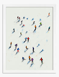
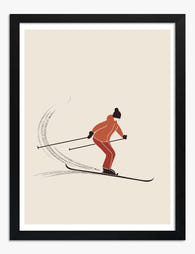
- 40% action shots: skiing or snowboarding figures, lift towers, powder turns
- 40% landscapes: mountain scenes, treelines, alpine vistas without people
- 20% resort or vintage: retro Alps posters, cable cars, chalet scenes, lodge interiors
For a six-print wall that's roughly two or three action prints, two or three landscapes, and one resort or vintage piece. The landscape prints calm the wall down. The action prints give it energy. The resort or vintage piece adds character and stops the whole thing feeling like a sports brochure.
A few things to avoid. Don't mix winter sports with adjacent themes that dilute the story. Hockey, ice skating and curling sit in a different visual world (rinks, indoor light, team sports) and they break the alpine mood. Keep it to mountain-based winter sports.
Don't go all action. Six photos of skiers mid-jump is exhausting to look at. The landscapes are what make the wall feel composed.
Don't mix radically different illustration styles. A bold geometric vintage poster next to a delicate watercolour mountain scene next to a moody black and white photograph creates three competing voices. Pick two visual languages maximum, for example "vintage poster" and "modern photography," and stick to them.
If you want to anchor the wall around landscape, browse mountain art prints first and let those set the palette. Then choose action and resort prints that share the same colour temperature.

The one frame rule that ties everything together
If you take one thing from this guide, take this. All your frames must match in finish. Not "mostly match." Not "tonally similar." Identical.
For winter sports art specifically, this matters more than for any other theme. Because you're likely mixing eras (vintage poster aesthetics with modern photography) and styles (illustration with photography), the frames have to be the consistent element. Mix a black frame, a wood frame and a white frame on the same wall and the whole thing falls apart.
Three finishes work reliably:
All black. Sharp, modern, makes vintage posters pop. Best for contemporary interiors and rooms with a lot of white wall.
All natural wood (oak or ash). Warm, slightly Scandinavian, softens action photography. Best for rooms with wooden floors, neutral palettes or a cabin-adjacent feel.
All white. Gallery-clean, lets the art do the talking. Best when your art is highly graphic or colourful and you don't want the frames competing.
Avoid black with gold inlay, distressed wood, or any frame with visible character. Winter sports art (particularly vintage poster graphics) is already doing a lot of visual work. The frame should be a quiet container.
A practical note on materials. Solid wood frames hold their shape over years and don't warp the way cheaper composite frames do, which matters when you're hanging six or nine prints together and any sagging becomes visible. UV-protective glazing also matters if your wall gets direct sunlight, because nothing ruins a gallery wall faster than one print fading slightly while the others stay vivid.
Step-by-step hanging guide for a straight, level gallery wall
This is the part that turns a good plan into a finished wall. Don't skip the paper template stage.
1. Measure the wall and mark your boundaries
Use painter's tape on the wall to mark the outer edges of your gallery. Step back. Adjust. The boundary should sit roughly two-thirds the width of the furniture below, and the centre point should be at eye level (around 145 to 150cm from the floor for a standalone wall, or 15 to 20cm above the back of a sofa).
The "57 inch rule" you may have read about (hanging the centre of a single artwork at 145cm) applies to the centre of the whole gallery, not each individual print.
2. Cut paper templates for every print
Cut a piece of paper or newspaper to the exact dimensions of each frame. Label each one. This sounds tedious. It will save you from a wall of unnecessary holes.
3. Lay out the gallery on the floor first
Arrange the paper templates on the floor in your chosen layout. Use 3 to 4 inches (8 to 10cm) of spacing between each frame. Closer than this looks cramped, wider than this and the wall stops reading as a single composition.
Photograph the floor layout from directly above so you have a reference.
4. Tape the templates to the wall
Use painter's tape (it won't damage paint) to put each paper template exactly where you want the frame. Step back. Live with it for an hour or a day. Adjust anything that bothers you.
5. Mark the hanging points through the paper
Measure where the hanging fixture sits on the back of each frame (usually a few centimetres below the top edge). Mark that point through the paper template directly onto the wall with a pencil. Remove the paper.
6. Hang in order
Start with the centre or anchor piece and work outwards. Use a small spirit level on each frame as you go. Frames that arrive ready to hang with fixtures already attached make this stage considerably faster than fitting hanging hardware yourself.
7. Step back every two prints
Don't wait until the end to assess. Hang two, walk to the other side of the room, look. Adjust before you commit to the next two.

Our recommended winter sports gallery wall edit
If you want a starting point rather than a blank slate, here's a six-print edit that follows the 40/40/20 ratio and works in most living rooms.
Two action prints (40%): a skier carving a powder turn in soft focus, and a snowboarder mid-air against a clear blue sky. Both at 40x50cm, both in landscape orientation. These give the wall its energy.
Two landscape prints (40%): a moody alpine peak at golden hour, and a graphic black and white mountain ridge. Both at 40x50cm, one landscape and one portrait orientation to add rhythm.
Two resort or vintage prints (20%): a vintage-style Alps travel poster (Chamonix, Zermatt, St. Anton) and a chalet or cable car scene. Both at 30x40cm, both portrait orientation. These add character and break up the photography.
Hung as a 3x2 grid with 8cm spacing, this edit fills a wall roughly 150 to 170cm wide and sits beautifully above a three-seater sofa. Frame everything in matching natural oak for a warm finish, or matching black for something sharper.
For a larger feature wall, scale up to nine prints by adding one more action shot, one more landscape and one more vintage poster, and shift to a 3x3 grid.
You'll find a deeper selection of subjects (everything from minimalist mountain illustrations to vintage ski poster reproductions to modern action photography) in the winter sports art prints collection.
Room-specific adjustments
Lounge or living room. Go bigger and bolder. Use 40x50cm or 50x70cm prints. Lean into action shots and saturated vintage posters. This is the room that can take drama.
Bedroom. Calmer tones. Skip the high-contrast action photography in favour of soft mountain landscapes and gentler vintage illustrations. Stick to smaller prints (30x40cm) and consider all white frames for a quieter feel.
Cabin or holiday home. This is where you can break some rules. Mix in larger statement pieces, lean towards vintage, and consider canvas prints alongside framed prints for a more eclectic feel. Wood frames suit this context best.
Hallway or stairwell. Smaller prints (30x40cm), tighter grouping, and follow the line of architecture. Vertical layouts work harder here than horizontal ones.
Before you buy: the checklist
Measure the wall width and height. Decide on your layout type (grid, salon, or row). Count the width of the furniture below. Choose your subject ratio. Choose your frame finish. Then shop. Buying first and planning afterwards is how you end up with three prints that don't talk to each other and a wall that never quite resolves.
A gallery wall isn't a collection of prints you happen to like. It's a single composition made of smaller parts. Treat it that way and the wall will look intentional from the first glance.


In diesem Blog vorgestellte Fab-Produkte
-

Leinwandbild Winterliche Skifahrergruppe
Translation missing: de.products.product.sale_price Ab €64,95€107,95 -

Poster Vintage-Skifahrer in Blau und Weiß
Translation missing: de.products.product.sale_price Ab €17,95€29,95 -

Poster Winter in Val-d’Isère
Translation missing: de.products.product.sale_price Ab €17,95€29,95 -

Poster Winterliche Stadtszene mit Skifahrern in Pastelltönen
Translation missing: de.products.product.sale_price Ab €17,95€29,95 -

Leinwandbild Skiabenteuer im Winter
Translation missing: de.products.product.sale_price Ab €64,95€107,95 -

Poster Abfahrtsschwung
Translation missing: de.products.product.sale_price Ab €17,95€29,95 -

Poster Skiabenteuer im Winterwunderland
Translation missing: de.products.product.sale_price Ab €17,95€29,95 -

Leinwandbild Bunte Skifahrer im Schnee
Translation missing: de.products.product.sale_price Ab €64,95€107,95 -

Leinwandbild Skifahrer auf sonniger Piste, Schwarzweiß, rote Sonne
Translation missing: de.products.product.sale_price Ab €64,95€107,95 -

Poster Winter in Kitzbühel
Translation missing: de.products.product.sale_price Ab €17,95€29,95 -

Leinwandbild Minimalistischer Skifahrer in Bewegung, Schwarz-Weiß
Translation missing: de.products.product.sale_price Ab €64,95€107,95 -

Leinwandbild Verspielte Winterstadt mit Skifahrern
Translation missing: de.products.product.sale_price Ab €64,95€107,95 -
Poster Skifahrer im Schnee
Translation missing: de.products.product.sale_price Ab €17,95€29,95 -
Poster Skifahrer vor verschneiten Gipfeln – Vintage
Translation missing: de.products.product.sale_price Ab €17,95€29,95 -

Poster bunte Skifahrer in der Winterlandschaft
Translation missing: de.products.product.sale_price Ab €17,95€29,95


Mehr aus The Frame

The Only Japanese Art Gallery Wall Guide You Need
You bought one Hokusai wave. Maybe a Hiroshige landscape too. Now you're staring at a blank wall trying to work out how to turn two prints into a proper gallery...

The Pop Art Gallery Wall Edit: Curated Layouts ...
Pop art was made for gallery walls. The bold colours, repeated motifs and graphic shapes do half the cohesion work for you, which is exactly why this is the easiest...

Building a Louis Wain Gallery Wall: From Edward...
Most gallery walls feature one mood, one palette, one feeling. A Louis Wain wall does the opposite. His work spans soft Edwardian parlour scenes, riotous middle-period crowds, and the famous...