Affordable Art Prints That Look Like They Cost Ten Times More
The technical markers that separate a £30 print from a £300 one, and how to spot them before you buy.

Most "affordable" art prints look affordable. The paper curls in the frame, the colours go flat after a year by the window, and the frame itself feels like it might snap if you squeezed it. But a genuinely premium-looking print at an accessible price is absolutely possible, if you know what separates the good from the cheap. This guide gives you the specific quality markers retailers rarely explain.
What 'affordable' actually means when it comes to art prints
Affordable doesn't mean disposable. The price of an art print is mostly determined by three things: the paper, the ink, and the frame. Skimp on any one and you can feel it within a week of hanging.
A truly affordable print, in our view, is one that costs under £100 framed at A2 size and still passes the tests we'll cover below. It uses archival materials, prints with proper pigment inks, and arrives in a frame that won't bow within a year. That's the benchmark.
Anything cheaper than that is usually achievable, but only if a brand is making it to order rather than warehousing thousands of units. Made-to-order is the quiet reason a £35 print can outperform a £120 one from a high-street homewares shop.

The hidden cost of cheap prints: warped frames, faded colours, and flimsy paper
The biggest failure in this category isn't the artwork itself. It's the framing. Frames shipped separately from prints almost always arrive misaligned, with the print floating, bubbling, or sitting at a slight angle behind the glazing. You then spend an hour with a craft knife trying to fix it.
Cheap prints fade. If a brand uses dye-based inks instead of pigment inks, you can expect noticeable colour shift within 12 to 18 months in any room that gets afternoon sun. Reds drift toward orange. Blues lose depth. Black becomes a sad grey.
Then there's the paper. Anything under 170 GSM (grams per square metre) will curl, ripple, or feel translucent. Hold a sheet of standard 80 GSM printer paper. That's what a flimsy print feels like behind glass, and you can see it the moment light hits it from the side.
Plastic and MDF frames warp in humid rooms. Bathrooms, kitchens, and any north-facing wall in a British winter will eventually pull a cheap frame out of square. You'll notice it first at the corners.
What to look for: paper weight, ink type, and frame materials
Three specs do most of the heavy lifting when you're judging quality online.
Paper weight
Look for 200 GSM or higher. At 200+ GSM the paper has body, sits flat in the frame, and reads as substantial when you hold it. Premium art prints typically use 230 to 310 GSM matte paper. If a product page doesn't list GSM at all, that's usually a sign there's nothing impressive to mention.
Ink type
You want pigment-based giclée inks, not dye-based inks. Pigment inks bond to the paper at a molecular level and resist UV exposure for decades. Dye inks sit on the surface and start fading the moment sunlight hits them. The word to search for on a product page is "archival" or "giclée," and ideally both.
Frame material
Solid wood, ideally FSC-certified, is the only material that holds its shape long-term. MDF (medium-density fibreboard) is heavier than solid wood, swells with humidity, and tends to chip at the corners. Plastic "wood-effect" frames feel hollow when you tap them and can yellow under direct sunlight.
A small but useful test: pick the frame up by one corner and feel how it balances. Solid wood feels evenly weighted. MDF feels weirdly heavy at the join. Plastic feels too light.
Why giclée printing on matte paper looks better than glossy alternatives
Giclée (pronounced zhee-clay) is a high-resolution inkjet process that uses pigment inks and produces a much wider colour gamut than standard digital printing. In practical terms, that means deeper blacks, smoother gradients, and detail that holds up when you stand close to the print.
Standard digital printing tends to "band" in areas of subtle tonal shift. You'll see it most in skies, skin tones, and soft abstract washes. Giclée renders these as continuous tone, the way the artist intended.
Matte paper beats glossy for almost every wall in a home, and we'll happily defend this position. Matte reduces glare, which means you can actually see the artwork from any angle without dodging reflections from a window or pendant light. It also doesn't show fingerprints, which matters more than you'd think when you're hanging the print.
Glossy finishes can look impressive on a screen, but in a real room they read as commercial. Think corporate office reception rather than considered home. Matte reads as gallery, full stop.
There's also a sensory tell with fresh giclée prints: they have a faint, clean ink smell when you first unbox them, more like good paper than chemical solvent. Cheap prints often have a sharp plastic smell from the coating that takes weeks to dissipate.

FSC-certified wood frames vs. MDF: you can feel the difference
FSC-certified wood comes from forests managed for long-term sustainability. That's the environmental reason to care. The practical reason is that solid wood is structurally better than MDF in almost every way that matters for a frame.
Run your thumb along the inner edge of a solid wood frame. You should feel a clean, slightly soft grain. MDF feels uniformly smooth in a way that tells you it's compressed dust, not timber. Look at a corner join: solid wood frames typically use a mitred 45-degree cut with visible grain continuity, while MDF often has a slightly rough corner that's been filled and painted over.
Frame profile matters too. We'd argue that frames thinner than about 18mm look cheap on anything larger than A3, regardless of how nicely they're made. The proportion is just off, and the print ends up looking like it's floating without support. For a 60x80cm print, a frame profile of 20 to 30mm tends to look most considered.
Glazing is the other quiet upgrade. UV-protective acrylic glazing is lighter than glass, won't shatter if it falls, and blocks the wavelengths that cause fading. Standard glass does none of that. If a product uses acrylic glazing with UV protection, that's a meaningful sign the brand is thinking long-term about your print.
Our favourite affordable prints that punch well above their price
We genuinely think there are pieces in the Fab Favourites collection that look like they should cost three or four times what they do, particularly at A2 and A1 sizes where the giclée detail really earns its keep.
A few categories where the quality-to-price ratio tends to be especially strong:
Abstract pieces
Abstract art prints often hide their hand. Soft tonal gradients, layered washes, and minimal palettes need genuine giclée reproduction to avoid looking like printed PDFs. When done properly, an abstract piece at 50x70cm can carry an entire feature wall on its own.
Landscape
A good landscape print needs depth in the shadows and subtle gradation in the sky. This is exactly where cheap printing falls apart, and where pigment inks on heavy matte paper genuinely sing. Atmospheric work (mist, dawn light, wide horizons) shows the difference instantly.
New work
Fresh pieces in the new arrivals collection tend to be where we trial more adventurous pairings of paper, ink density, and frame profile. Worth a look if you want something that doesn't feel like it's been on every wall on Instagram for two years.
The point isn't to tell you what to buy. It's that the same quality markers (paper, ink, frame) apply across every category, so once you know what to look for, you can pick confidently across abstract, landscape, photography, or typography.
How to inspect a print at home
When your print arrives, three quick checks will tell you almost everything.
The 45-degree light test. Hold the framed print so light hits the surface at roughly 45 degrees. Cheap glossy glazing will throw harsh reflections. Quality matte glazing will diffuse the light evenly with no hot spots, and you'll be able to see the print clearly even with light bouncing off it.
The touch test. If you've bought unframed, hold the corner of the paper between your thumb and forefinger. It should feel substantial, almost like a thin card. If it bends at the slightest pressure or feels papery, you're holding sub-170 GSM stock.
The across-the-room test. Hang it (or prop it against the wall) and stand 3 metres away. A good print looks rich and resolved from a distance, with clean colours and no visible banding. A cheap print looks flat or pixelated, like a photo on a screen with the brightness turned up too high.

Red flags when shopping for quality art prints uk-wide
A few things that should make you close the tab.
- Product pages that don't list paper weight, ink type, or frame material
- The word "premium" without anything specific behind it
- Prints described as giclée at suspiciously low prices (under £15 framed, A3 size, is usually a stretch)
- Compressed product images where you can't zoom in to see detail
- No clear returns policy, or a returns window under 30 days
- Frames shipped separately from prints (this almost always ends in misalignment)
A confident brand will tell you exactly what their materials are, what their printing process involves, and how long their inks are rated to last under direct sunlight. If those answers aren't on the product page, they're being hidden for a reason.
For context, Fab prints are giclée on thick matte FSC-certified paper, framed in solid FSC wood with UV-protective acrylic glazing, and the frame and print ship together in one box, properly fitted. That's what "ready to hang" should mean, and it's a useful benchmark when you're comparing anywhere else online.
How to build a collection over time without blowing your budget
The mistake most people make is trying to buy a "complete" wall in one go. You end up with prints that match too neatly, like a coordinated bedding set, and the wall feels stiff.
Start with one larger statement piece, ideally 60x80cm or bigger. This anchors the room. Spend a bit more on this one, because it's doing the most visual work and you'll look at it every day for years.
Add smaller pieces over the following months as you find work you actually love. A 30x40cm print picked up because it genuinely moved you will always look better than three coordinated pieces bought to fill space. The wall builds character through that mix.
Stick to a loose framing language across the collection. Either all the same frame colour, or a deliberate split (say, half black, half oak). This holds the wall together visually without making it feel matchy.
Rotate. Prints can move between rooms. The piece that anchored your lounge last year might be exactly right above the bed this year. Good prints aren't furniture, they're flexible.

Final thoughts
Quality at this price point is no longer about luck. It's about knowing the four markers (paper weight, ink type, frame material, glazing) and refusing to compromise on any of them. Once you've trained your eye, a £30 print that looks like £300 isn't a fluke. It's just what good materials and proper printing produce.
Buy fewer, better prints. Inspect them when they arrive. Trust your hands and your eyes more than the marketing copy. The wall will look after itself.

In diesem Blog vorgestellte Fab-Produkte
-
 Goldfolie
Poster Minimalistisch mit Goldfolie in Beige
Verkaufspreis Ab €23,95€38,95 -

Poster Sanfte Reflexionen
Verkaufspreis Ab €16,95€23,95 -

Poster im Bauhaus-Stil – Schwarze Formen auf Beige
Verkaufspreis Ab €16,95€23,95 -

Poster Unbezahlbare Energie – Klassisches Porträt
Verkaufspreis Ab €16,95€23,95 -

Poster Matisse-inspirierter Rückzugsort
Verkaufspreis Ab €16,95€23,95 -
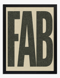
Poster FAB-Typografie in Schwarz auf Beige
Verkaufspreis Ab €16,95€23,95 -

Poster moderne Oase mit Pool
Verkaufspreis Ab €16,95€23,95 -
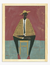
Poster Moderne Muse – Porträt in warmen Erdtönen
Verkaufspreis Ab €16,95€23,95 -

Poster Klassische Eleganz mit Attitüde
Verkaufspreis Ab €16,95€23,95 -

Poster Bauhaus Minimalistische Geometrie
Verkaufspreis Ab €16,95€23,95 -

Poster Warme Terrakotta-Schichten
Verkaufspreis Ab €16,95€23,95 -

Poster abstraktes Porträt – modernes, farbenfrohes Gesicht
Verkaufspreis Ab €16,95€23,95 -

Poster Lebhafte Blumenmarkt-Szene
Verkaufspreis Ab €16,95€23,95 -
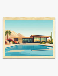
Poster Mid‑Century‑Oase mit gläsernem Haus und Pool
Verkaufspreis Ab €16,95€23,95 -

Poster Modernes Muse-Porträt in tiefem Blau
Verkaufspreis Ab €16,95€23,95 -

Leinwandbild Eleganz in Pastell – Klassisch mit modernem Akzent
Verkaufspreis Ab €65,95€93,95 -

Poster Terrakotta-Muse – kubistisches Porträt
Verkaufspreis Ab €16,95€23,95 -

Poster Sanfter Fluss in Terrakotta und Beige
Verkaufspreis Ab €16,95€23,95 -

Poster Frauenporträt im mühelosen Chic
Verkaufspreis Ab €16,95€23,95


Mehr aus The Frame

The Best Tulip Wall Art for Every Interior Styl...
Tulips are having a proper moment in interiors, and the range of prints available can make choosing feel harder than it should be. Once you understand the four main styles...

What Do Tulips Symbolise in Art? From Dutch Sti...
Tulips carry more baggage than any other flower in art history. They've been religious symbols, financial weapons, moral warnings, and quiet objects of beauty. Understanding that lineage changes how you...

Living Room William Morris Forest Designs: Hist...
Morris and the English woodland: where the obsession began Before William Morris was a designer, a poet, a socialist, or the reluctant father of modern interior style, he was a...