Chagall Art Prints for Every Room: A Styling Guide That Works
Room by room, colour by colour, the practical Chagall styling advice that actually tells you what to hang where.

Marc Chagall's work spans dreamy blue lovers, vivid village scenes, circus performers and stained-glass-bright still lifes. That range is exactly what makes his art so useful at home, and exactly why generic "works with modern décor" advice falls flat. Here's how to match specific Chagall prints to specific rooms, with concrete sizes, frame choices and wall colours that actually work.
Why Chagall's art adapts to modern, eclectic and traditional homes
Chagall painted across seventy years, and his palette shifts dramatically between periods. The Vitebsk village scenes lean warm and folk-art rich. The Paris lovers paintings drift into deep cobalts and violets. The later biblical and circus works explode into red, emerald and gold. That spread means there is almost always a Chagall print that suits the room you're standing in.
Modern minimalist interiors benefit from his blue period works, where flat washes of cobalt sit happily against white walls and pale oak. Eclectic homes thrive on the more chaotic compositions, the floating figures and tilted rooftops that reward layered styling. Traditional rooms with panelled walls, deeper colours and antique furniture pair well with his richer village scenes, which echo the same folk-narrative quality you find in older European interiors.
The rule is simple. Match the energy of the painting to the function of the room. Calm works in calm spaces. Busy works in spaces designed for conversation and movement.

Living room: choosing a Chagall statement piece at 70x100cm
The living room is where you want scale. A small print floating above a three-seater sofa looks apologetic, and Chagall's compositions in particular need room to breathe because there's so much going on inside them. Above a standard 200cm sofa, a single 70x100cm portrait-orientation chagall art prints lands at roughly two-thirds the width of the furniture below, which is the proportion most interior designers default to for a reason. It feels anchored.
For the actual artwork, lean towards his more theatrical pieces here. "I and the Village" works brilliantly because its circular composition pulls the eye in from across the room. "The Birthday" is another strong choice, with its red interior and floating embrace adding warmth to spaces that otherwise risk feeling cool.
Wall colour matters more than people admit. Against a chalky off-white, Chagall's reds and blues sing. Against deep navy or forest green, the same prints become moody and cinematic, almost theatre-like. Avoid hanging him against busy wallpaper or strong pattern because his compositions are already patterned themselves, and the two will fight.
If your sofa sits on a longer wall and you have the space, consider going framed at this size. A framed 70x100cm print has presence the moment you walk in, and because Fab's frames are solid FSC wood with UV-protective acrylic glaze rather than glass, you get the polished look without the weight or reflection problems that come with traditional framing. Browse more options in the living room wall art collection if you want to compare scales side by side.
A note on lighting
Chagall's layered colours need warm, indirect light. Overhead spots can flatten his blues into a muddy wash, and cool LED bulbs strip the warmth out of his reds. Aim for 2700K bulbs in nearby lamps, and if you have picture lights, angle them so they wash the print rather than spotlighting a single area.
Bedroom: why Chagall's blue paintings create the perfect calm
If there's one room Chagall was practically made for, it's the bedroom. The marc chagall blue paintings, particularly "The Blue Lovers" (1914), "Lovers in Blue" and "Lovers Among Lilacs," carry an emotional softness that suits a space designed for rest and intimacy. The story behind them helps too. Chagall painted Bella, his wife, obsessively across decades, and that romantic backstory gives the lovers paintings a quiet weight you feel even before you know the history.
Hang one above the bed, centred, at 50x70cm or 60x90cm depending on your headboard width. The print should sit roughly 15 to 20cm above the headboard, no higher, otherwise you create a visual gap that makes the wall feel disjointed.
For wall colours, the chagall lovers paintings work beautifully against:
- Warm off-white (Farrow & Ball Pointing or similar) for a soft, romantic feel
- Dusky pink or plaster tones, which pick up the violet undertones in his blues
- Deep teal or petrol blue if you want a moodier, enveloping bedroom
- Pale sage, which sits surprisingly well next to cobalt without competing
Avoid stark cool whites, which can make his blues read as cold and clinical rather than dreamy. The whole point of these paintings is warmth-within-blue, and the wall behind them needs to support that.

Size up rather than down here. A 30x40cm print above a king-size bed looks lost. If you're worried about overwhelming the space, choose a framed print in a slim natural oak frame to keep things light. The bedroom wall art edit has more on scale for headboard widths.
Hallway: narrow walls and smaller Chagall prints that draw people in
Hallways are the most underused walls in most homes, and they're perfect for Chagall because his work rewards close looking. Unlike a living room where art is viewed from across a room, hallway art is encountered at arm's length. You see the brushwork, the layered colour, the small floating figures you'd miss from a sofa.
Pick smaller formats here. 30x40cm or 40x50cm prints work best, hung at eye level (centre of the print at roughly 150cm from the floor, not higher). For longer hallways, a run of three prints spaced 8 to 10cm apart creates rhythm without crowding.
The chagall wall art that suits hallways tends to be his more graphic, less narrative pieces. Smaller circus studies, the rooster series, the simpler lovers sketches. Avoid hanging his most complex village scenes here because there's no room to step back and take them in properly.
Framing matters more in hallways than anywhere else. These are high-traffic spaces, often poorly lit, often bumped by coats and bags. Framed prints with proper fittings (not a clip-on hanger that twists every time someone walks past) are worth the extra spend. The UV-protective acrylic glaze also matters here because hallways near front doors get more direct light than people realise, and unprotected prints fade fastest in spaces nobody thinks to check.
Lighting a Chagall print in a dim hallway
If your hallway relies on a single overhead pendant, the print will sit in shadow most of the time. A small wall-mounted picture light, or even a nearby table lamp on a console, transforms the space. Chagall's paintings need light to come alive. In gloom, his blues turn grey and his reds turn brown.
Dining room: Chagall's vibrant still lifes and village scenes for warmth
Dining rooms ask for a different kind of art. You want conversation pieces, things that hold attention across a long meal without demanding it. Chagall's still lifes and village scenes are ideal because they're narrative, layered and naturally warm.
"The Bouquet with Flying Lovers," "Bouquet of Flowers" or any of the Vitebsk village paintings bring the kind of colour that flatters food and candlelight. Reds, oranges and warm yellows in the artwork pick up the same tones in wood furniture, terracotta and brass.
Go large here. A 70x100cm canvas above a sideboard or on the main dining wall sets the tone for the whole room. Canvas works particularly well in dining spaces because it's lighter, has no glaze to reflect candlelight back at your guests, and the mirrored-edge wrapping means nothing important gets cropped at the sides. If you'd prefer the polished look of a frame, a deep gallery-style mount in natural oak suits Chagall's warmer palette better than black.
Wall colour-wise, dining rooms are one of the few spaces where deep, saturated walls genuinely improve the art. A burgundy, terracotta or olive green wall makes a vibrant Chagall print look like it belongs in a private collection rather than a showroom.

Framing choices: black, white or natural wood with Chagall's palette
Chagall's palette is unusually flexible, which means frame choice depends more on the specific painting than on a blanket rule. Here's how to think about it.
Natural oak or ash suits the warm village scenes, the still lifes and most of the lovers paintings. The pale wood echoes the folk-art quality of his Vitebsk work and softens the edges of his more dramatic colours. This is the safest default for Chagall, and the one we'd recommend if you're buying your first print and unsure.
Black frames suit his more graphic, high-contrast pieces. The circus works, the bolder biblical scenes, anything where the composition relies on sharp shapes rather than dreamy washes. Black adds gravity and works best in modern rooms with plenty of other dark accents (black light fittings, dark joinery, leather furniture).
White frames work for the blue period paintings specifically, and almost nowhere else. The white frame extends the lightness of the surrounding white space in works like "The Blue Lovers" and lets the cobalt do the heavy lifting. In a minimalist bedroom against a pale wall, this combination is hard to beat.
What to avoid: ornate gold or dark mahogany frames. They drag Chagall backwards into a nineteenth-century context his work was actively rebelling against. Keep frames clean, slim and contemporary.
Building a mini gallery wall with two or three Chagall prints
Gallery walls fail when people hang too many things, too close together, in too many sizes. With Chagall, less is more. Two or three prints, carefully chosen, beats a dense cluster every time because his compositions are already busy.
The two-print pairing
Hang two prints of identical size (say, 50x70cm each) side by side with 6 to 8cm between them. Pair works that share a palette but differ in composition. "The Blue Lovers" alongside "Lovers Among Lilacs" creates a quiet, romantic pairing for a bedroom. Two village scenes in similar warm tones work above a dining sideboard.
The three-print arrangement
Three prints work best in a horizontal row, all the same size, evenly spaced. Avoid the staircase arrangement (one higher, one lower, one in the middle) because it fights Chagall's already-tilted compositions. A clean horizontal line lets each print stand on its own.
For three-print groupings, mix one larger central work with two smaller flanking pieces only if the central piece is clearly the hero. Otherwise stick to equal sizes. Pre-curated wall art sets take the guesswork out of this if you'd rather not pair works yourself.

Common mistakes to avoid
- Mixing Chagall with too many other artists in the same wall. His work is distinctive enough that it gets diluted by visual competition.
- Hanging too high. Centre line at 150cm from the floor for standalone prints, lower for prints above furniture.
- Choosing prints with conflicting palettes (a blue period work next to a fiery circus scene) and hoping they'll resolve. They won't.
- Buying small to save money and ending up with prints that look lost. Better to buy one well-sized print than three undersized ones.
A final word
Chagall's range is the gift here. The same artist gives you serenity for the bedroom, warmth for the dining room, intrigue for the hallway and theatre for the living room. Choose the painting for the mood you want the room to hold, size it generously for the wall it's going on, and pick a frame that gets out of the painting's way. Do those three things and the rest takes care of itself.

In diesem Blog vorgestellte Fab-Produkte
-

Poster Van Goghs Schlafzimmer
Translation missing: de.products.product.sale_price Ab €16,95€23,95 -

Poster Matisse-inspiriertes Schlafzimmer mit Bergblick
Translation missing: de.products.product.sale_price Ab €16,95€23,95 -

Leinwandbild Lässiger Lounge-Abend mit Retro-Flair
Translation missing: de.products.product.sale_price Ab €64,95€92,95 -

Poster Matisse-inspirierter Rückzugsort
Translation missing: de.products.product.sale_price Ab €16,95€23,95 -

Poster Pariser Straßenszene mit Pastellfassaden
Translation missing: de.products.product.sale_price Ab €16,95€23,95 -
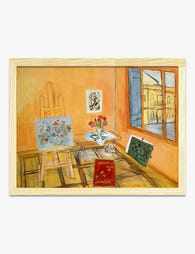
Poster Atelier-Interieur von Raoul Dufy
Translation missing: de.products.product.sale_price Ab €16,95€23,95 -
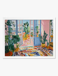
Poster Wintergarten im Matisse-Stil
Translation missing: de.products.product.sale_price Ab €16,95€23,95 -
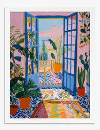
Poster Matisse-inspirierter Wintergarten in Pink und Blau
Translation missing: de.products.product.sale_price Ab €16,95€23,95 -

Leinwandbild Kandinsky – Violett & Grün
Translation missing: de.products.product.sale_price Ab €64,95€92,95 -

Leinwandbild Matisse-inspirierte Schlafzimmer-Szene mit Bergblick
Translation missing: de.products.product.sale_price Ab €64,95€92,95 -
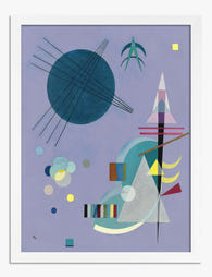
Poster Violett & Grün von Kandinsky
Translation missing: de.products.product.sale_price Ab €16,95€23,95 -

Poster modernes Wohnzimmer in Türkis mit gelbem Sessel und Pflanzen
Translation missing: de.products.product.sale_price Ab €16,95€23,95 -

Leinwandbild Van Goghs Schlafzimmer – Ruhe
Translation missing: de.products.product.sale_price Ab €64,95€92,95 -

Poster Sonnenuntergang am Meer mit Segelboot
Translation missing: de.products.product.sale_price Ab €16,95€23,95 -

Poster Bunte Pop-Art-Illustration fürs Wohnzimmer
Translation missing: de.products.product.sale_price Ab €16,95€23,95 -

Poster Modernes Interieur im Sonnenlicht
Translation missing: de.products.product.sale_price Ab €16,95€23,95 -

Poster Violett & Grün von Kandinsky
Translation missing: de.products.product.sale_price Ab €16,95€23,95 -

Poster Kräftiges blaues Figurenporträt
Translation missing: de.products.product.sale_price Ab €16,95€23,95


Mehr aus The Frame

Art for Above the Sofa: A Complete Guide
The wall above your sofa is the single most-looked-at surface in your home. Get it right and the whole room clicks into place. Get it wrong and you'll feel the...

Two Medium Prints or One Big Print? How to Decide
You've measured your wall. You've found prints you love. Now you're stuck between buying one big statement piece or two medium prints side by side. This guide gives you a...

Going Bigger Than You Think: Why Most People Un...
Walk into almost any home and you'll find it: a 30x40cm print floating awkwardly above a three-seater sofa, marooned in a sea of empty wall. The owner spent weeks choosing...