How to Choose the Right Picture Frame for Your Art Print (Without Overthinking It)
A no-nonsense framework for picking a frame that suits your art, your room, and your patience.

Most frame guides give you fifteen variables to weigh and then tell you to "trust your instincts." That's not a framework, that's an abandonment. This guide gives you one default that works for most prints, plus the handful of situations where you should deviate.
Why the frame matters as much as the art (and why most people get it wrong)
A great print in a bad frame looks cheap. A decent print in the right frame looks considered. The frame is doing roughly half the visual work, and most people treat it like an afterthought once they've spent two weeks choosing the art.
The most common mistake is matching the frame to the wall or the sofa instead of to the art. Your wall colour will change. Your sofa will eventually be replaced. The relationship between the print and its frame is the only one that has to last, so that's the one to optimise for.
The second most common mistake is going too thin. A delicate 15mm frame around a 70x100cm print looks like the frame is apologising for being there. Larger prints need more frame to feel resolved. We'll come back to proportions later.

Wood vs. MDF vs. veneer: what your frame is actually made of
Frame materials fall into three honest categories, and you can usually tell which you're buying by reading the product description carefully.
Solid wood is the real thing. Cut from a tree, sanded, finished. It has weight, slight grain variation, and it ages well. It also doesn't warp the way cheaper materials do when humidity changes, which matters if you're hanging art in a kitchen, bathroom, or anywhere near a radiator.
MDF (medium density fibreboard) is compressed wood dust and resin, usually wrapped in a printed paper or thin foil to mimic wood grain. It's lighter and cheaper. It's also prone to warping, swelling at the corners if it gets damp, and chipping at the edges where the wrap meets the join. If a frame is suspiciously cheap, it's almost always MDF.
Veneer is a thin slice of real wood glued onto an MDF or particleboard core. It looks better than wrapped MDF but shares the same structural weaknesses. Veneer can also lift at the corners over time, which is one of those small flaws you'll start noticing every time you walk past it.
How to tell what you're getting before you buy: look for the words "solid wood" or "FSC-certified wood" in the description. If the listing says "wood-effect," "wood finish," or just "wood frame" without specifics, assume MDF. Weight is another giveaway once it arrives. A solid wood frame for a 50x70cm print should feel substantial in your hands.
Our framed prints use solid FSC-certified wood, no MDF, no veneer, because the failure modes of cheap framing (warping, lifting, sagging) are exactly the things that make a wall feel scrappy rather than considered.
Black, white, oak, or gold: a colour decision tree for every room
You don't need to know art theory to pick a frame colour. You need a decision tree.
Start with the art
Minimal prints with white or pale backgrounds: Go with light oak or natural wood. White frames on these prints often disappear into pale walls and lose definition. Oak gives you warmth and a soft edge without competing with the print.
Bold, colourful abstracts: Go with black. Black contains every colour, so it never clashes. It also creates a clean stop between busy art and the wall, which lets the colours in the print do their work. White can also work here, but it tends to look more gallery, less lived-in.
Black and white photography: Go with black, almost always. White frames around black and white photography tend to feel clinical. Black extends the tonal range of the image and frames it like a photograph rather than a poster.
Vintage botanicals, maps, and illustrations: Light oak or natural wood. These prints have a slight warmth to them and metallic or stark frames fight that warmth.
Anything you want to feel a bit more luxurious: Gold or brass, used sparingly. Gold works beautifully with rich colours (deep greens, burgundies, navies) and traditional subject matter. It looks try-hard around minimalist line drawings.
Then check the room
The room only overrides the art in two cases. First, if you're hanging multiple prints in the same room, the frames should usually be consistent (more on this in the gallery wall section). Second, if your room is very high-contrast (lots of black, lots of white), avoid adding a third strong tone. Stick to oak or pull out a tone already in the room.
The white-frame-on-white-wall trap deserves its own warning. White frames against white walls look great in catalogue photography (because the lighting is controlled) and underwhelming in real homes (because your lighting isn't). If your walls are white or off-white, oak or black will almost always look more intentional.
Matching frame style to art style
Frame style is a separate question from frame colour, and it's where people overthink most.
There are really only two styles that matter for art prints: flat profile (a clean, modern frame with no decorative moulding) and rounded or stepped profile (slightly more traditional, with a bit of dimension to the wood).
Flat profile
Use this for: contemporary art, abstract prints, photography, line drawings, typographic prints, anything from the last 50 years stylistically.
Flat frames stay out of the way. They give the art a clean border and let the eye go straight to the image. For most modern interiors, this is the safer choice.
Rounded or stepped profile
Use this for: vintage prints, traditional landscapes, classical reproductions, botanical illustrations.
The dimension in the moulding adds a bit of formality that suits older subject matter. In a very modern room, this can read as fussy, so know your context.
What you almost never want is an ornate, carved, or heavily detailed frame around a contemporary print. It creates a tonal mismatch that looks like you couldn't decide.

The mount question: when to use one and when to skip it
A mount (or mat) is the border of card between the print and the frame. People agonise over this and they shouldn't.
Use a mount when:
- The print is small (A4 or smaller) and you want it to feel more substantial in a larger frame
- The art has fine detail near the edges that would feel cramped touching the frame
- You want a gallery-style presentation, particularly for photography
- You're framing a piece smaller than the standard frame size you've bought
Skip the mount when:
- The print is large (A2 and above). Big prints have their own visual weight and don't need help
- The art is bold or graphic and reaches edge-to-edge
- You want a more contemporary, less precious look
- The print already has white space designed into it (most modern art prints do)
How much border? If you do use a mount, a 5-7cm border on small to medium prints is the safe range. Too thin and it looks accidental. Too thick and the print starts to feel lost in the middle.
Most modern art prints are designed with their own internal margins, so an additional mount can feel redundant. When in doubt, skip it.
How to spot a bad frame before you buy
Buying frames online comes with risks that high street shopping doesn't, because you can't pick the thing up and check it. Here's what to look for in a product listing, and what to inspect when it arrives.
Before you buy
Material specifics. "Solid wood" or "FSC-certified wood" is good. Vague language is a warning sign.
Glazing type. Glass is cheap, heavy, fragile, and prone to glare. Acrylic is lighter, shatter-resistant, and the better quality versions are nearly invisible. UV-protective acrylic also stops your print fading in direct sunlight, which matters more than people realise (one summer of harsh light can dull a cheap print noticeably).
Whether the print and frame ship together, fitted. This is the single biggest avoidable problem in online frame buying. When prints ship separately from frames and you have to assemble them yourself, you get bubbles, dust trapped under the glazing, prints that aren't centred, and corners that don't sit flush. A frame should arrive with the print already properly fitted, in one box, ready to hang.
Hanging hardware. If the listing doesn't mention hanging fixtures, assume they're not included. Pre-attached hardware is a small thing that makes a real difference on the day.
When it arrives
Check the corners. They should be tight, square, and flush. Gaps at the corners mean the joinery is poor and will get worse.
Check for warping. Lay the frame flat on a table. If any corner lifts, the wood (or worse, the MDF) has bowed. Warped frames don't sit flat against the wall and look slightly wrong from every angle.
Check the glazing. Hold it up to a window. You should see your print, not a mirror image of yourself. Heavy glare usually means cheap glass or low-grade acrylic.
Check the print fitting. The print should sit perfectly centred and flat against the back of the glazing. Bubbles, ripples, or visible adhesive marks mean it was rushed.
Our recommendation: the one frame choice that works 80% of the time
If you want to stop reading and just order something, here it is.
A solid oak frame, flat profile, no mount, in 50x70cm or 70x100cm, with UV-protective acrylic glazing.
This combination works for almost any modern art print, in almost any room, with almost any colour scheme. Oak is warm enough to feel inviting and neutral enough not to fight anything. The flat profile suits contemporary work and doesn't look out of place around vintage either. Skipping the mount keeps things modern. The size is large enough to feel intentional without being a logistical nightmare to hang.
Deviate when:
- You're hanging black and white photography (use black)
- You're going for a more glam or traditional look (use gold)
- The room is very dark and needs lifting (use white)
- You're building a gallery wall (more on that in a second)
That's it. Eight times out of ten, oak in 50x70cm or 70x100cm is the answer.

The gallery wall exception
Gallery walls are the one situation where matching frames matters more than matching the individual art pieces. The art can vary wildly in colour, style, and subject, but if the frames are consistent, the wall reads as cohesive.
The simplest rule: pick one frame colour and one profile, then vary the sizes. Three or four different sizes in the same oak (or all black, or all white) will look intentional even if the art itself is a mixed bag. Mixing frame colours in a gallery wall almost always looks like an accident, even when it isn't.
If you're not sure how to start, pre-curated wall art sets take the guesswork out of the proportions and pairings.
Standard vs. custom sizing
Custom framing is expensive and slow. For most online buyers, the smarter move is to choose a print at a standard size and a frame designed to fit it exactly. You get a better price, faster delivery, and a guaranteed fit. Custom only makes sense for unusual artwork sizes or specific wall constraints.
Browse picture frames at standard sizes and you'll save yourself weeks of back-and-forth.
A final thought
The best frame is the one you stop noticing within a week of hanging it, because your eye goes straight to the art instead. If you find yourself still studying the frame a month later, something's off. Trust the defaults, deviate only when there's a clear reason, and stop optimising.


In diesem Blog vorgestellte Fab-Produkte
-

Poster Minimalistische Stuhlstudie
Translation missing: de.products.product.sale_price Ab €16,95€23,95 -

Poster Gelber Kult-Rahmen
Translation missing: de.products.product.sale_price Ab €16,95€23,95 -

Poster Eingehüllt in Ruhe
Translation missing: de.products.product.sale_price Ab €16,95€23,95 -

Poster Gestreifter Chic mit grünem Kleid
Translation missing: de.products.product.sale_price Ab €16,95€23,95 -
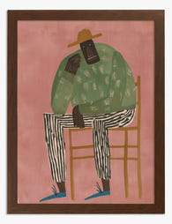
Poster Porträt mit grünem Pullover und Streifenhose
Translation missing: de.products.product.sale_price Ab €16,95€23,95 -
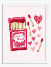
Poster Perfektes Match – Streichholzschachtel mit Herzen
Translation missing: de.products.product.sale_price Ab €16,95€23,95 -

Leinwandbild Nachdenkliche Figur in Grün
Translation missing: de.products.product.sale_price Ab €64,95€92,95 -

Poster Sonnendurchflutetes grünes Fenster
Translation missing: de.products.product.sale_price Ab €16,95€23,95 -

Leinwandbild Eleganz in Pastell – Klassisch mit modernem Akzent
Translation missing: de.products.product.sale_price Ab €64,95€92,95 -

Poster Zitat Schwarz-Weiß – Sei, was du früher gebraucht hast
Translation missing: de.products.product.sale_price Ab €16,95€23,95 -

Leinwandbild ikonischer gelber Rahmen vor Lavendel-Hintergrund
Translation missing: de.products.product.sale_price Ab €64,95€92,95 -

Poster Matisse-inspirierter Rückzugsort
Translation missing: de.products.product.sale_price Ab €16,95€23,95 -

Poster Klassisches Porträt mit modernem Augenzwinkern
Translation missing: de.products.product.sale_price Ab €16,95€23,95 -

Poster Porträt Gestreifte Eleganz
Translation missing: de.products.product.sale_price Ab €16,95€23,95 -

Poster Muse im grünen Streifenkleid mit Blume
Translation missing: de.products.product.sale_price Ab €16,95€23,95 -

Poster Blick in die Baumkronen – Schwarz-Weiß
Translation missing: de.products.product.sale_price Ab €16,95€23,95 -

Poster moderne Oase mit Pool
Translation missing: de.products.product.sale_price Ab €16,95€23,95 -

Poster Muse in grünem Kleid mit Streifen
Translation missing: de.products.product.sale_price Ab €16,95€23,95 -

Poster Buchladenfassade mit Herzdetails und Frühlingsblüten
Translation missing: de.products.product.sale_price Ab €16,95€23,95


Mehr aus The Frame

Modern Kitchen Art Trends: What's Actually on W...
Kitchen art has quietly had a glow-up. The herb prints and "Eat, Drink, Be Merry" signs that defined kitchen walls for the better part of a decade are being replaced...

The Amsterdam Print Edit: Curated Display Ideas...
Amsterdam prints have a specific failure mode. Buy three or four, hang them in roughly the right area, and somehow the wall reads less "considered European apartment" and more "souvenir...

Art Nouveau Flower Prints That Don't Look Like ...
Ornamental floral art has a reputation problem. Mention Art Nouveau and most people picture chintz curtains, dusty rose wallpaper, and a porcelain figurine collection. The reality is that designers are...