Vintage Botanical Prints: The Art That Makes Every Room Feel Finished
Why 200-year-old plant illustrations are the most reliable upgrade your walls will ever get.

Vintage botanical prints are the closest thing wall art has to a sure bet. They work in period homes, new builds, kitchens, bedrooms, and hallways that have defeated everything else you've tried. Here's exactly why they hold up, and how to choose them properly.
Why botanical illustrations from the 18th and 19th centuries still look this good
The golden age of botanical illustration ran roughly from the 1730s to the late 1800s, when artists like Pierre-Joseph Redouté, Maria Sibylla Merian, and Elizabeth Blackwell were producing plates for scientific journals, herbals, and royal commissions. These weren't decorative pieces. They were working documents, made to identify species accurately, which meant every vein, stamen, and leaf margin had to be exact.
That technical precision is the reason they still look good two centuries later. The compositions are clean, usually a single specimen centred on cream or off-white ground, with handwritten Latin nomenclature underneath. There's no styling, no trend, no period signifier beyond the slight warmth of aged paper. It's the visual equivalent of a white linen shirt.
The colour palettes also age well. Plant pigments and the natural dyes used in hand-coloured engravings sit in muted, earthy registers: sage, ochre, dusty pink, burnt sienna, faded indigo. None of these fight with modern interiors the way a brighter contemporary print might.

The vintage botanical resurgence: from maximalism to quiet luxury
Botanicals have been quietly resurging for nearly a decade, but the last two years have pushed them firmly back into the mainstream. The shift started with the maximalist, English country house revival, all clashing florals and chintz wallpaper, where botanicals were one ingredient in a busy mix.
What's happened more recently is that quiet luxury picked them up too. Stripped of the wallpaper and the patterned curtains, a single large vintage botanical print on a plain wall reads as considered, slightly scholarly, expensive in a way that has nothing to do with price. It's the same print doing two different jobs depending on what you put around it.
We think this is why they've outlasted the trend cycle. They flex. A Redouté rose looks at home in a layered, pattern-heavy snug and equally at home in a minimalist Scandinavian bedroom. Very few art categories can do both.
There's also a sustainability angle that matters to a lot of buyers. Choosing a piece of art based on something drawn in 1820 feels less disposable than chasing whatever happens to be trending on Instagram this month. Vintage art prints generally hold up better psychologically too. You don't get bored of them.
Choosing your subject: florals, ferns, fungi, and fruit
The category is bigger than most people realise. "Vintage botanical" is a useful shorthand, but the subject matter splits into four broad groups, and each one behaves differently on a wall.
Florals
The classic choice. Roses, tulips, peonies, anemones, and lilies dominate the historical archive because they were the most commissioned. Florals tend to be the most colourful botanicals, which makes them the easiest entry point if your room is otherwise neutral, and the trickiest if your room is already busy. Browse flower art prints if this is your direction.
Ferns and foliage
The quietest of the four. Ferns, palms, and leaf studies are usually rendered in greens and browns, with a more architectural, almost graphic quality. These are our pick for rooms where you want texture without colour, particularly bathrooms, hallways, and minimalist living rooms. Look at the broader green art prints collection for adjacent options.
Fungi
The category that's exploded over the past five years. Mushroom illustrations from the late 19th century, particularly the German and French mycological plates, have a strangeness and a depth of colour that makes them feel modern. They suit darker rooms, north-facing studies, and anywhere you want art that starts a conversation.
Fruit
The most underrated. Citrus studies, apple varieties, grapes, and pomegranate plates have a quiet domesticity that works brilliantly in kitchens and dining rooms. They're warmer than florals, less expected than ferns, and they ground a room without demanding attention.
Size matters: why a single large botanical print beats a grid of small ones
This is the mistake we see most often. Someone falls in love with vintage botanicals, buys four or six small ones, hangs them in a tidy grid, and ends up with something that looks like a hotel corridor.
Botanicals are detailed pieces. Every leaf, root, and seed pod was drawn to be looked at closely. When you shrink them down to A4 and arrange them in a grid, you're throwing away the thing that makes them worth hanging. The eye reads the grid pattern first and the actual art second.
A single large vintage botanical print at 70x100cm or above does the opposite. It gives the illustration room to breathe, lets you appreciate the detail from across the room and up close, and acts as a proper focal point rather than wallpaper.

Our rule of thumb: if your wall is wider than 1.5 metres, go for one print at 60x80cm minimum, ideally 70x100cm. If you genuinely want a pair, hang them side by side at the same size, with about 5cm between them, so they read as a diptych rather than a collection.
The exception is a stairwell or a long, narrow hallway, where a vertical series of three large prints can work because you're never seeing all of them at once. Even then, we'd argue a single very large piece often looks better.
Best rooms for vintage botanicals (and the one room to avoid)
Bedrooms
The strongest room for botanicals, full stop. The soft palette, the calm subject matter, and the slight formality of the Latin labelling all suit a space designed for rest. A large fern or magnolia print above the bed, framed properly, will outlast every other styling decision in the room.
Living rooms
Botanicals work here, but the size has to be right. A small print above a large sofa looks lost. We'd go 70x100cm minimum above a three-seater, hung so the centre of the print sits roughly 145 to 150cm from the floor.
Kitchens and dining rooms
Fruit and herb illustrations are made for these rooms. A row of three citrus studies above a kitchen banquette, or a single large grape vine print in a dining room, gives the space a sense of place. Canvas prints are worth considering here too, since they handle humidity better than paper.
Bathrooms
Ferns, palms, and seaweed studies look excellent in bathrooms. The slight Victorian botanist energy suits the room, and the green tones pick up beautifully under warm lighting. Make sure your bathroom is properly ventilated and avoid hanging anything directly above the bath.
Hallways and stairwells
Vertical botanical prints (single tall specimens like foxgloves, hollyhocks, or palm leaves) are perfect for narrow walls and stair walls where the orientation of the room dictates the orientation of the art.
The room to avoid: a home office that's already busy
If your office already has a bookshelf, a desk pinboard, a calendar, and several monitors, adding detailed botanical art is one element too many. Detail layered on detail flattens the whole composition. Either simplify the rest of the room or choose something graphic and quieter for that wall.
Framing vintage botanicals: natural oak vs black vs white
Frame choice changes everything. The same print in three different frames reads as three different objects, and getting this right is the difference between art that feels finished and art that feels like a poster.
Natural oak
Our default recommendation. Solid oak (not veneer, not MDF wrap) has enough warmth to complement the aged paper tones of vintage botanicals, and enough restraint to stay out of the way. It works in almost every room, with almost every wall colour. If you're not sure, choose oak.
Black
Sharper, more formal, more graphic. Black frames pull the colour out of the print and create a hard boundary against the wall, which works brilliantly on white or pale grey walls and in modern interiors. Black can feel slightly heavy in a small room or against a deep wall colour.
White
The lightest option, the most invisible. White frames disappear against white or off-white walls, which lets the print do all the work. They can look fantastic in minimalist rooms but slightly insubstantial in period homes with skirting and cornicing.

A note on what to look for in the frame itself. The biggest problem with framed prints generally is when the frame and the print are shipped separately, or when the frame is made from MDF and warps in a humid room. Vintage botanical prints framed properly should arrive in a single box, with the print already fitted, the glazing in place, and fixtures attached to the back. UV-protective acrylic glazing is non-negotiable for botanicals because the warm colours in old illustrations fade faster than cooler tones if they're hit by direct sunlight.
How to pair vintage botanical prints with other wall art styles
Botanicals are unusually generous neighbours. They sit happily next to a lot of styles that you might expect to clash.
With abstract art: a single large botanical anchors a wall, and a smaller abstract piece nearby (geometric, painterly, or monochrome) adds modernity without competing. Keep one detailed and one quiet.
With black and white photography: an excellent pairing. The tonal contrast between a coloured botanical and a black and white portrait or landscape creates visual rhythm. Match the frames to unify the pair.
With antique maps: the cartography of the same era reads as a coherent set. A botanical and a vintage map of, say, the Mediterranean look like they came from the same library, even if they didn't.
With contemporary line drawings: modern minimalist line art and 19th century botanicals share a graphic sensibility. The combination feels intentional rather than accidental.
What to avoid: pairing botanicals with other heavily detailed vintage pieces. Two busy prints next to each other cancel each other out. Always pair detailed with simple.
Where giclée printing makes a real difference for botanical detail
Botanicals are the category where print quality is most obvious, and most often disappointing. The reason is that the original illustrations were made for close inspection. Every cross-hatch, every gradient in a petal, every fine line of a root system was drawn at high resolution by hand. A cheap print flattens all of that into mush.
Giclée printing (pronounced zhee-clay) uses pigment-based inks sprayed onto thick matte paper at very high resolution, with a colour range far wider than standard digital printing. For botanicals specifically, this matters in three places: the fine line work of leaf veins and stems, the subtle gradients in petal colour, and the warm cream of the background paper, which on a poor print reads as muddy beige.

The matte finish is the other thing worth caring about. Botanicals look wrong under gloss. The whole point is that they reference paper, watercolour, and ink, and a glossy surface fights that completely. Matte paper with non-reflective acrylic glazing (rather than glass) holds up the illusion that you're looking at the original plate.
For very large pieces, canvas is also a legitimate option. A 100x150cm fern or palm on stretched canvas, hung unframed, has a different mood: more relaxed, less scholarly, better suited to coastal homes and informal living rooms. The print itself loses a tiny amount of crispness compared to framed paper, but gains a softness that suits foliage particularly well.
A short, useful conclusion
If you're buying your first vintage botanical, go bigger than you think you need, choose oak unless you have a clear reason not to, and pick a subject that actually interests you (not the one that matches your cushions). Botanicals reward attention, so put them somewhere you'll actually look at them. The Latin name underneath is part of the charm. Don't crop it out.

In diesem Blog vorgestellte Fab-Produkte
-

Poster botanische Lehrtafel im Vintage-Stil
Verkaufspreis Ab €16,95€23,95 -

Poster Vintage-Pflanzenillustration in sattem Grün
Verkaufspreis Ab €16,95€23,95 -
Leinwandbild Botanischer Kräuterzweig – Schwarz‑Weiß, Vintage
Verkaufspreis Ab €65,95€93,95 -

Poster Boho-Vasen mit Zimmerpflanzen
Verkaufspreis Ab €16,95€23,95 -

Poster Botanische Vintage-Blüten in Violett auf Beige
Verkaufspreis Ab €16,95€23,95 -

Poster Vintage-Gartenblüten
Verkaufspreis Ab €16,95€23,95 -

Leinwandbild Botanische Oase im Vintage-Stil
Verkaufspreis Ab €65,95€93,95 -

Poster Botanische Pflanzen auf dem Regal vor gelbem Hintergrund
Verkaufspreis Ab €16,95€23,95 -

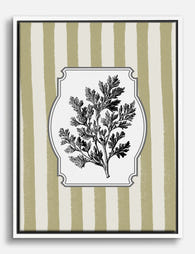
Poster Botanische Kräuter-Illustration Artemisia im Vintage-Stil
Verkaufspreis Ab €16,95€23,95 -

Poster Dunkle botanische Blüten im Vintage-Stil
Verkaufspreis Ab €16,95€23,95 -

Poster botanische Eleganz in Dunkelgrün
Verkaufspreis Ab €16,95€23,95 -

Poster Botanische Blüten auf Rot – Heritage
Verkaufspreis Ab €16,95€23,95 -

Poster dunkle Vintage-Botanik
Verkaufspreis Ab €16,95€23,95 -

Leinwandbild Botanische Minzblätter im Vintage-Look
Verkaufspreis Ab €65,95€93,95 -

Poster Botanischer Vintage-Stil Brisbane
Verkaufspreis Ab €16,95€23,95 -

Poster Blaue Blumen im Vintage-Botanik-Stil
Verkaufspreis Ab €16,95€23,95 -

Poster Ausdrucksstarke Blumenvasen
Verkaufspreis Ab €16,95€23,95 -

Leinwandbild Botanische Boho-Vasen
Verkaufspreis Ab €65,95€93,95 -

Poster Zimmerpflanzen auf Sonnengelb
Verkaufspreis Ab €16,95€23,95


Mehr aus The Frame

Are Botanical Prints Still in Style? The Trend ...
Botanical prints have been declared "over" roughly every three years since 2015, and yet they keep hanging on more walls than ever. The truth is they're not a trend at...

Room-by-Room or Whole-Home? Styling Botanical P...
Most botanical prints are hung wrong. They're too small for the wall, glossy in rooms that need calm, and floating at eye level above sofas they should be anchoring. This...

You're Overthinking Art Above Your Sofa
The blank wall above your sofa isn't a maths problem. It's a mood decision, a colour decision, and a "what do I actually want to look at every evening" decision....