What Size Art for a Hallway? Exact Dimensions for Every Layout
Exact dimensions for narrow corridors, wide foyers, console tables and stairwells, with no vague percentages in sight.

Hallways break the standard rules of art sizing. The usual "two-thirds of the sofa" maths doesn't translate when there's no sofa, the wall is interrupted by doors and switches, and people are walking past your art at speed rather than sitting opposite it. This guide gives you exact measurements for every common hallway scenario.
Why hallways are the trickiest room to size art for
Three things make hallways uniquely awkward. First, the wall space is rarely a clean rectangle. You're working around doorframes, light switches, thermostats, radiator pipes and skirting boards, all of which eat into your usable canvas. Second, viewing distance is short and moving. Most hallways are 90cm to 120cm wide, which means people are looking at your art from roughly 60cm to 80cm away, often at an angle, and rarely standing still.
Third, hallways are transitional. Art here has to work in glances, not in long contemplative stares. That changes what size, complexity and orientation actually function in the space.
The fix is to stop thinking in percentages and start thinking in actual centimetres. Measure your wall properly first: width at the narrowest point, height from the top of the skirting to the ceiling, and the distance between any architectural interruption (doorframes, switches, light fittings). The space between those interruptions is your real working area.

Narrow hallway: the right print size for corridors under 1m wide
If your hallway is under 1m wide, you have one job: don't crowd the space. The viewer can't physically step back, so anything wider than around 60cm starts to feel claustrophobic and you lose the ability to see the image as a whole.
Exact sizing for narrow hallways:
- Hallway width 80 to 100cm: art width 40 to 60cm maximum
- Hallway width under 80cm: art width 30 to 50cm maximum
- Orientation: portrait, almost always
Portrait works because it draws the eye upward and uses vertical wall space without protruding into the walking zone. A 50x70cm portrait print sits comfortably in a 90cm corridor. A 70x50cm landscape in the same corridor feels like it's blocking the path, even though it isn't.
For series of prints down a long narrow corridor, stick to identical sizes (30x40cm or 40x50cm work beautifully) spaced 15 to 20cm apart, hung at a consistent centre-line of 145cm to 150cm from the floor. This is slightly lower than the standard gallery hanging height of 150cm to 155cm, which suits a seated gallery viewer. Hallway viewers are walking, often slightly looking down, so dropping the centre-line by a few centimetres reads better.
For inspiration sized correctly for tight corridors, our narrow hallway art prints collection is filtered to portrait formats that work in tighter spaces.
The door clearance problem
Leave at least 15 to 20cm between the edge of your frame and any door trim. Anything closer looks cramped and visually merges the art with the doorframe. If you only have 50cm of wall between two doors, you don't have room for art there. Move on to the next section of wall.
The light switch challenge
If a light switch sits at 110cm from the floor (standard UK height) and your art's lower edge would land at 115cm, that 5cm gap will look like a mistake. Either hang higher so the gap reads as deliberate (minimum 15cm clearance below the frame) or pick a section of wall without obstacles. Don't try to hide a switch behind art. It looks worse than just acknowledging it.
Wide entrance hall: going big without overwhelming the space
Wide foyers (anything over 1.5m across, or open-plan entrance halls) flip the problem entirely. Now the risk is hanging something too small and watching it float forlornly on a vast wall.
Exact sizing for wide entrance halls:
- Wall width 1.5 to 2.5m: art width 70 to 100cm
- Wall width 2.5 to 4m: art width 100 to 150cm (canvas territory)
- Wall width over 4m: art width 150cm+, or a multi-piece arrangement
This is where large art prints earn their keep. A 70x100cm framed print or a 100x150cm canvas creates the focal point a generous foyer needs. Below 70cm wide on a 3m wall, the art will look like a postage stamp.
For canvas at this scale, the practical advantages matter. A 100x150cm canvas is significantly lighter than a framed print of the same size, easier to hang on plasterboard, and the mirrored edge wrapping means you don't lose any of the image to cropping. Framed prints up to 70x100cm give you the more polished, museum-feel finish if your foyer leans formal.
Viewing distance in a foyer is usually 2 to 3m as people enter, which is closer to a normal "room" viewing distance. You can use more detailed work here. Botanicals, portraits, and intricate illustrations all hold up because the viewer has space and time to actually look.

Above a console table: the 15cm rule and ideal print proportions
Console tables are the most common hallway furniture and they need their own sizing logic. The console is narrow (usually 25 to 40cm deep) and long (90 to 150cm wide), so the proportional relationship between art and furniture differs from a sofa or bed.
The 15cm rule: leave roughly 15cm (6 inches) of clear wall between the top of the console and the bottom of your frame. Less than 10cm and the art looks like it's sitting on the table. More than 25cm and the two elements feel disconnected.
The two-thirds proportion: your art width should be roughly two-thirds of the console width. So:
- 90cm console: art width 55 to 65cm
- 120cm console: art width 75 to 85cm
- 150cm console: art width 95 to 110cm
You can break this rule in one direction. A single piece that runs the full width of the console (so 100% rather than two-thirds) looks bold and intentional. What doesn't work is anything between two-thirds and full width: it just reads as slightly wrong.
Single piece vs pair vs triptych above a console
A single landscape-orientation print is the safest bet and almost always looks balanced. A pair of portraits side by side works on consoles 120cm and wider, with about 5 to 8cm between the frames. A triptych of three smaller prints (say 30x40cm each) suits longer consoles of 140cm+.
If you're decorating a console, our wall art sets collection has matched pairs and triptychs sized to standard console proportions.
Stairwell walls: sizing and spacing for ascending arrangements
Stairwells are the most ambitious hallway project and the one most people get wrong. The trick is that the wall isn't actually slanted, but your eye reads the staircase line as the new horizontal. Your art arrangement has to climb in step with that line.
Single piece on a stairwell: if you're hanging just one print, position the centre 145 to 155cm above the middle stair tread (not the floor below). For a typical UK staircase that's about a third of the way up the wall.
Ascending arrangement spacing:
- Stair angle is typically 35 to 42 degrees
- Centre-to-centre spacing between frames: 50 to 60cm horizontally, with each frame stepped up to follow the stair line
- Vertical rise between frame centres: roughly 30 to 40cm (depending on stair pitch)
- Gap between frame edges: 8 to 12cm
The simplest approach is to use identical-sized prints (40x50cm portrait works particularly well) and step each one up by the same vertical and horizontal increment. Imagine a diagonal line running from bottom-left to top-right at the same angle as your handrail. The centre point of each frame should sit on that line.
Sight line alignment: stand at the bottom of the stairs and look up. The lowest piece should be visible at eye level (around 150 to 160cm from the bottom step). The highest piece should be visible without you having to crane your neck once you reach the top. If you can't comfortably see the top piece from anywhere on the stairs, it's hung too high.
For larger stairwells, consider mixing sizes. A 70x100cm anchor piece at the bottom of the run, with smaller 30x40cm prints climbing alongside, creates rhythm without feeling repetitive. Keep frame styles consistent even when sizes vary.

Single statement print vs a gallery wall: which suits your hallway
Use the actual length of your hallway wall to decide.
Hallways under 2m: single statement piece. There isn't enough wall length to make a gallery feel intentional rather than crammed. One well-sized print (50x70cm or 60x80cm portrait) does more than three small ones fighting for attention.
Hallways 2 to 4m: two to three pieces. Either a matched pair or trio of identical sizes evenly spaced, or a single larger statement piece (70x100cm) with breathing room. Both work, depending on whether you want rhythm or focal point.
Hallways over 4m: gallery wall potential. You have the length to support six to twelve pieces in a structured grid or salon-style arrangement. Stick to a unifying element (frame colour, image palette, or subject matter) so it reads as a collection rather than a collision.
Gallery wall sizing in a hallway
If you're going gallery, plan for a total arrangement footprint of around 60 to 70% of your wall length, centred. So on a 4m hallway wall, your gallery should span roughly 2.5 to 2.8m horizontally. Vertical height of the arrangement should be 80 to 120cm, hung so the centre of the whole arrangement sits at 150cm from the floor.
Frame-to-frame spacing in a gallery: 5 to 8cm. Tighter than that feels chaotic, wider than that and the pieces stop reading as a group.
The honest trade-off: gallery walls take longer to plan and hang well. Lay everything out on the floor first, take a photo, adjust, then transfer to the wall. Trying to wing it on the wall itself almost never works.
Our recommended sizes for entryway art prints
If you want a shortcut, here's what works in most real hallways:
Narrow corridor (under 1m wide):
- Single piece: 40x50cm or 50x70cm, portrait
- Series: three to five 30x40cm prints, portrait, spaced 15 to 20cm apart
Standard hallway (1 to 1.5m wide):
- Single piece: 50x70cm or 60x80cm, portrait or landscape
- Pair: two 40x50cm prints, portrait
Wide entrance hall or foyer:
- Single statement: 70x100cm framed print or 100x150cm canvas
- Triptych: three 50x70cm prints
Above a 120cm console table:
- Single piece: 70x50cm landscape, hung 15cm above the table
- Pair: two 40x50cm portraits, 5 to 8cm apart
Stairwell:
- Three to five 40x50cm portraits, ascending at 50 to 60cm horizontal centre-to-centre
For all of these, framed prints give you a more polished, gallery-like finish and arrive ready to hang with fixtures fitted. Canvas works better for the very largest sizes (above 100cm) because of weight and ease of hanging. Both options are made to order and ship in a single box, properly fitted, with no warping or bubbling on arrival.

Measure twice, mark with masking tape on the wall before you commit, and trust portrait orientation in tight spaces. Hallways reward restraint and exact dimensions far more than they reward bold percentage formulas. Get the measurements right and the art will do the rest.

In diesem Blog vorgestellte Fab-Produkte
-

Leinwandbild Farbenfroher städtischer Hauseingang
Translation missing: de.products.product.sale_price Ab €64,95€92,95 -
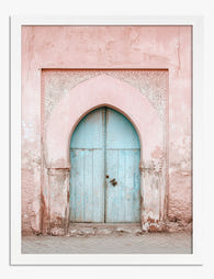
Poster Pastell-Torbogen mit blauer Tür
Translation missing: de.products.product.sale_price Ab €16,95€23,95 -

Poster Botanische Treppe
Translation missing: de.products.product.sale_price Ab €16,95€23,95 -

Leinwandbild Stille im Türrahmen
Translation missing: de.products.product.sale_price Ab €64,95€92,95 -

Poster Welcome Home – Typografie in Pink und Gelb
Translation missing: de.products.product.sale_price Ab €16,95€23,95 -

Poster Willkommen im Blumengarten
Translation missing: de.products.product.sale_price Ab €16,95€23,95 -

Poster Sonnenblumen-Sommeridylle
Translation missing: de.products.product.sale_price Ab €16,95€23,95 -

Leinwandbild Farbintensives Treppenmotiv
Translation missing: de.products.product.sale_price Ab €64,95€92,95 -

Poster Grüne Treppen-Oase
Translation missing: de.products.product.sale_price Ab €16,95€23,95 -

Poster Winterspaziergänge
Translation missing: de.products.product.sale_price Ab €16,95€23,95 -

Poster lichtdurchfluteter Waldweg
Translation missing: de.products.product.sale_price Ab €16,95€23,95 -

Leinwandbild Treppen-Oase mit Zimmerpflanzen
Translation missing: de.products.product.sale_price Ab €64,95€92,95 -

Poster Blaue marokkanische Tür
Translation missing: de.products.product.sale_price Ab €16,95€23,95 -

Poster Winterspaziergang zu zweit
Translation missing: de.products.product.sale_price Ab €16,95€23,95 -

Leinwandbild Bogeneingang in Altrosa mit pastellblauer Tür
Translation missing: de.products.product.sale_price Ab €64,95€92,95


Mehr aus The Frame

You're Overthinking Your St. Louis Gallery Wall
Most St. Louis gallery walls fail for the same reason: too many ideas competing for attention. You bought a beautiful Gateway Arch print, found a Soulard map you love, threw...

Stop Matching Everything: How to Choose Artwork...
Matching artwork is the fastest way to make a living room feel like a hotel lobby. What you actually want is cohesion, which is a much more interesting problem to...

Random or Curated? Making Your Motivational Wal...
Motivational prints have a reputation problem. Hang too many, in too many fonts, with too many frame styles, and your lounge starts to look like the breakroom of a startup...