Art for Above the Sofa: A Complete Guide
The measurements, the layouts, and the design instincts you need to fill the most visible wall in your home.

The wall above your sofa is the single most-looked-at surface in your home. Get it right and the whole room clicks into place. Get it wrong and you'll feel the wrongness every time you sit down, even if you can't name why.
This guide covers the rules that actually matter, the ones you can break, and what to do when your sofa, ceiling, or wall refuses to cooperate.
Start with the measurements that matter
Two numbers do most of the work: the width of your art relative to your sofa, and the height of the art above the sofa back.
The two-thirds rule (and why it works)
Your art (or arrangement of art) should be roughly two-thirds to three-quarters the width of your sofa. A 220cm sofa wants art around 140cm to 170cm wide. A 180cm two-seater wants something closer to 120cm to 140cm.
The reason this works is visual weight. A small piece floating above a long sofa looks like a stamp on an envelope. The eye reads the sofa and the art as two separate, unrelated objects. Match the proportion and they become one composition.
If you're going smaller than two-thirds, you almost always need to commit to a gallery wall or a pairing to make up the width. A single 40x50cm print above a three-seater is the most common mistake in interior design, and we see it constantly.
The 15 to 25cm gap
Hang the bottom of your frame 15 to 25cm (roughly 6 to 10 inches) above the top of the sofa back. Closer than that and the art feels pinned to the furniture. Further than 25cm and it floats, disconnected from everything below it.
The old "57 to 60 inches from the floor to the centre of the art" rule is fine for empty walls, but above a sofa, ignore it. Anchor to the furniture, not the floor.

Choosing your layout
There are really only four layouts worth considering above a sofa. The right one depends on your sofa, your wall, and how much risk you want to take.
Single statement piece
One large print, centred. This is the cleanest option and the hardest to get wrong, provided you size it correctly. It works for almost every style, from minimalist to maximalist, and it's the layout we'd default to if someone asked us to pick blind.
Best when: your sofa sits against a clean, uninterrupted wall, your ceiling is standard height (2.4 to 2.7m), and you want the room to feel calm and resolved.
Go large. A 70x100cm or 100x70cm framed print is the sweet spot above a standard three-seater. For longer sofas or sectionals, a canvas at 100x150cm gives you the scale you need without the weight of a framed piece that size.
Diptych or triptych
Two or three pieces hung side by side, treated as a single composition. Leave a consistent 5 to 10cm gap between frames so they read as one unit rather than separate works.
Best when: you want presence without a single huge piece, or when you're working with a wide sofa where a single print would need to be impractically large. Three 50x70cm prints with 8cm gaps give you a 174cm-wide composition, which is ideal above a 220 to 240cm sofa.
Abstract prints and botanical sets work particularly well as triptychs because the eye can follow colour and form across the panels.
Gallery wall
A cluster of mixed-size frames arranged in a loose grid or organic shape. Higher effort, higher reward, easier to get wrong.
Best when: you have an eclectic or layered style, you collect art over time rather than buying it all at once, and you're willing to lay everything out on the floor first before touching the wall.
Keep the overall outline of the gallery within the two-thirds rule. The cluster as a whole should occupy roughly the same width as a single statement piece would. Anchor it with one larger piece (often slightly off-centre) and build outwards.
Oversized horizontal
A single very wide piece, often a panoramic landscape, abstract, or black and white photography. At 150cm wide on canvas, this is the most cinematic option and works brilliantly above modern, low-profile sofas.
Best when: you have high ceilings, a long sofa, and a confident style. It's a commitment, but it's the layout that gets the most compliments.
How to choose art that actually works with your sofa
Measurements are the easy part. Choosing the right image is where most people freeze.
Match the temperature, not the colour
You don't need your art to match your cushions. You need it to share a temperature. A warm, oatmeal-coloured linen sofa wants art with warm undertones: terracotta, ochre, sage, soft browns, cream. A cool grey velvet sofa wants cooler palettes: ink blue, charcoal, dusty pink, off-white.
Pick one or two colours in the art that pull from somewhere else in the room (a rug, a cushion, the curtains) and you've created a visual loop that makes the whole space feel intentional.
Sofa material matters more than you think
Leather sofas, especially in tan or cognac, sit better under art with strong contrast and graphic shapes. The richness of the leather can swallow soft, washy pieces.
Velvet wants the opposite: softer, more painterly work that doesn't compete with the sofa's own drama. Linen and boucle are the most flexible and work with almost anything.
Bold sofa, quiet art (and vice versa)
If your sofa is the loudest thing in the room (emerald green, mustard, a bold print), let your art recede. Soft tonal pieces, line drawings, monochrome photography. If your sofa is neutral, your art can be the personality of the room. This is the easiest way to avoid a space that feels visually exhausting.

Difficult sofas and awkward walls
Most guides assume a rectangular wall and a straight three-seater. Real homes rarely cooperate.
Sectionals
The trick with sectionals is to ignore the L-shape entirely. Centre your art over the longer run of the sofa, not the corner. Treat the chaise or return as if it doesn't exist for the purposes of art placement.
If the longer side faces a wall, hang as you would for a regular sofa. If the sectional sits in the middle of the room with only the back of the chaise against a wall, consider a vertical orientation (100x70cm portrait) above the chaise itself, which breaks up the horizontal mass.
Sofas under windows
If your sofa sits beneath a window, you've lost the wall above it. Instead, flank the window with two narrow vertical pieces, or hang a single horizontal piece between the window and ceiling if the gap is at least 50cm. Don't try to squeeze something into a tiny strip; it will look apologetic.
Sofas not against a wall
A floating sofa with no wall behind it doesn't need art above it at all. The art should go on the nearest visible wall, sized to that wall rather than the sofa.
Low ceilings
With ceilings under 2.4m, go horizontal. Tall vertical pieces will exaggerate the squat proportions. A 100x70cm landscape orientation or a horizontal triptych keeps the eye moving sideways, which makes the room feel wider.
Keep the top of the art at least 30cm below the ceiling. Anything closer feels crammed.
High ceilings
The opposite problem, and a more forgiving one. You can hang taller, go bigger, and even stack two pieces vertically. Just don't leave the art marooned at standard height with a vast blank expanse above it. Either raise it or add a second layer above (a small shelf, a sconce, or a second print).
Chair rails, wainscoting, and panelling
Treat the rail or panel line as your new floor. Hang the art 15 to 25cm above the rail rather than above the sofa back if the rail sits higher. Working with the architecture rather than against it always reads better.
Renting? Here's what works
Drilling into walls isn't the only option. Heavy-duty adhesive strips (the proper picture-hanging kind, rated by weight) hold prints up to around 3kg reliably. That covers most unframed prints and small framed pieces up to roughly 50x70cm.
For anything larger, a leaning approach works beautifully. A long, low console or floating shelf behind the sofa lets you lean larger pieces against the wall, layer them, and swap them out whenever you want. Canvas prints are particularly good for this because they're lightweight and don't have glass to worry about.
Picture rails, if your rental has them, are a gift. Use them.
Framed or unframed, canvas or paper
A quick orientation, because the choice affects how the art reads above your sofa.
Framed paper prints feel formal and polished. They suit traditional, classic, and Scandi interiors, and they hold their own in eclectic rooms too. The frame gives the art a defined edge, which helps it read as a deliberate composition above the sofa rather than something tacked on.
Canvas prints feel softer and more contemporary. They sit close to the wall (no deep frame profile), which works well in modern minimalist spaces. They're also significantly lighter than a large framed piece, which matters if you're hanging something at 100x150cm.
We'd reach for framed prints in formal living rooms, period properties, and rooms with a lot of soft furnishings that benefit from a crisp edge. Canvas works better in lofts, family rooms, and any space where the art needs to feel relaxed.
One practical note: if your living room gets strong direct sunlight, both options handle it well, but the UV-protective acrylic glaze on framed prints means you'll never see fading, even on a south-facing wall.

Lighting your art
Most people forget this entirely. A beautifully chosen, perfectly sized piece looks dead in flat overhead light.
The cheapest fix is a pair of table lamps on either side of the sofa, positioned to wash the wall with light. The next step up is wall sconces flanking the art (battery-operated versions exist for renters). The full commitment is a hardwired picture light above the frame, which transforms the art in the evening.
Avoid downlights pointing straight down at the sofa. They throw the wall above into shadow and make the art recede.
A simple decision framework
If you're stuck, work through these in order:
- Measure your sofa. Multiply the width by 0.66 and 0.75. That's your target art width range.
- Check your ceiling height. Under 2.4m, go horizontal. Over 2.7m, you have options.
- Pick your risk level. Single piece (low risk, high impact), diptych or triptych (medium risk, very forgiving), gallery wall (high risk, high personality).
- Match the temperature of your sofa, not the colour.
- Decide framed or canvas based on the formality of the room.
- Hang the bottom 15 to 25cm above the sofa back. Step back. Adjust.

What to do if you genuinely can't decide
Buy one large piece rather than several small ones. A single, well-sized print is the layout most likely to look good in five years, the easiest to live with, and the hardest to get wrong. You can always add to it later. Building outwards from a strong anchor is much easier than trying to assemble a gallery wall from scratch.
Measure first, choose temperature second, commit third. The wall above your sofa is forgiving of confident decisions and brutal to half-measures.

In diesem Blog vorgestellte Fab-Produkte
-

Poster Stillleben mit grünem Sofa
Verkaufspreis Ab £11.95£19.95 -

Poster 'Above Me Now' – Klassisches Porträt mit Statement
Verkaufspreis Ab £11.95£19.95 -

Leinwandbild Gemütliche Katze & farbenfrohes Sofa
Verkaufspreis Ab £49.95£74.95 -

Leinwandbild Weiße Katze auf grünem Sofa
Verkaufspreis Ab £49.95£74.95 -

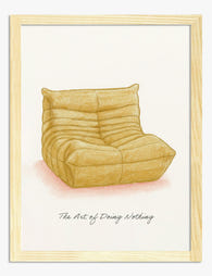
Poster Togo-Sofa in warmen Tönen
Verkaufspreis Ab £11.95£19.95 -

Poster Gemütlicher Lesemoment auf dem Sofa
Verkaufspreis Ab £11.95£19.95 -

Poster Gemütliche Bibliothek mit gelbem Sofa
Verkaufspreis Ab £11.95£19.95 -

Poster Die Sonne von Arthur Dove
Verkaufspreis Ab £11.95£19.95 -
Poster Gelbes Sofa – Minimalistische Gemütlichkeit
Verkaufspreis Ab £11.95£19.95 -

Poster weiße Katze auf grünem Sofa
Verkaufspreis Ab £11.95£19.95 -

Poster Rote Katze und grünes Sofa im Sonnenlicht
Verkaufspreis Ab £11.95£19.95


Mehr aus The Frame

The Best Wall Art for Plant Lovers (That Doesn'...
You already have too many plants. You know it, your partner knows it, the fiddle leaf fig blocking the window knows it. But your walls are still bare, and there's...

Are Botanical Prints Still in Style? The Trend ...
Botanical prints have been declared "over" roughly every three years since 2015, and yet they keep hanging on more walls than ever. The truth is they're not a trend at...

Room-by-Room or Whole-Home? Styling Botanical P...
Most botanical prints are hung wrong. They're too small for the wall, glossy in rooms that need calm, and floating at eye level above sofas they should be anchoring. This...