Art Deco vs Art Nouveau: A Visual Guide to Finally Telling Them Apart
One is all flowing vines and dreamy goddesses. The other is chrome, geometry and pure jazz-age swagger.

People mix these two up constantly, and it's understandable. Both are decorative, both feel "vintage" in a glamorous way, and both lean heavily on stylised women and natural motifs. But once you know what to look for, you'll never confuse them again.
A quick visual test: curves vs geometry
Here's the fastest way to tell them apart. Look at the lines.
If the image is built from flowing, asymmetrical curves that seem to grow like vines, you're looking at Art Nouveau. If it's built from sharp angles, repeating geometric shapes and strict symmetry, that's Art Deco.
Try this mental exercise. Picture a peacock. An Art Nouveau peacock has trailing tail feathers that swirl across the whole composition, melting into the border. An Art Deco peacock is stylised into a fan of identical chevrons, perfectly symmetrical, often gold on black.
That's the whole game in a sentence: Art Nouveau grows, Art Deco is built.

Origins and timelines: 1890s organic forms vs 1920s machine-age glamour
Art Nouveau came first, roughly 1890 to 1910. It was a reaction against the heavy, fussy Victorian style and the ugliness of early industrial mass production. Designers wanted to bring beauty, nature and craftsmanship back into everyday objects: lamps, jewellery, posters, ironwork, entire Métro stations in Paris.
It had regional names too. Jugendstil in Germany. Sezessionstil in Vienna (think Klimt). Glasgow Style in Scotland (Charles Rennie Mackintosh). All slightly different flavours of the same impulse: nature, line, craft.
Then the First World War happened, and the world changed. By the time the dust settled in the early 1920s, people wanted something new: faster, sleeker, more confident.
Art Deco ran from roughly 1920 to 1939, peaking around the time of the 1925 Paris Exposition that gave it its name (Arts Décoratifs). It celebrated speed, machines, skyscrapers, ocean liners and jazz. Where Art Nouveau looked at a flower, Art Deco looked at the Chrysler Building.
The 1922 discovery of Tutankhamun's tomb also poured Egyptian motifs into the Deco vocabulary: sunbursts, stepped pyramids, scarab shapes, hieroglyphic-style figures.
Key characteristics of Art Deco design
Once you know the visual vocabulary, Art Deco becomes instantly recognisable. Here are the art deco design characteristics that show up again and again.
Geometry, everywhere
Chevrons. Zigzags. Stepped forms (the "ziggurat" look). Triangles. Concentric circles. If the print could be drawn with a ruler and a compass, that's a strong Deco signal.
The sunburst
A radiating fan of lines emerging from a single point, often in gold. This is probably the single most iconic Deco motif. You'll see it on mirrors, clocks, building facades and prints.
Strict symmetry
Art Deco loves balance. Left mirrors right. Top mirrors bottom. The composition feels deliberate and architectural, never accidental.
Bold colour and metallics
Deep emerald, navy, black, cream, burgundy, and acres of gold, silver and chrome. High contrast. Confident. The opposite of muddy or muted.
Stylised, streamlined figures
Women in Deco posters are sharp-jawed, long-limbed and impossibly elegant. Think of Tamara de Lempicka's chrome-skinned aristocrats, or the travel posters of Cassandre with their compressed forms and dramatic angles. Erté's fashion illustrations are pure Deco: figures elongated into near-abstract patterns.
Materials that scream "modern"
In furniture and objects, Deco loved chrome, steel, lacquer, glass, Bakelite and exotic veneers. The materials themselves announced that this was the future.
So if someone asks what is art deco style in one sentence: it's the visual language of the machine age dressed up for a cocktail party.

Key characteristics of Art Nouveau
Now flip everything.
The whiplash curve
This is THE defining Art Nouveau line. A long, asymmetrical, S-shaped curve that snaps back on itself like a cracking whip. Look at the iron railings of a Hector Guimard Métro entrance and you'll see it. Look at the way Mucha's hair flows around his goddesses and you'll see it again.
Botanical and natural motifs
Lilies, irises, poppies, vines, ferns, peacocks, dragonflies, swans. Nature isn't a decorative afterthought here, it's the whole grammar of the style. Our botanical art prints collection draws on a lot of this DNA.
Asymmetry and flow
A Nouveau composition often feels like it's been caught mid-movement. Lines drift off the edge of the frame, plants sprawl, hair flows. Symmetry is broken on purpose.
Muted, earthy palettes
Burnt orange, mustard, olive green, soft teal, dusty rose, sepia. Colours pulled from autumn leaves, mossy stones and stained glass, not from a paintbox.
Sensuous, dreamy figures
Alphonse Mucha's posters for Sarah Bernhardt defined the look: women with rivers of hair, surrounded by halos of stylised flowers, gazing softly into the middle distance. Gustav Klimt added gold leaf and Byzantine pattern. Louis Comfort Tiffany blew it all into stained glass lamps.
Craft over machine
Where Deco celebrated industry, Nouveau celebrated the handmade. The same designer might draw a poster, design the typography, mould the bronze and sketch the dress. It was a "total work of art" movement.
You can see all of this play out in our Art Nouveau collection, where the Mucha and Klimt influence is hard to miss.
Where the two styles overlap (and why people confuse them)
Here's the part most articles skip. They aren't as opposite as they look.
Both are decorative arts movements. Both rejected the rules of academic fine art and elevated posters, prints, jewellery and furniture to gallery status. Both put women's faces front and centre. Both drew heavily on nature, even if they translated it differently. Both happened within a 50-year window in the same European capitals.
Some artists worked in both. René Lalique started as an Art Nouveau jeweller making delicate dragonfly brooches, then reinvented himself as an Art Deco glass sculptor with bold geometric vases. Josef Hoffmann's Stoclet Palace in Brussels is often described as a prototype that helped move Vienna's Sezession towards proto-Deco geometry.
They share motifs but treat them differently. A flower in Nouveau is rendered organically, with all its irregularities. A flower in Deco is reduced to a stylised emblem, often a simple repeated shape. Same source, completely different processing.
Quick cheat sheet for spotting the difference:
- Flowing line that wanders? Nouveau.
- Repeating shape on a grid? Deco.
- Muted, autumnal colours? Nouveau.
- High-contrast black, gold and jewel tones? Deco.
- Hair like a river? Nouveau.
- Hair like a sculpted helmet? Deco.
- You feel like you're in a garden? Nouveau.
- You feel like you're in a 1930s hotel lobby? Deco.

Which style suits your home: a practical decision guide
The fun question. Both look incredible on the right wall, but they ask different things of the room around them.
Choose Art Deco if...
- Your space leans modern, minimal or monochrome and you want a confident focal point.
- You're drawn to black, navy, emerald, brass, gold as a colour scheme.
- Your furniture has clean lines: velvet sofas, marble surfaces, brass legs, lacquered finishes.
- You like the idea of a print that feels graphic and bold from across the room.
- You're decorating a dining room, bar area, home cinema or any room where a touch of theatre is welcome.
Deco prints work brilliantly in pairs or trios because of their inherent symmetry. Two matching 50x70cm framed prints flanking a fireplace, or three 40x50cm prints in a horizontal row above a sideboard, look genuinely architectural.
Choose Art Nouveau if...
- Your space is softer, more layered, more romantic, with textures like linen, rattan, aged brass and warm wood.
- You're drawn to ochre, olive, terracotta, sage, dusty teal.
- You love botanical detail and don't mind a print that rewards close looking.
- You want art that feels like it's been there for a hundred years.
- You're decorating a bedroom, snug, reading corner or bathroom (and yes, our framed prints use UV-protective acrylic glaze rather than glass, which is more forgiving in humid rooms than you'd expect).
Nouveau prints are often best as single statement pieces rather than gallery walls, because the compositions are already so rich. One 70x100cm Mucha-style print above a bed does more work than five smaller ones competing with each other.
Still torn? A quick three-question test
- Do you instinctively like things symmetrical or asymmetrical? Symmetrical leans Deco. Asymmetrical leans Nouveau.
- Pick a room you love: is the mood more "glamorous" or "dreamy"? Glamorous is Deco. Dreamy is Nouveau.
- Black and gold, or olive and ochre? You already know.
If you've answered all three the same way, you have your style. If you're split, you might be a person who layers both, which is also a legitimate move. Look at the work of transitional designers like Lalique or Hoffmann if you want permission.

Our favourite Art Deco prints to get you started
If the decision tree pointed you towards Deco, here's what to look for and where to put it.
Look for a sunburst or fan motif for above a fireplace
A central, symmetrical Deco composition over a mantel is one of the most satisfying art placements in interior design. Go large: at least two-thirds the width of the fireplace below it. A framed 70x100cm print in a black solid wood frame does this beautifully.
Stylised figure prints for bedrooms and dressing areas
Lempicka-style portraits and Erté-inspired fashion illustrations have a quiet glamour that works particularly well in bedrooms. Stick to one strong piece rather than a cluster. The figure is already the focal point, it doesn't need company.
Travel and architecture posters for hallways and kitchens
The Cassandre school of Deco travel posters (ocean liners, trains, ski resorts in compressed perspective) are tailor-made for long, narrow spaces. Three matching frames in a row down a hallway looks intentional and confident.
Geometric pattern prints for modern living rooms
If figures feel too literal for your taste, go abstract. Pure chevron, sunburst or stepped pattern prints in gold and black sit beautifully against minimalist sofas and concrete walls. These are the prints that look most like "design" rather than "art", which is exactly the Deco point.
A note on format: we'd generally recommend framed prints over canvas for Art Deco, because the style itself is so much about precision, edges and finish. A clean, solid wood frame echoes the architectural feel of the work. Canvas suits Nouveau better, where the softer surface flatters the painterly, organic compositions. Both options arrive ready to hang with fixtures attached and the print properly fitted, so you're not wrestling with a separate frame kit at home.
For more pieces in this era, the broader vintage art prints collection covers the full sweep from late Nouveau through high Deco and beyond.
The takeaway
Forget the dates and the manifestos. The fastest way to tell these two apart is to ask one question: is this composition grown or built?
Grown, flowing, asymmetrical, botanical, muted: Art Nouveau. Built, geometric, symmetrical, metallic, bold: Art Deco. Once that distinction clicks, you'll start spotting both styles everywhere, in cinemas, hotel lobbies, jewellery shops and your own scroll history. The next step is just deciding which one you want to wake up to.

In diesem Blog vorgestellte Fab-Produkte
-

Poster Art Deco Blumen von Séguy
Translation missing: de.products.product.sale_price Ab £11.95£19.95 -

Poster Art-Déco Blumen Vintage – inspiriert von Emile Alain Seguy
Translation missing: de.products.product.sale_price Ab £11.95£19.95 -

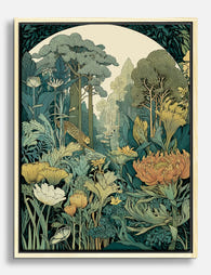
Poster Verzauberter Jugendstil-Garten
Translation missing: de.products.product.sale_price Ab £11.95£19.95 -

Poster Jugendstil: verwunschener botanischer Garten
Translation missing: de.products.product.sale_price Ab £11.95£19.95 -

Leinwandbild Seguy Jugendstil-Blumenmuster
Translation missing: de.products.product.sale_price Ab £44.95£74.95 -

Poster Vintage-Blaupause – technische Zeichnung mit Charme
Translation missing: de.products.product.sale_price Ab £11.95£19.95 -

Poster Bauhaus-Geometrie in tiefem Marineblau
Translation missing: de.products.product.sale_price Ab £11.95£19.95 -

Poster Fahrradrennen im Vintage-Stil mit Jugendstil-Bordüre
Translation missing: de.products.product.sale_price Ab £11.95£19.95 -

Poster moderne Boho-Vase mit abstrakten Blättern
Translation missing: de.products.product.sale_price Ab £11.95£19.95 -
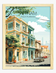
Poster Französischer Kolonialstil in Vietnam
Translation missing: de.products.product.sale_price Ab £11.95£19.95 -
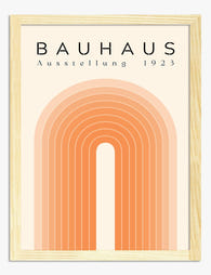
Poster moderner Bogen im Bauhaus-Stil
Translation missing: de.products.product.sale_price Ab £11.95£19.95 -
Leinwandbild Verwunschener Jugendstil-Garten mit Leopard
Translation missing: de.products.product.sale_price Ab £44.95£74.95 -

Poster Bauhaus-Geometrie 1919
Translation missing: de.products.product.sale_price Ab £11.95£19.95 -

Poster Geometrische Grafik im Bauhaus-Stil
Translation missing: de.products.product.sale_price Ab £11.95£19.95 -

Poster Bauhaus Minimalistische Geometrie
Translation missing: de.products.product.sale_price Ab £11.95£19.95 -

Leinwandbild Botanische Vintage-Blüten im Séguy-Stil
Translation missing: de.products.product.sale_price Ab £44.95£74.95 -

Poster Bauhaus-Muster in Schwarz und Creme
Translation missing: de.products.product.sale_price Ab £11.95£19.95 -

Poster Moderne Geometrie im Bauhaus-Stil
Translation missing: de.products.product.sale_price Ab £11.95£19.95 -

Leinwandbild Verwunschener Jugendstilgarten
Translation missing: de.products.product.sale_price Ab £44.95£74.95


Mehr aus The Frame

The Gallery Wall Edit: Curated Layouts That Fee...
There is a specific kind of gallery wall that haunts the internet. Six matching black frames in a perfect grid, a Matisse line drawing, an "abstract neutral", and possibly the...

Glass vs Acrylic Glazing: The Bit Nobody Explains
Every guide to picture frame glazing reads the same way: a tidy pros and cons list, a vague nod to "personal preference," and a recommendation that conveniently aligns with whatever...

Why We Frame with Real Wood (And What Flat-Pack...
Most people buying a framed print never think about the frame itself. That's fair. You're buying the art. But the frame is the structure that protects it, defines it on...