Art at the Top and Bottom of a Staircase
The often-ignored rules for hanging art where staircases begin, end, and pause in between.

Staircases are the most overlooked walls in the house. They are also the trickiest, because the top of the stairs, the bottom of the stairs, and the landing in between each have completely different rules. This guide treats them as three separate problems, with three separate solutions.
Why staircases need their own playbook
Most rooms have a fixed viewing distance. You sit on the sofa, you look at the wall opposite. Staircases break this. Your eye line shifts with every step, your distance to the art changes constantly, and you often see the same piece from a hallway, a landing, and halfway up the stairs.
That means a piece that looks perfect at standing height in your living room can feel completely wrong on a stair wall. Scale, height, and even subject matter need rethinking.
The three zones we are going to cover are: the bottom (your first impression as you enter or pass through), the landing (your pause point), and the top (a focal point visible from below). Each gets its own section.

Art at the bottom of stairs
The bottom of the staircase is doing two jobs. It is the visual anchor for the stair run, and it is often part of an entryway or hallway, which means it is the first thing guests see when they walk in.
What works here
You want something with presence. Bottom-of-stairs walls are usually viewed from a few angles: head-on from the front door, in passing as you walk through the hallway, and from adjacent rooms like the lounge or kitchen. A single large piece tends to outperform a fussy arrangement here, because it reads cleanly from a distance.
Our rule of thumb: pick a piece that fills roughly two-thirds of the available wall width. For a standard stairwell wall of around 90 to 120cm wide, that means a 60x80cm or 70x100cm framed print. Anything smaller starts to look like a postage stamp.
Subject matter
Bottom-of-stairs art sets the tone for the home. We lean towards pieces with a bit of depth and atmosphere rather than purely decorative graphics, because you are going to walk past this thing thousands of times. Landscape photography, abstract work with strong composition, or a single bold botanical all hold up well to repeat viewing.
Avoid anything too busy or too small in detail. You will rarely stand still and study it, so it needs to register at a glance.
Height and hanging
The standard 145 to 152cm to the centre of the artwork still applies here, measured from the floor of the room the staircase opens into, not from the first stair tread. If your hallway has high ceilings, you can push the piece slightly higher, but not so high that the bottom edge sits above your eyeline.
Leave at least 15cm of breathing room between the top of the frame and the underside of the staircase or any moulding above. Cramped art looks like an afterthought.
Lighting
Bottom-of-stairs walls are often gloomy. They sit away from windows and lose light to the staircase above them. If you can, add a picture light above the frame or a small wall sconce nearby. Even a well-placed floor lamp in the hallway makes a difference.
This is one reason we use UV-protective acrylic glaze rather than glass on framed prints. It does not reflect light back into your eye the same way, so a softly lit hallway piece reads as art rather than a mirror.
Art at the top of stairs
The top of the stairs is the hardest wall in the house to get right. You are usually looking up at it from below, then walking towards it as you climb, then turning away from it at the top. It needs to work from all three perspectives.
The viewing angle problem
If you hang art at standard height (centre at 145cm) at the top of a flight of stairs, anyone standing at the bottom looking up will see mostly the bottom edge of the frame and a foreshortened version of the image. That is why so much top-of-stairs art looks awkward in photos.
The fix: hang it slightly higher than you would in a normal room. We tend to push the centre to around 155 to 160cm from the top landing floor, so the piece tilts more naturally into the upward sightline from below. Test it by standing at the bottom of the stairs and looking up. If the bottom edge of the frame dominates, raise it.
Scale matters more here
Because the piece is viewed from distance more often than up close, small art disappears. A 50x70cm print that would feel generous in a bedroom can look lost at the top of a stair run.
Go big. A 70x100cm framed print, or a 100x70cm landscape orientation, tends to be the sweet spot. If you have very tall ceilings or a long sightline up the stairs, look at canvas in 100x150cm, which reads cleanly even from two floors below. Our canvas prints collection is worth a look for these larger formats, since canvas is lighter than glazed framed prints and easier to hang on awkward upper walls.
Subject matter for the top
This is the piece you see as you climb the stairs. We think it should reward the climb. Something with depth, scale, or a sense of opening up works well, like a wide landscape, a moody abstract, or a strong architectural photograph. Avoid anything that needs close reading.
Practical hanging
Top-of-stairs walls are often hard to reach. You may be standing on a ladder balanced precariously on the landing, with stairs dropping away beside you. A few rules:
- Use two fixings rather than one, even for smaller pieces. The piece is more likely to be knocked by people coming up the stairs.
- Mark your hanging points carefully before you drill, because correcting holes in a stairwell is a nightmare.
- If you can, hang the piece while someone stands at the bottom of the stairs to check the sightline.
Framed prints from Fab arrive with fixtures already attached, which removes one of the more fiddly steps when you are working on a ladder above a stair drop.

Art for a stair landing
Landings are the secret weapon of staircase styling. They are the one part of the staircase where you actually pause, turn, and stand still. That makes them perfect for art you want people to actually look at.
Treat the landing as a small room
Unlike the rest of the stair wall, on the landing you are stationary, often at standing height, with a clear view of the wall in front of you. The standard rules of art hanging apply: centre at around 145 to 150cm from the landing floor, with the piece sized to roughly two-thirds the width of the wall.
This is the one staircase location where smaller, more detailed work earns its place. A 40x50cm or 50x70cm print can hold its own here, because you are close enough to actually read it.
Mini gallery walls
Landings are also the best spot on a staircase for a small gallery wall. You have a defined, flat wall and a fixed viewing distance, which makes arranging multiple pieces much easier than along the angled stair run.
We suggest keeping landing gallery walls tight. Three to five pieces, consistent framing, with around 5 to 8cm between frames. Anything looser and it starts to drift into the stair wall and lose coherence. Our gallery wall art collection has prints designed to sit well together, which takes the guesswork out of pairing.
A change of pace
Landings are also a chance to break the visual tone of the rest of the staircase. If your stair run features a moody photograph or a single large abstract, the landing is where you can introduce something quieter, more personal, or more graphic. The pause point in the climb is where the eye welcomes a small shift in mood.
Lighting your staircase art
Staircases are usually the darkest part of the house. They are transitional spaces with few windows, and the artificial lighting is often a single overhead pendant designed to light the treads, not the walls.
A few practical fixes:
- Picture lights mounted above larger framed pieces. Battery-operated, rechargeable versions exist now, so you do not need to run wiring through plaster.
- Wall sconces at landing level, angled to wash the wall rather than glare into your eyes.
- Stronger bulbs in the existing pendant, especially warm white (around 2700K) which flatters art without distorting colour.
Without enough light, even the best art reads as a dark rectangle. Lighting is half the job.
Hanging methods for tricky stair walls
Drilling above a stair drop is genuinely difficult. If you are renting, or just nervous about plaster, there are workable alternatives.
Adhesive strips
Heavy-duty adhesive strips can hold framed prints up to a certain weight, usually around 3 to 4kg per pair. They work best on smooth, painted plaster. They do not work well on textured wallpaper or freshly painted walls (give paint at least three weeks to cure first).
For canvas prints, which are significantly lighter than framed and glazed equivalents, adhesive strips become much more viable. This is another reason canvas tends to be the practical choice for high or awkward stair walls.
Picture rails
If your home has original picture rails, use them. A single wire dropped from a rail can hold a large piece with no plaster damage at all. Picture rails also let you adjust height without re-drilling, which is useful while you are still figuring out the right viewing angle.
Standard fixings
If you are drilling, use the right anchor for your wall type. Plasterboard needs proper plasterboard fixings rated for the weight, not just a screw into plaster. For heavier framed pieces, find the stud where possible. A piece falling off a stair wall is more dangerous than one falling in a normal room.

Common mistakes to avoid
A few patterns we see again and again:
Hanging too small. Stair walls are large, sightlines are long, and viewing distances vary. Small art looks lost. When in doubt, size up.
Ignoring the handrail. Leave at least 10cm of clearance between the bottom of your frame and the top of the handrail. Anything closer looks crowded and risks getting knocked.
Following the stairs too literally. The classic "stair-step" arrangement, where frames descend in a diagonal line matching the stairs, is fine, but it is often the default rather than the best answer. For top and bottom walls, a single statement piece usually outperforms a stair-stepped arrangement.
Forgetting the view from adjacent rooms. Staircases are usually visible from a hallway, lounge, or kitchen. The art needs to coordinate with those rooms, not exist in its own bubble.
Mounting at standard height regardless of angle. Bottom-of-stairs art works at standard height. Top-of-stairs art usually needs to go higher to account for the upward viewing angle. The same rule does not apply to both.
Coordinating with adjacent rooms
Because stair walls are visible from multiple rooms, the art needs to play nicely with what is around it. We are not saying everything should match, but the dominant tones should sit comfortably together.
If your lounge leans warm, with terracotta, ochre, and warm wood, a cool-toned blue abstract at the bottom of the stairs will fight with it. Pull at least one colour from the adjacent room into the staircase art and the whole space starts to feel coherent.
For homes that lean tonal or monochrome, our black and white art collection is an easy way to sidestep the colour-matching problem entirely. Black and white reads cleanly from any angle and against almost any wall colour.

Choosing between framed and canvas
Quick guide for staircases specifically:
Framed prints look more polished, sit flatter against the wall, and feel more considered. Best for landings and bottom-of-stairs walls where you want a finished look. Heavier, so consider hanging weight if drilling above a stair drop.
Canvas prints are lighter, easier to hang, and read cleanly from a distance. Best for the top of stairs and for larger statement pieces where weight is a concern. The matte canvas finish also handles low-light environments well, with no glare from overhead lighting.
For landscape or photographic subjects, our landscape art collection covers most staircase use cases, and you can switch between framed and canvas depending on the wall.
A simple test before you commit
Cut your chosen frame size out of newspaper or brown paper. Tape it to the wall with masking tape. Walk up and down the stairs, look up from the bottom, stand on the landing. Live with it for a day.
If it still feels right tomorrow, drill. If it feels too small, too low, or too tight to the handrail, adjust before you commit to holes in your plaster. Twenty minutes of paper testing saves hours of patching.

In diesem Blog vorgestellte Fab-Produkte
-

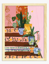
Poster botanische Treppe
Translation missing: de.products.product.sale_price Ab £11.95£19.95 -

Leinwandbild Farbintensives Treppenmotiv
Translation missing: de.products.product.sale_price Ab £44.95£74.95 -

Poster Zimmerpflanzen am Treppenabsatz
Translation missing: de.products.product.sale_price Ab £11.95£19.95 -

Leinwandbild Botanische Oase an der Treppe
Translation missing: de.products.product.sale_price Ab £44.95£74.95 -

Poster Sonnenblumen-Sommeridylle
Translation missing: de.products.product.sale_price Ab £11.95£19.95 -

Poster Grüne Treppen-Oase
Translation missing: de.products.product.sale_price Ab £11.95£19.95 -

Leinwandbild Abstrakte, dynamische Treppe – farbenfroh und modern
Translation missing: de.products.product.sale_price Ab £44.95£74.95 -

Poster Boho-Pflanzen auf gefliesten Stufen
Translation missing: de.products.product.sale_price Ab £11.95£19.95 -

Poster Santorin-Treppen im Sonnenlicht
Translation missing: de.products.product.sale_price Ab £11.95£19.95 -

Leinwandbild bunte Fliesentreppe mit Zimmerpflanzen
Translation missing: de.products.product.sale_price Ab £44.95£74.95 -

Leinwandbild Boho-Treppe mit üppigen Pflanzen
Translation missing: de.products.product.sale_price Ab £44.95£74.95 -

Leinwandbild Sonnige Treppe zum Meer
Translation missing: de.products.product.sale_price Ab £44.95£74.95 -

Poster Botanische Treppe
Translation missing: de.products.product.sale_price Ab £11.95£19.95 -

Leinwandbild Botanischer Treppengarten
Translation missing: de.products.product.sale_price Ab £44.95£74.95 -

Leinwandbild Treppen-Oase mit Zimmerpflanzen
Translation missing: de.products.product.sale_price Ab £44.95£74.95 -
Poster Gemusterte Stufen und üppiges Grün
Translation missing: de.products.product.sale_price Ab £11.95£19.95 -

Poster Boho-Treppe mit Pflanzen in Töpfen
Translation missing: de.products.product.sale_price Ab £11.95£19.95 -

Poster Sonnendurchflutete Treppe in Santorin
Translation missing: de.products.product.sale_price Ab £11.95£19.95 -

Poster Sonnendurchflutete mediterrane Stufen
Translation missing: de.products.product.sale_price Ab £11.95£19.95 -

Leinwandbild Treppenstufen mit Fliesenmuster und Topfpflanzen
Translation missing: de.products.product.sale_price Ab £44.95£74.95


Mehr aus The Frame

Art for Green Walls: What Works, What Fights
You painted the walls green. Maybe sage, maybe forest, maybe something in between. Now the room feels half-finished and the art you owned before suddenly looks wrong against it. Green...

What to Put in a Stairwell: The Hardest Wall in...
Stairwells are the wall everyone postpones. The ceiling is too high, the angle is wrong, the lighting is bad, and every nail hole feels like a permanent mistake on a...

Above the Toilet, Above the Bath: Bathroom Art ...
Bathrooms are the most overlooked walls in the house, and the trickiest to get right. Steam, splash, awkward sightlines and tiled surfaces all conspire against the kind of art advice...