Bathroom Wall Art Ideas That Last in Every Style and Layout
The bathroom is the most underrated wall in your home, and you've probably been talked out of using it.

Bathrooms are the easiest room in the house to style with art and the room most people leave bare. The fear is humidity. The real culprit, almost always, is cheap framing.
Why most people are too cautious about hanging art in bathrooms
Walk through ten homes and nine of the bathrooms will have a candle, a plant, and absolutely nothing on the walls. The assumption is that anything paper-based will buckle, fade, or grow mould within a season. That assumption is roughly 30 years out of date.
Modern bathrooms have extractor fans, double glazing, and central heating that keep humidity spikes brief. A 15-minute shower with the fan running is not a tropical greenhouse. Your bathroom spends most of its day at roughly the same humidity as the rest of your house, especially if there's a window.
The truth is that any room with four walls deserves art, and bathrooms in particular benefit because you actually look at the walls. You're standing at a mirror, soaking in a bath, or sitting somewhere with not much else to do. It's prime viewing real estate.

The real enemy: cheap framing, not humidity
Warped art in bathrooms almost never comes down to the bathroom itself. It comes down to how the piece was made. Here's what to actually look for.
Sealed backs
A sealed back means the paper print is enclosed behind a backing board that's properly bonded, not just slotted in with two staples and a prayer. Moisture in bathrooms doesn't come at art head-on, it creeps in from behind, where condensation collects on cold walls. A properly fitted frame stops this.
Solid wood, not MDF or veneer
Wood frames get a bad reputation for bathrooms because cheap MDF frames swell, separate, and look terrible after one humid summer. Solid FSC-certified wood, the kind we use across our framed art prints, behaves completely differently. It moves slightly with seasonal humidity, the way all real wood does, but it doesn't delaminate or warp because there's nothing layered to come apart.
Acrylic glaze instead of glass
Acrylic is lighter, doesn't shatter, and crucially doesn't cause the same condensation pooling you get on cold glass. Our frames use a UV-protective acrylic that also stops fading from direct sunlight, which matters in south-facing bathrooms with one bright window.
Single-box delivery
The other failure point is frames that arrive in three pieces with a print rolled separately, then sit in a damp bathroom waiting for you to assemble them. A print that arrives already fitted, flush, and hanging-ready will outlast a self-assembled one by years.
If you're nervous, ask one question before buying: does it arrive in one piece, fully fitted? If the answer is yes, you're fine.
Best subjects for bathroom art
The default advice is "spa vibes." Stones stacked on top of each other. Misty forests. Pebbles. It's all very calm and very forgettable. You can do better.
Towels, robes, and laundry
This sounds odd until you see it. Paintings and prints of folded towels, hanging robes, or stacks of linen are quietly brilliant in bathrooms because they nod to the room's function without being literal or twee. They feel like a still life from a 1960s travel poster, not a label on a toiletries bottle. Our towel art prints collection leans into this. Striped beach towels, a robe on a hook, a folded stack on a chair. It's specific enough to feel intentional and abstract enough to read as art.
Botanicals
Botanicals work in bathrooms for the same reason real plants do. Green is restful, the shapes are organic, and the subject matter never feels forced. Skip the moody dark backgrounds if your bathroom is small and windowless, those go muddy under cool lighting. Go for lighter, paler botanical prints with white or cream backgrounds in tight spaces, and save the dramatic dark green palm prints for bathrooms with proper natural light.
Still life
Still life is the most underused category in bathroom art. A bowl of lemons, a glass of wine, a vase of tulips. It treats the bathroom like any other room in your house instead of a "wet zone" requiring themed decor. Our still life prints work especially well in family bathrooms where you want something warm but not aggressively decorated.
Abstract
Abstract art is the safest bet for small bathrooms because it doesn't have to "read" from far away. The eye relaxes into shape and colour. Avoid anything too busy, busy patterns feel claustrophobic in a 4 square metre room. Soft shapes, two or three colours, plenty of negative space.
What to actively avoid
Portraits. A face looking at you while you brush your teeth is one thing. A face looking at you on the toilet is another. The same applies to anything with eyes, including most animal photography. Save them for the hallway.

Size and placement: above the vanity, beside the mirror, or over the bath
Forget the "art at eye level" rule. In bathrooms, you're rarely standing still in one spot. You're sitting, lying, leaning, or moving. Hang for the most common sightline.
Above the toilet
The classic spot, and the easiest to get wrong by going too small. Aim for 24 to 30cm clearance above the cistern and a piece roughly 60 to 75cm wide. A single 50x70cm print works beautifully here. A pair of 30x40cm prints stacked vertically also works if your ceiling is high.
Beside the vanity mirror
This is the spot for smaller, more detailed work. Pieces between 20 and 40cm wide flanking a mirror create symmetry without competing with it. If you have one mirror and one bare wall, a single 40x50cm print balances the composition better than something tiny floating awkwardly.
Above a freestanding bath
This is where you go big. A bath wall can take a 70x100cm framed print or a 100x150cm canvas without looking oversized. Hang the centre of the piece roughly 150 to 160cm from the floor, which sits perfectly in the eyeline of someone soaking.
In the shower line of sight
If you can see a wall clearly from inside the shower, that wall deserves art too. Keep it at least a metre back from the shower head and ideally behind a half-wall or glass screen.
Framing materials that actually survive a bathroom environment
A quick guide to what works and what doesn't, in order of how confident you should be.
Framed prints with solid wood frames, sealed backs, and acrylic glaze. The gold standard. Lasts indefinitely in any normal bathroom. The acrylic prevents condensation pooling, the sealed back stops rear moisture, and the wood frame handles humidity fluctuations without warping.
Canvas prints with a matte finish. Excellent for humid bathrooms because there's no glass to fog, no glaze to pool, and the poly-cotton canvas with its smooth matte coating handles moisture changes well. Our canvas prints are hand-stretched on FSC wood with mirrored edge wrapping, so they hold their shape. Particularly good in older bathrooms with less ventilation.
What to avoid: thin MDF frames, glass with thin paper backing, anything described as a "poster frame" with a flexible plastic front, or prints sold separately from frames that need home assembly. These are the warping horror stories.
Matte vs. glossy finishes and why it matters under bathroom lighting
Most bathroom lighting is cool-toned (4000K or higher) and comes from directly above the vanity or from a single ceiling fitting. That creates two problems for art.
Glossy prints throw glare directly back at you under overhead bathroom lights. You can't see the image properly from any normal standing or sitting angle. Skip gloss entirely in bathrooms.
Matte prints solve the glare problem but introduce a second one: in windowless or dim bathrooms, very matte finishes can look muddy and flat under cool light. The sweet spot is a museum-grade matte that has depth and detail without surface shine. Our giclée prints on thick matte paper sit in exactly this range. You get rich colour, no glare, and the image stays crisp even under harsh vanity lighting.
If your bathroom has a window, you have more flexibility. If it doesn't, lean toward art with lighter backgrounds and brighter palettes. Dark moody pieces will look more dramatic in showrooms than in your actual windowless en-suite.

Three bathroom art combinations that always work
If you want something that's effectively pre-designed, these three combinations work in almost any bathroom.
1. The single statement piece above the bath
One large framed print, 70x100cm, centred above a freestanding or built-in bath. Botanical, abstract, or a soft landscape. Nothing else on the surrounding walls. It feels intentional, gallery-like, and works in everything from minimalist new-builds to Victorian conversions.
2. The vertical pair beside the mirror
Two 30x40cm framed prints stacked vertically next to the vanity mirror, with about 5cm between them. Choose two pieces from the same series or palette. Towel still lifes work brilliantly here, as do botanical pairs.
3. The gallery cluster in a powder room
Four to six small framed pieces, mixed sizes between 20x30cm and 40x50cm, hung as a tight cluster on one wall of a powder room. This is your chance to mix subjects: a botanical, a fashion illustration, an architectural drawing, a still life. The cluster reads as a single composition.
Powder room vs. family bathroom: different rules for different spaces
These are completely different rooms with different audiences, and they deserve different art.
Powder rooms
Powder rooms are tiny, low-humidity, guest-facing, and used briefly. This is your experimental wall. Bolder colours, weirder subjects, more personality. Vintage advertisements, fashion illustrations, architectural drawings, anything graphic and confident. Dark walls with a tight gallery cluster look extraordinary here, and humour works in a way it doesn't in a primary bathroom. You can also get away with smaller pieces, since people are 30cm from the wall.
Family bathrooms
The opposite brief. Higher humidity, daily use, shared by multiple people including children. Go with calmer subjects, larger single pieces, and frames you'd describe as "quiet." Botanicals, soft abstracts, gentle still lifes. Avoid anything with strong personality, you'll get tired of it within six months when you're seeing it twice a day.
En-suites
The trickiest middle ground. High humidity from showers, but it's just for you. Treat it more like a family bathroom on the framing side (good sealed frames, matte finishes, larger pieces) but more like a powder room on the subject side. You can pick something personal because nobody else has to live with it.
Kids' bathrooms
Worth saying briefly: skip anything precious. Affordable framed prints you can swap out as taste evolves work better than expensive pieces. The 99-day returns policy on our prints means you can experiment without commitment.
A final word on longevity
Treat bathroom art the same way you treat the rest of your home. Buy something you actually love, make sure the framing is properly made, and stop worrying about it. The combination of a sealed frame, acrylic glaze, museum-grade inks, and a properly ventilated bathroom means a good print will outlast the bathroom itself. If you redecorate in five years, the art moves with you.
The boring bathroom is a choice. The bare wall above your bath isn't protecting your art from anything. It's just bare.


In diesem Blog vorgestellte Fab-Produkte
-
Leinwandbild Stilvolle Badregeln in Schwarz-Weiß
Translation missing: de.products.product.sale_price Ab £44.95£74.95 -

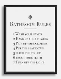
Poster Klassischer Leitfaden für Badezimmerregeln
Translation missing: de.products.product.sale_price Ab £11.95£19.95 -

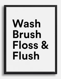
Poster Badezimmer-Spruch in Schwarz-Weiß – Typografie
Translation missing: de.products.product.sale_price Ab £11.95£19.95 -

Poster Tägliche Badezimmer-Rituale – Line Art
Translation missing: de.products.product.sale_price Ab £11.95£19.95 -

Leinwandbild Otter mit Toilettenpapier – Humor fürs Bad, schwarzweiß
Translation missing: de.products.product.sale_price Ab £44.95£74.95 -

Leinwandbild Tägliche Baderituale – Schwarz-Weiß Line Art
Translation missing: de.products.product.sale_price Ab £44.95£74.95 -

Poster Tiger in der Badewanne
Translation missing: de.products.product.sale_price Ab £11.95£19.95 -

Poster Pop-Art-Blumen fürs Badezimmer
Translation missing: de.products.product.sale_price Ab £11.95£19.95 -
Leinwandbild Badezimmer-Spruch 'Fresh Start' – Schwarz-Weiß
Translation missing: de.products.product.sale_price Ab £44.95£74.95 -

Poster Frecher Gruß fürs Bad - Schwarz auf Weiß
Translation missing: de.products.product.sale_price Ab £11.95£19.95 -

Leinwandbild Frecher Badezimmer-Spruch in Schwarz-Weiß
Translation missing: de.products.product.sale_price Ab £44.95£74.95 -

Leinwandbild Krokodil beim Baden
Translation missing: de.products.product.sale_price Ab £44.95£74.95 -

Leinwandbild Neugierige schwarze Katze im Badezimmer
Translation missing: de.products.product.sale_price Ab £44.95£74.95 -

Poster 'Best Seat' – Schwarz-Weiß Spruch fürs Badezimmer
Translation missing: de.products.product.sale_price Ab £11.95£19.95 -

Leinwandbild verspielte Typografie fürs Bad in Pastell
Translation missing: de.products.product.sale_price Ab £44.95£74.95 -

Leinwandbild handschriftliches Zitat fürs Bad – Schwarz-Weiß
Translation missing: de.products.product.sale_price Ab £44.95£74.95 -

Poster Schwarze Katze im Bad – spielt mit Toilettenpapier
Translation missing: de.products.product.sale_price Ab £11.95£19.95 -

Leinwandbild Neugierige schwarze Katze im Badezimmer
Translation missing: de.products.product.sale_price Ab £44.95£74.95


Mehr aus The Frame

What to Put on a Big Blank Wall
Big blank walls feel impossible because they multiply your options instead of narrowing them. Every idea seems plausible, nothing feels right, and the wall stays empty for another six months....

Art for Above a Console Table
A console table without art on the wall above it always looks unfinished. Get the art right and the whole vignette clicks into place. Get it wrong (too small, too...

Art for Above the Bed: What Works and What Doesn't
The wall above your bed is the largest, most visible blank space in most bedrooms, which is why so many people get it wrong. They hang something too small, too...