How to Create an Edinburgh Gallery Wall That Actually Looks Considered
The difference between a curated Edinburgh gallery wall and a random jumble comes down to six decisions made before you pick up a hammer.

Edinburgh is a city built for gallery walls. The dramatic skyline, the moody stone architecture, the sudden bursts of colour in Dean Village or the Grassmarket. The problem is that throwing five Edinburgh prints on a wall rarely works. You end up with something that looks like a tourist shop, not a thoughtful display.
This guide walks you through the actual decisions that separate a considered gallery wall from a chaotic one, with layouts you can copy directly.
Start with a hero piece: picking your anchor print
Every gallery wall needs an anchor. This is the largest print, the one that does the heavy lifting visually and dictates everything else. Without it, the eye has nowhere to land and the whole arrangement feels like a scattered afterthought.
For Edinburgh, the anchor is usually a recognisable landmark rendered in your dominant style. Arthur's Seat at dusk, the Castle from Princes Street Gardens, the Calton Hill monuments silhouetted against a moody sky. Choose something at 50x70cm or 70x100cm depending on your wall, then build everything else around it.
Pick the anchor based on what you actually feel something about. If you walked up Arthur's Seat on your first date, that's your hero. If you lived above a shop on Victoria Street for three years, that's your hero. The supporting cast can be more decorative, but the anchor should mean something.
A quick rule we keep coming back to: your anchor should be roughly twice the visual weight of any other piece on the wall. If everything is the same size, nothing is the focal point, and the wall reads as busy rather than composed.

The grid vs the salon hang: which layout suits Edinburgh prints
Two layout philosophies dominate gallery walls, and the right one for Edinburgh depends entirely on your prints.
The grid hang uses identical frame sizes in a clean rectangular formation, usually 2x2, 3x2, or 3x3. It looks architectural, calm, and intentional. This works brilliantly for a series of Edinburgh prints in the same style. Six black-and-white photographs of closes off the Royal Mile, for example, or four illustrated Edinburgh landmarks at the same scale.
The salon hang is the layered, asymmetrical arrangement that feels collected over time. Different sizes, different orientations, anchored around a hero piece. This suits mixed-media Edinburgh collections, where you're combining a photographic Castle print with an illustrated Dean Village and a typographic map of the Old Town.
Our take: if all your prints share a clear visual language (same artist, same palette, same medium), go grid. If you're mixing styles, go salon. The mistake is doing a half-grid, where things almost line up but don't quite. That's the layout that reads as accidental.
For Edinburgh wall art specifically, we lean towards salon hangs because the city itself is layered and varied. A grid can sometimes flatten Edinburgh's character into something too uniform.
Mixing styles: photography prints alongside illustrated Edinburgh scenes
Edinburgh is one of the few cities that translates equally well into photography and illustration. The granite stone, the geometry of New Town, the silhouettes of Calton Hill. All of it works in either medium. The challenge is making them sit together without clashing.
Three rules we use:
Limit yourself to two mediums maximum. Photography and illustration is fine. Photography, illustration, vintage maps, and typography is too much. Pick a primary style (say, 60% photography) and a secondary one (40% illustration).
Find a shared colour thread. Edinburgh's natural palette is grey stone, deep green, slate blue, and warm sandstone. If your photography prints are largely grey and moody, choose illustrations that pull at least one colour from that palette. A vibrant pop-art Castle print next to a misty black-and-white photograph of the same Castle will look like two different walls.
Match contrast levels. A high-contrast inky photograph next to a soft pastel illustration creates visual whiplash. Either go all moody and high-contrast, or all soft and tonal. Don't mix.
This is also where you can avoid the tourist-shop trap. Pair one obvious landmark (the Castle, the Royal Mile) with two or three lesser-known scenes (a Stockbridge bookshop, a wynd in the Old Town, the curve of Circus Lane). The familiar anchors the wall, the obscure makes it personal.
How many prints you actually need (hint: fewer than you think)
Most gallery walls fail because there are too many prints. Five well-chosen pieces beats nine compromises every time.
For a standard wall behind a sofa or above a sideboard (roughly 2 to 2.5 metres wide), we recommend:
- Three prints for a minimal, modern look
- Five prints for the sweet spot of considered and collected
- Seven prints if you genuinely have seven things you love and a wall big enough to hold them
Anything beyond seven and you're decorating, not curating. The whole point of a gallery wall is that each piece earns its place. If you can't articulate why a print is on the wall, take it off.
A useful test: can you describe each print in one sentence that explains why it's there? "The Arthur's Seat photograph because that's where we got engaged." "The illustrated map because it shows the route we walked every Sunday." If you can't, it's filler.

Choosing a consistent frame finish for cohesion
Frame finish is the single biggest decision for cohesion, more than print style or subject matter. Mismatched frames are what turn a gallery wall into visual noise.
Our recommendation: pick one frame finish for the entire wall. One. Not "mostly black with a couple of natural wood ones for warmth." Just one.
Three finishes that work for Edinburgh prints:
Black frames suit modern interiors and high-contrast photography. They sharpen the architectural lines of Edinburgh's buildings and feel particularly good with monochrome prints.
Natural oak or ash frames work for traditional or eclectic interiors and warm up the grey palette of Edinburgh's stone. They're our default recommendation for mixed photography and illustration.
White frames suit Scandi-influenced or pared-back rooms and let colourful illustrations sing. They can wash out moody photography though, so use them when your prints are bright.
All Fab framed prints use solid FSC-certified wood, not MDF or veneer, so the finish stays consistent piece to piece. The frames also arrive properly fitted with UV-protective acrylic glaze (lighter than glass, won't shatter, prevents fading), and ship in the same box as the print so nothing arrives warped or separated.
If you want to mix finishes, the only combination we'd endorse is black frames for photography and natural wood for illustration, with a clear visual logic to the grouping. But honestly, just pick one. You'll thank yourself.
Spacing, heights, and the paper template trick
This is where most people go wrong, and it's the easiest part to get right.
Spacing between frames: 5 to 7cm (roughly 2 to 3 inches) is the standard. Tighter than 5cm feels cramped. Wider than 8cm and the prints stop reading as a single composition. Keep the spacing identical across the whole wall.
Centre height: The middle of the gallery wall (not the middle of the top print) should sit at roughly 145 to 152cm from the floor. That's eye level for the average person standing.
Above furniture: Leave 17 to 25cm between the top of your sofa or sideboard and the bottom of the lowest frame. Closer than 15cm and the art looks like it's resting on the furniture. Further than 30cm and it floats.
The paper template trick: Cut sheets of newspaper or kraft paper to the exact dimensions of each frame. Tape them to the wall with masking tape and rearrange until the layout works. Mark where each nail or hook will go on the paper itself, then hammer through the paper. Tear it away and your art hangs perfectly first time.
This single step is the difference between a wall you love and a wall full of unnecessary nail holes. It takes twenty minutes and saves hours of regret.
Three Edinburgh gallery wall layouts you can copy directly
Layouts that genuinely work, with frame sizes specified.
Layout 1: The Classic Five (salon hang)
Best for: a wall above a sofa, 2m wide.
- Anchor: 70x100cm portrait photograph of Edinburgh Castle, slightly left of centre
- Top right: 30x40cm landscape illustration of Dean Village
- Middle right: 40x50cm portrait photograph of a Royal Mile close
- Bottom right: 30x30cm square typographic print ("Auld Reekie" or similar)
- Far left, mid-height: 40x50cm landscape illustration of Arthur's Seat at sunset
All in natural oak frames. Spacing 6cm throughout.
Layout 2: The Considered Grid
Best for: a hallway or above a console table.
Six prints, all 30x40cm portrait, in a 3x2 grid. Pick six Edinburgh scenes by the same artist or in the same medium. Six photographs of doors in the Old Town. Six illustrated landmarks in the same colour palette. Six black-and-white close-ups of architectural details.
Black frames, 5cm spacing. The discipline of the grid means the prints can be quieter and still feel impactful.
Layout 3: The Asymmetric Three
Best for: a narrower wall, an awkward alcove, or a minimalist room.
- Anchor: 70x100cm portrait of Arthur's Seat
- Top right: 40x50cm landscape of Calton Hill
- Bottom right: 40x40cm square illustration of a Stockbridge street
Natural oak or black frames. 7cm spacing. The asymmetry feels intentional precisely because there are only three pieces.
For larger walls, look at curated wall art sets where the prints are designed to work together from the start. It removes most of the guesswork.

Common gallery wall mistakes and how to avoid them
The patterns we see again and again.
Hanging too high. This is the most common mistake by a wide margin. People hang art at standing eye level rather than seated eye level, especially above sofas. The result is a wall that floats and disconnects from the room. Drop everything 10cm lower than you think.
Mixing too many frame finishes. We've said it already, but it's worth saying again. Three finishes is too many. Two is risky. One is right.
Choosing prints by subject, not by style. A wall of "things in Edinburgh" with no visual coherence is a tourist board, not a gallery wall. Choose by palette, contrast, and medium first, subject second.
Forgetting the wall colour. Pale grey prints disappear on a pale grey wall. Inky black-and-white photography vanishes on a charcoal feature wall. Step back and check that your prints have enough contrast against the wall to read clearly.
Using flimsy frames. Cheap frames with thin profiles, plastic glazing, or visible joints undermine even the best print. The frame should feel substantial. If you can flex it with two fingers, it's not good enough.
Ignoring the room's light. Edinburgh's natural light shifts dramatically through the year. A wall that gets harsh afternoon sun will fade prints over time unless they're properly UV-protected. Worth checking before you commit to a layout.
If you're still gathering pieces, browsing broader city art prints or Scotland art prints collections can help you find supporting pieces that complement your Edinburgh anchors without competing with them.
The honest summary
Pick one anchor that means something. Limit yourself to five or seven prints. Choose one frame finish. Space everything 5 to 7cm apart. Hang at 145 to 152cm centre height. Use paper templates before you hammer.
That's it. Everything else is taste, and taste is the bit you already have.


In diesem Blog vorgestellte Fab-Produkte
-

Leinwandbild historische Straße in Edinburgh
Translation missing: de.products.product.sale_price Ab £44.95£74.95 -
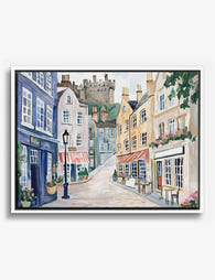
Leinwandbild Edinburgh – Charmante Altstadtstraße in Aquarell
Translation missing: de.products.product.sale_price Ab £44.95£74.95 -

Poster Edinburghs gemalte Straßen in Aquarell
Translation missing: de.products.product.sale_price Ab £11.95£19.95 -

Leinwandbild Edinburgh Castle – Vintage-Illustration
Translation missing: de.products.product.sale_price Ab £44.95£74.95 -

Leinwandbild Schloss Edinburgh im warmen Herbstlicht
Translation missing: de.products.product.sale_price Ab £44.95£74.95 -

Poster Gartenweg im Königlichen Botanischen Garten Edinburgh
Translation missing: de.products.product.sale_price Ab £11.95£19.95 -

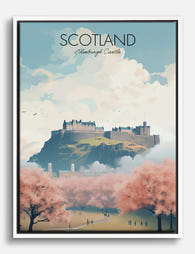
Poster Edinburgh Castle im goldenen Herbstlicht
Translation missing: de.products.product.sale_price Ab £11.95£19.95 -

Leinwandbild Der Charme von Edinburgh Castle
Translation missing: de.products.product.sale_price Ab £44.95£74.95 -

Leinwandbild Schottische Straßenszene
Translation missing: de.products.product.sale_price Ab £44.95£74.95 -

Poster Schottische Straßenszene
Translation missing: de.products.product.sale_price Ab £11.95£19.95 -
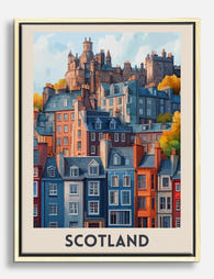
Leinwandbild Zauberhafte schottische Stadtansicht
Translation missing: de.products.product.sale_price Ab £44.95£74.95 -

Poster Skyline von Edinburgh in Pastellfarben
Translation missing: de.products.product.sale_price Ab £11.95£19.95 -

Poster Blick auf Edinburgh Castle
Translation missing: de.products.product.sale_price Ab £11.95£19.95 -
Leinwandbild Edinburgh Castle in Blüte
Translation missing: de.products.product.sale_price Ab £44.95£74.95 -

Poster Stadtansicht von Edinburgh in Pastellfarben
Translation missing: de.products.product.sale_price Ab £11.95£19.95 -

Poster Edinburgh Castle über den Dächern Edinburghs
Translation missing: de.products.product.sale_price Ab £11.95£19.95 -

Poster Blumenmarkt in Edinburgh – farbstarke Blüten
Translation missing: de.products.product.sale_price Ab £11.95£19.95


Mehr aus The Frame

Landscape vs Portrait Wall Art: Which Orientati...
Most advice on this topic ends with "trust your eye" and leaves you scrolling for another hour. We're going to do the opposite: give you specific rules tied to specific...

Playful Art Gallery Wall or Single Statement Pi...
Most people who buy playful art end up leaving it in the wrapping. Not because they regret the purchase, but because they're worried it'll clash with the sofa, the curtains,...

Realist Garden Prints vs Botanical Illustration...
Realist garden prints are some of the most rewarding wall art you can hang, and some of the trickiest to arrange. Get the balance right and you've got a wall...