Where and How to Hang Abstract Art: Placement Rules That Actually Work
The exact measurements, formulas and spacing rules that turn a blank wall into a properly composed one.

Most hanging advice stops at "eye level" and leaves you holding a hammer. This guide gives you the actual numbers: the 2/3 rule with the maths worked out, the spacing between frames in a gallery wall, and what to do when there's no furniture to anchor anything. If you've ever stood back and thought your art looks like it's floating away from the sofa, this is why.
The 2/3 rule for hanging art above furniture
The single most useful rule for displaying art over a sofa, sideboard or bed: your art (or arrangement) should be roughly two thirds the width of the furniture below it. Anything narrower looks stranded. Anything wider looks like it's about to fall off the edges.
The maths is simple. Multiply your furniture width by 0.67 and aim for a piece (or grouping) close to that figure.
Quick reference for common sofa widths:
- 150cm sofa → 100cm of art
- 180cm sofa → 120cm of art
- 210cm sofa → 140cm of art
- 230cm sofa → 155cm of art
A single 100x150cm canvas works beautifully above a three-seater. Two 50x70cm prints hung side by side with a 5cm gap between them give you about 105cm of total width, which sits perfectly above a 150cm two-seater. You're measuring the total visual span, not the individual pieces.
One question that always comes up: do you measure the print or the frame? Measure the frame. The outer edge is what your eye reads as the boundary of the piece, so a thick frame counts. A 60x80cm print with a 4cm frame becomes 68x88cm of visual real estate.
The 56-60cm centre rule (and when to ignore it)
The standard advice is to hang art so its centre point sits 145-150cm (roughly 57 inches) from the floor. This works in entryways, hallways and on any blank wall where there's no furniture nearby. It approximates gallery eye level for someone of average height.
But it's the wrong rule above a sofa. Follow it there and your art ends up marooned 30cm above the sofa back, looking completely disconnected from the room. This is the floating art problem, and it's the most common hanging mistake we see.
Above furniture, ignore the 145cm rule. Instead, leave 15-20cm between the top of your furniture and the bottom of your frame. That's it. The art reads as part of the seating area, not as a separate event happening somewhere up the wall.
In dining rooms, drop the centre point to around 140cm because people are seated and looking up. In bedrooms, treat the headboard as your furniture reference and apply the 15-20cm gap above it.

Single statement piece vs gallery wall: which suits your space
A statement piece works when you have a clean, generous wall and want the art to do the talking. One 70x100cm framed print or a 100x150cm canvas above a sofa creates instant focus and asks nothing else of the room. It's the easier choice if you're new to displaying art, because there's only one decision to get right.
A gallery wall works when you have an awkward wall (too tall, too narrow, oddly proportioned) or when you want the layered, collected look that builds over time. Gallery walls forgive imperfect proportions because the eye reads the whole arrangement as one shape.
Our general position: if the wall is under 2 metres wide, go with one or two pieces. If it's wider than 2.5 metres or unusually tall, a gallery layout earns its keep. Browse large wall art for single-piece options that can carry a wall on their own.
Gallery wall spacing that actually works
The professional consensus on spacing: leave 5-8cm between frames. Closer than 5cm and the pieces start to feel cramped, like they're shouldering each other. Wider than 8cm and the arrangement loses cohesion and reads as separate prints rather than one composition.
Keep the spacing consistent across the whole arrangement. Mixing 5cm gaps with 10cm gaps looks like a mistake even if it isn't.
For a grid of four or six matching frames, hold to the 5-8cm gap religiously. For a salon-style mix of different sizes, the same rule applies but you're balancing visual weight rather than aligning edges. Anchor the arrangement on a strong central axis, often a horizontal line that runs through the middle of the largest piece.
Centre the arrangement on the furniture below, not on the wall. A gallery wall offset from a sofa looks worse than one offset from the wall edges.
Abstract art in narrow spaces
Hallways, stairwells and console tables present the trickiest hanging puzzles because you lose your usual reference points. Here's how to handle each.
Hallways without furniture
When there's no sofa or sideboard to anchor your art, fall back to the 145-150cm centre rule. Hallways are passing spaces where you mostly view art while walking, so true eye level genuinely works.
For long hallways, a row of three or four prints at consistent height creates rhythm. Hang them with 15-25cm between frames (slightly wider than gallery wall spacing, because hallway prints tend to be viewed individually as you pass). Vertical-orientation prints suit narrow halls better than horizontal ones.
Take a look at our hallway wall art collection for prints sized and proportioned with these spaces in mind.
Stairwells
Stairwells are the wall everyone gets wrong. The rule: follow the diagonal. Hang each piece so its centre point sits 145-150cm above the tread directly below it. The arrangement climbs with the stairs.
If you're hanging a cluster, imagine a diagonal line running parallel to the staircase and centre your composition on it. Don't try to align frame tops or bottoms horizontally. The staircase is the structural rhythm, not the ceiling.
Above console tables
Console tables are shallow (usually 30-40cm deep) and often quite long, so the 2/3 rule still applies but the height calculation changes. Console tables sit higher than sofas, around 75-80cm, which means there's less wall above them before you hit ceiling territory.
Leave the same 15-20cm gap from the table top to the frame bottom. A 50x70cm print in portrait orientation tends to suit a console better than landscape because it draws the eye up rather than emphasising the horizontal.

Pairing abstract prints: cohesion without buying a set
The "matching set" look is easy but lazy. The collected look is harder but more rewarding. To pair prints that weren't designed together, you need one anchor in common and one point of contrast.
The anchor (pick one):
- Shared dominant colour (both prints feature a clay terracotta, even if the supporting palettes differ)
- Shared format (both vertical, identical aspect ratio)
- Shared frame (both in the same oak or black frame)
- Shared mood or technique (both gestural and loose, or both geometric and hard-edged)
The contrast (pick one):
- Different scale of mark-making (one bold, one delicate)
- Different orientation within the same format
- Different temperature (one cool-leaning, one warm-leaning) within the same colour family
Two prints with no common thread look like two prints. Two prints with everything in common look like wallpaper. You want one strong anchor and one clear contrast.
Frame consistency is the cheapest cohesion trick. Three completely different abstract prints in identical thin black frames will read as a set. The frame does the unifying work so the images don't have to.
If you want the cohesion done for you, our wall art sets are designed to work together with the anchor and contrast already balanced.
Orientation flexibility is abstract art's secret weapon
Unlike figurative work, most abstract wall art prints work in either orientation. A landscape composition often reads just as well rotated 90 degrees because there's no horizon line or figure to disrupt. This means you can buy based on what you love and decide on the wall whether it hangs portrait or landscape based on the space.
A tall narrow wall might call for the same print you'd hang horizontally above a sofa, simply turned upright. Trust your eye over the original orientation.
Lighting abstract art
Natural light is the best light for art, with one caveat: prolonged direct sunlight will fade most prints over time. Pigment-based giclée prints with UV-protective glazes (we use UV-protective acrylic on our framed prints, not glass) hold up dramatically better than standard prints, but no print loves being baked all day.
Position art on walls perpendicular to your main window rather than directly opposite. This gives you bright reflected light without the glare or fade risk.
Picture lights and spotlights
A picture light mounted above the frame transforms abstract art at night, especially work with strong texture or a matte surface. Choose a warm white bulb (2700-3000K) and aim for the light to spill across the full face of the print, not just the top edge.
Wall-mounted picture lights typically project 15-20cm from the wall. Account for this when choosing one for a piece that sits close to a doorway or walkway.
Avoiding glare
Glare is the enemy of abstract art, where surface and texture matter as much as image. Glass framing reflects everything in the room, which is why we use acrylic glazing instead. Acrylic has less surface reflection than glass and weighs significantly less, which matters on bigger pieces.
For unframed canvas, glare is rarely a problem because the matte poly-cotton surface scatters light rather than reflecting it. If you're hanging art opposite a large window or a TV, canvas often photographs and reads better than glass-framed work.

Why framing quality makes or breaks how your print looks
The single biggest variable in how art reads on a wall isn't the print itself, it's the framing. A beautifully printed piece in a warped, badly assembled frame looks cheap. A modest print in a properly built frame looks considered.
Things that go wrong with poorly made frames: corners that don't sit flush, MDF or veneer frames that warp in normal humidity, prints not properly fitted so they bubble or shift behind the glazing, frames that arrive separately from the print and have to be assembled at home (with all the crooked-art consequences that follow).
Our framed prints ship in one box with the print already fitted, the fixtures attached, and the whole thing ready to hang straight out. Solid FSC-certified wood, no MDF, no warping. It sounds boring until you've had the alternative arrive in pieces.
Frame weight and the 2/3 rule
Thicker frames carry more visual weight, so a 60x80cm print in a chunky 5cm frame reads bigger than the same print in a thin 1cm frame. When you're calculating the 2/3 rule, use the outer frame dimensions. A heavy frame can let you get away with a slightly smaller print because the visual presence is bigger than the image alone.
Thin frames suit gallery walls and minimalist rooms. Thicker frames suit single statement pieces in traditional or maximalist interiors.
Framed or unframed?
Framed prints look more polished and protect the work behind UV glazing. They're heavier, which matters on plasterboard walls, and they cost more.
Unframed canvas is lighter, works in humid rooms (kitchens, bathrooms with extraction), and gives a softer, less formal finish. The mirrored edge wrapping means the image isn't cropped on the sides. Canvas suits abstract work particularly well because the matte surface enhances texture and brushwork.
Neither is objectively better. We tend to recommend canvas for larger statement pieces (the lighter weight is a real advantage above 80x120cm) and framing for smaller works and gallery walls where the frame becomes part of the composition.
Common hanging mistakes and how to avoid them
Hanging too high. The most common error, caused by following "eye level" advice above furniture. Stick to the 15-20cm rule above sofas, sideboards and headboards.
Skipping the mock-up. Before drilling, cut your frame size out of kraft paper or newspaper and tape it to the wall with painter's tape. Live with it for a day. You'll catch placement problems before they become holes you have to fill.
Centring on the wall instead of the furniture. If the sofa is offset from the wall (because of a doorway or a radiator), centre the art on the sofa, not the wall. The eye reads the relationship between art and furniture first.
Inconsistent gallery spacing. Measure your gaps. 5-8cm, the same all the way through. Eyeballing it almost never works.
Forgetting the room's scale. High ceilings (over 3 metres) often need taller arrangements or larger pieces to relate to the room. A 40x50cm print on a 3.5-metre wall looks lost. Either size up or hang in a vertical arrangement that climbs the wall.
Using the wrong fixings. Plasterboard needs proper anchors for anything over 5kg. A nail won't hold a large framed print, and discovering this at 11pm involves more wall repair than you'd think.

The short version
Measure twice, drill once. Two thirds of your furniture width for size, 15-20cm above the furniture top for height, 5-8cm between frames in a gallery wall, and 145-150cm to the centre point when there's no furniture to reference. Mock it up in paper before you commit. Most "I don't know what's wrong with this wall" problems come down to one of those numbers being off by 20cm.

In diesem Blog vorgestellte Fab-Produkte
-

Leinwandbild Abstrakte Geometrie im Bauhaus-Stil
Translation missing: de.products.product.sale_price Ab £44.95£74.95 -

Poster Minimalistische Balance – Geometrisch in Schwarz-Beige
Translation missing: de.products.product.sale_price Ab £11.95£19.95 -

Poster moderne geometrische Formen in neutralen Erdtönen
Translation missing: de.products.product.sale_price Ab £11.95£19.95 -

Poster Bauhaus geometrische Komposition
Translation missing: de.products.product.sale_price Ab £11.95£19.95 -

Leinwandbild abstrakte Balance in warmen Erdtönen
Translation missing: de.products.product.sale_price Ab £44.95£74.95 -

Poster Bauhaus-Geometrie in Schwarz auf Beige
Translation missing: de.products.product.sale_price Ab £11.95£19.95 -

Poster/Leinwandbild Bauhaus-Geometrie in Blau und Weiß
Translation missing: de.products.product.sale_price Ab £44.95£74.95 -

Poster Bauhaus-Geometrie in Schwarz auf Beige
Translation missing: de.products.product.sale_price Ab £11.95£19.95 -

Poster modernes monochromes Gleichgewicht – abstrakte Kunst
Translation missing: de.products.product.sale_price Ab £11.95£19.95 -

Poster Abstrakte geometrische Formen in Erdtönen
Translation missing: de.products.product.sale_price Ab £11.95£19.95 -

Poster moderne Bauhaus-Geometrie in Beige und Schwarz
Translation missing: de.products.product.sale_price Ab £11.95£19.95 -

Poster Abstrakte Kurvenkomposition
Translation missing: de.products.product.sale_price Ab £13.99£19.99 -

Poster Verspieltes modernes Porträt in Blau, Pfirsich & Gelb
Translation missing: de.products.product.sale_price Ab £13.99£19.99 -

Poster/Leinwandbild Bauhaus-Geometrie in Grün und Creme
Translation missing: de.products.product.sale_price Ab £44.95£74.95 -

Poster Abstrakter Organischer Fluss in Beigetönen
Translation missing: de.products.product.sale_price Ab £11.95£19.95 -

Poster Terrakotta Balance
Translation missing: de.products.product.sale_price Ab £11.95£19.95 -
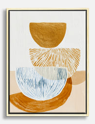
Leinwandbild Abstrakte Balance in Ocker und Blau
Translation missing: de.products.product.sale_price Ab £44.95£74.95


Mehr aus The Frame

How to Build a Floral Gallery Wall That Looks C...
Most gallery walls fail because they grow randomly. You buy one print, then another six months later, and suddenly your wall looks like a mood board nobody finished. This guide...

How to Build a Ski-Themed Gallery Wall That Act...
Most ski-themed walls fail in the same way: too many styles competing, mismatched frames fighting each other, prints hung at random heights. A great gallery wall looks effortless because every...

How to Display Portrait Prints: Placement, Grou...
Portrait prints solve problems landscape art can't. They fit narrow walls, draw the eye upward, and bring presence to spaces a horizontal piece would swim in. Get the placement right...