How to Style Matisse Prints in Every Room: A Practical Room-by-Room Guide
A room-by-room guide to placing Matisse's window scenes where they'll actually earn their wall space.

Matisse wanted his art to function like "a good armchair" for the tired mind. That intention is the entire reason his prints work so well at home: they were designed to live with, not just look at. This guide covers exactly where, how, and at what size to hang them, room by room.
Why Matisse's Colour Palette Works in Almost Any Room (But Some Better Than Others)
Matisse's palette is unusually flexible because he was painting feeling, not accuracy. "When I put a green, it is not grass," he said. That liberation from realism is why his Mediterranean blues, coral pinks, sage greens and ochres slot neatly into both warm and cool interior schemes without clashing.
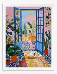
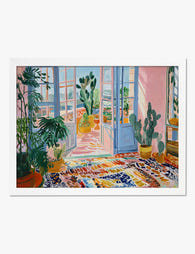
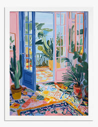
The window scenes (think Collioure, Nice, Tangier) are particularly versatile. They contain an interior frame and an exterior view, which means they bring two colour stories into a single image: a calmer indoor palette and a brighter outdoor one. You're hanging a painting and a window at the same time.
The rooms where Matisse works hardest are living rooms, bedrooms, kitchens and entryways. The rooms where he works less well are heavily patterned bathrooms, ultra-minimalist offices that depend on monochrome, and any space already dominated by saturated mid-century artwork that will fight him for attention.

Living Room: Making a Matisse Window Print Your Focal Point
The living room is where a Matisse window print earns its keep as a focal point. The compositions almost always have a strong vertical or horizontal pull (a balcony rail, shutters, a sea horizon), which gives you a clear axis to align with sofas, fireplaces or sideboards.
For a sofa wall, go big. A 70x100cm framed print sits well above a standard 2 to 3 seater, with the bottom of the frame around 20 to 25cm above the back cushions. Smaller than 60x80cm and you'll get the "postage stamp" effect where the art looks marooned on the wall.
Frame and wall pairings that actually work
- Warm white walls (something like a soft chalky off-white): natural oak frame. The undertones in the wood pick up the ochres in Matisse's interiors.
- Sage or olive walls: black frame. The contrast sharpens the composition and stops the greens in the print from disappearing into the wall.
- Terracotta or clay accent wall: white frame. Counterintuitive, but it lets the Mediterranean palette pop without the wall and the print competing.
- Deep navy or forest green: natural oak again, or a warm walnut. Black frames on dark walls vanish.
Canvas works in a living room too, especially if you want a softer, more painterly read. A 100x150cm canvas above a long sofa has real presence without the visual weight of a heavy frame, and it suits rooms with high ceilings or open-plan layouts. Browse the wider living room art prints collection for scale references.
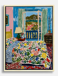
Bedroom: Why the Calmer Nice-Period Interiors Suit a Space for Rest
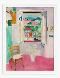
The Nice period (roughly 1917 to 1930) is where Matisse softens. The colours are still rich but more diffused, the compositions more domestic: open windows looking onto palm trees, hotel interiors, balconies in early morning light. These are the prints to hang in a bedroom.
The energetic Fauvist work from 1905 (vivid, almost vibrating) is too stimulating for a room you're trying to fall asleep in. Save that for the hallway. For the bedroom, look for the quieter blues, pearly pinks and warm whites of the Riviera interiors.
Sizing for above the bed
Above a standard double or king, a single 60x80cm portrait orientation print centred over the headboard hits the right note: present but not overwhelming. If your headboard is wide and low, a pair of 40x50cm prints flanking the centre point looks more considered than one floating piece.
Avoid going too small. A 30x40cm print above a king bed reads as an afterthought. The frame should look like it was chosen for the bed, not borrowed from a corridor.
Frame finishes for bedrooms
Bedrooms tend to be lower-light spaces, so frame contrast matters more. White or pale ash frames on warm white walls keep the room feeling airy. Black frames work beautifully against muted plaster pinks, dusty terracottas, or pale clay paints, but skip them on cool greys, where the effect goes cold and clinical.
A framed print arrives ready to hang with the fixtures already attached, which matters more than it sounds. Bedroom walls are usually the last to get drilled, and you don't want to be improvising hardware at 9pm on a Sunday.

Kitchen and Dining Room: Pairing Matisse's Mediterranean Colour with Everyday Spaces
Kitchens are the most underrated room for Matisse. His Mediterranean palette (cobalt, lemon yellow, geranium pink, sea green) is essentially a still life of the food and light he was painting around. Dropping that into a kitchen feels native, not decorative.
One thing to flag honestly: kitchens are humid and prone to temperature swings. Canvas tends to handle this slightly better than framed paper prints because there's no glazing to fog and no paper to absorb moisture. If your kitchen is small or steamy, a stretched canvas at 50x70cm above a shelf or worktop is the safer call. In a larger, well-ventilated kitchen-diner, a framed print is fine.
Where to actually hang it
- Above a dining table: centre at eye level when seated, not standing. Most people get this wrong. The midpoint of the print should be roughly 145 to 150cm from the floor, lower than the standard "gallery height" of 155cm.
- Above open shelving or a console: leave at least 15cm of breathing room between the top shelf and the bottom of the frame.
- On a narrow wall between cabinets: vertical orientation, 30x40cm or 40x50cm, framed in a finish that echoes your cabinet hardware.
For dining rooms with deep paint colours (oxblood, ink blue, bottle green), a Matisse window print in a black frame creates the Parisian-restaurant feeling without trying too hard.
Hallway and Entryway: First Impressions with Fauvist Energy
Hallways are where the louder, earlier Matisse comes into its own. The 1905 Collioure window paintings, the Tangier views, the high-saturation Fauvist work: these are all first-impression pieces. You're not living with them for hours. You're walking past them, and you want them to do something.
Narrow hallways are the perfect home for a henri matisse window art print because the inward-then-outward composition tricks the eye into perceiving more depth. A window painted onto a flat wall acts like a real one. In a windowless corridor or galley entryway, this is genuinely useful.
Sizing for tight spaces
In a hallway under 1.2m wide, don't go larger than 50x70cm portrait orientation. The viewer can't physically step back far enough to take in anything bigger, so a giant print just feels claustrophobic. For wider entryway walls (think the bit by the front door where coats and keys live), a 60x80cm framed print above a slim console is the move.
Pair with a small picture light if there's no natural daylight. Matisse's colours need light to read properly, and the UV-protective acrylic glaze on a framed print means you can hang it in direct sunlight without worrying about fade, even years down the line.
Gallery Wall Combinations: Mixing Matisse Window Prints with Other Artists
A gallery wall is where most people overthink. The trick is to anchor everything to one print (your Matisse window) and build outward with pieces that share at least one element: palette, era, or subject.
Three combinations we actually like
1. The Mediterranean wall. Centre: a Matisse window print, framed in oak. Around it: a Bonnard interior, a small Dufy harbour scene, and a black-and-white photograph of a Provençal doorway. The unifying thread is southern French light. Mix sizes (one large, two medium, one small) and keep frame finishes within the same wood family.
2. The colour-block wall. Pair Matisse with mid-century abstracts. A Matisse window in the centre, surrounded by a few smaller geometric prints in colours pulled directly from the Matisse palette. This works best with white frames on a warm white wall. Modernist and a bit graphic.
3. The botanical wall. Matisse window print as the colour anchor, then a mix of vintage botanical illustrations, a single line drawing, and one piece of typography. The window scene's foliage echoes the botanicals; the line drawing keeps it from feeling Victorian.
For layout: lay everything on the floor first, photograph it from above, and rearrange digitally before drilling. Aim for 5 to 8cm gaps between frames. Pre-curated wall art sets take the guesswork out if you'd rather skip the assembly stage.

Size and Framing Guide: Which Format to Choose for Each Room
Here's the short version, by room and use:
Living room
- **Above a 2 to 3 seater sofa:** 70x100cm framed, or 100x150cm canvas - **On a feature wall, no furniture below:** 70x100cm framed - **Flanking a fireplace:** pair of 40x50cm framed prints, matching framesBedroom
- **Above a king or double bed:** 60x80cm portrait framed, single piece - **Pair above a wide headboard:** two 40x50cm framed prints, 10cm gap - **On a side wall opposite the bed:** 50x70cm framedKitchen and dining
- **Above the dining table:** 60x80cm framed (low-humidity kitchen) or canvas (steamier kitchen) - **Between cabinets or on a narrow wall:** 30x40cm framed - **Above a sideboard:** 50x70cm framedHallway and entryway
- **Narrow hallway (under 1.2m wide):** 40x50cm or 50x70cm framed, portrait orientation - **Above a console:** 60x80cm framed - **End of a long hallway:** 70x100cm framed for the trompe-l'oeil window effectFrame finish quick reference
- Natural oak: warm whites, sage, navy, terracotta, plaster pink
- Black: off-whites, deep greens, burgundy, mustard, mid-greys
- White: clay, terracotta, ochre, deep blues, anything with strong saturation
If you're undecided between framed and canvas, the rule of thumb is: framed for polish and longevity (the UV acrylic protects the colour for decades), canvas for softness, scale, and humid rooms. Both ship from us in a single box, properly fitted, no warping. The whole Matisse collection is available in both.

A Final Note on Living with Matisse
Matisse believed colour could rest the mind. That only works if you place his work somewhere you actually spend time, at a size that suits the wall, in a frame that suits the room. Get those three right and the print does the rest of the work itself. Start with the room you use most, hang one piece properly, and let the rest of the house follow from there.

In diesem Blog vorgestellte Fab-Produkte
-
Poster Matisse-inspirierter Wintergarten in Pink und Blau
Translation missing: de.products.product.sale_price Ab £11.95£19.95 -
Poster Wintergarten im Matisse-Stil
Translation missing: de.products.product.sale_price Ab £11.95£19.95 -

Poster Lebendiges Schlafzimmer mit Aussicht im Matisse-Stil
Translation missing: de.products.product.sale_price Ab £11.95£19.95 -

Poster Pariser Fenster von Matisse
Translation missing: de.products.product.sale_price Ab £11.95£19.95 -

Poster Sonnendurchflutetes botanisches Zimmer von Matisse
Translation missing: de.products.product.sale_price Ab £11.95£19.95 -
Poster Matisse-inspirierter Wintergarten
Translation missing: de.products.product.sale_price Ab £11.95£19.95 -

Poster Matisse-inspiriertes Schlafzimmer mit Bergblick
Translation missing: de.products.product.sale_price Ab £11.95£19.95 -

Poster Matisse-inspirierte Eleganz – Abstrakt in Monochrom
Translation missing: de.products.product.sale_price Ab £11.95£19.95 -

Leinwandbild Matisse-inspiriertes italienisches Fenster
Translation missing: de.products.product.sale_price Ab £44.95£74.95 -

Poster Farbenfrohe Landschaft von Matisse
Translation missing: de.products.product.sale_price Ab £11.95£19.95 -

Poster Fensterblick im Stil von Matisse
Translation missing: de.products.product.sale_price Ab £11.95£19.95 -

Leinwandbild Matisse Riviera-Fenster
Translation missing: de.products.product.sale_price Ab £44.95£74.95 -
Poster Offenes Fenster von Henri Matisse
Translation missing: de.products.product.sale_price Ab £13.99£19.99 -

Leinwandbild Botanische Wohnszene im Matisse-Stil
Translation missing: de.products.product.sale_price Ab £44.95£74.95 -

Poster Sitzende Frau im Matisse-Stil in Beige und Rosa
Translation missing: de.products.product.sale_price Ab £11.95£19.95 -

Poster Interieur in Gelb von Henri Matisse
Translation missing: de.products.product.sale_price Ab £11.95£19.95 -
Leinwandbild Matisse-inspiriert – farbenfrohes Schlafzimmer
Translation missing: de.products.product.sale_price Ab £44.95£74.95


Mehr aus The Frame

Why William Morris Prints Look Brilliant in Mod...
William Morris has been quietly miscategorised for decades. His patterns get filed under "country cottage" or "Arts and Crafts revival" and rarely escape, which is a shame because his tree...

Why Arts and Crafts Nature Prints Are the Antid...
The minimalism hangover: why bare walls stopped feeling calming For about a decade, the aspirational interior was a white box with one boucle chair in it. That look has officially...

Botanical Petal Art: Why Close-Up Prints Feel M...
Full florals have had a long run, and they're not going anywhere. But if you've noticed that the botanical art appearing in design magazines, boutique hotel lobbies, and the better-styled...