How to Style Woman Art Prints So They Look Intentional, Not Random
A practical guide to mixing line art, portraits, and abstracts on one wall without creating a visual jumble sale.

You've bought a print you love. Now the wall around it looks slightly empty, slightly off, and you're not sure what to add without the whole thing turning into a mess. This guide is for that exact moment.
The five main woman art print styles and what each one brings to a room
Most woman art prints fall into one of five visual families. Knowing which one you own, and which one you're considering buying next, is the first step to making them work together.
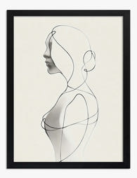
Line art is minimal, usually black ink on cream or white, often a single continuous line forming a face or figure. It brings calm, breathing space, and a graphic edge. Works well in rooms with a lot of soft furnishings because it adds visual structure.
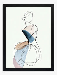
Abstract figurative uses loose shapes, blocks of colour, and suggestion rather than detail. Think terracotta curves, sage green silhouettes, ochre backgrounds. It brings warmth and movement, and it's the most forgiving style to live with because there's no single focal point demanding attention.
Portraiture is realistic or semi-realistic painted faces and figures. It brings drama and presence. One large portrait can carry an entire wall, but two competing portraits in the same room often fight each other.
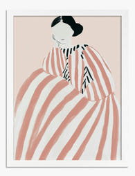
Illustration sits between line art and portraiture. More detail than a single line, less realism than a portrait. Often features fashion-style figures, botanical accents, or storybook compositions. Brings personality and a slightly editorial feel.
Vintage and classical covers reproductions of older paintings, art nouveau figures, Renaissance studies. Brings depth, history, and richness. Pairs surprisingly well with very modern interiors because the contrast does the work.

Mixing styles without chaos: the one-thing-in-common rule
Here's the rule we come back to constantly: any two prints can hang together if they share at least one strong visual element. Just one. But it has to be obvious.
That one thing can be:
- Colour palette. A line art print with a terracotta accent and an abstract print using terracotta and cream will read as a set, even if the styles are completely different.
- Frame. Identical frames in identical colours can hold together prints that have nothing else in common. This is the easiest unifier and the one most people underuse.
- Subject orientation. All figures facing the same direction, or all facing the viewer, creates a visual rhythm that the eye reads as intentional.
- Tonal weight. All prints heavy on white space, or all prints saturated and dense. Don't mix one airy line drawing with three dense oil-painting portraits and expect harmony.
- Era or mood. All modern, all vintage, or a deliberate one-against-many contrast (one vintage portrait surrounded by three minimal line drawings reads as curated).
If your prints share two of these things, you're golden. If they share none, the wall will feel random no matter how good each individual piece is.
A worked example: you own a black line art portrait and you're considering an abstract print with mustard, rust, and cream tones. They share nothing. But put the abstract in a black frame matching the line art, and suddenly the eye reads them as a pair. The frame became the one thing in common.
Solo statement pieces: choosing the right size and wall for maximum impact
A single large print can do more for a room than a gallery wall, and with less risk. The trick is sizing it correctly to the wall and the furniture beneath it.
Above a sofa or bed: the print should span roughly two thirds of the furniture's width. A standard three-seater sofa is around 220cm wide, so a 100x70cm or 70x100cm print works beautifully, especially framed. Anything smaller floats awkwardly.
Above a console, sideboard, or dresser: aim for the print to be slightly narrower than the furniture, never wider. A 60x80cm framed print sits perfectly above a 100cm console.
Narrow walls and hallways: vertical orientation, 50x70cm or 70x100cm. A tall portrait or full-figure illustration draws the eye down the corridor and makes the space feel deliberate rather than transitional.
Accent walls: if you have a painted accent wall in a deep colour like forest green, navy, or oxblood, a single large canvas in a soft palette will glow against it. Canvas works particularly well here because the matte finish absorbs rather than reflects, so you don't get distracting glare from windows.
Hang the centre of the print at roughly 145cm to 150cm from the floor. The most common mistake is hanging too high. Above furniture, leave 15cm to 25cm of breathing room between the top of the sofa and the bottom of the frame.

Gallery wall layouts that work with woman art prints
Gallery walls fail when they look like a collection of unrelated things. They succeed when there's clear logic underneath.
Odd numbers feel intentional
Three, five, or seven prints almost always look better than four or six. Even numbers create symmetry, which is fine for very formal rooms but can feel stiff with figurative art. Odd numbers create a natural focal point.
If you must use an even number, break the symmetry deliberately by mixing one large piece with three smaller ones, rather than four equal sizes in a grid.
The hero-and-supporting-cast layout
Pick one print as the hero. Usually your favourite, usually the largest, often a portrait or illustration. Build two to four smaller prints around it that share at least one visual element with the hero.
The hero sits slightly off-centre, the supporting prints cluster around it. Keep gaps consistent, around 5cm to 8cm between frames.
The grid layout
Three or six prints in identical sizes and identical frames, hung in a tight rectangle. This works brilliantly for line art and minimalist illustration. It does not work for mixed styles. If you're going grid, commit to consistency.
Pre-made wall art sets take the guesswork out of this entirely because the prints are designed to sit together.
Mixing orientations
Don't be afraid to combine portrait and landscape orientations in the same gallery wall, but anchor the arrangement with a horizontal line. Either align all the tops of the frames, or all the bottoms, or all the centres. Pick one and stick to it.
Frame colour matters more than you think: our specific recommendations
Frame colour does roughly half the styling work, and it's the single decision people agonise over least. Here's what we'd actually recommend.
Black frames make minimalist line art pop. The contrast between fine ink and a solid black border sharpens the whole composition. Black also works beautifully with vintage and classical portrait prints where you want a museum-grade weight to the piece.
White frames soften busy or saturated abstracts. If your print is dense with colour and movement, a white frame gives the eye a place to rest. White frames also disappear into white walls, letting the art do all the talking.
Natural oak is the most forgiving choice and works with almost everything. We'd reach for oak when you're mixing styles on a gallery wall and need a unifier, or when the room has a lot of warm wood already (oak floors, walnut furniture). Oak adds warmth without competing.
Dark wood suits illustration and vintage styles in rooms with rich, layered palettes. Less common, but striking when it lands.
A word on frame quality: cheap frames warp, the print buckles inside, and the whole thing telegraphs as budget regardless of the art. Solid wood frames stay flat. The acrylic glaze on a properly made framed print also matters more than people realise: it prevents fading from sunlight and weighs less than glass, so heavier sizes don't pull off the wall over time.

Colour palette coordination: matching art to your existing room tones
The vague advice you'll see everywhere is "complement your decor." That's useless. Here's a simple system instead.
Step 1: identify your room's three dominant tones
Walk into the room and name the three colours you see most. Wall colour, largest piece of furniture, and the dominant textile (rug or curtains). Write them down. For most rooms it'll be something like: white walls, oatmeal sofa, terracotta rug.
Step 2: pick prints that contain at least one of those three tones
Not all three. Just one. If your rug is terracotta, an abstract print with a terracotta figure will feel anchored. If your sofa is sage green, a line art print on a sage-tinted background does the same.
Step 3: add one accent colour the room doesn't have yet
This is where prints earn their keep. Your art is the easiest place to introduce a new colour to a room without committing to repainting or reupholstering. A mustard accent in a print can transform a beige and white room.
Step 4: avoid the matchy-matchy trap
Pulling three colours from your cushions and finding a print with the exact same three colours is overkill. The room will look styled, but in a self-conscious way. One overlap is enough.
If your room has very neutral tones (whites, creams, greys, pale woods), you have full creative freedom on the print. Neutral rooms can absorb almost any palette. Saturated rooms need more careful matching.
What to pair with woman art prints (mirrors, shelving, lighting)
Art doesn't live alone on a wall. What surrounds it shapes how it reads.
Mirrors work beautifully alongside figurative prints, especially round mirrors next to portrait orientation prints. The roundness softens the rectangular weight of the frame. Hang a mirror at a slightly different height than the print to avoid them competing.
Floating shelves below a print create a styled vignette: print on the wall, a small ceramic vase and a stack of books on the shelf. Keep the shelf items lower than half the height of the print, otherwise the eye gets pulled down and the art recedes.
Picture lights above the frame are an underused trick. A small brass picture light above a single statement portrait turns the wall into a gallery moment in the evenings. Wired or battery-operated both work.
Plants soften graphic prints. A trailing pothos or a small fiddle leaf next to a stark line art print introduces organic texture against the geometry. Don't overdo it. One plant near the art, not a jungle.
Sculpture and ceramics on nearby surfaces echo the figurative theme. A small terracotta bust on a console below an illustration print creates a quiet conversation between three-dimensional and two-dimensional figures.
What to avoid: hanging clocks next to art (they fight for attention), competing busy patterns directly behind the print (a heavily patterned wallpaper plus a busy abstract is too much), and tiny prints lost in vast empty walls (scale matters more than content).

A few final styling mistakes worth dodging
Hanging too high is the most common one. If your eye line is constantly travelling upward to see the print, it's too high. Bring it down.
Buying small to "test" the wall and never upgrading. A 30x40cm print on a large lounge wall looks like a postage stamp. Either commit to the right size or wait.
Over-curating. Some of the best gallery walls grew over years, with one print added at a time. You don't need to finish the wall in a weekend. Start with the hero print, live with it for a month, then add the next one when you've found something that genuinely shares one thing in common.
The walls that look the most intentional are almost always the ones built slowly, with one rule held consistently. Pick your rule, hold the line, and the rest will follow.

In diesem Blog vorgestellte Fab-Produkte
-

Poster Muse im grünen Streifenkleid mit Blume
Translation missing: de.products.product.sale_price Ab £11.95£19.95 -

Poster Feminines Modeporträt, inspiriert von Matisse
Translation missing: de.products.product.sale_price Ab £11.95£19.95 -

Poster Porträt Gestreifte Eleganz
Translation missing: de.products.product.sale_price Ab £11.95£19.95 -

Poster Frauenporträt im mühelosen Chic
Translation missing: de.products.product.sale_price Ab £11.95£19.95 -

Poster Frau im üppigen Blumenmantel
Translation missing: de.products.product.sale_price Ab £11.95£19.95 -
Poster Minimalistische Einlinienzeichnung einer Frau
Translation missing: de.products.product.sale_price Ab £11.95£19.95 -
Poster Minimalistische Frau – Tusche, Puderrosa, Blau & Taupe
Translation missing: de.products.product.sale_price Ab £11.95£19.95 -

Poster Sitzende Frau im Matisse-Stil in Beige und Rosa
Translation missing: de.products.product.sale_price Ab £11.95£19.95 -

Poster Mode-Muse mit Streifen und floralen Akzenten
Translation missing: de.products.product.sale_price Ab £11.95£19.95 -

Poster Gestreifte Anmut – Frau mit Blüte
Translation missing: de.products.product.sale_price Ab £11.95£19.95 -

Poster Frau in roten Streifen
Translation missing: de.products.product.sale_price Ab £11.95£19.95 -

Leinwandbild Gestreifte Muse
Translation missing: de.products.product.sale_price Ab £44.95£74.95 -

Poster Frauenporträt von Henri Matisse
Translation missing: de.products.product.sale_price Ab £11.95£19.95 -

Leinwandbild Elegante Frau in Weiß und Indigo
Translation missing: de.products.product.sale_price Ab £44.95£74.95 -
Poster Gestreifte Eleganz – Porträt
Translation missing: de.products.product.sale_price Ab £11.95£19.95 -

Poster Frau im Matisse-Stil in Blau und Grün
Translation missing: de.products.product.sale_price Ab £11.95£19.95


Mehr aus The Frame

Living Room Botanical Prints: The Right Way to ...
Botanical prints are one of the most forgiving categories of wall art to choose, and one of the easiest to ruin with bad framing. A warped frame, the wrong glazing,...

Why William Morris Animal Prints Work in Modern...
Morris's floral patterns get all the attention, but his animal designs are quietly the easier win. A fox or a hare gives your eye somewhere to land, which means these...

The Best Botanical Prints for Your Conservatory...
Conservatories are sun traps, and most art prints are not built for them. The same light that makes the space so lovely to sit in will cook a poorly made...