
 Heute bestellen, Lieferung bis
 Italian Decor Inspiration That Skips the Clichés: A Modern Approach
How to capture the warmth of Amalfi, Rome and Tuscany in your home without it looking like a pizzeria.


Italy is the most copied and most misunderstood country in interior design. The good ideas, sun-drenched colour, generous proportions, art treated as essential rather than decorative, get buried under fake grape vines and Tuscan-script wall decals. This is a guide to taking what actually works and leaving the rest behind.
The problem with most 'Italian decor' advice
Most Italian decor articles read like a shopping list for a themed restaurant. Wrought iron sconces, faux-aged plaster, a ceramic rooster, an olive tree in a terracotta pot, a wine rack shaped like a barrel. Tick every box and you don't end up with an Italian home. You end up with a stage set.
The reason is simple. Genuine Italian interiors are not assembled from a list of "Italian things." They're shaped by climate, light, regional materials and centuries of restraint. A flat in Milan looks almost nothing like a farmhouse in Chianti, and neither of them looks like the version sold to tourists. When you try to layer every signifier into one room, you flatten that variety into kitsch.
The fix is not to do less Italian. It's to do Italian more carefully. Pick a region, pick a palette, pick one or two anchor pieces, and edit ruthlessly from there. Two or three deliberate Italian elements in a room will read as warm and considered. Eight will read as a holiday rental.

Steal the palette, not the props: colours from Italian villages and coasts
The fastest way to bring Italy into a home without crossing into theme territory is colour. Forget the props entirely and start with a palette pulled from a specific place. Specificity is what separates "Italian-inspired" from "Italian cosplay."
The Amalfi Coast
Chalk white, deep lemon yellow, the particular Mediterranean blue that sits between cobalt and teal, and a soft bougainvillea pink. This palette works beautifully in north-facing rooms because the white bounces light while the blue and yellow add warmth without weight. Think paint colours like Farrow & Ball's Wimborne White paired with a single accent wall in a clean blue.
Tuscany
Burnt sienna, olive green, ochre, dusty rose, and a warm off-white that leans towards cream rather than grey. This is the most copied and most botched palette. The trick is to use the warm tones sparingly as accents, not as wall colour. A cream wall with terracotta cushions and an olive throw reads as sophisticated. A terracotta wall with everything else terracotta reads as a pasta restaurant.
Cinque Terre
Coral, soft mustard, faded peach, sage, washed-out lavender. The pastel village palette. It's playful, slightly faded, slightly sun-bleached. This is the palette to lean into if you want colourful Italy prints without it feeling formal or rustic.
Roman ochres
Deep ochre, oxblood, travertine cream, antique gold, charcoal. The grandest of the four, drawn from Roman palazzi and Renaissance facades. Best used in rooms with high ceilings or generous proportions, because these colours need air around them.
Pick one palette per room. Mixing Tuscan ochre with Amalfi blue is where most people go wrong, because both want to be the lead.
Using Italian art prints as your room's anchor piece
Most decor advice treats wall art as the final step. You finish the room, then hunt for "something to fill the wall." This is backwards, and it's why so many Italian-inspired rooms feel disjointed.
A large, well-chosen Italian print should be the first thing you buy, not the last. It sets the palette, the mood, and the level of formality for everything else in the room. A washed lemon-grove print with sage and pale yellow tones tells you exactly what your cushions, throws and lampshades should look like. You're no longer guessing.
This works particularly well because a 70x100cm framed print has enough scale to genuinely anchor a wall. Anything smaller tends to float, especially above a sofa or sideboard. We'd suggest going larger than feels comfortable. People consistently underestimate the size of art they need.
A few things worth knowing if you're investing in a piece this size. The frame matters as much as the print. Solid FSC wood holds its shape over years and through humidity changes, which MDF and veneer frames tend not to. UV-protective acrylic glaze keeps the colours from fading even if the wall gets direct afternoon sun, which is exactly when an Amalfi blue or Tuscan ochre should be glowing rather than washing out.
If you're nervous about the framing process, framed prints that arrive ready to hang with fixtures already attached take the guesswork out. The print, mount and frame should ship together, properly fitted, in one box. Anything else and you're playing assembly roulette.

Modern whimsical Italian style: what it looks like in a real living room
The version of Italian decor almost no one writes about is the modern whimsical one. It's the playful, slightly surreal, colour-drenched style you see in design-led Italian flats: a deep blue sofa, a coral lamp, a print of a lemon the size of a person, a curved cream armchair, a single piece of antique brass.
Whimsical Italian style in a living room is built on three things. Saturated colour used confidently rather than apologetically. Curves rather than hard lines, in furniture, lighting and art. And a sense of humour, which is where Italian style genuinely diverges from French or Scandinavian restraint.
Here's a working formula for a whimsical Italian style decor living room. Start with cream or off-white walls. Add one piece of furniture in a saturated colour, a sofa in deep terracotta or a velvet armchair in petrol blue. Hang a large playful Italian print as the focal point, something with citrus, swimmers, parasols, or a stylised village scene. Add one curved floor lamp. Finish with a textured rug in a warm neutral and a couple of ceramic objects that look slightly handmade.
That's it. Five or six decisions, not fifty. The room reads as Italian because the print and the colour story do the work. You don't need a Chianti bottle on the mantelpiece.
The whimsical approach is forgiving for renters and people who can't repaint, because the personality lives in the art, the lighting and one or two pieces of furniture rather than in built-in finishes.
Textures and materials that complement Italian wall art
Italian interiors lean on natural materials with visible age and craft. Synthetic finishes, high-gloss surfaces and matchy-matchy furniture suites are what break the spell.
A short list of materials that always work. Linen, in upholstery, curtains and bedding, especially in oat, ecru and faded terracotta. Travertine or unpolished marble, in a coffee table or lamp base. Aged brass, not shiny gold, in handles, taps and lighting. Rattan and cane, used in moderation, ideally one piece per room. Solid wood with visible grain, oak or walnut, rather than painted finishes.
Pair these with the print finish carefully. A matte paper print on thick stock has a softness that complements linen and limewash walls beautifully. Glossy finishes tend to fight with natural textures. A canvas print with a smooth matte finish works well in larger, more relaxed rooms, particularly where you want the art to feel part of the wall rather than framed off from it. Canvas also handles humid rooms, kitchens and bathrooms, more reliably than framed glass would.
Don't be afraid to leave surfaces empty. Italian rooms tend to have one beautiful object on a console rather than five competing ones. The empty space is part of the look.

Gallery wall ideas: mixing Italian scenes with abstract and botanical prints
A wall of nothing but Italian landscape prints is the fastest route to the travel-agent look. Six framed pictures of different villages, all in similar tones, arranged in a grid. It reads as a holiday slideshow.
The fix is to mix categories. A good Italian-inflected gallery wall combines three types of print. One or two recognisably Italian scenes, a coastal village, a lemon grove, a Roman piazza, an architectural detail. One or two abstract pieces in colours pulled from the Italian prints, a wash of ochre and cream, or a soft blue and white composition. One or two botanical or still-life prints, a single lemon, a sprig of olive, a fig.
The Italian scenes provide the narrative. The abstracts provide breathing room and stop the wall from feeling literal. The botanicals provide a bridge between the two and tie the colour story together.
A few rules that consistently work. Limit yourself to three or four colours across the whole gallery wall. Vary the print sizes significantly, one large anchor piece and several smaller ones reads better than five medium prints. Use the same frame finish across all pieces, or commit fully to mixing finishes, but don't do something halfway. Black frames suit graphic and abstract work. Natural oak suits warmer Italian palettes. White frames work for the Amalfi or Cinque Terre style.
Pre-curated wall art sets take a lot of the guesswork out, particularly if you've never built a gallery wall before. The colour relationships are already worked out, so you just need to handle the spacing.
On spacing, keep gaps between frames consistent, around 5 to 8cm for most walls. Lay everything out on the floor first, then transfer to the wall using paper templates. The temptation to wing it is strong. Resist it.
Where to start if you have one blank wall and zero plan
If you've read this far and you're staring at an empty wall with no idea where to begin, here is the simplest possible framework. It works in a living room, a hallway, a dining area, or a bedroom.
Step one: pick your palette in five minutes
Choose one of the four regional palettes from earlier. Amalfi if your room gets cool light and you want freshness. Tuscan if it gets warm light and you want enveloping warmth. Cinque Terre if you want playful and pastel. Roman if you have a formal space with high ceilings.
Step two: buy one large print
Not three medium prints. One large piece, ideally 70x100cm or 60x80cm depending on the wall. Pick a scene that captures your chosen region. Browse colourful art prints if you want the saturated whimsical look, or stay with a more muted landscape if you want something quieter.
Hang it with the centre of the print at roughly 145 to 150cm from the floor. Slightly lower than instinct suggests, especially above a sofa, where the bottom of the frame should sit around 15 to 25cm above the back of the sofa.
Step three: add three things, no more
A textile in a colour pulled from the print, a throw or cushion. A lamp with a warm bulb, ideally with a curved or sculptural form. A single ceramic or wooden object on the nearest surface.
That's the entire room. Resist the urge to add a fourth, fifth and sixth thing in the first month. Live with it. Let the space breathe.
Step four: edit before you add
Before bringing anything else in, remove one thing that doesn't fit the new palette. This is the step almost everyone skips, and it's the difference between a room that feels considered and one that feels accumulated.

The genuine answer to how to decorate like an Italian is not more. It's better, and less. Pick the place that moves you, pull the colours from it, anchor the room with one piece of art that holds the whole story, and then stop adding things long before you think you should. The restraint is what makes it feel real.

In diesem Blog vorgestellte Fab-Produkte
-

Poster Farbenfrohes italienisches Dorf
Translation missing: de.products.product.sale_price Ab £13.99£19.99 -

Poster Lebendige italienische Straßenszene
Translation missing: de.products.product.sale_price Ab £13.99£19.99 -

Poster Italienische Landschaft mit mediterranem Charme
Translation missing: de.products.product.sale_price Ab £11.95£19.95 -

Poster Italienische Riviera – Refugium am Mittelmeer
Translation missing: de.products.product.sale_price Ab £13.99£19.99 -

Poster Dorf in den Hügeln der Toskana
Translation missing: de.products.product.sale_price Ab £13.99£19.99 -

Poster Sonnendurchflutetes italienisches Dorf mit Zypressen
Translation missing: de.products.product.sale_price Ab £13.99£19.99 -
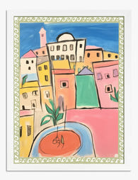
Poster farbenfrohes italienisches Dorf
Translation missing: de.products.product.sale_price Ab £11.95£19.95 -

Poster Ländlicher Charme Italiens
Translation missing: de.products.product.sale_price Ab £11.95£19.95 -

Leinwandbild Italienische Küstenstadt in Pastell – Aquarell
Translation missing: de.products.product.sale_price Ab £44.95£74.95 -

Leinwandbild Italienische Küste in leuchtenden Farben
Translation missing: de.products.product.sale_price Ab £55.99£79.99 -

Leinwandbild Cinque Terre – Farbenfrohe italienische Küste
Translation missing: de.products.product.sale_price Ab £44.95£74.95 -

Leinwandbild Buntes italienisches Dorf
Translation missing: de.products.product.sale_price Ab £55.99£79.99


Mehr aus The Frame

Why William Morris Prints Look Brilliant in Mod...
William Morris has been quietly miscategorised for decades. His patterns get filed under "country cottage" or "Arts and Crafts revival" and rarely escape, which is a shame because his tree...

Why Arts and Crafts Nature Prints Are the Antid...
The minimalism hangover: why bare walls stopped feeling calming For about a decade, the aspirational interior was a white box with one boucle chair in it. That look has officially...

Botanical Petal Art: Why Close-Up Prints Feel M...
Full florals have had a long run, and they're not going anywhere. But if you've noticed that the botanical art appearing in design magazines, boutique hotel lobbies, and the better-styled...