Kitchen Wall Art: What Actually Works on Kitchen Walls (And What to Avoid)
The honest guide to choosing kitchen art that survives the steam and skips the restaurant clichés.

Kitchens are the hardest room in the house to hang art in. You're working around steam, grease, awkward cabinet gaps, and the very real risk of accidentally turning your home into a chain bistro. This guide is about getting it right: what survives the environment, what fits the space, and what looks like art rather than wall filler from a service station gift shop.
The practical stuff first: steam, grease, sunlight, and what they do to your prints
Before you even think about subject matter, think about physics. Kitchens generate heat, airborne moisture, and a fine mist of cooking oils that settles on every surface within a few metres of the hob. Over months and years, that mist dulls finishes, attracts dust, and works its way into anything porous.
Paper prints in a kitchen need protection. Open-frame paper prints (those without glazing) are a bad idea anywhere near cooking zones because the paper absorbs moisture and oils and there's no way to clean the surface. A properly framed print with a glaze is a different story: the glaze takes the abuse and wipes clean with a damp cloth.
This is where acrylic glazing genuinely matters. Glass is heavy, and a heavy frame above a hob is a hazard nobody needs. Acrylic is lighter, shatter-resistant, and on our framed prints it's also UV-protective, which matters more than people realise in kitchens with big windows or skylights. Direct sunlight will fade cheap inks within a year. Museum-grade pigment inks behind UV acrylic will hold their colour for decades.

Canvas behaves differently. The poly-cotton weave doesn't trap moisture the way uncoated paper does, and the matte surface is more forgiving of the slow build-up that happens in kitchens. It's not invincible, but it handles humidity better than an unframed paper print, and it's lighter than glass-fronted alternatives.
The simple rule: if it's within about a metre of the hob or sink, you want either a framed print with proper glazing or a canvas. Anything else is asking to be replaced in two years.
Canvas vs framed in a kitchen: why canvas wins near the hob and framed wins near the table
This is the choice most people get wrong, and it has nothing to do with which one looks nicer in the abstract.
Near the hob, sink, or kettle, canvas prints are usually the smarter pick. They don't have a glass or acrylic surface to fog up when you're boiling pasta. They're lighter, so you can hang them with less hardware. The hand-stretched poly-cotton weave shrugs off humidity in a way framed paper simply doesn't, and you can wipe the surface gently if something splashes.
Near the dining table, breakfast bar, or in the cooler corners of an open-plan kitchen, framed art prints win. The crispness of giclée on thick matte paper behind a clean frame reads as more polished, more deliberate, more like a room you decorated and less like a room you furnished. Framed prints look more grown-up. They just do.
If your kitchen is fully open-plan and the dining area flows into it, you can mix both formats in a single scheme as long as you're consistent within each zone. Canvas above the worktops, framed near the table. The eye reads it as intentional rather than chaotic.
The counter-to-cabinet gap: sizing art for the most common kitchen wall space
Here's the bit nobody talks about. The defining wall space in most kitchens isn't a big open feature wall, it's the strip between the worktop and the underside of the upper cabinets. This is usually 45 to 60cm tall, sometimes a little more, and it's where most kitchen art has to live.
This gap rules out almost every "statement piece" recommendation you'll read elsewhere. A 70x100cm print won't fit. Even a 50x70cm landscape can be a squeeze depending on your splashback height.
The sizes that actually work in this space:
- Small prints (15x20cm or 28x35cm) for tight gaps next to a hob extractor or beside a window. These look best in pairs or trios.
- Medium prints (30x40cm or 40x50cm) in landscape orientation are the workhorse for the average counter-to-cabinet gap. Hung centred between worktop and cabinet base, with roughly equal breathing room top and bottom, they feel balanced.
- A horizontal pair or trio of medium prints along a longer run of wall (say, behind the kettle and toaster zone) creates rhythm without overwhelming the space.
Avoid trying to cram a portrait-orientation print into this gap. Portrait wants vertical room and you don't have any. Landscape and square formats are your friends.
If you've got a clear stretch of wall without upper cabinets (say, beside a fridge alcove, or above a breakfast bar), that's where you can go bigger. Save your large and XL pieces for those walls.
Food art that does not look like a restaurant menu: subjects with actual taste
Most kitchen art fails at the subject stage. The instinct is to put food on the kitchen wall because, well, it's a kitchen. But the obvious choice is usually the wrong one.
The things to avoid: cartoon coffee cups with motivational slogans, butcher diagram prints showing cuts of meat, "But First, Coffee" typography, illustrated wine guides, and anything featuring the word Bon Appétit in script. These read as restaurant decor, not residential. They're the visual equivalent of background music in a chain steakhouse.

What does work is food art that takes itself seriously as art. Vintage botanical illustrations of fruits and herbs. Painterly still lifes in the tradition of Dutch and Italian masters, which photograph beautifully as prints. A single, beautifully composed image of lemons on a marble surface looks ten times better than ten cartoon lemons in a grid. One is a piece of art that happens to feature food. The other is a placemat.
If you love coffee, skip the slogans and look for coffee art prints that treat the subject like still life: a textured close-up of beans, a moody photograph of an espresso pull, a vintage advertising print from the 1920s. The subject can be coffee. The execution has to be art.
The same applies to drinks. Cocktail art prints work brilliantly in a kitchen with a bar area, but only when they have actual visual sophistication. A 1960s graphic illustration of a Negroni is timeless. A printable that says "Wine O'Clock" in cursive is not.
The test: would you hang it in your living room if the colours worked? If yes, it's probably good kitchen art. If no, it's probably tat.
Beyond food: botanical, Mediterranean, vintage, and other subjects that sing in kitchens
The biggest shift you can make in your kitchen is realising you don't actually need food on the wall at all. Some of the best kitchen art has nothing to do with food.
Botanical prints are almost unbeatable in a kitchen. They reference the natural world without screaming "kitchen," they pair beautifully with greenery on the worktop, and the vintage scientific illustration aesthetic has aged better than almost any other genre. A trio of pressed-fern style prints above a counter feels considered rather than themed.
Mediterranean prints are the other category we'd push hard. Whitewashed walls, blue shutters, lemon trees, terracotta pots. They evoke the kind of cooking and eating most people actually want to do at home, and they bring warmth without the cliché of food-as-subject. A coastal scene from the Amalfi or a sun-bleached doorway in Puglia, particularly in our Italy collection, can completely change the feel of a small kitchen.
Vintage travel posters, mid-century graphic art, and abstract landscapes all work. The connecting thread is that they suggest a sensibility rather than spelling out a theme. Kitchens that look styled never have a single piece of "Eat. Drink. Be Merry" wall art in them.
Colour palettes that work with white kitchens, wood kitchens, and dark kitchens
Cabinet colour should drive your art palette more than anything else.
White kitchens can take almost anything, which is why they often end up with the most generic art. We'd push the other way: use the white cabinets as a gallery wall background and go for prints with real saturated colour. Deep ochres, terracotta, ultramarine blues, forest greens. A single rich-toned print on a white kitchen wall does more work than three muted ones.
Wood kitchens (oak, walnut, beech) want art that has either a warm, earthy palette or a clean contrasting cool tone. Sage green, soft cream, burnt orange, faded terracotta all sit beautifully against natural wood. Avoid cool greys and pure whites in the art itself, they tend to fight the wood undertones. Vintage botanicals on cream backgrounds are practically made for wood kitchens.

Dark kitchens (navy, forest green, charcoal, deep aubergine) are where art selection gets interesting. Pale, luminous prints pop against dark cabinets the way they do against gallery walls. Think soft Mediterranean light, faded vintage botanicals on cream, monochrome architectural studies. Avoid anything too dark or too saturated, it gets swallowed. Cream, blush, dusty blue, and pale ochre are your friends here.
The breakfast bar and dining nook: different walls need different approaches
If your kitchen has a breakfast bar or dining nook, treat it as a separate room for art purposes. The walls around where you sit and eat are not subject to the same grease and steam considerations as the cooking zone, and they deserve a different approach.
This is where you go bigger. A single large or XL framed print over a breakfast bar reads as a feature, not a kitchen accessory. The size signals "this is where we sit and linger" in a way that small worktop-zone prints can't.
It's also where formal framed prints really earn their keep. The polish of a clean wood frame around a beautifully printed image elevates a dining nook into something that feels like a small restaurant in the best possible sense, the kind you'd actually choose to eat at.
If your nook is small and the wall is short, a vertical stack of two medium prints can work better than one large piece. It draws the eye up and makes a low-ceilinged corner feel taller.
Gallery walls in kitchens: why smaller prints in a tight grid work better than large singles
Gallery walls in kitchens need to be approached differently from gallery walls anywhere else, because the walls themselves are different. They're interrupted by cabinets, appliances, sockets, and windows. The big sprawling gallery wall format that works in a hallway falls apart in a kitchen.
The format that does work is the tight grid. Four or six small prints in a clean rectangular arrangement, with consistent spacing (around 5cm between frames), all the same size and ideally all the same frame style. The grid's geometry holds up against the surrounding cabinet lines instead of fighting them.
A 2x3 grid of 15x20cm or 28x35cm prints fits beautifully in many counter-to-cabinet gaps and reads as one considered piece rather than six separate things. Choose images with a connecting thread: same colour palette, same subject category, same era of illustration. A grid of six different vintage botanical specimens is timeless. A grid of six unrelated images is chaos.
The other format worth considering is the horizontal trio: three matching medium prints side by side along a wider stretch of wall. It works particularly well above a long run of worktop, and it gives you the visual impact of a large piece without the height problem.
What we'd avoid is the asymmetric mixed-frame gallery wall in a kitchen. It needs more breathing room than most kitchens have, and the cabinets break up the composition in ways that look unintentional.

A note on rentals, peninsulas, and walls that aren't really walls
If you're renting, Command strips rated for the weight of a small framed print or canvas will hold up fine in a kitchen, provided you're not putting them directly above the hob where the heat cycles are extreme. Floating shelves with leaning prints are another low-commitment option that lets you swap things seasonally.
If your kitchen has a peninsula or island layout with very little actual wall space, lean into the few short sections you have rather than trying to make a non-existent feature wall happen. A single well-chosen medium print on a 60cm wall section beside a fridge does more for the room than three mediocre prints crammed somewhere they don't fit.

The bottom line
Pick your format for the zone (canvas near heat, framed near the table). Size for the counter-to-cabinet gap, which means landscape and square in medium sizes. Skip food clichés and lean into botanicals, Mediterranean scenes, and proper still life. Match palette to cabinet colour, not to a Pinterest mood board. And when in doubt, fewer pieces, better chosen, hung properly.
In diesem Blog vorgestellte Fab-Produkte
-

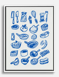
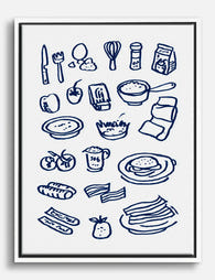
Poster Verspielte Küchenutensilien
Translation missing: de.products.product.sale_price Ab £11.95£19.95 -
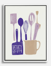
Leinwandbild Blaue Küchenutensilien
Translation missing: de.products.product.sale_price Ab £44.95£74.95 -

Leinwandbild Blaue Küchenutensilien
Translation missing: de.products.product.sale_price Ab £44.95£74.95 -
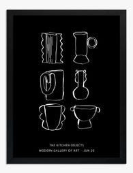
Poster Stilvolle Küchen-Linienzeichnung in Schwarz-Weiß
Translation missing: de.products.product.sale_price Ab £11.95£19.95 -

Leinwandbild Verspielte Küchenutensilien
Translation missing: de.products.product.sale_price Ab £44.95£74.95 -

Leinwandbild Moderne Küchen-Linienkunst
Translation missing: de.products.product.sale_price Ab £44.95£74.95 -
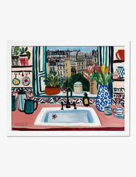
Poster Pariser Küchenfenster
Translation missing: de.products.product.sale_price Ab £11.95£19.95 -

Poster Küchenregeln in Schwarz-Weiß – auffällig & verspielt
Translation missing: de.products.product.sale_price Ab £11.95£19.95 -

Leinwandbild Verspielte Küchen-Skizzen
Translation missing: de.products.product.sale_price Ab £44.95£74.95 -
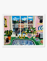
Poster Küchenblick im Matisse-Stil
Translation missing: de.products.product.sale_price Ab £11.95£19.95 -

Poster Küchenutensilien in Blau – Linienzeichnung
Translation missing: de.products.product.sale_price Ab £11.95£19.95 -

Poster Verspielte Küchenzutaten – Aquarell-Illustration
Translation missing: de.products.product.sale_price Ab £11.95£19.95 -

Poster Küchenutensilien in Lavendel und Pflaume
Translation missing: de.products.product.sale_price Ab £11.95£19.95 -

Leinwandbild Farbenfrohe Küchenfenster-Szene mit Stadtblick
Translation missing: de.products.product.sale_price Ab £44.95£74.95 -
Leinwandbild Blaue Küchenutensilien – Strichzeichnung
Translation missing: de.products.product.sale_price Ab £44.95£74.95 -
Leinwandbild grafische Küchenutensilien – Violett & Beige
Translation missing: de.products.product.sale_price Ab £44.95£74.95 -

Leinwandbild Verspielte Küchenzutaten
Translation missing: de.products.product.sale_price Ab £44.95£74.95 -

Poster Küchenblick im Matisse-Stil
Translation missing: de.products.product.sale_price Ab £11.95£19.95 -

Poster Handgezeichnete Küchenutensilien in Blau
Translation missing: de.products.product.sale_price Ab £11.95£19.95 -

Leinwandbild Moderne Küchenoase
Translation missing: de.products.product.sale_price Ab £44.95£74.95


Mehr aus The Frame

Vintage Art Prints Explained: From Botanical to...
Vintage art is one of the most loved categories in wall decor, and one of the most loosely defined. Botanicals, travel posters, oil portraits and psychedelic 1970s graphics all get...

7 Ways to Style William Morris Tree Prints in Y...
Tree of Life. Woodpecker. The towering, tangled branches that made Morris famous. These prints have a vertical pull and a visual density that other Morris designs don't, which means hanging...

Why Art Prints Make the Most Meaningful Housewa...
Most housewarming gifts get consumed, regifted, or shoved in a cupboard within a month. Art does something different. It hangs on a wall in the new home for years, quietly...