Stop Centering Your Modern Art Prints: A Better Way to Display Them
Tighter spacing, fewer frame styles, and the one rule worth breaking for large abstract pieces.

Most advice on hanging art treats every print the same. But modern art prints, with their clean lines, flat colour fields and confident negative space, need different rules to traditional or eclectic work. This is the guide for getting them on the wall properly.
The single statement piece: when one large print is all you need
A single large print does more for a modern interior than three medium ones fighting for attention. If you have a clean wall above a sofa, bed or console, resist the urge to fill it. One 70x100cm or 100x150cm piece, hung with intention, reads as confident. A cluster of smaller prints in the same spot tends to read as busy.
The rule for sizing is the 2/3 width principle: your art should be roughly two thirds the width of the furniture beneath it. A 200cm sofa wants art around 130 to 140cm wide. Anything narrower starts to look like a postage stamp floating above the cushions.
This is where larger formats earn their place. A bold abstract or a strong geometric composition at XL canvas size holds a wall on its own. You want presence, not decoration.
Centre the piece horizontally over the furniture, not the wall. People notice when art lines up with the sofa beneath it. They rarely notice when it lines up with the wall edges.

Two-print pairings: the easiest way to make a wall feel considered
Two prints are the most forgiving arrangement in modern art. They feel intentional without the planning headache of a full gallery wall. The trick is in the spacing and the relationship between the two pieces.
Spacing for diptychs
For a true diptych (two prints that read as one image or pairing), space them 5 to 8cm apart. Tighter than that and they look stuck together. Wider and they stop reading as a pair.
For two prints that complement each other but stand alone, push it slightly wider: 8 to 12cm. The eye still groups them, but each piece gets to breathe.
Matching vs complementing
Two identical-style prints with shared palette work best when hung at the same size and orientation. Think two minimalist line drawings, both 50x70cm portrait, hung side by side. Calm, balanced, easy.
Complementary pairs are harder but more interesting. An abstract colour piece next to a monochrome geometric one. The trick is one shared element: usually colour temperature or scale. If one print is warm and the other cool, you need something else linking them, like a matched frame or identical dimensions.
Orientation rules
Two portrait prints work above almost any furniture. Two landscape prints need a wide piece of furniture beneath them or they look squat. Avoid mixing one portrait and one landscape side by side unless you really know what you're doing. It almost always looks like an accident.
For pre-curated combinations, the work of matching palette and scale is already done. Worth considering if you don't trust your eye yet.
Building a gallery wall with modern art prints
Gallery walls have a bad reputation in modern interiors because most gallery wall advice is built around eclectic, salon-style density. That's the opposite of what modern art needs. Modern gallery walls require more white space, less frame variety, and far more geometric precision.
Spacing
Use 5 to 8cm between frames for modern arrangements. Traditional gallery walls often use 10 to 15cm, but tighter spacing reads as cleaner and more deliberate. The pieces start to feel like a single composition rather than a collection.
Whatever spacing you choose, keep it identical between every frame. A modern gallery wall lives or dies on consistency. Varied gaps look casual. Identical gaps look designed.
Layout templates
For geometric or minimalist prints, use a symmetrical grid. Two by two, three by two, three by three. The strict geometry mirrors the work and gives the whole arrangement architectural weight.
For abstract prints, an asymmetrical layout can work, but it needs an anchor. Pick one large piece as the focal point and build smaller pieces around it, keeping the outer edges of the arrangement roughly rectangular. Wild, organic shapes belong in eclectic homes, not modern ones.
Frame consistency
Pick one frame finish and stick to it. All black, all white, or all natural oak. Mixing two finishes can work (black and white, or oak and black) if you alternate them in a clear pattern. Mixing three or more finishes turns a modern wall into a charity shop window.
Frame profiles should be slim and unadorned. Ornate mouldings fight with modern art. A clean 2 to 3cm frame in solid wood does the job without competing with the print inside it.

Mixing modern art styles: abstract with geometric, colour with monochrome
The fear with mixing styles is that the wall will look like a mood board. The fix is to limit your variables. If you're mixing styles, match something else: palette, frame, or scale.
Abstract with geometric
This is the easiest modern pairing. Abstract pieces bring softness and movement. Geometric pieces bring structure and rhythm. They balance each other naturally. Just make sure they share a palette or a tonal range. A muted abstract in dusty pink and sage works beautifully next to a geometric piece using the same two colours.
Colour with monochrome
A bold colour piece next to a black and white piece can look stunning or jarring depending on the ratio. Aim for one colour piece per two or three monochrome pieces on the same wall, not a 50/50 split. The colour print becomes the focal point. The monochrome pieces become the supporting cast.
If you want a 50/50 mix, match the frames exactly and keep the pieces the same size. The visual symmetry compensates for the tonal contrast.
What not to do
Avoid mixing more than three distinct styles on one wall. Don't combine bold colour, dense pattern and high contrast monochrome all at once. And don't put a vintage botanical print next to a hard-edged geometric abstract. It can be done, but rarely well, and not by accident.
Height, lighting and the details most people get wrong
The most common mistake in art display is hanging too high. The standard rule is that the centre of the piece should sit at 145cm (roughly 57 inches) from the floor. This is gallery convention because it puts the centre of the work at average human eye level.
Above furniture, the rule shifts. The bottom edge of the art should sit 15 to 25cm above the top of the sofa or console. Going higher creates a visual gap that disconnects the art from the room.
When to break the height rule
Large-scale abstract pieces (anything over 100cm tall) often look better hung slightly lower than the 145cm centre rule suggests. The eye reads the piece as a presence rather than a focal point. Drop the centre to around 135cm and let the piece dominate.
Horizontal compositions hung above wide furniture should follow the furniture line, not the eye-level rule. A long landscape print above a 240cm sideboard can sit comfortably with its centre at 150cm or higher because the furniture grounds it.
Lighting
Modern art is forgiving with light because most prints use flat colour and bold composition rather than fine detail. But direct sunlight still matters. UV-protective acrylic glaze (which is what we use on framed prints, rather than glass) prevents fading, but the room still benefits from indirect natural light or warm directional lamps.
Avoid downlights pointed directly at glossy frames. Matte paper and acrylic glazing solve most glare issues, but a ceiling spot aimed at a shiny black frame will still create hotspots. Wash the wall, don't spotlight the frame.
Leaning vs hanging: which approach suits modern art best
Leaning is the most underrated display method for modern art. It works because it leans into (literally) the casual confidence that modern interiors are built around. It also lets you change your mind without filling holes.
When leaning works
A picture ledge or shallow shelf at around 150cm from the floor lets you layer two or three prints, overlap them slightly, and play with depth. This is where mixing frame styles becomes acceptable, because the layering creates its own structure.
Leaning a single large piece against a wall, resting on the floor or a low console, is one of the most striking moves in modern styling. Use it for statement modern prints at 70x100cm or larger. Smaller pieces leaning on the floor just look forgotten.
When to hang instead
Hang when the room is high-traffic (hallways, busy living rooms) or when small children and pets live there. Hang when you want geometric precision: leaning is inherently slightly imperfect. Hang when the piece is the only art in the room and you want it to anchor the space rather than feel temporary.
The honest trade-off: leaned art looks relaxed and curated. Hung art looks committed and intentional. Pick based on the mood you want.

Step-by-step: hanging your framed prints with no stress
The reason most people end up with crooked, badly placed art is they skip the planning. The fix takes ten extra minutes.
Step 1: Plan on the floor
Lay your prints out on the floor in the arrangement you're considering. Photograph it from directly above. Rearrange until you're happy. This is far easier than rearranging on the wall.
Step 2: Make paper templates
Cut newspaper or kraft paper to the exact dimensions of each frame. Mark where the hanging fixture sits on the back of each frame onto the paper template (measure from the top edge).
Step 3: Tape the templates to the wall
Use low-tack masking tape. Position the templates exactly where you want the frames, using a spirit level and a measuring tape. Step back. Live with it for a few hours, or a day if you can. You'll spot problems you didn't see at first.
Step 4: Mark and drill
Mark the fixture points through the paper directly onto the wall. Remove the paper. Drill, plug, and screw.
Step 5: Hang
Framed prints from us arrive with fixtures already attached, ready to hang, so there's no fiddling with kits or hardware. Hang each piece, check level, adjust if needed.
For canvas prints, the process is the same, though canvas frames are lighter and most walls only need a simple picture hook rather than a wall plug.

A few final things to get right
Measure twice before you drill. Use tighter spacing than you think you need. Pick one frame finish and commit. And remember that the wall around the art does as much work as the art itself. Modern design is about what you leave out, not just what you put in.

In diesem Blog vorgestellte Fab-Produkte
-

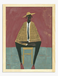
Poster Abstrakte geometrische Formen in Erdtönen
Translation missing: de.products.product.sale_price Ab £11.95£19.95 -
Poster Moderne Muse – Porträt in warmen Erdtönen
Translation missing: de.products.product.sale_price Ab £11.95£19.95 -

Poster Minimalistische Balance – Geometrisch in Schwarz-Beige
Translation missing: de.products.product.sale_price Ab £11.95£19.95 -

Poster moderne geometrische Formen in neutralen Erdtönen
Translation missing: de.products.product.sale_price Ab £11.95£19.95 -

Poster Modernes Streifen-Porträt in Blau & Pfirsich
Translation missing: de.products.product.sale_price Ab £13.99£19.99 -

Poster Elegante Balance – Line Art in Schwarz-Weiß
Translation missing: de.products.product.sale_price Ab £11.95£19.95 -

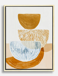
Poster abstrakte Spiralen und Schalen
Translation missing: de.products.product.sale_price Ab £11.95£19.95 -

Poster modernes monochromes Gleichgewicht – abstrakte Kunst
Translation missing: de.products.product.sale_price Ab £11.95£19.95 -
Leinwandbild Abstrakte Balance in Ocker und Blau
Translation missing: de.products.product.sale_price Ab £44.95£74.95 -

Poster Moderne geometrische Formen in Gelb und Grün
Translation missing: de.products.product.sale_price Ab £11.95£19.95 -

Poster im Bauhaus-Stil – Schwarze Formen auf Beige
Translation missing: de.products.product.sale_price Ab £11.95£19.95 -

Poster Minimalistische weiße Blüte
Translation missing: de.products.product.sale_price Ab £13.99£19.99 -

Poster Verspieltes modernes Porträt in Blau, Pfirsich & Gelb
Translation missing: de.products.product.sale_price Ab £13.99£19.99 -

Poster Minimalistischer Halbmond
Translation missing: de.products.product.sale_price Ab £11.95£19.95 -

Leinwandbild Bauhaus: Moderner Minimalismus und geometrische Formen
Translation missing: de.products.product.sale_price Ab £44.95£74.95 -

Poster Abstrakte Kurvenkomposition
Translation missing: de.products.product.sale_price Ab £13.99£19.99 -

Poster Minimalistisches Porträt in Pink und Orange
Translation missing: de.products.product.sale_price Ab £13.99£19.99 -

Poster modernes geometrisches Design
Translation missing: de.products.product.sale_price Ab £11.95£19.95 -

Poster Sonnenuntergang am Meer mit Segelboot
Translation missing: de.products.product.sale_price Ab £11.95£19.95 -

Poster Porträt einer modernen Muse in Rosa und Weiß
Translation missing: de.products.product.sale_price Ab £11.95£19.95


Mehr aus The Frame

Why Floral Prints Work Better in Bedrooms Than ...
Floral prints carry baggage. Mention them in the context of a bedroom and most people picture chintz curtains, brass headboards, and a potpourri bowl on the dresser. That reputation is...

Vintage Dog Art: From Victorian Kennel Portrait...
Dogs have been painted, etched, lithographed and screen-printed for as long as people have made images of the things they love. The vintage dog art you can buy today draws...

Botanical vs Tropical Prints: A Straightforward...
Plant prints get lumped together online, but botanical and tropical are two genuinely different things. One is rooted in 18th century scientific illustration, the other is a modern celebration of...