The Boho Eclectic Wall Art Edit: Curated Picks for Elevated Spaces
How to build a collected, lived-in wall that feels artistic and intentional, never like a chaotic flea market haul.

Boho eclectic is the most misunderstood look in interior decor. Done well, it feels collected, soulful, and quietly artistic. Done badly, it looks like three styles arguing on the same wall.
This guide is about getting it right: the colour rules, the print subjects, the proportions, and the layout techniques that turn a pile of pretty prints into a wall that looks like it was curated over years.
What makes boho eclectic different from pure boho or pure eclectic
Pure boho leans soft, earthy, and global. Think rattan, woven textures, desert tones, macrame, and pampas. It has a recognisable warmth and a slightly free-spirited, lived-in quality.
Pure eclectic, by contrast, is defined by deliberate contrast. It pulls from different eras, cultures, and design movements, and the tension between them is the point. A Baroque mirror next to a brutalist lamp. A 70s portrait beside a modernist abstract.
Boho eclectic is the intersection: the warmth and natural palette of boho, combined with the curated contrast of eclectic. Crucially, this means it needs more editing than pure boho, not less. You're balancing the boho impulse to layer everything with the eclectic discipline of choosing pieces that earn their place.
The shortcut: boho is a feeling, eclectic is a method. Boho eclectic uses the eclectic method to deliver the boho feeling.

The colour palette: earthy tones, terracotta, sage, and where to add a pop
Boho eclectic lives in warm neutrals. Terracotta, ochre, rust, sage green, clay, dusty pink, bone, cream, and deep walnut form the backbone. These are pigments you'd find in dried botanicals, old plaster, and worn leather, and they're the reason the look reads as warm rather than cool.
The professional consensus on cohesion is the three-to-four colour rule. Pick three or four colours that appear in most of your prints, then let smaller accent shades vary. This is what stops a gallery wall from feeling random. The eye finds the repeating tones and reads the whole arrangement as one composition.
One thing competitors get wrong: pairing warm prints with cool-toned neutral walls. Grey-beige or cool white walls will fight terracotta and ochre. If your walls are cool, either repaint to a warmer off-white, or weave more cream and bone into your prints to bridge the gap.
The pop colour is where boho eclectic gets interesting. A single deep aubergine, inky navy, or mustard yellow piece, used sparingly, creates the contrast that tips the wall from pretty to characterful. One pop per cluster. Two starts to compete.
Print subjects that define the look: botanicals, line art, landscapes, vintage portraits
Most guides list the same subjects without telling you how to mix them. Proportions matter more than the list itself.
A formula that works: roughly 60% organic and soft, 30% structured and graphic, 10% unexpected. Organic means botanicals, pressed ferns, sun-faded landscapes, watercolour florals, and soft abstract washes. These do the heavy lifting of warmth.
Structured means line art, geometric abstracts, architectural sketches, and minimalist figure drawings. These give the eye somewhere to rest and prevent the wall from drifting into pure softness.
The final 10% is the unexpected piece: a vintage portrait, a quirky still life, a strange surrealist composition, a piece of bold typography. This is the eclectic spark. Without it, you have a pretty boho wall. With it, you have a wall that makes people stop and look.
A few specific subjects that consistently work in this style:
- Single-stem botanical studies in muted greens and browns
- Continuous-line female figure drawings
- Faded desert or mountain landscapes in ochre and sand
- Vintage-style portraits or animal studies with patina
- Abstract earth-tone compositions with visible brushwork
Browse a broader mix in our eclectic art prints edit for ideas on the unexpected pieces that make the difference.
Mixing textures: pairing framed prints with canvas and unframed pieces
Texture is the boho half of boho eclectic. A wall of identical framed prints reads as a corporate hallway. A wall that mixes finishes reads as collected.
Three textures to play with:
Framed prints with thick matte paper. These give you the polished, gallery feel. The matte finish reads softer and more painterly than glossy, which suits the earthy palette. Our framed prints arrive with solid FSC wood frames and a UV-protective acrylic glaze, so the colours stay true even on sunny walls.
Canvas prints. Canvas softens a wall. The poly-cotton weave catches light differently to paper, and the lack of frame and glaze means the piece sits flush with the wall, almost like a painting. Canvas works particularly well for larger anchor pieces in abstract or landscape subjects, where the texture adds to the painterly feel.
Unframed paper prints. A clipped or bulldog-pinned print, or one tucked behind a shelf ledge, adds the casual, in-progress quality that stops the wall from feeling overly precious.

The trade-off worth knowing: canvas is lighter and forgiving in humid rooms like bathrooms or kitchens. Framed prints look more formal but are heavier and need proper fixings. Mix both, and you get range without losing cohesion.
Layout inspiration: asymmetric clusters, shelf displays, and the lean-and-layer technique
Symmetrical grids kill boho eclectic. The whole point is controlled looseness. Three layouts deliver that consistently.
Asymmetric clusters
Start with your anchor piece, the largest print, and place it slightly off-centre. Build outwards with smaller pieces, varying the spacing so it feels organic. The professional rule of thumb for gallery walls is 5 to 8 cm (roughly 2 to 3 inches) between frames. Closer than that and the wall feels overcrowded. Further apart and the pieces stop reading as a group.
Vary the heights. If everything sits along the same horizontal line, you've made a row, not a cluster. Drop pieces above and below the anchor's centreline to distribute visual weight.
Shelf displays
A long wooden picture ledge, ideally in walnut or oak, lets you lean prints rather than hang them. Layer larger pieces at the back and smaller ones in front. This is the easiest layout to change seasonally, and the lean itself adds the collected, artist-studio quality boho eclectic is built on.
Two ledges stacked vertically, with a 40 to 50 cm gap, gives you a generous display zone without committing to nail holes for every piece.
Lean and layer
Floor-leaning a large piece, then layering a smaller framed print in front of it, is the move that gives a corner instant character. It works best with one substantial canvas (60x80cm or larger) and one or two smaller framed prints leaned against it. Behind a console, beside a reading chair, or at the base of a tall plant.
Common mistakes that tip boho eclectic into visual chaos
This is where most boho walls fail. Avoid these and you're 80% there.
Buying a matched set. A four-print "boho gallery wall" pack defeats the entire point. The whole aesthetic is supposed to look collected over time. If every piece arrived in the same delivery, every piece needs to feel like it belongs to a different chapter.
Skipping the editing pass. Lay every print on the floor first. Remove two. Then remove one more. The cluster always looks better with fewer pieces than you think.
Ignoring vertical distribution. Most beginners hang everything between 140 cm and 160 cm off the floor. Boho eclectic walls breathe vertically. Some pieces should sit low (above a sofa back), some high (closer to the ceiling line), with clear differences in elevation.
Cool neutrals fighting warm prints. As mentioned earlier, terracotta on a cool grey wall looks muddy. Match the wall temperature to the prints, or bridge with cream-heavy pieces.
Overcrowding the surface. Negative space is part of the composition. If there's no breathing room around the cluster, the eye has nowhere to land and the whole wall reads as noise.
Matching every frame. All-black or all-white frames flatten the eclectic quality. But going completely random is also a mistake. The trick is "frame families": pick two or three frame finishes (say, natural oak, black, and a warm walnut) and repeat them across the wall in no particular pattern.
Missing the unexpected piece. Without that 10% quirky element (the vintage portrait, the weird still life, the bold piece of text), the wall stays in pure boho territory and never reaches eclectic.

Our top picks: curating a boho eclectic wall from the collection
Here's how to build a cluster from scratch, with specific sizes and roles. This is a six-piece arrangement designed for a wall roughly 180 cm wide, ideal above a sofa or sideboard.
1. The anchor (60x80cm, canvas). A soft abstract landscape in ochre, sand, and rust, or a large botanical study. Canvas, unframed, hung slightly left of centre. This sets the palette for everything else.
2. The structural counterpoint (40x50cm, framed in oak). A continuous-line figure drawing or a minimalist architectural sketch on matte paper. Sits to the upper right of the anchor, slightly higher than its top edge.
3. The botanical (30x40cm, framed in walnut). A single-stem pressed-fern study or a watercolour eucalyptus. Tucks just below piece two. Browse botanical art prints for options that lean muted rather than vibrant.
4. The unexpected piece (30x40cm, framed in black). A vintage-style portrait, an odd still life, or a piece of bold lettering. Bottom right, breaking the warm palette with something deeper or stranger.
5. The second botanical or landscape (21x30cm, framed in oak). A small piece to bridge the anchor and the unexpected piece. Keep it quiet.
6. The layered piece. A small unframed print, leaning on a shelf or tucked behind another, in the same palette. This is the "still in progress" piece that signals collected over time.
A few specific notes on getting the final assembly right.
Frame finishes: two oak, one walnut, one black, with two unframed (the canvas anchor and the layered piece). Repeated finishes in different positions create the rhythm.
Spacing: 5 to 7 cm between framed pieces. Tighter than that and the cluster feels crowded; looser and it loses coherence.
Hanging order: hang the anchor first, then piece two (the counterpoint), then build outward. Lay everything out on the floor first, take a phone photo, and look at it as a thumbnail. If it works at thumbnail size, it works on the wall.
If you want to start narrower and expand, our boho art prints edit is a good place to find anchor pieces, while the eclectic art prints collection covers the quirkier accents.

The edit before you hang
Before you put a single nail in the wall, do this. Lay all your prints on the floor in the shape you're planning. Stand back two metres. Take a photo. Then remove the one piece you're least certain about.
Look again. If the wall still works, that piece wasn't earning its place. Boho eclectic rewards restraint far more than abundance, and the difference between a wall that looks collected and one that looks cluttered usually comes down to two or three prints too many. When in doubt, take one down.

In diesem Blog vorgestellte Fab-Produkte
-

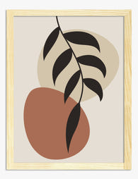
Poster Botanische Boho-Harmonie
Translation missing: de.products.product.sale_price Ab £11.95£19.95 -
Poster abstrakte Formen in warmen Farben
Translation missing: de.products.product.sale_price Ab £11.95£19.95 -

Poster Boho-Punkte & Wellen in Rosé & Petrol
Translation missing: de.products.product.sale_price Ab £11.95£19.95 -

Leinwandbild Abstrakte Boho-Geometrie
Translation missing: de.products.product.sale_price Ab £44.95£74.95 -

Poster Zimmerpflanzen in Boho-Vasen
Translation missing: de.products.product.sale_price Ab £11.95£19.95 -

Poster Boho Botanische Harmonie – Blumen in Line-Art
Translation missing: de.products.product.sale_price Ab £11.95£19.95 -

Poster Boho-Silhouetten in warmen Erdtönen
Translation missing: de.products.product.sale_price Ab £11.95£19.95 -

Leinwandbild Minimalistischer Boho-Bogen
Translation missing: de.products.product.sale_price Ab £44.95£74.95 -

Poster Boho cremefarbene Gänseblümchen auf ockerfarbenen Wellen
Translation missing: de.products.product.sale_price Ab £11.95£19.95 -
Poster Minimalistischer Boho-Bogen in Erdtönen
Translation missing: de.products.product.sale_price Ab £11.95£19.95 -

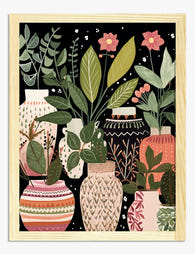
Poster Boho-Vasen mit Zimmerpflanzen
Translation missing: de.products.product.sale_price Ab £11.95£19.95 -

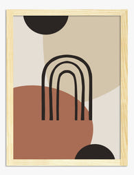
Poster Boho-Bogen in Terrakotta
Translation missing: de.products.product.sale_price Ab £11.95£19.95 -

Poster Moderne Boho-Harmonie
Translation missing: de.products.product.sale_price Ab £11.95£19.95 -

Poster Botanische Treppe
Translation missing: de.products.product.sale_price Ab £11.95£19.95 -
Poster Boho-Vasen mit botanischen Motiven
Translation missing: de.products.product.sale_price Ab £11.95£19.95 -

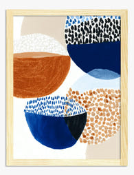
Poster Abstrakte Boho-Balance in Marineblau, Pfirsich & Orange
Translation missing: de.products.product.sale_price Ab £11.95£19.95 -

Poster Abstrakte Boho-Formen in Terrakotta
Translation missing: de.products.product.sale_price Ab £11.95£19.95 -

Poster Moderne Boho-Finsternis
Translation missing: de.products.product.sale_price Ab £11.95£19.95 -
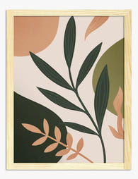
Poster Modern-Boho-Botanik in Erdgrün, Beige & Terrakotta
Translation missing: de.products.product.sale_price Ab £11.95£19.95 -
Poster Boho-Blätter in Terrakotta und Beige
Translation missing: de.products.product.sale_price Ab £11.95£19.95


Mehr aus The Frame

Art for White Walls: The Hardest Wall to Dress
Everyone tells you white walls are easy. They're not. A white wall hides nothing: every proportion mistake, every cheap frame, every clashing undertone gets magnified because there's no colour to...

Art for Pink Walls
Pink walls are the most misunderstood backdrop in interiors. People assume they're tricky, twee, or only for nurseries, when in fact pink is one of the most flattering colours you...

Art for Blue Walls: Sage, Navy, and Powder
Blue walls are one of the most rewarding paint decisions you can make, and one of the trickiest to style. Navy swallows light, powder blue can wash out, and sage...