The Pop Art Gallery Wall Edit: Curated Layouts That Work
A dimension-specific playbook for building a pop art gallery wall that feels deliberate, not chaotic.

Pop art was made for gallery walls. The bold colours, repeated motifs and graphic shapes do half the cohesion work for you, which is exactly why this is the easiest style to group on a single wall. What follows is a practical, dimension-specific guide to actually building one.
Why pop art is the easiest style to gallery-wall with
Most gallery walls fall apart because the prints have nothing in common. A moody landscape, a line drawing and a botanical print share neither palette nor energy, so the wall reads as clutter rather than collection.
Pop art solves this problem by default. The genre is built around saturated primaries, flat colour blocks, repetition and high-contrast graphic style, which means almost any two pop pieces share visual DNA before you've even tried to coordinate them.
You also get permission to be loud. With muted prints, you're forever worrying about whether the room can take more colour. With pop art wall art, the loudness is the point, so you can stop second-guessing and start arranging.
The only real risk is over-doing it, which is why the rest of this guide is mostly about restraint.

Choosing your wall: minimum size and best rooms for a pop art grouping
A pop art grouping needs breathing room. As a working minimum, give yourself a wall that's at least 1.8 metres wide and 2.2 metres tall, ideally with no other competing artwork on adjacent walls. Anything tighter and the prints crowd each other, which is the opposite of what you want.
The best rooms are ones where you spend social time rather than quiet time. Living rooms, hallways, kitchens, dining rooms and home offices all work. Bedrooms are trickier because the colour energy can fight against rest, though a single accent wall behind a headboard can be glorious if the rest of the room is calm.
Avoid placing a pop gallery wall opposite another bold feature. If you've got patterned wallpaper, a brightly upholstered sofa or a busy rug already, the wall behind the calmest piece of furniture is your spot. White, off-white, pale grey and warm beige walls all read well as backdrops. Deep navy or charcoal can also work and actually amplify the colours, but skip anything in the same family as your prints.
How many prints you actually need (hint: fewer than you think)
The instinct with gallery walls is to keep adding. With pop art specifically, this is the fastest route to a wall that looks like a teenager's bedroom in 2007.
For most rooms, five prints is the sweet spot. Three feels sparse for the visual weight pop art carries. Seven starts to feel manic unless your wall is genuinely vast. Nine or more belongs in a commercial space, not a home.
Here's the rule: the bolder the work, the fewer pieces you need. A grid of nine muted line drawings looks considered. A grid of nine pop art prints looks like a pop-up shop. Trust that one large anchor plus three or four supporting prints will do more for the room than a dense salon-style cluster.
If budget is a factor, start with three. You can always add to a gallery wall over time, and a thoughtfully spaced trio is genuinely more impactful than a cramped quintet you bought in a hurry.
The anchor print method: start with one large piece and build out
The single best decision you can make is to choose one print as the anchor, then build the rest of the wall around it.
Your anchor should be your largest print, ideally 70x100cm or thereabouts, and it should sit slightly off-centre on the wall rather than dead in the middle. Off-centre placement creates the asymmetry that makes a gallery wall feel curated rather than corporate.
The anchor sets the palette. Whichever two or three colours dominate that print become the rules for everything else you add. If your anchor is a Lichtenstein-style comic panel in red, yellow and black, every supporting print needs to feature at least two of those three colours. No exceptions, no "but this blue one would be fun." Discipline at this stage is what separates an intentional wall from a confused one.
Around the anchor, plan for two medium prints (around 50x70cm) and two smaller ones (30x40cm or 40x50cm). The variation in size creates rhythm. Five prints at the same size starts to feel like a contact sheet.

Colour cohesion: picking prints that share at least two tones
The two-tone rule is the most useful thing you'll read in this guide. Every print on the wall must share at least two colours with the anchor.
Not similar colours. The same colours. If the anchor uses a specific cherry red and a specific lemon yellow, your other prints need to feature that red and that yellow, not a burgundy and a mustard. Pop art works because of saturated, declarative colour, and once you start mixing tonal cousins, the wall loses its punch.
This is also where you get to introduce variation in subject matter. Once colour is locked, you can mix portraits, typography, food motifs, abstract shapes and graphic illustration freely. The shared palette holds it all together.
Browsing colourful art prints is a useful exercise even if you already have your anchor. Lay potential prints next to your anchor on screen and squint. If the colours don't snap together immediately, they won't on the wall either.
A quick failure mode to flag: avoid mixing prints with white backgrounds and prints with coloured backgrounds in the same arrangement. The negative space behaves differently and your eye will keep getting snagged. Pick one approach and commit.
Spacing and layout: a specific template for a five-print arrangement
Here's a template that works almost anywhere. Wall space required: roughly 2 metres wide by 1.5 metres tall.
The prints:
- 1 anchor at 70x100cm (portrait orientation)
- 2 medium at 50x70cm (one portrait, one landscape)
- 2 small at 40x50cm (both portrait)
The arrangement:
Place the anchor on the left side of your wall section, with its centre at standard eye height (more on that below). To the right of the anchor, stack two prints vertically: a 50x70cm landscape on top and a 40x50cm portrait beneath it. Then to the right of those, stack the remaining 50x70cm portrait above the second 40x50cm portrait.
Spacing:
Leave 5 to 7cm (roughly 2 to 3 inches) between every frame edge. Less than 5cm and the frames feel crowded. More than 7cm and the wall stops reading as one composition and starts reading as separate prints that happen to share a wall.
The visual trick is that the right-hand prints align loosely along an invisible vertical centre line, while the anchor sits to the left holding the whole thing in place. Your eye lands on the anchor first, then travels across the supporting prints, which is exactly the journey a good gallery wall should provide.
Test before you hang. Cut newspaper or kraft paper to the exact size of each frame, label them, and tape them to the wall with masking tape. Live with it for 24 hours. Move things around. This step takes ten minutes and saves you from filling a wall with pointless holes.
Frame consistency: why matching frames make bold art feel intentional
For pop art specifically, frame matching is non-negotiable.
When the artwork is calm, mixed frames can add character. When the artwork is loud, mixed frames add chaos. Your prints are already doing the visual work, so the frames need to step back and let them.
Pick one frame finish for the entire wall and stick to it. The three finishes that work hardest with pop art are:
- Black: sharpens the graphic edges of pop art and feels gallery-like
- White: lightens the overall feel and lets the colours shine
- Natural oak: adds warmth and stops the wall feeling too clinical
Avoid gold, ornate or distressed frames with pop art. The genre's whole point is graphic modernity, and decorative framing fights against it.
Frame quality matters more than people realise. Cheap frames warp, prints shift inside the mount, and the whole wall starts to look slightly off within a year. Solid wood frames hold their shape, and acrylic glazing (rather than glass) avoids the glare that ruins photos and means a frame falling off the wall doesn't shatter across the floor. If you're investing in five prints to hang together, this is the place not to compromise.
For coordinated sets where the framing is already sorted, browse wall art sets which take the guesswork out of size pairing too.

Hanging it right: tools, heights and the one measurement that matters
The one measurement that matters: 145cm to 152cm (roughly 57 to 60 inches) from the floor to the centre of your gallery wall arrangement. This is gallery-standard eye height and it's the single biggest reason most home gallery walls look slightly wrong. People hang too high. Almost always.
For a five-print arrangement, you measure to the centre of the whole composition, not the centre of the anchor. Map out your prints on paper first (or on the wall with templates), find the visual midpoint, and use that as your 145 to 152cm reference.
If your wall sits above furniture, leave 15 to 20cm between the top of the sofa, sideboard or console and the bottom of the lowest frame. Less than that and the art feels like it's resting on the furniture. More than that and the two stop relating to each other.
Tools you actually need:
- Tape measure
- Spirit level (a phone app works at a pinch but a proper one is better)
- Pencil
- Paper templates and masking tape
- Appropriate fixings for your wall type (picture hooks for plaster, wall plugs and screws for masonry)
Mark the position of each hanging point with a pencil before you commit. Check level twice. Hang the anchor first, then work outwards. If a print sits 2 to 3mm off level, nobody will ever notice. If it sits a centimetre off level, everyone will notice forever.
One thing worth knowing: properly framed prints arrive ready to hang with fixtures already attached, which removes the most fiddly part of the job. If you're ordering from across the modern art prints collection, the prints and frames ship together fitted, so you're not separately mounting paper into a frame on your kitchen table.

Troubleshooting
The wall feels too busy. Remove one print. Almost always the smallest or the most colour-saturated one. Live with the gap for a day before deciding whether to fill it.
The wall feels too sparse. Don't add a print, increase frame size first. A larger anchor often fixes sparseness better than additional pieces.
The colours clash despite following the rules. Check your backgrounds. Mixed white-background and coloured-background prints are usually the culprit, not the foreground colours.
It looks fine but boring. Your prints are probably too similar in subject matter. Keep the colour rules but introduce more variety in what's actually depicted.
Build it slow, anchor it well, match the frames, and respect the 145cm rule. Pop art rewards confidence, but only if the structure underneath is precise.

In diesem Blog vorgestellte Fab-Produkte
-

Poster Verspielte Pop-Art fürs Wohnzimmer
Translation missing: de.products.product.sale_price Ab £11.95£19.95 -

Poster Grafischer Pop-Blumenstrauß in Pink und Grün
Translation missing: de.products.product.sale_price Ab £11.95£19.95 -
Poster Rote Mohnblumen & Pastellstreifen fürs Wohnzimmer
Translation missing: de.products.product.sale_price Ab £11.95£19.95 -

Poster Bunte Pop-Art-Illustration fürs Wohnzimmer
Translation missing: de.products.product.sale_price Ab £11.95£19.95 -

Poster Modernistischer Raum in Color-Pop-Farben
Translation missing: de.products.product.sale_price Ab £11.95£19.95 -

Poster Mohnblumen-Pop für das Wohnzimmer
Translation missing: de.products.product.sale_price Ab £11.95£19.95 -

Poster Blütenrausch in Pink und Grün
Translation missing: de.products.product.sale_price Ab £11.95£19.95 -

Poster Mohnblüte & Muster-Mix mit optischer Illusion
Translation missing: de.products.product.sale_price Ab £13.99£19.99 -

Poster Abstrakte Pop-Formen in Pink und Orange
Translation missing: de.products.product.sale_price Ab £11.95£19.95 -
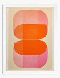
Poster Abstrakte Formen in Pink und Orange
Translation missing: de.products.product.sale_price Ab £11.95£19.95 -
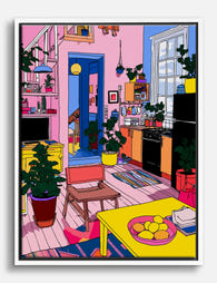
Leinwandbild farbenfrohe Pop-Art-Wohnszene
Translation missing: de.products.product.sale_price Ab £44.95£74.95 -

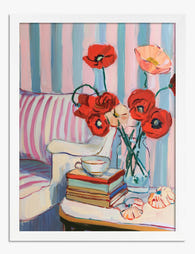
Leinwandbild Mohnblumen in gestreifter Vase mit Büchern & Teetasse
Translation missing: de.products.product.sale_price Ab £44.95£74.95 -

Poster Bunte Rennwagen auf der Rennstrecke
Translation missing: de.products.product.sale_price Ab £13.99£19.99 -

Poster Feige Pop-Art – Pink, Blau und Grün
Translation missing: de.products.product.sale_price Ab £11.95£19.95 -

Poster Botanische Pop-Art in Grün und Pink
Translation missing: de.products.product.sale_price Ab £11.95£19.95 -

Leinwandbild Verspieltes Pop-Porträt
Translation missing: de.products.product.sale_price Ab £55.99£79.99 -

Leinwandbild Pop-Art Wohnzimmer – farbenfrohe Illustration
Translation missing: de.products.product.sale_price Ab £44.95£74.95 -

Poster Pop-Art Sneaker-Duo vor rotem Hintergrund
Translation missing: de.products.product.sale_price Ab £11.95£19.95 -
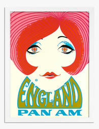
Poster Pop-Art mit Retro-England-Flair
Translation missing: de.products.product.sale_price Ab £11.95£19.95


Mehr aus The Frame

Why Seafood Art Works in Every Room (Not Just K...
Seafood art has a reputation problem. Mention an octopus print or a vintage lobster illustration and most people picture a fish market, a beachside diner, or someone's nautical-themed bathroom. That...

What Gallery Curators Know About Displaying Sur...
Surrealism has a reputation for being difficult to live with. Floating apples, melting clocks, men in bowler hats raining from the sky: not the obvious choice for the wall behind...

Transform One Wildflower Print into a Stunning ...
You bought a wildflower print. You love it. Now it's leaning against the wall because you suspect it wants company, but you don't know what kind of company, or how...