Transform Blank Walls with Illustration Prints: A Gallery Plan
A confidence-building method for building a cohesive gallery wall around illustration prints, with real measurements and zero guesswork.

Most gallery wall advice tells you to "trust your eye" and "go with what feels right." That's how you end up with eleven nail holes and a wall that still looks wrong. This guide gives you a measurable, repeatable method built specifically around illustration prints, because they're the easiest art type to anchor a gallery wall with.
Why illustration prints make the best gallery wall anchors
Illustrations have a quality that photography and abstract work don't: a visible human hand. Line weight, brushwork, the specific way one artist draws a leaf or a face. That visual signature is what makes a wall feel cohesive even when subjects vary wildly.
Try building a gallery wall around photography first and you'll quickly run into a problem. Different photographers shoot with different light, different grain, different colour grading. The mismatch is loud. Abstract work has the opposite issue, where pieces can feel random next to each other without an obvious thread.
Illustrations sidestep both. A botanical line drawing and a city skyline illustration in similar styles will read as siblings, even if the subjects have nothing in common. That's why we'd suggest starting any gallery wall with two or three illustration art prints as your foundation, then layering other mediums around them.
There's also a confidence factor. Illustrations feel less precious than fine art photography or original paintings, which means people freeze less when arranging them. You're more willing to experiment, and experimentation is how good gallery walls happen.

Choosing a cohesive thread: colour, subject, or style
Before you buy a single print, pick one of three threads to tie everything together. Just one. People who try to coordinate by colour AND subject AND style end up with a wall that looks like a coordinated outfit at a school photo, flat and overworked.
Colour thread. Pick a palette of two or three shades that appear across every print. Terracotta and cream. Navy and ochre. Sage and rust. The subjects can be wildly different (a portrait, a landscape, a still life) as long as the colour story holds.
Subject thread. All botanicals. All architecture. All figures. With a strong subject thread you can mix styles more freely, because the visual link is obvious.
Style thread. All line drawings. All gouache-style washes. All mid-century graphic illustrations. This is the most forgiving thread for mixing in photography or typography later, because the hand-drawn feel becomes the unifier.
We think the style thread works best for first-time gallery walls. It's the most forgiving, and it's what gives you permission to mix in a typography print or a black and white photograph later without breaking the spell.
The layout that works for 90% of gallery walls
Here are the measurements that quietly do all the heavy lifting. Memorise these and most of your decisions are already made.
Centre the arrangement at 145-152cm from the floor. That's measured to the visual centre of the whole grouping, not the centre of any individual print. This is the standard museums and galleries use, calibrated to average eye level when standing.
Adjust down for seated rooms. Above a sofa, dining table, or bed, the bottom edge of your lowest print should sit 15-20cm above the furniture. Closer than that feels cramped. Further away and the art floats unmoored from the room.
Keep 5-8cm between frames. Tighter than 5cm and the wall feels claustrophobic. Wider than 8cm and the arrangement reads as separate prints rather than one composition. We tend toward 6cm for most walls.
Span two-thirds of the furniture below. Over a 200cm sofa, your gallery wall should span roughly 130-140cm wide. Smaller than that looks like postage stamps. Wider and it overpowers the furniture.
The mock-up rule. Cut paper templates the exact size of each frame, label them, and tape them to the wall with painter's tape. Live with the arrangement for 48 hours before you put a single nail in. This single step prevents about 90% of regret.
Mixing illustration with photography, abstract, and typography prints
Once your two or three illustration anchors are chosen, you can start layering. The ratio we'd suggest: illustrations should make up 60-70% of the gallery wall. Other mediums are accents, not equals.
Illustration plus photography. Black and white photography mixes beautifully with line illustrations because both rely on contrast and form rather than colour. Colour photography is trickier; if you go this route, choose photographs with the same dominant colour as your illustrations. Browse photography art prints with a clear filter in mind: does this photograph share at least one colour with my anchor illustrations?
Illustration plus typography. A single typography print can act as a punctuation mark in an otherwise image-led wall. One quote, one word, or one numbered print is enough. Two or more and the wall starts to read like a Pinterest board. The right typography art prints are the ones with restrained type and lots of negative space, not busy compositions.
Illustration plus abstract. Abstract pieces work best when they pick up a single colour from your illustrations. A sage green abstract next to a botanical line drawing in the same green will feel intentional rather than random.
The general principle: every non-illustration print needs at least one visual link back to your anchors. Colour, line quality, or subject reference. If a print doesn't share at least one of those, it doesn't belong on the wall.

Frame consistency: the single decision that makes or breaks it
If you only take one thing from this article, take this: frame consistency does more for a gallery wall than print selection. You can pick mismatched art and pull it together with the right frames. You cannot pick perfect art and rescue it with mismatched frames.
There are three approaches that work, in order of foolproof to advanced.
All identical frames. Same colour, same width, same finish. This is the safest option and the one we'd recommend for first-time gallery walls. Black is sharp and graphic, oak is warmer and more flexible, white disappears into pale walls and lets the art do all the work.
Same colour, varied widths. All black frames, but some thin and some chunky. This adds rhythm without breaking cohesion. Save the chunkiest frames for your two anchor illustrations.
All wood tones, mixed species. Oak, walnut, ash, all together. This works for organic, salon-style arrangements but requires confidence. The trick is keeping the undertones consistent, all warm or all cool. Mixing a yellow-toned pine with a grey-toned ash will look mismatched.
What never works: mixing black frames with wood frames in the same arrangement. Mixing ornate with minimal. Mixing thick mat borders with no-mat frames. These look unintentional regardless of how good the art is.
A note on glazing. Glass is the traditional choice but it's heavy, fragile in transit, and prone to glare under spotlights. Acrylic glazing is lighter, doesn't shatter, and when it's UV-protective it actually keeps colours from fading in sunlit rooms. For a wall with five to nine pieces, the weight difference adds up significantly.
Common gallery wall mistakes and how to avoid them
Mistake 1: Choosing illustrations in competing styles. A delicate watercolour botanical next to a bold graphic block-print illustration looks like two different walls fighting. Stay within one style family.
Mistake 2: Over-matching everything. Same frames, same colours, same subjects, same sizes. The result is flat and lifeless. You need at least one variable, usually size, to create visual rhythm. A wall of nine identical-sized prints in identical frames is a grid, and grids only work in very specific contexts (more on that below).
Mistake 3: Frames that compete with the art. Ornate gold frames around minimalist line drawings is a mismatch. The frame should let the illustration breathe. For hand-drawn work, simple is almost always right.
Mistake 4: Centring on the wall instead of the furniture. A gallery wall should be centred on whatever's below it (sofa, console, bed), not on the wall itself. If your sofa is off-centre, your gallery wall should be too.
Mistake 5: Hanging too high. Almost everyone does this. The visual centre at 145-152cm from the floor will feel low if you've been getting it wrong for years, but trust the measurement.
Mistake 6: Skipping the mock-up. Painter's tape and paper templates take an hour. Patching nail holes from a failed arrangement takes a weekend.
Mistake 7: Buying frames separately from prints. This is where most gallery walls fall apart. Frames bought separately rarely fit prints precisely, prints warp inside frames that weren't made for them, and you end up with bubbling under glass within a year. Prints and frames designed together, fitted in one box, solve this entirely.
A room-by-room sizing cheat sheet
Living room (over a sofa)
- Sofa width: 180-220cm
- Total prints: 5 to 9
- Largest print: 50x70cm
- Total spread: 130-150cm wide
- Frame style: matching, slightly chunky
- Anchor placement: largest illustration just left or right of centre, never dead centre
Bedroom (over the bed)
- Bed width: 140-180cm
- Total prints: 3 to 5
- Largest print: 40x50cm
- Total spread: 100-130cm wide
- Frame style: lighter, less chunky than living room
- Mood: keep it calmer, fewer competing elements
Dining room
- Wall width: highly variable
- Total prints: 4 to 6
- Largest print: 50x70cm
- Layout: works well as a horizontal line of similar-sized prints rather than salon-style
- Why: you're seated, so the eye scans horizontally
Hallway
- Total prints: 5 to 9
- Largest print: 30x40cm
- Layout: horizontal line, evenly spaced, all the same size
- Why: hallways are passing spaces, the eye doesn't linger, so a confident grid pattern works better than salon-style
Home office
- Wall above desk: 3 to 4 prints
- Largest print: 50x70cm
- Mood: typography mixes in well here, where words feel more contextual
Kid's room or nursery
- Total prints: 3 to 6
- Largest print: 40x50cm
- Layout: organic, lower than adult height (centre at 120-130cm so the child can see)
For larger spaces or anywhere you want to skip the planning entirely, pre-arranged wall art sets take all the sizing decisions off the table.

Reading your wall: grid, salon, or horizontal line
Three layouts cover almost every situation.
The grid. Two by two, three by three, or two by three. Identical frame sizes, identical spacing, perfectly aligned. Works in modern rooms, hallways, and offices. Feels formal and considered. Less forgiving of mismatched art, more forgiving of crowded spaces.
The salon-style cluster. Mixed sizes, organic arrangement, varied spacing within the 5-8cm range. Works in living rooms, bedrooms, and stairwells. Feels collected and personal. Needs a rectangular invisible boundary; the outer edges should form a clean rectangle even if the interior is varied.
The horizontal line. All prints aligned along a horizontal centre, evenly spaced. Works above sofas, sideboards, and in hallways. Feels architectural and calm. Easiest layout to execute.
How to choose: grid for modern rooms with strong horizontal lines, salon for warmer rooms with organic furniture, horizontal line for long furniture below or long walls.
A note on lighting
Illustration prints, especially line drawings and minimalist styles, are particularly vulnerable to glare. A spotlight bouncing off glazing washes out the entire piece. If your gallery wall is opposite a window or under a directional light, position prints so the light hits the wall at an angle rather than head-on, or choose matte paper with non-reflective glazing. Picture lights mounted above the frame work well but only if the bulb is warm-toned (around 2700K). Cool white light flattens illustrations and makes paper look grey.

What to do this week
Pick your two anchor illustrations first. Don't think about the rest of the wall yet. Order them, hang one of them solo for a few days, and see how it feels in the room. Then start building outward, adding one or two prints at a time, mocking up with paper before committing. A gallery wall built this way, slowly and with measurement, almost always lands. One built in a single panicked weekend almost never does.

In diesem Blog vorgestellte Fab-Produkte
-

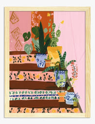
Leinwandbild Treppenstufen mit Fliesenmuster und Topfpflanzen
Translation missing: de.products.product.sale_price Ab £44.95£74.95 -

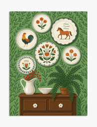
Leinwandbild Wandteller mit Blumen, Hahn und Pferd im Volkskunst-Stil
Translation missing: de.products.product.sale_price Ab £44.95£74.95 -

Poster Willkommen im Blumengarten
Translation missing: de.products.product.sale_price Ab £11.95£19.95 -
Poster Volkskunst-Charme mit Wandtellern
Translation missing: de.products.product.sale_price Ab £11.95£19.95 -

Poster Fantasievoller Hügelspaziergang
Translation missing: de.products.product.sale_price Ab £11.95£19.95 -

Poster Schwarz-Weiß Typografie – Kraftvolle Linien
Translation missing: de.products.product.sale_price Ab £11.95£19.95 -

Leinwandbild verspielte Zusammenkunft
Translation missing: de.products.product.sale_price Ab £44.95£74.95 -
Poster Gemusterte Stufen und üppiges Grün
Translation missing: de.products.product.sale_price Ab £11.95£19.95 -

Poster Winterspaziergang mit Büchern
Translation missing: de.products.product.sale_price Ab £11.95£19.95 -

Poster Bunter Waldweg mit blauen Bäumen
Translation missing: de.products.product.sale_price Ab £11.95£19.95 -

Poster Frau vor floraler Tellerwand in Rosa
Translation missing: de.products.product.sale_price Ab £11.95£19.95 -

Leinwandbild Motivationsspruch Typografie „Dreams to Plans“
Translation missing: de.products.product.sale_price Ab £44.95£74.95 -

Poster Surreales Schwarz-Weiß-Schachbrett mit Blüte
Translation missing: de.products.product.sale_price Ab £13.99£19.99 -

Leinwandbild Gemusterte Stufen mit Topfpflanzen
Translation missing: de.products.product.sale_price Ab £44.95£74.95 -

Leinwandbild Frau vor Wand voller Vintage-Wandteller
Translation missing: de.products.product.sale_price Ab £44.95£74.95 -

Leinwandbild Wonderwall Songtext Typografie
Translation missing: de.products.product.sale_price Ab £44.95£74.95 -

Poster Winterspaziergänge
Translation missing: de.products.product.sale_price Ab £11.95£19.95 -

Leinwandbild Treppen-Oase mit Zimmerpflanzen
Translation missing: de.products.product.sale_price Ab £44.95£74.95


Mehr aus The Frame

Stop Hanging Sketch Prints Like Regular Art: A ...
The number one mistake people make with sketch art You hang a small, thinly framed sketch on a pale wall and step back expecting magic. Instead, the print vanishes. The...

Stop Buying Random Amalfi Coast Prints: How to ...
Most Amalfi Coast gallery walls fail for the same reason: they're a pile of pretty prints rather than a planned arrangement. The fix is to treat your wall like a...

Whimsical Nature Decor That Feels Grown-Up and ...
Whimsical nature art has a sophistication problem. Done well, a hand-illustrated fern or a watercolour fox brings warmth and personality to a room that minimalist abstracts simply cannot. Done badly,...