
 Heute bestellen, Lieferung bis
 What Colours Go With Bouquet Prints? Pairings Interior Designers Actually Use
The paint colours, frame finishes and soft furnishing pairings that make a bouquet print look considered, not chaotic.


You've found a bouquet print you love. Now you need to know if it will actually work above your sofa, opposite that mustard armchair, next to the curtains you spent too much on. This guide gives you specific answers, including paint families, frame finishes, and the pairings that work in real rooms.
The simple rule: pull one colour from the print into your room
Every good bouquet print pairing starts with the same move. Pick one colour from the print and echo it somewhere in the room: a cushion, a throw, a lamp base, a vase, the wall itself. That's it.
The trick is choosing which colour to pull. Most people instinctively reach for the most dominant flower, which is usually a mistake. The dominant colour tends to be loud, and matching it loudly elsewhere makes the room feel like a theme park.
Pull a secondary colour instead. The dusty sage in the leaves. The soft ochre in a half-open peony. The chalky lilac you almost missed. These quieter notes are what designers call "bridge colours," and they tie a print to a room without shouting about it.
If you want a third option: pull the background colour. A bouquet print on a warm ivory ground asks for warm ivory walls, or at least a cushion in that exact tone. This is the most subtle approach and almost always the most expensive looking.

Warm-toned bouquets: best wall colours and soft furnishing pairings
Warm bouquets are the peach, coral, blush, ochre, terracotta, and butter-yellow arrangements. Think garden roses, ranunculus, dahlias in autumn shades, dried palettes.
These prints want warm walls behind them. Cool greys make them look orphaned. The wall colours that work hardest are creamy off-whites (anything described as "warm white" or with a yellow undertone), greige (grey with a brown base, not a blue base), and soft clay tones. If you want a brand reference point, look at Farrow & Ball's School House White, Setting Plaster, or Joa's White. These all sit in the same warm, slightly chalky territory.
For soft furnishings, lean into texture rather than more colour. Linen in oatmeal, bouclé in cream, a wool throw in burnt sienna. One cushion can echo the print's brightest flower (a rust velvet against a coral bouquet), but keep the rest of the palette quiet.
Avoid anything cold and synthetic looking near a warm bouquet print. Crisp white bedding, chrome lamp bases, glossy black side tables. They drain the warmth out of the print and make the whole arrangement feel mismatched.
For inspiration on warm-toned arrangements specifically, browse the bouquet art prints collection and filter by the palettes you're drawn to.
Cool-toned bouquets: greens, blues, and lavender arrangements
Cool bouquets behave differently. Eucalyptus and fern arrangements, blue hydrangea studies, lavender and delphinium prints, white peonies on pale grounds. These prints have a calmness that warm whites can flatten.
The wall colours that lift cool bouquets are pure whites with a slight blue undertone, soft sage greens, dove greys, and the pale putty shades sitting between grey and beige. Farrow & Ball's Strong White, Cromarty, and Pavilion Gray are the kind of tones that work. So does almost any sage in the dusty, slightly grey range.
Where warm bouquets want warm linen, cool bouquets can take a colder palette. Stonewashed linen in pale blue, a wool throw in soft sage, ceramic lamp bases in chalky white. You can also bring in soft black accents (a thin metal frame, a matte black candlestick) without the print feeling harsh.
A cool bouquet print on a sage green wall is one of the most underrated pairings in interior design. The leaves in the print disappear into the wall and the flowers float forward. It's a trick that costs nothing and looks deeply considered.
If your bouquet leans heavily botanical (more foliage than flowers), it might actually sit better with the botanical art prints collection, where the rules around green-on-green pairing apply even more strongly.
Moody, dark-background bouquets and why they love neutral rooms
Dark-background bouquet prints are having a moment. These are the Dutch Old Masters style arrangements, deep burgundy peonies and dark dahlias against near-black or charcoal grounds, often with dramatic lighting.
The instinct is to put them on a dark wall for drama. Resist this. Dark prints on dark walls disappear, and you lose the entire point of the print, which is the contrast inside it.
Moody bouquets work best against quiet, neutral rooms. Warm white walls, oatmeal sofas, jute rugs, simple wooden furniture. The print becomes the focal point because everything around it has stepped back.
If you want a slightly braver pairing, try a deep warm clay or a soft terracotta wall. Both pick up the russet and burgundy tones inside a moody bouquet without competing. What you want to avoid is cool grey or stark white, which makes moody prints look stranded.
Soft furnishings should stay in the earthy neutral family: cream, oatmeal, mushroom, soft black. One velvet cushion in a deep wine red, pulled directly from the print, is all the colour echo you need.

Frame colour matters more than you think: black, white, oak, and walnut
The frame is doing more work than most people realise. It's the bridge between the print and the wall, and the wrong choice can make a beautiful print look cheap.
Black frames
Black frames work brilliantly with graphic, high-contrast bouquet prints, especially ones with crisp lines, dark backgrounds, or strong botanical illustration energy. They give the print weight and presence.
Where black frames go wrong is with soft, painterly, pastel bouquets. A thin black frame around a delicate watercolour peony print can look like a Halloween invitation. If your print is gentle and romantic, black is rarely the answer.
White frames
White frames are the safest choice for soft, light, pastel bouquets. They let the print breathe and reinforce the airiness. They work especially well in bedrooms, bathrooms, and any room with lots of natural light.
The risk with white is that it can look flimsy in larger sizes. If you're going for a 70x100cm print, white sometimes lacks the gravity the print needs. Consider oak instead.
Oak frames
Oak is the most versatile frame finish for bouquet prints, and it's where most people should start. The pale, warm wood adds weight without darkness, and it sits comfortably with almost any palette: warm bouquets, cool bouquets, neutral rooms, colourful rooms.
Oak works particularly well in homes with other wooden elements already (floors, furniture, window frames). It feels intentional rather than decorative.
Walnut frames
Walnut is the right choice for moody, dark-background bouquets, oil painting style arrangements, and anything that feels rich and traditional. The deep brown frame echoes the depth inside the print and gives it a gallery quality.
It's also the best frame for any bouquet print you want to feel collected and older, even if the print itself is modern. Walnut adds instant heritage.
A note on framing in general: a lot of bouquet prints get ruined by bad framing. Warped backing boards, prints that arrive with bubbles, frames shipped separately and assembled badly. The whole point of buying a framed print is that this isn't your problem. Our framed prints arrive in one box, properly fitted, ready to hang, with UV-protective acrylic glaze instead of glass (lighter, no shatter risk, no glare).
What to avoid: the colour clashes that make bouquet prints look cheap
This is the section nobody writes, so pay attention.
Clashing undertones. This is the biggest single mistake. A peach bouquet print (warm undertone) on a cool grey wall (blue undertone) looks wrong even if you can't articulate why. Test it: hold the print up against the wall. If one looks slightly yellow and the other looks slightly blue, they're clashing. Match warm with warm, cool with cool.
Matching too closely. A pink bouquet print on a pink wall with pink cushions and a pink lampshade isn't coordinated, it's a costume. Pull one colour, then let the rest of the room sit in neutrals.
Thin, shiny gold frames on delicate prints. This pairing reads as inexpensive almost every time. If you want a metallic accent, bring it in through a lamp base, a side table, or a small piece of decor, not the frame itself.
Hanging a small print on a dark wall. A 30x40cm print on a deep navy or charcoal wall looks lost. Dark walls need oversized prints (70x100cm or larger, or a canvas at 100x150cm) to hold their own.
Crowding the print. A bouquet print needs visual space. If you've stuffed the surrounding wall with shelves, sconces, and other art, the print can't do its job. Give it 20cm of breathing room on every side at minimum.
Mixing too many floral patterns. A bouquet print, a floral cushion, floral curtains, and a floral rug is too much. The print should be the floral moment. Everything else stays plain.

Three real room setups with specific bouquet print pairings
Here are three complete pairings you can copy directly.
Setup one: a warm, sunlit living room
Wall colour: a warm off-white in the Setting Plaster or School House White family.
Print: a large bouquet of coral and peach garden roses with sage foliage, 70x100cm, in an oak frame, hung above a linen sofa in oatmeal.
Soft furnishings: two cushions in rust linen, one in cream bouclé, a wool throw in soft camel. A ceramic table lamp with a cream linen shade on the side table. A single dried bouquet in a stoneware vase on the coffee table.
Why it works: the warm white wall wraps around the print's warm tones. The oak frame ties to the wooden coffee table. The rust cushions pull the coral from the print without copying it. Nothing competes.
For more ideas in this kind of space, the living room wall art collection has the larger sizes that work best above sofas.
Setup two: a calm, cool bedroom
Wall colour: a soft sage green, slightly dusty, slightly grey.
Print: a cool bouquet of white peonies and eucalyptus on a pale ivory ground, 50x70cm, in a white frame, hung above a low wooden bed.
Soft furnishings: stonewashed linen bedding in pale grey-blue, two cushions in cream, one in soft sage to echo the wall. A small ceramic vase in matte white on the bedside table. Curtains in unbleached linen.
Why it works: the sage wall lets the foliage in the print recede and pushes the white peonies forward. The white frame keeps the airy, restful feel. Everything is cool toned, so nothing clashes.
Setup three: a moody, characterful dining room
Wall colour: warm clay or soft terracotta, or a warm off-white if you're not ready for colour on the walls.
Print: a dark-background bouquet, deep red peonies, burgundy dahlias, dark foliage, 70x100cm, in a walnut frame.
Soft furnishings: a jute or wool rug in oatmeal, dining chairs in natural oak with cream linen seats, a stoneware vase with dried grasses on the table, a brass pendant light overhead.
Why it works: the moody print is the room's focal point because everything else has stepped back into neutrals. The walnut frame echoes the oak chairs and adds richness. The single brass note in the pendant light brings warmth without competing with the print.

A few final notes on size, season, and getting it right
Size matters more than colour in some ways. A print that's too small for the wall will look uncertain no matter how well the colours coordinate. Above a standard three-seater sofa, you want a print that's at least 60% of the sofa's width. For a 200cm sofa, that means at least a 70x100cm framed print or a 100x150cm canvas.
If you want to change the feel of the room across the seasons without buying new art, change the cushions and throws around the print. The same warm bouquet print sits happily with rust and burnt sienna in autumn, and shifts effortlessly to soft sage and cream in spring. The print stays. The room evolves.
When you've narrowed down a print, hold a printed photo of it (or the listing image on your phone) against your wall, with your sofa cushions in shot. If something looks wrong, it usually is. Trust that test, and trust your eye. The rules in this guide will get you 90% of the way there. The last 10% is yours.

In diesem Blog vorgestellte Fab-Produkte
-

Painted Bouquet in Blue Vase Art Print
Translation missing: de.products.product.sale_price Ab £11.95£19.95 -

Poster Farbwirbel in kräftigen Regenbogenfarben – abstrakte Kunst
Translation missing: de.products.product.sale_price Ab £11.95£19.95 -
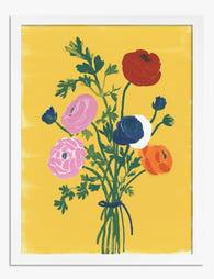
Poster Farbenfroher Wildblumenstrauß
Translation missing: de.products.product.sale_price Ab £11.95£19.95 -
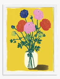
Poster Kraftvoller Ranunkelstrauß
Translation missing: de.products.product.sale_price Ab £11.95£19.95 -

Painterly Bouquet in Orange Jug Art Print
Translation missing: de.products.product.sale_price Ab £19.95£34.95 -

Poster zarter Blumenstrauß auf Terrakotta
Translation missing: de.products.product.sale_price Ab £11.95£19.95 -

Painted Bouquet in Blue Vase Canvas Print
Translation missing: de.products.product.sale_price Ab £49.95£74.95 -

Poster Strahlender Tulpenstrauß
Translation missing: de.products.product.sale_price Ab £11.95£19.95 -

Poster Blumenstrauß in gemütlicher Leseecke
Translation missing: de.products.product.sale_price Ab £11.95£19.95 -

Poster Ausdrucksstarker Blumenstrauß
Translation missing: de.products.product.sale_price Ab £11.95£19.95 -

Leinwandbild Kräftige Ranunkeln auf sonnigem Gelb
Translation missing: de.products.product.sale_price Ab £49.95£74.95 -

Painterly Bouquet in Orange Jug Canvas Print
Translation missing: de.products.product.sale_price Ab £59.95£119.95 -

Leinwandbild Ranunkelstrauß vor gelbem Hintergrund
Translation missing: de.products.product.sale_price Ab £49.95£74.95 -

Leinwandbild Bunte Pinselstrich-Blüte
Translation missing: de.products.product.sale_price Ab £49.95£74.95 -

Leinwandbild moderne Boho-Blütenpracht
Translation missing: de.products.product.sale_price Ab £49.95£74.95 -

Pink Bouquet Still Life Art Print
Translation missing: de.products.product.sale_price Ab £19.95£34.95 -

Leinwandbild Zarte Blütenzweige in Pfirsichton
Translation missing: de.products.product.sale_price Ab £49.95£74.95 -

Bouquet in a Spotted Vase Art Print
Translation missing: de.products.product.sale_price Ab £11.95£19.95 -

Poster Frühlingsblüten am Fenster
Translation missing: de.products.product.sale_price Ab £11.95£19.95 -

Leinwandbild Gemütliche Leseecke mit Blumenstrauß
Translation missing: de.products.product.sale_price Ab £49.95£74.95


Mehr aus The Frame

William Morris Animal Designs: The Complete Sto...
Animals in William Morris's original work: what he actually designed William Morris designed a surprising number of animals, but not the ones most people assume. His original wallpapers, textiles and...

Why Vintage Fish Prints Work in Modern Homes Wh...
Vintage fish prints have quietly become one of the most useful things you can put on a wall. Not because they're trendy, but because their scientific origins make them work...

Every Bird in William Morris's Designs: The Sto...
Why birds obsessed William Morris more than any other motif Morris designed acanthus leaves, willow boughs, strawberries, tulips and pomegranates, but he kept coming back to birds. Between the 1870s...