Whimsical vs Realistic Tree Art: Which Style Actually Suits Your Home?
A practical guide to picking between playful and botanically accurate tree prints, with room pairings and mixing rules that actually work.

Tree art is one of the most versatile categories of wall art, but the gap between styles is huge. A stylised oak with lilac leaves and a botanically accurate woodland photograph belong to entirely different design languages. This guide helps you work out which one belongs on your wall.
Defining whimsical tree art vs realistic tree art
Whimsical tree art is intentionally playful. Proportions are exaggerated, colours are imagined rather than observed, and the artist's hand is visible in every line. Think pink canopies, spiral trunks, trees that look slightly cartoonish or dreamlike. The goal is mood and personality, not accuracy.
Realistic tree art aims for fidelity. Whether it's a photograph, a detailed painting, or a precise illustration, the work tries to represent the tree as it actually exists in nature. Bark looks like bark. Light falls correctly. Greens are the greens you'd see on a walk through Hampstead Heath.
Between these two poles sits a wide middle ground: semi-stylised botanical illustrations, loose watercolours, minimal line drawings. Most prints lean one way or the other, and once you can spot the cues, you'll classify any print in about three seconds.

The visual differences: what to look for at a glance
When you're scanning a product page, these are the cues that tell you which camp a print sits in.
Whimsical tells
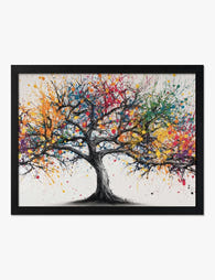
- Unnatural colours. Purple bark, blue leaves, gold trunks. Any colour that wouldn't survive a botany exam.
- Exaggerated shapes. Trunks that curl, branches that loop back on themselves, canopies shaped like clouds or hearts.
- Visible brushwork or hand-drawn lines. Wobbles, uneven edges, ink bleeds.
- Flat or simplified backgrounds. Solid colour fields, geometric shapes, no detailed landscape.
- Off-kilter proportions. Trees that are too tall for their trunks, or oddly chunky, or floating above the ground.
Realistic tells
- Natural colour palette. Greens, browns, ochres, the muted greys of winter branches.
- Accurate branching. Branches taper as they split, twigs get thinner the further they go from the trunk.
- Detailed texture. You can see bark grain, individual leaves, dappled light.
- Atmospheric depth. Foreground, midground, background. Sky behaves like sky.
- Correct light logic. Shadows fall consistently from one source.
If a print has three or more whimsical tells, it's whimsical. Three or more realistic tells, realistic. If it's split, you've found a hybrid, which is its own useful category.
When whimsical works better (and when it doesn't)
Whimsical tree art does heavy lifting in spaces that need warming up, lightening, or injecting with personality. It works particularly well in:
- Children's bedrooms and playrooms, where literal accuracy isn't the point and bold colour earns its keep.
- Creative studios and home offices, where you want visual interest without the seriousness of a landscape photograph.
- Eclectic interiors that already mix patterns, periods, and textures. Whimsical art slots in without trying to compete.
- Small spaces that need a focal point with personality. A stylised tree can do this without overwhelming a room the way a dense forest photograph might.
- North-facing rooms that get cool, flat light. Imaginary colour palettes warm things up.
It doesn't work in formal spaces. A whimsical pink tree above a Chesterfield in a panelled study will fight the room. It also doesn't suit spa-like bedrooms designed for calm, where the visual chatter of a stylised piece becomes noise. And it can feel out of place in heritage homes with ornate cornicing or Victorian fireplaces, where the architecture is already doing the decorative work.
The honest trade-off with whimsical art is trend exposure. Some stylised work dates faster than realistic work because bold colour choices and illustration styles cycle in and out of fashion. The way around this is to pick pieces with strong composition rather than purely trendy palettes. A well-drawn whimsical tree with restrained colour will outlast a hyper-saturated one.
You can browse a curated edit of whimsical tree art prints if you want to see how the visual cues above translate across different artists.
How Da Vinci's tree-drawing rules shaped realistic art traditions
Leonardo da Vinci wrote one of the most quoted observations in botanical art: the combined thickness of all the branches at any given height equals the thickness of the trunk below them. Cut a tree at any level, add up the cross-sections of every branch above that cut, and you get the same area as the trunk.
This sounds nerdy until you start looking at tree art. Realistic prints follow this rule almost without exception. Branches taper logically. The eye reads the tree as believable because the proportions match what we unconsciously expect from real trees.
Whimsical art breaks this rule on purpose. A trunk might stay thick all the way up. Branches might be the same width as the trunk. Canopies might balloon out from a stem too thin to support them. The break is what makes the image feel playful, dreamlike, or stylised. Your brain registers "tree" but also registers "not quite right," and that tension is the whole point.
Use this as a diagnostic. If the branches taper correctly and the proportions feel grounded, you're looking at realistic work. If they don't, the artist is deliberately working in a whimsical art style and the deviation is the design.

Rooms where each style shines: practical pairings
Living rooms
Realistic tree art tends to anchor a living room. A large landscape print of a misty forest or a single mature oak gives the room a focal point and a sense of place. Pair with natural wood furniture, linen upholstery in oatmeal or stone, and unfussy ceramics.
Whimsical tree art works in living rooms with more colour and pattern already in play. If you've got a mustard sofa, a patterned rug, and a few vintage finds, a stylised tree print pulls the whole thing together.
Bedrooms
Realistic wins in most bedrooms. The detail and natural palette read as calming, especially in larger sizes hung above the bed. A 70x100cm framed print of a quiet woodland creates the effect of a window onto nature.
Whimsical can work brilliantly in bedrooms that lean playful or romantic. A loose, illustrative tree with hand-drawn lines suits a bedroom with vintage textiles, brass details, and warmer colour. Avoid whimsical in minimalist white bedrooms designed for sleep, where it tends to feel busy.
Kitchens and dining rooms
Both styles can work, but the room's formality decides. A formal dining room with a polished table suits realistic botanical or landscape work. A kitchen-diner with open shelving and mismatched chairs suits whimsical.
Home offices
Whimsical art genuinely improves home offices. The unexpected colour and playful shapes break up Zoom-call monotony and add personality to a space that often defaults to grey and beige. Realistic work can feel too serious in a room you already spend eight hours a day in.
Kids' rooms and nurseries
Whimsical, almost always. But pick prints with longevity. A loose, painterly tree with a confident composition will outlast cartoonish work as your child gets older. You can stretch the budget further by choosing pieces that will still look right in a teenager's room.
Bathrooms and hallways
Hallways are where you can take risks with whimsical work because you're moving through the space rather than dwelling in it. Bathrooms suit smaller realistic botanical prints, which read as serene. Canvas prints work particularly well in humid rooms because they're less prone to issues than glazed framed pieces.
Can you mix whimsical and realistic prints on one wall?
Yes, but with a structure. Mixing styles randomly produces visual chaos. Mixing them with a rule produces a gallery wall that looks considered.
The 70/30 anchor rule
Pick one style as your anchor and let it occupy roughly 70% of the wall. The other style provides accents in the remaining 30%. So a gallery wall of five prints might be three realistic woodland scenes and two stylised pieces, or four whimsical trees and one realistic anchor that grounds the group.
Unify with frame and palette
If you're mixing styles, do not also mix frame finishes. Pick one frame colour (natural oak, black, or white) and stick to it across every piece. Then look for a shared colour thread running through the prints, even a subtle one. A muted green that appears in both a realistic forest photograph and a stylised tree illustration is enough to make the wall read as intentional.
Use realistic as the anchor for formal spaces, whimsical for casual
In a living room with traditional architecture, your largest piece should be realistic and your accents whimsical. In a child's room or creative studio, flip it. The anchor sets the room's tone.
Avoid the middle ground
The one combination that doesn't work is mixing equal amounts of both styles with no clear hierarchy. Three realistic and three whimsical prints, all the same size, in a symmetrical grid, looks like you couldn't decide. Always favour one.
For broader inspiration on building a botanical wall, our botanical art prints collection has both anchor pieces and accents that work together.

How print quality affects both styles differently
This is the bit nobody talks about, and it matters more than you'd think.
Whimsical art is forgiving
Stylised prints can survive lower print quality because the loose lines, flat colour fields, and intentional imperfection mean small flaws don't register. A slight banding in a solid colour or a less-than-sharp edge reads as part of the illustration's character. This is partly why so many cheap prints lean whimsical: the style hides the production.
But "forgiving" is not the same as "doesn't matter." Even whimsical work suffers from poor printing. Faded blocks of colour, muddy blacks, and warped paper look bad regardless of style. The improvement when you move to museum-grade giclée on thick matte paper is obvious: colours are dense and even, blacks are properly black, and the surface sits flat in the frame.
Realistic art is unforgiving
Detailed, photographic, or botanically accurate work demands high-resolution printing. The whole appeal is the texture of bark, the light through leaves, the subtle gradient of a misty sky. If the print is low resolution, those details turn to mush. If the paper is glossy or thin, glare flattens the image and the depth disappears.
Realistic tree art is where matte paper with no glare really earns its place. A glossy finish on a detailed forest photograph reflects every lamp and window in the room and you lose the image. Matte paper holds the detail and lets you see the print from any angle.
UV-protective acrylic glazing helps too, particularly if the print will sit on a wall that catches direct light. It stops the colours fading and avoids the dangerous weight of glass on a large frame.
Framing affects each style differently
Whimsical art often looks best either unframed (as a canvas) or in a thin, simple frame that doesn't compete with the playful image. A heavy ornate frame around a stylised tree creates tension that rarely works.
Realistic art can carry more frame. A wide white mount and a substantial wood frame around a forest photograph reads as gallery-considered. Solid wood frames with no MDF or veneer make a visible difference here because the depth and weight of the moulding feel right against detailed work.
If you're choosing between framed and canvas, canvas suits whimsical work particularly well because the texture of the canvas weave adds to the handmade feel. Canvas also works in larger sizes, up to 100x150cm, which suits whimsical pieces that benefit from scale. Realistic detailed work tends to look more polished as a framed print on matte paper.
Browse the wider landscape art prints and nature art prints collections to compare how the same scene reads on canvas versus framed paper.

Quick diagnostic: which style is right for your space?
Run through these questions. They take about thirty seconds and the answer is usually clear.
- Does your room have ornate cornicing, panelling, or traditional architecture? Lean realistic.
- Is your palette mostly neutral with natural materials? Realistic anchors well.
- Do you already have bold colour, pattern, or vintage finds in the room? Whimsical fits in.
- Is the room for work, sleep, or quiet reading? Realistic.
- Is the room for play, creativity, or socialising? Whimsical.
- Are you trying to add personality to a beige rental? Whimsical, in a smaller framed size you can take with you.
- Are you furnishing a forever room with pieces meant to last decades? Realistic, in the largest size the wall can carry.
The honest answer for most homes is that you don't have to pick one forever. Your living room can be realistic and your kitchen can be whimsical. The decision is per-room, per-wall, per-mood. Get the cues right and the print quality right, and either style will hold its own.

In diesem Blog vorgestellte Fab-Produkte
-

Poster Verspielte Waldlandschaft in Erdgrün und Ocker
Translation missing: de.products.product.sale_price Ab £11.95£19.95 -

Leinwandbild Verspielter Waldspaziergang
Translation missing: de.products.product.sale_price Ab £44.95£74.95 -

Poster Märchenwald – Hohe Bäume in Orange und Blau
Translation missing: de.products.product.sale_price Ab £11.95£19.95 -

Poster Verspielte Waldszene mit Tieren und Kindern – fürs Kinderzimmer
Translation missing: de.products.product.sale_price Ab £11.95£19.95 -

Poster Verspielter Waldspaziergang in Grau und Gelb
Translation missing: de.products.product.sale_price Ab £11.95£19.95 -

Poster Bunter Waldweg mit blauen Bäumen
Translation missing: de.products.product.sale_price Ab £11.95£19.95 -

Poster Farbenprächtiger Baum des Lebens
Translation missing: de.products.product.sale_price Ab £11.95£19.95 -

Leinwandbild Waldspaziergang mit Gefährten
Translation missing: de.products.product.sale_price Ab £44.95£74.95 -

Poster botanische Verspieltheit in Pastelltönen
Translation missing: de.products.product.sale_price Ab £11.95£19.95 -

Poster Blauer Baum in Aquarell
Translation missing: de.products.product.sale_price Ab £11.95£19.95 -

Leinwandbild festlicher Weihnachtsbaum in Aquarell
Translation missing: de.products.product.sale_price Ab £44.95£74.95 -

Leinwandbild Verspielte Waldtiere
Translation missing: de.products.product.sale_price Ab £44.95£74.95 -

Leinwandbild verspielte Zusammenkunft
Translation missing: de.products.product.sale_price Ab £44.95£74.95 -

Leinwandbild Verspielter Tag im Zoo
Translation missing: de.products.product.sale_price Ab £44.95£74.95 -

Poster Ruhiges blaues Blätterdach
Translation missing: de.products.product.sale_price Ab £11.95£19.95 -

Poster Farbenfroher abstrakter Baum mit Farbspritzern
Translation missing: de.products.product.sale_price Ab £11.95£19.95 -
Poster abstrakter bunter Baum aus Farbspritzern
Translation missing: de.products.product.sale_price Ab £11.95£19.95 -

Poster Festlicher Aquarell-Weihnachtsbaum
Translation missing: de.products.product.sale_price Ab £11.95£19.95 -

Poster Ruhiger Waldspaziergang in Aquarell
Translation missing: de.products.product.sale_price Ab £13.99£19.99 -

Leinwandbild Abstraktes Grün mit Pastelltönen
Translation missing: de.products.product.sale_price Ab £44.95£74.95


Mehr aus The Frame

Kids' Room Art: Playful Without Childish
Most kids' room art falls into two camps: aggressively cute (rainbows, cartoon animals, alphabet posters) or weirdly adult (minimal black and white prints that could hang in a dentist's office)....

Nursery Art That Grows with the Room
Most nursery art gets retired by the time the cot comes down. That's a waste of money, wall space and the chance to build something genuinely meaningful. This guide is...

Office and Study: Art That Helps You Focus or A...
The art you hang in a workspace isn't neutral decoration. It either supports the kind of thinking you do at your desk, or it quietly works against it. The trick...