


 Heute bestellen, Lieferung bis
 Abstrakter Himmel: Poster & Wandbilder
Der Himmel als Farbe statt als Kulisse: verfließende Dämmerung, dramatisches Sturmlicht, zarte Verläufe in Rosa, Grau und Gold – zuerst Stimmung, dann Motiv. Manche Werke bleiben fast leer, andere bauen spürliches Gewicht und Struktur auf. Wenn du eine klare Linie bevorzugst, sind die Horizont-Poster geerdeter, Küsten-Sonnenuntergang-Poster bringen wärmere Töne, und abstrakte Landschafts-Poster holen die gleiche Lockerheit wieder auf den Boden.


Poster Strandsonnenschirm in Blockstreifen

Poster Pastellgrüne Felder

Poster Ruhige Küstenlinie – Abstrakt

Poster Grauer Nachthimmel mit Sternen

Poster Sanfter Wolkenhimmel in Rosa und Blau

Poster Sanfte Blautöne

Poster Aquarellverlauf in sanftem Himmelblau

Poster Pastellfarbenes Risographie-Raster
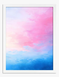
Poster Zartrosa Horizont

Poster Weicher Horizont in Grün und Creme

Poster Senfgelbe Sonne über blauer Wiese

Poster Grüne Wiese, Blauer Himmel
Weitere Fab Kunstkurationen



 Abstraktes Himmels-Poster wählen



Kurze Antworten zu Farbrichtung, Rahmung, Platzierung und dazu, was nach deiner Bestellung passiert