How to Build a Calming Gallery Wall That Actually Feels Peaceful
The counterintuitive rules for arranging multiple prints so your wall feels like a deep breath, not a busy inbox.

Most gallery walls promise serenity and deliver visual static. The fix isn't softer colours or gentler subjects, it's restraint, repetition, and a few specific measurements that almost nobody gets right. This is how to build one that actually feels like the calm room you had in mind.
Why most gallery walls feel stressful (and how calm ones differ)
The standard gallery wall, the one with twelve frames in mismatched finishes climbing up to the ceiling, is built for visual interest. Interest is not the same as calm. Interest pulls your eye around the room. Calm lets your eye rest.
Three things separate a peaceful arrangement from a chaotic one: fewer pieces, tighter colour discipline, and consistent framing. When you mix frame finishes, vary spacing, and squeeze in "just one more" print, you're adding what designers call visual noise. Your brain has to process every edge, every contrast, every transition. That processing is the opposite of relaxing.
Calm gallery walls do the opposite. They repeat. They breathe. They behave more like a single composition with parts than a collection of individual moments competing for attention.

The three-print rule: why fewer pieces create more impact
If you want serenity, cap your count at three to five prints. Three is the sweet spot. Five is the upper limit before you start working harder than the wall does.
Traditional gallery walls of seven to twelve pieces work in spaces designed for energy: hallways you walk through, kitchens, eclectic studies. They reward close inspection. A bedroom or lounge needs the opposite. You're going to spend hours in front of this wall, and your eye will trace it whether you mean to or not. Three pieces give your eye a clear path: left, middle, right. Done.
There's a useful exception. A single large print, say 70x100cm or a 100x150cm canvas, often reads calmer than three medium ones. If your wall is narrow, your furniture is low-slung, or you already feel decision fatigue setting in, one big piece is the most peaceful answer of all. Our calm and serene art prints collection is a good place to start when you're leaning toward a single statement.
For everyone else, three it is.
When to push to five
Five works if you're hanging above a long sofa (220cm or wider), if your ceilings are over 2.7 metres, or if you're committing to a tight grid where the pieces read as a single block rather than five separate decisions.
Choosing a cohesive colour thread across multiple prints
Colour is the single biggest factor in whether your wall feels calm. Subject matter matters less than people think. Three abstract prints in clashing palettes will feel busier than three wildly different subjects united by the same muted blue.
Cool tones do most of the heavy lifting here. Soft greys, sage and eucalyptus greens, dusty blues, and pale stone tones all read as restful. Warm tones (terracotta, mustard, deep red) raise the visual temperature of a room. They're not banned, they just work harder for energy than for stillness.
The most reliable approach is a 60-30-10 split across your three prints. Sixty percent of the visible colour should be your dominant calm tone (say, soft blue-grey). Thirty percent is a supporting neutral (warm white, oatmeal, pale sand). Ten percent is an accent that appears in at least two of the three prints to tie them together (a single charcoal, a thread of muted ochre).
If you fall in love with a print that doesn't fit your palette, don't force it onto a calm wall. Hang it somewhere else. The point of a serene gallery wall is that every piece earns its place by serving the mood.

Layout templates that work: horizontal rows, asymmetric pairs, and diptychs
Forget the salon-style arrangement with prints scattered at varied heights. For calm, you want geometry your eye can predict.
The horizontal row
Three prints of identical size, hung at the same height, evenly spaced. This is the most peaceful layout in existence. It works above sofas, beds, sideboards, and console tables. Use it when in doubt. Match all three to the same orientation (all portrait or all landscape) and the effect is immediate.
The diptych
Two prints, equally sized, hung side by side with consistent spacing. Diptychs work beautifully above beds and in narrow spaces between windows. They feel deliberate and quiet. A diptych made from a pair of related landscapes, sunrise and dusk over the same horizon, for example, creates depth without complication.
The asymmetric pair
One large print paired with one smaller print, aligned along a single axis (usually the bottom edge or the centre line). This is the only "asymmetric" layout that stays calm, because the alignment itself does the visual work. It suits awkward walls and corners.
The tight grid
Four prints in a 2x2 grid, or six in a 2x3, with minimal spacing. Grids feel orderly almost by default. The trick is keeping spacing tight (5cm or less between frames) so the grid reads as one block.
Quick decision framework
Sofa wider than 200cm: horizontal row of three. Bed wall: diptych or horizontal row. Narrow wall under 120cm: single large piece. Square wall above a sideboard: 2x2 grid. Awkward shape: asymmetric pair.
Browse wall art sets if you'd rather start with pieces designed to hang together. The colour and tonal work is already done.
Frame finish matters: why matching frames keep things serene
This is the rule almost everyone breaks. Mixing frame finishes (one black, one oak, one white) immediately doubles the visual complexity of your wall. Your eye now has to process not just three images but three frames, three materials, three transitions to the wall behind.
Pick one finish and commit. Three options work for calm interiors:
- Black frames for definition and contrast. Best in rooms with white or pale walls and modern furniture.
- Natural oak for warmth and softness. Best in spaces with wood floors, linen textiles, and a Scandi-leaning palette.
- White frames for the quietest possible look. Best in already-busy rooms where the art needs to recede into the wall.
Avoid mixing metals (gold and silver in the same arrangement) and avoid combining ornate frames with minimal ones. Whatever you choose, make sure it's the same across every piece on the wall.
A practical note on frame quality: cheap frames often arrive warped, with prints poorly fitted or shipped separately from the frame. That's how a calm wall becomes a weekend project. Our framed prints arrive ready to hang with the print already fitted, fixtures attached, in solid FSC-certified wood with UV-protective acrylic glaze instead of glass. The acrylic also means no glare, which matters when you're trying to actually see the art from across the room.
Spacing and alignment: the measurements that actually work
Vague advice ("space them evenly") is why so many gallery walls drift into chaos. Use these numbers instead.
Spacing between frames: 5 to 8cm. Closer than 5cm and the frames start to merge visually. Wider than 8cm and the arrangement loses cohesion, reading as separate pieces rather than a single composition.
Centre height: 145 to 150cm from the floor to the centre of your arrangement. This is roughly eye level for an average adult standing, and it's the height used in galleries and museums. If you're hanging above a sofa or sideboard, drop the bottom edge of the frames to 15 to 20cm above the furniture instead.
Width relative to furniture: Your arrangement should span roughly two-thirds of the width of the furniture below it. A 240cm sofa wants an arrangement around 160cm wide. Wider feels overwhelming, narrower looks like the art is floating untethered.
Alignment: For horizontal rows, align the centres of all frames. For asymmetric pairs, align bottom edges or centres, not tops (top alignment looks accidental). For grids, align everything (top, bottom, sides) and keep spacing identical in every direction.

Mixing subjects without breaking the mood
You don't need three identical prints to create cohesion. You need three prints that share a visual language. The colour thread does most of the unifying work, but you can mix subjects if you follow a few principles.
Mix abstract with nature. A soft abstract in dusty blue alongside a misty coastal landscape and a minimal botanical study can read as one calm idea, as long as the palette holds. The abstract gives the wall depth, the landscape gives it space, the botanical gives it stillness.
Mix black and white with colour, carefully. This works only if the colour pieces are extremely muted. A high-contrast black and white photograph next to a vivid sunset will fight. Next to a pale, washed-out coastal scene, it will sing.
Stay in one register of "loudness." Every print on the wall should be quiet at roughly the same volume. One detailed, busy print among two minimal ones will dominate and break the mood.
Nature imagery deserves a special mention. There's strong professional consensus, supported by research in environmental psychology, that exposure to natural scenes lowers stress responses. Soft landscape art prints, botanical studies, and water imagery (mist, sea, lakes) reliably create the physiological calm you're after. If in doubt, lean toward nature.
For abstracts, look for pieces with soft edges, low contrast, and limited palettes. Hard-edged geometric work in primary colours is wonderful, but it's not what you want here. The abstract art prints that work for calm walls are the quietest ones, often resembling watercolour washes or weathered surfaces.
Step-by-step: hanging your calm gallery wall
Here's the actual process, in the order that will save you the most time and wall plaster.
1. Lay everything out on the floor first. Arrange your prints on a stretch of floor or a bed before you touch the wall. Live with the arrangement for at least an hour. Calm walls reveal themselves slowly. If something feels off after an hour, it will feel worse on the wall.
2. Measure your wall and mark the centre. Use a pencil to mark the horizontal centre of the space the arrangement will occupy. For a sofa wall, the arrangement centres on the sofa, not the wall.
3. Cut paper templates. Trace each frame onto kraft paper or newspaper, cut out, and tape the templates to the wall using painter's tape. Step back ten feet. Adjust until the spacing and height feel right.
4. Use a spirit level. Eyeballing alignment is how walls go wrong. A small spirit level (or the one on your phone, if you must) will save you. Mark hanging points through the paper templates, then remove them.
5. Hang the centre piece first. For three prints in a row, hang the middle one. For diptychs, start with the left. Use the centre as your anchor and work outward, measuring spacing each time.
6. Step back between every piece. Don't hang all three then assess. Hang one, walk away, come back, then hang the next.
7. Live with it for a week before judging. New arrangements always look slightly off for a few days while your eye adjusts. Resist the urge to rearrange immediately.
Rescuing an existing chaotic wall
If you already have a busy gallery wall and want to calm it down: take everything off, remove at least half the pieces, regroup the survivors by colour palette, and rehang only the ones that share a thread. The pieces you remove aren't failures, they just belong in different rooms.

A final thought
A calm gallery wall is mostly about what you leave out. Fewer prints, one frame finish, one colour thread, predictable spacing. The discipline is the design. Once you have that scaffolding in place, the art itself can do the quiet work it's meant to do.

Fab products featured in this blog
-

Wrapped in Calm Art Print
Translation missing: en.products.product.sale_price From €16,95€23,95 -

Tree Pose Line Drawing Canvas Print
Translation missing: en.products.product.sale_price From €64,95€92,95 -

Yoga Flow Sketch Art Print
Translation missing: en.products.product.sale_price From €16,95€23,95 -

Seated Woman in a Sunhat Canvas Print
Translation missing: en.products.product.sale_price From €64,95€92,95 -

Serene Blue Waves Art Print
Translation missing: en.products.product.sale_price From €16,95€23,95 -

Tranquil Woodland Stroll Canvas Print
Translation missing: en.products.product.sale_price From €64,95€92,95 -

Soft Coast in Blue Canvas Print
Translation missing: en.products.product.sale_price From €64,95€92,95 -

Wrapped in Calm Canvas Print
Translation missing: en.products.product.sale_price From €64,95€92,95 -

Tranquil Woodland Stroll Art Print
Translation missing: en.products.product.sale_price From €16,95€23,95 -

Serene Line-Up Art Print
Translation missing: en.products.product.sale_price From €16,95€23,95 -

Misty Coastal Calm Art Print
Translation missing: en.products.product.sale_price From €16,95€23,95 -

Blue Canopy Tree Art Print
Translation missing: en.products.product.sale_price From €16,95€23,95 -

Seated Woman in a Sunhat Art Print
Translation missing: en.products.product.sale_price From €16,95€23,95 -

Tranquil Coastal Waves Canvas Print
Translation missing: en.products.product.sale_price From €64,95€92,95 -

Neutral Flow Art Print
Translation missing: en.products.product.sale_price From €16,95€23,95 -

Zen Flow Tree Pose Line Art Canvas Print
Translation missing: en.products.product.sale_price From €64,95€92,95 -
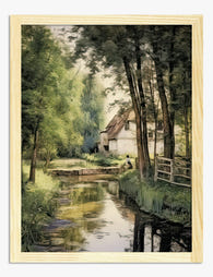
Cottage by the Mill Stream Art Print
Translation missing: en.products.product.sale_price From €16,95€23,95


More from The Frame

What Colours Go With Bouquet Prints? Pairings I...
You've found a bouquet print you love. Now you need to know if it will actually work above your sofa, opposite that mustard armchair, next to the curtains you spent...

Boho Sun Wall Art: How to Nail the Look Without...
Boho sun art has a reputation problem. Done badly, it screams student halls and macramé overload. Done well, it's one of the warmest, most grounding aesthetics you can put on...

Every Animal in William Morris's Designs: The C...
Most people know the thrush in Strawberry Thief and stop there. But Morris's wider body of work contains foxes, hares, peacocks, ravens, lions, herons, woodpeckers, deer, and doves, often half-buried...