How to Build a Gallery Wall Around Flamingo Prints (Without It Looking Chaotic)
A step-by-step formula for styling flamingo prints in a gallery wall that looks considered, not kitsch.

Flamingo prints are having a moment. The trouble is, most people buy one, hang it alone, and then freeze when it comes to building anything around it. This guide solves that with specific subject pairings, layout templates, and the frame and size formulas that keep a flamingo wall feeling elegant rather than tropical-themed-restaurant.
Start with your anchor: choosing the right large flamingo print
Every gallery wall needs an anchor, and on a flamingo wall it has to be the flamingo itself. Go big. A 70x100cm print as your centrepiece sets the tone and gives every smaller print around it a reason to exist. Anything smaller and the bird gets lost the moment you add botanicals or abstracts beside it.
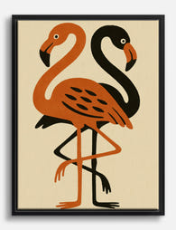
Style matters as much as size. Photographic flamingos (think a single bird against a soft, neutral background) read most sophisticated. Watercolour and ink illustrations work too if the linework is restrained. What we'd avoid as your anchor: overly graphic pop-art flamingos in fluorescent pink, or cartoon styles. They commit you to a kitsch direction the rest of the wall can't recover from.
Pay attention to the pink. The most versatile flamingo prints feature dusty, coral, or salmon tones rather than hot pink. Muted pinks sit happily alongside botanical greens, warm neutrals, and terracottas. Saturated pinks demand the rest of the room match their energy, which is a much harder room to decorate.
Browse flamingo art prints with photography or fine illustration in mind, and shortlist three before committing. The anchor decides everything that follows.

Subjects that pair beautifully with flamingos
The job of every other print on the wall is to support the flamingo without competing with it. Three categories do this reliably.
Tropical botanicals
Monstera leaves, banana palms, fan palms, bird of paradise. Botanicals work because they share the flamingo's natural habitat without repeating its shape or colour. Greens calm the pink, leafy textures break up smooth photographic backgrounds, and the scale of large foliage feels grown-up rather than themed.
Stick to one or two leaf types across your wall. A monstera and a palm is plenty. Three or more different leaves starts to look like a garden centre. Browse tropical art prints and botanical art prints and pick botanicals where the green is rich and the background is clean (white, off-white, or soft sand).
Abstract watercolours in complementary tones
Abstracts give your eye a place to rest. Soft watercolour washes in coral, blush, terracotta, or sage pull the flamingo's pink into the wider composition without shouting. The trick is keeping them quiet. Loose washes, two or three colours maximum, no hard graphic shapes.
Abstracts also let you work in accent colours that sharpen the whole wall: a hint of mustard, a stroke of charcoal, a wash of dusty blue. These are the details that lift a flamingo wall out of "tropical" and into "considered."
Other elegant birds and coastal scenes
Heron, crane, egret, or ibis prints sit naturally next to flamingos because they share the long-legged elegance without duplicating it. Audubon-style botanical bird illustrations are particularly good if your flamingo is photographic, because the contrast in medium adds depth. Coastal scenes (a calm horizon, a quiet beach, soft dunes) work for the same reason: shared environment, different visual texture.
Subjects that clash, and why to trust us on this
Some pairings undo a flamingo wall faster than you'd think.
Other pink-heavy subjects. Pink peonies, pink sunsets, pink abstract florals. Two pink focal points fight each other. The flamingo should be the pinkest thing on the wall.
Cartoon or pop-art anything. Even one graphic, bold-outlined print drags the rest of the wall down to its level.
Black and white street photography or moody portraits. The tonal contrast is too aggressive. Your flamingo will look like it wandered in from a different mood board.
Heavy text prints and motivational quotes. Typography prints rarely sit well with photographic or illustrative subjects. They flatten the composition.
Animals from completely different climates. A stag, a Highland cow, an Arctic fox. The mismatch in habitat is jarring even if the colours technically work.
If a print makes you hesitate, leave it out. The wall is stronger with four confident choices than five with a question mark.
Frame consistency vs. eclectic mix: our recommendation for flamingo walls
For a flamingo wall specifically, we'd always go with frame consistency. Here's why: the subject matter is already doing a lot of work. The pink, the long legs, the tropical association, all of it asks the eye to slow down. Mixed frames add another variable, and a flamingo wall doesn't need more variables.
Pick one frame finish and use it across all five prints. Our recommendations, in order:
- Natural oak. The most flattering frame for flamingo prints. Warm wood softens the pink, grounds the composition, and reads modern without being cold.
- White. Best in lighter rooms with white or off-white walls. Disappears into the background and lets the prints carry the weight.
- Black. Sharp and graphic. Works beautifully if your flamingo is high-contrast photography, but can feel heavy with watercolour styles.
- Gold or brass. Use sparingly. Beautiful in formal rooms but tips quickly into Art Deco territory, which is its own aesthetic.
Whichever you pick, all five frames should match. This is the single biggest move that separates a sophisticated flamingo wall from a chaotic one.
A note on the frames themselves: the failure mode in this category is poor framing (warped mounts, prints that bubble, frames that ship separately and never quite line up). Our framed prints arrive ready to hang in one box, fitted properly, in solid FSC-certified wood with UV-protective acrylic glaze rather than glass. That last detail matters for a flamingo wall, because pink pigments fade fastest in direct light.

The layout: a 5-print arrangement that works on any wall
This is the formula. Five prints, three sizes, one anchor.
Centre: 1 x 70x100cm flamingo print (portrait orientation), hung as the anchor.
Flanking the anchor: 2 x 50x70cm prints (one each side), portrait orientation. These should be your tropical botanicals. Monstera on the left, palm on the right, or whichever pairing balances visually.
Below, sitting under the botanicals: 2 x 30x40cm prints, landscape or portrait depending on the wall, positioned beneath each botanical. These are your abstracts or smaller bird prints.
The result is a loose grid that reads as one composition. The flamingo dominates, the botanicals support, the abstracts ground the bottom edge.
Spacing: leave 5-7cm between each frame. Tighter than that and the wall feels cramped. Wider and the prints stop reading as a group.
This layout works above a sofa, behind a bed, on a long hallway wall, or in a dining room. It scales: if your wall is smaller, drop everything by one size (50x70 anchor, 40x50 botanicals, 21x30 abstracts) and keep the proportions. If you're nervous about choosing five prints individually, pre-curated wall art sets are an easier starting point.
Size guide: mixing 30x40, 50x70 and 70x100 prints in one wall
Mixing sizes is what stops a gallery wall looking like a sticker chart. The rule is straightforward: one big, two medium, two small. Never two prints the same size sitting directly next to each other unless they're a deliberate pair flanking the anchor.
Why these specific sizes? They scale in a way the eye reads as intentional. 30x40, 50x70, and 70x100 each step up by a clear margin. If you mix 30x40 with 40x50 and 50x70, the differences are too small to feel deliberate, and the wall looks like a slightly-wrong grid.
A few sizing principles worth keeping:
- The anchor should be at least twice the area of the smallest print. 70x100 next to 30x40 gives you that ratio.
- Heavier subjects (photographic flamingos, dense botanicals) belong in larger frames. Lighter subjects (loose watercolours, simple line drawings) sit better small.
- Landscape prints are useful at the bottom of an arrangement to give the composition a base. Portrait prints work better at the top and sides.
If you're working with a wider wall and want to scale up, swap the 30x40s for 50x70 landscape prints and add a sixth print above the anchor. The same logic applies: one anchor, two flankers, supporting prints below.

Hanging tips that actually work
Most gallery walls go wrong not in the curation but in the hanging. Here's what actually saves you.
Plan on the floor first
Lay all five prints out on the floor in front of the wall, exactly as you want them on it. Move them around for ten minutes. Take a photo on your phone. Look at the photo. You will spot imbalances on a screen that you missed in person.
Use paper templates
Cut newspaper or kraft paper to the exact size of each frame. Tape the templates to the wall with masking tape in your planned arrangement. Live with it for a day. Adjust. This is the single biggest reason gallery walls succeed or fail, and it costs nothing.
Get the centre right
The middle of your anchor print should sit at roughly 145-150cm from the floor, which is gallery standard eye level. Above a sofa or bed, leave 15-20cm between the top of the furniture and the bottom of the lowest print.
Spacing, properly measured
Mark a 5-7cm gap between every frame using a ruler, not your eye. Eyes are bad at this. Use a pencil mark on the wall, light enough to rub off later.
Level everything
A small spirit level (or the level app on your phone) on top of each frame, every time. Frames hung even slightly off level look much worse next to other frames than they do alone, and a five-print wall amplifies the problem.
Hanging fixtures
Framed prints should arrive with fixtures attached and ready to hang. If they don't, that's a sign the framing wasn't done properly. Ours come ready to mount straight from the box, which makes the difference between an afternoon project and a weekend of swearing.

A few last thoughts on keeping it sophisticated
Limit your pink saturation across the whole wall. The flamingo can be the pinkest thing in the room, but the abstracts and botanicals around it should pull towards earth tones, soft greens, and warm neutrals. If three of your five prints contain pink, you've gone too far.
Photography reads more grown-up than illustration on a flamingo wall, but mixing one watercolour into a photographic set adds welcome softness. Avoid mixing four different mediums; pick two and stick with them.
And if you're worried about the wall looking dated in two years, the answer is in the supporting prints. Botanicals and abstract watercolours have been hanging in well-decorated rooms for a century. The flamingo is the moment. The rest of the wall is the foundation that makes the moment last.

Fab products featured in this blog
-

Tropical Flamingo Vibes Canvas Print
Translation missing: en.products.product.sale_price From €65,95€92,95 -

Flamingo Dreams Canvas Print
Translation missing: en.products.product.sale_price From €65,95€92,95 -

Flamingo Dreamscape Canvas Print
Translation missing: en.products.product.sale_price From €65,95€92,95 -

William Morris Flamingo Exhibition Poster Canvas Print
Translation missing: en.products.product.sale_price From €65,95€92,95 -

Flamingo in Style Art Print
Translation missing: en.products.product.sale_price From €16,95€23,95 -

Beach Bonfire and Marshmallows Art Print
Translation missing: en.products.product.sale_price From €16,95€23,95 -

Sunny Flamingo Chic Art Print
Translation missing: en.products.product.sale_price From €16,95€23,95 -

Hammock Between Palms Art Print
Translation missing: en.products.product.sale_price From €16,95€23,95 -

Flamingo Preening Close-Up Art Print
Translation missing: en.products.product.sale_price From €16,95€23,95 -

Flamingo Cotton Prints Exhibition Poster Canvas Print
Translation missing: en.products.product.sale_price From €65,95€92,95 -
Two Flamingos Folk Illustration Canvas Print
Translation missing: en.products.product.sale_price From €65,95€92,95 -

Flamingo Summer Style Art Print
Translation missing: en.products.product.sale_price From €16,95€23,95 -

Flamingo in Style Canvas Print
Translation missing: en.products.product.sale_price From €65,95€92,95 -

Flamingo Cotton Prints Exhibition Canvas Print
Translation missing: en.products.product.sale_price From €65,95€92,95


More from The Frame

Thrushes, Hares, and Peacocks: The Animals in W...
Why Morris put animals at the centre of his designs William Morris wasn't decorating walls with cute creatures. He was making a quiet argument. While Victorian factories churned out cheap,...

From Dutch Masters to Modern Minimalism: The Ke...
Search "types of flower bouquet art" and you'll get wedding centrepieces, posy guides, and cascading bridal arrangements. Useful if you're getting married. Useless if you're trying to choose what goes...

Every Flower in William Morris's World: A Guide...
William Morris designed roughly 50 wallpapers and around 30 chintzes across his career, and almost every single one features a plant. If you've ever stood in front of a Morris...