Poster vs Art Print: What's Actually Different and Why It Matters
The honest buyer's guide to what £5 actually gets you, what £50 buys, and when each is the smart choice.

The terms "poster" and "art print" get used interchangeably by retailers who know exactly what they're doing. Behind the labels are real differences in paper, ink, longevity, and how the thing actually looks on your wall five years from now. Here's what separates them, and when each is worth your money.
The traditional poster: what you're actually getting for £5
A traditional poster is printed on thin paper, usually somewhere between 60 and 150 GSM (grams per square metre, the standard measure of paper weight). For context, the paper in a glossy magazine sits around 100 GSM. A proper art print starts at 200 GSM and often runs to 300 or 400.
That thinness matters. Thin paper curls at the edges, ripples when humidity changes, and shows every imperfection on the wall behind it. It also tears easily, which is why posters traditionally got tacked up with Blu Tack rather than framed.
The printing method is usually offset lithography or low-end digital printing using dye-based inks. Dye inks sit on top of the paper and produce bright, punchy colours, but they're not lightfast. UV exposure breaks them down within two to five years. You've seen it: the once-vibrant red poster in the cafe window now looks salmon pink.
None of this makes posters bad. It makes them a specific product designed for short-term display at a low price. Problems start when retailers blur the line and charge art print prices for poster-quality goods.

What makes a giclée art print different (paper, ink, detail)
Giclée (pronounced "zhee-clay") is a French-derived term for a specific kind of inkjet printing using archival pigment inks on heavyweight, acid-free paper. The word gets misused constantly, so let's be precise about what it should mean.
A real giclée print uses pigment-based inks rather than dye. Pigments are made of tiny solid particles that bond into the paper fibres, where dyes are liquid and sit on the surface. Pigment inks resist UV damage for decades, often a century or more under normal indoor conditions. They also produce a wider colour gamut and deeper blacks.
The paper is heavier and more textured. Museum-grade matte paper at 200-300 GSM has a slight tooth to it that catches light differently from glossy poster paper. It looks more like a watercolour or a drawing than a magazine page. Detail holds up close, which matters because you'll be standing right next to this thing every day.
Our art prints use exactly this process: museum-grade giclée on thick matte paper, water-based pigment inks, FSC-certified materials. The inks are rated to last hundreds of years even in direct sunlight. That's not marketing fluff, it's what archival pigment chemistry actually does.
If a retailer calls something "giclée" but it's printed on 150 GSM paper with no ink specification, treat that as a red flag. The term has no legal protection, so anyone can use it.
How printing quality affects colour and longevity over time
The visible difference between a poster and an art print isn't always obvious on day one. A bright, glossy poster can look more punchy than a matte art print under shop lighting. The gap shows up over months and years.
Three things happen to a cheap poster on a wall:
Fading. Dye inks lose intensity as UV light breaks down the colour molecules. Reds and yellows go first, then blues. Skin tones in photographic posters shift towards green or grey. By year three on a sunny wall, you've got a different image.
Yellowing. Acidic paper (which most poster paper is) yellows as it oxidises. The whites turn cream, then beige. Acid-free archival paper doesn't do this.
Surface damage. Thin paper marks easily. A fingerprint on glossy poster stock leaves a permanent mark. Steam from a kitchen or bathroom causes rippling that won't flatten out.
A pigment-ink giclée on archival paper sidesteps all of this. Our prints sit behind UV-protective acrylic glaze, which blocks the wavelengths that cause fading even in direct sunlight. Acrylic also weighs less than glass and won't shatter, which matters if you've got kids or live in a flat with thin walls.
The honest trade-off: matte archival paper doesn't have the wet-look gloss that suits certain bold graphic posters. If you want a high-shine finish for a film poster or a piece of pop art, a glossy poster might genuinely look better than a matte art print. Match the finish to the artwork, not the other way round.
Framing: where cheap posters fall apart (literally)
Framing is where the poster vs print difference goes from theoretical to obvious. Cheap paper doesn't sit flat behind glass. It curls, ripples, and bows, especially in rooms with any humidity variation.
Professional framers know this. Properly framing a poster means dry mounting it onto a rigid backing board, which costs £40-80 per piece at a UK framer. Add a frame and you're often spending more on framing than the poster cost in the first place. At that point the value equation has flipped.
Cheap pre-made frames cause their own problems. The MDF backing absorbs moisture, the plastic "glass" scratches and yellows, and the staples holding it together loosen. We've all opened a flat-pack frame and found the print has shifted sideways inside, or the cardboard backing has warped into a gentle curve.

The biggest disappointment in the wall art category is buying a print and a frame separately, then discovering they don't fit, the print isn't sized to standard frame dimensions, or the whole thing arrives bubbled and warped. Buying framed prints that ship pre-fitted in solid wood frames with the fixtures already attached cuts out every one of these failure points. The print sits flat because it's been mounted properly. The frame is solid FSC-certified wood rather than MDF or veneer. It arrives ready to hang.
That's the practical case for spending more, not because expensive things are inherently better, but because cheap framing is where most wall art goes wrong.
Side-by-side: what the same image looks like as a poster vs an art print
Imagine the same image printed twice: a moody landscape painting with deep greens, dusky purples, and a pale sky.
As a £5 poster on glossy 130 GSM paper, the colours look saturated and bright under shop lighting. Up close, you can see the printing dots that make up the image. The paper feels slick and slightly plasticky. The blacks aren't quite black, more a very dark navy. Move it to a sunlit wall and within six months the purples have started shifting towards brown.
As a £50 giclée art print on 250 GSM matte paper, the same image looks more muted at first glance. Stand closer and the difference inverts. The brushwork detail is visible. The paper has texture you can almost feel from a metre away. The blacks are properly black, the shadows have depth, and the colours sit into the paper rather than on top of it. Three years later, it looks identical to the day it arrived.
Neither is objectively "better". The poster suits a student bedroom, a temporary office, a teenage music phase. The art print suits a wall you actually look at every day for the next decade.
When a poster is fine and when it's worth upgrading
Posters are the right choice more often than premium retailers admit. Specifically:
Rentals and short-term living. If you're moving in a year, archival lifespan is irrelevant. Tack up posters, enjoy them, leave them behind.
Kids' rooms. A seven-year-old's dinosaur obsession will be a Pokemon obsession by Christmas. Buy posters, swap them out, don't fight it.
Trend-following decor. If you want the specific Instagram-aesthetic print that everyone has this year, you're not buying a forever piece. Buy cheap, replace when the look dates.
High-humidity rooms. Bathrooms and kitchens degrade any paper-based art. Use posters in these rooms because you'll need to replace them anyway. Better still, use canvas prints, which handle humidity far better than paper.
Testing layouts. Trying a gallery wall configuration? Print cheap posters first to see what works before committing to framed pieces.
When to upgrade to an art print:
- Living rooms, bedrooms, and hallways you'll keep for years
- Walls with significant sun exposure
- Larger sizes (anything above A2, where poster paper looks visibly cheap)
- Pieces with subtle colour or fine detail that needs proper paper to show
- Anywhere you want the room to feel finished rather than provisional
There's also a middle ground worth knowing about. Smaller archival prints (A4 or A3) often cost £25-40 and last as long as larger ones. If budget is tight, going smaller on quality paper beats going bigger on poster paper.

How to buy poster prints online without getting disappointed
The hardest part of buying posters and prints online is that everything looks the same in product photography. Every retailer photographs their print on a clean wall in flattering light, framed with linen-textured backgrounds. You can't see paper weight from a photo.
Here's what to actually check before buying:
1. Look for specific paper weight in GSM. If a product description doesn't list paper weight, assume it's at the cheap end. Real art prints will tell you they're 200 GSM or higher. Posters at 150 GSM or below should be priced accordingly (under £15 for A3).
2. Check the ink specification. "Pigment inks" or "archival inks" means pigment-based, lightfast for decades. "High-quality inks" with no further detail usually means dye-based. If it's not specified, ask.
3. Be sceptical of misused terminology. "Giclée" should mean pigment inkjet on archival paper. "Museum quality" should mean it meets archival standards (acid-free paper, lightfast inks). "Fine art print" has no protected meaning at all. If a product is labelled "museum-quality giclée fine art print" but costs £8 for an A3, the labels are doing work the product can't back up.
4. Read the returns policy. A retailer confident in their quality offers generous returns. We offer 99 days, partly because shoppers regularly tell us prints look better in person than on screen and we want them to see for themselves.
5. Look for honest sizing. Standard frame sizes are A4, A3, A2, A1 (and 30x40cm, 50x70cm, 70x100cm in continental sizes). If a print is sold in an unusual size, framing it later will cost you.
6. Check whether print and frame ship together. Buying them separately is where things go wrong. Misalignment, warping, gaps between print and mount. Properly fitted prints in solid frames, shipped in one box, eliminate the most common complaints in the category.
7. Read reviews carefully. Skip the five-star "lovely!" reviews. Look for three-star reviews where people describe specific issues. Recurring complaints about warping, colour mismatch, or flimsy frames are real signals.

The bottom line
The honest version of this comparison: posters and art prints are different products for different jobs. A good poster is fine. A bad art print mislabelled as "museum quality" is worse than an honest poster sold as a poster.
Spend on the walls you'll keep. Save on the walls you won't. And when a retailer can't tell you what paper weight or ink type they're using, that's the answer to your question.

Fab products featured in this blog
-

Vintage Floral Exhibition Poster Canvas Print
Translation missing: en.products.product.sale_price From €64,95€92,95 -
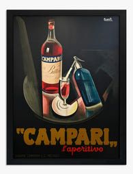
Campari Bitter Aperitivo Poster Art Print
Translation missing: en.products.product.sale_price From €16,95€23,95 -

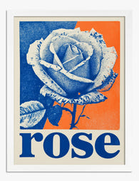
Retro Japanese Rose Poster Art Print
Translation missing: en.products.product.sale_price From €16,95€23,95 -

Kitten Bath Time Joy Art Print
Translation missing: en.products.product.sale_price From €16,95€23,95 -

Nice Peach Pop Poster Art Print
Translation missing: en.products.product.sale_price From €16,95€23,95 -

Pizza Club Poster Art Print
Translation missing: en.products.product.sale_price From €16,95€23,95 -

Vintage Bicycle Race Poster Art Print
Translation missing: en.products.product.sale_price From €16,95€23,95 -
Retro Pop Rose Poster Art Print
Translation missing: en.products.product.sale_price From €16,95€23,95 -

Retro Peach Pop Poster Art Print
Translation missing: en.products.product.sale_price From €16,95€23,95 -

Playful Peach Nice Poster Art Print
Translation missing: en.products.product.sale_price From €16,95€23,95 -

Vintage Cycle Race Poster Art Print
Translation missing: en.products.product.sale_price From €16,95€23,95 -

Saint-Tropez Modern Poster Art Print
Translation missing: en.products.product.sale_price From €16,95€23,95 -

Meaningful Connections Art Print
Translation missing: en.products.product.sale_price From €16,95€23,95 -

Tigers & Porto Pitters Poster Art Print
Translation missing: en.products.product.sale_price From €16,95€23,95 -

Vintage Boston Free Art Exhibition Flower Poster Art Print
Translation missing: en.products.product.sale_price From €16,95€23,95 -

Dubai Modern Minimal Poster Art Print
Translation missing: en.products.product.sale_price From €16,95€23,95 -

Retro Campari Aperitivo Poster Art Print
Translation missing: en.products.product.sale_price From €16,95€23,95


More from The Frame

Botanical Prints vs Floral Prints: Which Style ...
Most online stores use "botanical" and "floral" as if they mean the same thing. They don't. The difference shapes the mood of a room, the furniture it pairs with, and...

Pink Gallery Wall Ideas: 7 Looks from Soft and ...
Pink is having a long moment, and a gallery wall is the most flexible way to commit to it without painting your walls. The trouble is that "pink gallery wall"...

How to Decorate Your Living Room with Vintage A...
Vintage art is having a moment, and most people are still hesitating because they worry their lounge will end up looking like a tea room. It won't, if you follow...