How to Build a Sunset Gallery Wall That Actually Looks Cohesive
Specific layouts, frame formulas, and complementary subjects to keep warm-toned art looking intentional instead of chaotic.

Sunset prints are some of the most rewarding art you can hang, and some of the easiest to get wrong in multiples. Warm tones dominate, saturation levels fight each other, and what looks dreamy as a single piece can read as a chaotic orange smear when you cluster three together. This guide walks you through the exact layouts, ratios, and subject mixes that keep a sunset gallery wall looking curated.
Why sunset art is tricky (but rewarding) in a gallery wall
Most gallery wall advice assumes you're working with neutrals: black and white photography, botanical line drawings, soft abstracts. Warm-toned art behaves differently. Oranges, pinks, and deep reds pull the eye harder than cool tones, so two sunset prints next to each other compete instead of complement.
The other issue is saturation. A vivid tropical sunset hung beside a muted desert dusk creates a visual jump that reads as mismatched, even if the colour families overlap. Your eye registers the difference in intensity before it registers the shared subject matter.
The reward, when you get it right, is a wall that genuinely changes the temperature of a room. Warm-toned art makes lounges feel softer in winter light and bedrooms feel intimate at night. It just requires more curation than the average gallery wall.

The 3-print horizontal row: the easiest layout that always works
If you've never built a gallery wall before, start here. Three prints in a horizontal row, identical sizes, identical frames, evenly spaced. It's the layout that's hardest to mess up and the one that flatters sunset imagery most reliably.
The reason it works: by removing every variable except the artwork itself, you force the eye to read the three pieces as a sequence. Even if one print is more saturated than the others, the matching frames and spacing tell your brain "these belong together."
Specific dimensions that work
For most lounges and bedrooms, three 50x70cm prints hung 5 to 8cm apart sit beautifully above a standard three-seater sofa (around 200 to 220cm wide). For smaller walls or above a console table, three 30x40cm prints with 4cm gaps work well. Above a king bed (150cm wide), try three 40x50cm prints with 5cm spacing.
Centre the row at roughly 145 to 150cm from the floor to the middle of the artwork. That's the gallery standard for eye level, and it stops the row drifting too high (the most common gallery wall mistake).
What to put in each frame
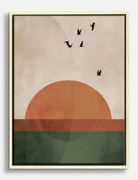
The trick with the horizontal row is treating it like a panorama. Three sunset scenes that share a horizon line, or progress through time of day (golden hour, sunset peak, dusk), create a narrative your eye reads left to right. You can browse sunset art prints and look specifically for series or pieces with similar horizons.
Avoid putting your most dramatic, high-contrast print in the centre. Counterintuitive but true: the centre piece should be the calmest, with the more dynamic compositions flanking it. This stops the wall feeling top-heavy in attention.
Mixing subjects: ocean, landscape, and abstract prints that complement sunsets
A wall of nothing but sunsets is exhausting to look at. Three orange-dominant pieces in close proximity create what designers sometimes call colour fatigue, where the eye stops registering individual works and starts seeing one continuous warm blur.
The fix is to break up your sunset pieces with subjects that share a colour story without repeating the heat.
Ocean and coastal scenes
Cool-toned ocean prints are the natural counterweight to warm sunsets. A deep navy seascape or a misty coastal scene drops the temperature of the wall without abandoning the mood. Look for pieces with hints of warm light (a strip of horizon, a pale orange reflection on water) so they share DNA with your sunsets rather than fighting them. The beach art prints collection is a good starting point for this.
Landscapes with neutral palettes
Desert scenes, sand dunes, mountain silhouettes at dawn. These give your eye a place to rest while keeping the palette earthy. A muted ochre landscape between two vivid sunsets calms the whole arrangement. Browse landscape art prints for pieces with cream, taupe, and dusty pink tones.
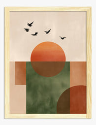
Abstracts (use sparingly)
A single abstract piece in muted blush, terracotta, or burnt sienna can act as a "translator" between sunset prints, picking up colours from each without competing. One abstract per gallery wall is plenty. Two starts to feel like an art fair stand.
The ratio that works
For a six-piece gallery wall, aim for roughly three sunsets, two complementary scenes (ocean or landscape), and one abstract or textural piece. For three pieces, try two sunsets and one cooler-toned landscape or seascape. Pure sunset clusters work only if the prints are very muted.
Keeping frames consistent: why it matters more with warm tones
Frame consistency matters for any gallery wall. With warm-toned art it matters twice as much, because mismatched frames compete with the colour energy already present in the artwork.
When you hang four cool botanical prints, you can mix a black frame and a natural oak frame and the eye accepts it. Do the same with four sunsets and the eye reads it as visual noise. The warm tones already pull attention; the frames need to step back.
The frame colours that work with sunset art
Natural oak or light wood: the safest choice. Picks up the warm undertones in the artwork without competing. Best for casual rooms, bedrooms, kitchens.
Black: sharpens warm-toned art beautifully and adds gallery-style polish. Best for lounges, hallways, formal spaces. Avoid if your room is already heavy on dark furniture.
White: cools the overall composition and creates breathing space, especially useful if your sunset prints lean very vivid. Best for light, neutral interiors.
Avoid: ornate gold frames (compete with warm tones), dark walnut (muddies oranges and pinks), and any mix of metallic finishes.
Pick one frame colour and stick to it across every piece. If you genuinely want variation, vary the wood tone of the print itself, not the frame.
Why this matters even more with prints
A gallery wall lives or dies on its frames. Cheap frames that warp, ship separately, or arrive with the print rattling loose ruin the whole effect. Solid wood frames with the print properly fitted (and arriving in one piece, ready to hang) save you the entire project. Fab's framed prints use FSC-certified solid wood and a UV-protective acrylic glaze, which matters specifically for warm-toned art because pinks and oranges are the first colours to fade in direct sunlight.

Size ratios that create visual balance (the 1 large + 2 small formula)
The horizontal row is the easiest layout, but the 1 large plus 2 small formula is the most flexible. It works above sofas, beds, sideboards, and in awkward corners where a perfect row won't fit.
How the formula works
One large anchor print on one side, two smaller prints stacked on the other side. The combined height of the two smaller prints should roughly match the height of the large print, with about 5cm of breathing room between them.
Specific dimensions that work:
- One 70x100cm print + two 40x50cm prints stacked
- One 60x80cm print + two 30x40cm prints stacked
- One 50x70cm print + two 24x30cm prints stacked
The large print should be your strongest sunset piece. The two smaller prints should be complementary subjects (one ocean or landscape, one abstract or textural) rather than two more sunsets. This is where the temptation to go full warm-tone is strongest, and where restraint pays off most.
Asymmetrical arrangements (for confident decorators)
If you want to scale up to five or six pieces, the trick is to anchor the arrangement on an invisible centre line and let pieces fall either side at varying heights. Treat the largest piece as your anchor, then work outwards with smaller pieces, alternating warm and cool subjects so no two sunsets sit immediately adjacent.
For asymmetrical layouts, give your warm-toned pieces slightly more breathing room than the cool ones. Sunset prints need about 6 to 8cm of space between them; cooler pieces can sit closer at 4 to 5cm.
Step-by-step hanging guide for a straight, level gallery wall
The floor layout method first, then the wall.
Tools you'll need
- Brown craft paper or newspaper (one sheet per print)
- Pencil
- Spirit level (or a level app on your phone)
- Tape measure
- Painter's tape
- Picture hooks or wall fixings appropriate to your wall type
Step 1: Lay it out on the floor
Clear a floor space roughly the same size as the wall. Arrange your prints exactly as you want them on the wall, adjusting until the composition feels balanced. Take a photo from directly above. This is your blueprint.
Step 2: Make paper templates
Trace each frame onto craft paper, cut to size, and mark where the hanging hook sits on the back of each frame. Number each template to match your photo.
Step 3: Tape templates to the wall
Stick the templates to the wall using painter's tape, following your floor layout. Use a spirit level to make sure each template is straight, and a tape measure to keep the spacing consistent.
Live with the arrangement for at least an hour. Walk past it, sit down, look at it from across the room. Adjust before you commit.
Step 4: Mark and hang
Through each template, mark the wall where the hook needs to go. Remove the template. Install your fixings. Hang the prints.
Step 5: Final level check
Hang a spirit level across the tops of the frames once everything is up. Small adjustments at this stage are normal.
Hanging without damage
If you're renting or want to avoid drilling, heavy-duty adhesive picture hooks (rated for the weight of your specific frame) work well for prints up to about 50x70cm. For anything larger or heavier, drill into a stud or use proper plasterboard fixings. Adhesive strips struggle with the weight of a 70x100cm framed print and will eventually let go.

Our top sunset print combinations picked for you
These are the combinations we've seen work best in real homes, with specific subject pairings rather than vague colour advice.
The coastal sunset trio
Two warm beach sunsets (one with figures or silhouettes for narrative, one purely atmospheric) plus one cool-toned ocean print with a stormy or moody palette. Hang as a horizontal row. Frame in natural oak. Best in lounges and bedrooms.
The desert and dusk pairing
One large desert sunset with muted oranges and dusty pinks, two smaller prints showing dawn or twilight landscapes in cooler tones. Use the 1 large + 2 small formula. Frame in black for contrast. Best in hallways and dining rooms.
The horizon series
Three sunset prints from the same artist or with matching horizon lines, hung as a panoramic row. This works best when the prints genuinely belong to a series rather than being assembled from different sources. Frame in white for a calm, gallery feel. Best in bedrooms.
The mixed media wall
Two sunset prints, one moody seascape, one minimal abstract in terracotta or blush. Asymmetrical arrangement, with the abstract acting as the visual bridge between the warm and cool pieces. Frame in oak. Best in open-plan living spaces. Ready-made wall art sets take some of the guesswork out of these combinations.

A few last things worth knowing
Lighting changes everything with warm-toned art. South-facing rooms make sunset prints glow at midday but can wash them out by late afternoon. North-facing rooms keep the colours stable but cooler. If you can, hang sunset gallery walls on a wall that gets indirect rather than direct sunlight, and use warm-temperature bulbs (around 2700K) in nearby lamps to flatter the palette in the evening.
Mat or no mat is a real question with sunsets. A cream or white mat cools the overall composition and gives vivid prints space to breathe. Skip the mat if your prints are already muted, or if you want a more contemporary look. Don't mix matted and unmatted prints in the same gallery wall.
Step back regularly while you're arranging. The mistake almost everyone makes is decorating from too close. Your gallery wall is going to be viewed from across the room, not from 30cm away.

Fab products featured in this blog
-
Sunset Geometry Canvas Print
Translation missing: en.products.product.sale_price From €65,95€92,95 -

Sunset City Facade Canvas Print
Translation missing: en.products.product.sale_price From €65,95€92,95 -

Bold Sunset Vista Art Print
Translation missing: en.products.product.sale_price From €16,95€23,95 -

Sunset Celebration Canvas Print
Translation missing: en.products.product.sale_price From €65,95€92,95 -
Sunset Geometry Art Print
Translation missing: en.products.product.sale_price From €16,95€23,95 -

Bold Sunset Vista Canvas Print
Translation missing: en.products.product.sale_price From €65,95€92,95 -

Sunset Geometry Art Print
Translation missing: en.products.product.sale_price From €16,95€23,95 -

Sunset City Facade Art Print
Translation missing: en.products.product.sale_price From €16,95€23,95 -

Sunset Desert Silhouettes Art Print
Translation missing: en.products.product.sale_price From €16,95€23,95 -

Le Paysage — Lavender Fields at Sunset Canvas Print
Translation missing: en.products.product.sale_price From €65,95€92,95 -

Sunlit Terrace Bliss Canvas Print
Translation missing: en.products.product.sale_price From €65,95€92,95 -

Coastal Pines at Sunset Canvas Print
Translation missing: en.products.product.sale_price From €65,95€92,95 -

Sunset Desert Vista Art Print
Translation missing: en.products.product.sale_price From €16,95€23,95 -

Pine Forest at Dusk Canvas Print
Translation missing: en.products.product.sale_price From €65,95€92,95 -

Sunset Valley Blossoms Canvas Print
Translation missing: en.products.product.sale_price From €65,95€92,95 -

Sunset Over the Coastal Fairway Art Print
Translation missing: en.products.product.sale_price From €16,95€23,95 -

Capri Italy Sunset Waves Canvas Print
Translation missing: en.products.product.sale_price From €65,95€92,95 -

Painted Garden in Bloom Art Print
Translation missing: en.products.product.sale_price From €16,95€23,95 -

Sunset Pines by the Coast Canvas Print
Translation missing: en.products.product.sale_price From €65,95€92,95


More from The Frame

Our Favourite Jungle Prints for Every Room: The...
Jungle prints have a reputation problem. Done badly, they tip a room into themed-restaurant territory faster than almost any other trend. Done well, they add depth, movement and a sense...

Thrushes, Hares, and Peacocks: The Animals in W...
Why Morris put animals at the centre of his designs William Morris wasn't decorating walls with cute creatures. He was making a quiet argument. While Victorian factories churned out cheap,...

From Dutch Masters to Modern Minimalism: The Ke...
Search "types of flower bouquet art" and you'll get wedding centrepieces, posy guides, and cascading bridal arrangements. Useful if you're getting married. Useless if you're trying to choose what goes...