Why Vase Prints Belong in Your Kitchen (and How to Choose the Right One)
The most overlooked art category for kitchens happens to be the one that flatters your ceramics, cabinetry, and morning light all at once.

Kitchens get the worst of it. They're the hardest-working room in the house and somehow end up with the least considered walls. A vase print fixes that faster than almost any other choice, because it speaks the kitchen's own language: vessels, plants, daily use, quiet beauty.
Why kitchens deserve better wall art than a clock and a spice rack
There's a strange convention that kitchens should be functional first and decorative never. Tiled splashbacks, magnetic knife strips, a wipeable surface where art might go. The result is a room you spend three hours a day in that looks like nobody actually lives there.
Vase imagery works in kitchens for a reason that's almost too obvious to notice. The kitchen is already full of vessels: jugs, mugs, mixing bowls, the actual vase by the window holding the supermarket tulips. A print of a vase isn't decoration imposed onto the space, it's a reflection of what the space already does. Vessels are useful and beautiful, which is the whole brief for a kitchen.
This is also why vase prints sit so comfortably between two more common kitchen art categories. Botanical prints can feel soft and floral to the point of being twee. Culinary prints (lemons, espresso cups, "But First, Coffee") can feel like a theme park. A well-chosen vase print has the structure of still life and the warmth of botanicals without committing to either extreme.

The best vase print styles for different kitchen aesthetics
Match the print's drawing style to your kitchen's overall mood. This matters more than matching colours, which we'll come to next.
Scandi and modern kitchens
Minimalist line drawings, single-stem ink studies, monochrome compositions on cream or off-white backgrounds. Look for prints with a lot of breathing room around the subject. A small vase rendered in confident black brushstrokes against an empty field works harder than a busy, detailed image in a clean kitchen. Browse still life art prints with restrained palettes if this is your direction.
Farmhouse and cottage kitchens
Vintage botanical illustrations with labelled species, antique-feeling watercolours, blowsy bouquets in stoneware jugs. These rooms can carry detail and pattern, so prints with more visual richness sit comfortably. Slightly faded, archival-looking colour palettes work better than punchy contemporary printing.
Eclectic and maximalist kitchens
Bold colour, oversized blooms, Matisse-adjacent cutouts, anything with personality. If your kitchen already has patterned tiles or strong cabinet colour, the print needs to stand its ground rather than apologise. Two or three smaller prints in conversation often work better than one big timid one.
Coastal and transitional kitchens
Muted watercolours, soft greens and sandy neutrals, loose painterly vases with dried grasses or branches rather than tight flower arrangements. Avoid anything too saturated, which fights with the typical coastal palette of whites, pale blues and natural wood.
Size and placement: where to hang a vase print in a kitchen
Most kitchen art is hung too high and too small. Both mistakes come from treating the kitchen wall like a living room wall, when it isn't.
The width rule
Your print (or grouping) should be roughly 60 to 75% of the width of the furniture or feature underneath it. Above a 120cm sideboard, that's a print around 75 to 90cm wide. Above a narrow stretch of wall between two cabinets, you might only have 40cm to play with, and that's fine. A vertical 30x40cm or 50x70cm print fills a narrow run beautifully.
Distance from counters and appliances
Hang prints 15 to 30cm above the worktop. Any higher and the art starts floating untethered from the room. Above a sink, aim for around 15 to 20cm above the tap. Keep prints at least a metre away from the hob itself, not because they'll be destroyed, but because direct splatter range is a hassle to keep clean.
The breakfast nook is the prime spot
If you have a built-in banquette, a small dining table tucked into the kitchen, or any wall adjacent to where people actually sit, this is where to put your best print. People are looking at it at eye level, for sustained periods, while relaxed. That's the gallery wall of your kitchen.
Other strong placements
Between upper cabinets where there's an awkward run of wall. Above open shelving (more on this later). On the end panel of a run of cabinets that faces the room. Above a coffee station or drinks trolley. Any narrow vertical wall that currently does nothing.

Colour matching vase art to your cabinetry and backsplash
You don't need the print to match the kitchen exactly. You need it to talk to the kitchen. Aim for two or three points of colour connection, not a paint-chip identical pull.
White and cream cabinets
Warm terracotta, ochre and burnt sienna vases. Soft sage stems. Dusty pinks. Cream kitchens can swing cold quickly, and these earthy tones bring warmth without competing for attention. Avoid stark black-and-white prints in an all-white kitchen unless you want a deliberately graphic, gallery feel.
Sage and olive green cabinets
Muted botanicals where the greens in the print are slightly different from the cabinet green. Mustard yellow accents work brilliantly. Cream and bone backgrounds rather than bright white. The aim is harmony with one note of contrast, usually warm.
Navy and dark cabinets
This is where vase prints get to be bold. Saturated coral, deep rust, electric blue, bright white backgrounds that pop against the dark cabinet. Dark kitchens swallow timid art, so go a shade braver than feels comfortable.
Natural wood and stained cabinets
Soft greens, dusty blues, cream and oat backgrounds. Anything that echoes the warmth of the wood without competing with its grain. Avoid orange-leaning tones, which clash with most wood stains.
Black or charcoal cabinets
High contrast works: white or cream backgrounds with bold blooms, single bright stems, graphic compositions. Or go fully tonal with charcoal-on-charcoal still lifes for a moodier, restaurant feel.
Worth browsing: our vase art prints and the broader botanical art prints collection for palette range.
Will a framed print survive a kitchen environment? (Spoiler: yes)
This is the question that stops people putting proper art in their kitchens, so let's get to it directly.
Kitchens have two genuine concerns for paper-based art: humidity (steam from cooking, kettles, dishwashers) and bright direct sunlight (the kitchen tends to be the most window-heavy room in the house). Both can degrade unprotected prints over time. Cheap framing makes this worse, because warped backing boards and gappy mounts let moisture creep in around the edges.
Our framed prints are built specifically to handle this. The frames are solid FSC-certified wood, not MDF or veneer, so they don't warp the way composite materials do when humidity fluctuates. The glaze isn't glass, it's UV-protective acrylic, which blocks the rays that actually cause fading. The print itself is museum-grade giclée on thick matte paper with water-based inks rated to last hundreds of years even in direct sunlight.
The print, mount, backing and frame all ship together in one box, fitted properly, ready to hang. No flapping print inside a separately purchased frame, which is where most kitchen art goes wrong.
Practical caveat: don't hang any framed print directly above the hob, and don't position it where the dishwasher vents steam onto it daily. Three feet of clearance from active heat and steam sources is plenty. Sunlight is genuinely not a problem.
If you prefer canvas, our canvas prints are hand-stretched over solid wood and work well in kitchens too, with the bonus of being lighter and slightly more forgiving of humidity. The trade-off is that canvas reads more casual than framed paper, which suits some kitchens and not others.
Our top vase print picks for kitchens right now
A few directions worth searching for, depending on your kitchen.
For a Scandi-modern kitchen: a single ink-drawn vase with one or two stems, framed in natural oak, 30x40cm hung vertically between cabinets. Quiet, considered, doesn't shout.
For a farmhouse kitchen: a vintage-style botanical study of garden flowers in a stoneware pitcher, framed in black or dark walnut, 50x70cm above a sideboard or dresser. Looks like you've had it for years.
For a navy kitchen: a bold modern still life with one bright bloom (coral, mustard, pink) on a cream background, framed in black, 60x80cm above the breakfast table.
For a small galley kitchen: two 21x30cm prints stacked vertically in matching frames between the window and the corner. Small footprint, big effect.
For open-plan kitchens: a larger framed piece around 70x100cm anchors the space and pulls the eye, which helps the kitchen read as a deliberate room rather than an appendage to the living area.

How to pair a vase print with open shelving and real ceramics
This is where vase prints become something more than decoration. They start a conversation with the objects you already own.
The principle is simple. Pick a print whose vase shape, palette or mood echoes (but doesn't duplicate) the ceramics on your open shelves. If your shelves hold cream stoneware and a few terracotta pieces, choose a print featuring a warm earthy vessel. If your shelves are stacked with white porcelain and clear glass, a print of a single white vase against a soft background extends the collection upward.
You're aiming for what stylists call the collected look: things that clearly belong together without being matchy. Vary the scale. A print of a tall narrow vase looks great above a shelf of short, round ones. A print of a generous full bouquet works above a shelf of empty, sculptural vessels.
Three rules for the open-shelf pairing
- One hero, not three. Don't crowd the wall above open shelving with multiple prints. The shelf is already busy. One framed piece, centred, is enough.
- Echo a colour from the print in at least one shelf object. A small terracotta jug, a sage tea towel folded on the edge of the shelf, a green glass bottle. This is what makes the eye read everything as one composition.
- Leave physical space around the print. Don't let the top shelf crowd within 10cm of the bottom of the frame. Art needs air to read as art.
The collected look with multiple prints
If you want a gallery feel rather than a single statement, use two or three vase prints in identical frames. Vary the subject (tall vase, wide bowl, single stem, full arrangement) but keep the style and palette related. Same frame, similar background tone, complementary colours. This gives cohesion without the prints looking like a set bought in a hurry.
Seasonal rotation
One quiet advantage of vase prints in particular: they're easy to swap. Spring tulips, summer wildflowers, autumn branches, winter evergreens. Keep the frame on the wall, change the print inside. Browse our kitchen art prints collection seasonally if this appeals.
A few common mistakes to skip
Hanging too high is the biggest. Trust the 15 to 30cm rule above counters, and resist the urge to centre everything to the ceiling.
Choosing prints too small for the wall is the second. A 21x30cm print floating in a metre of empty wall looks lonely. Either go bigger or add a second print.
Mixing too many competing themes is the third. If your backsplash is patterned, your tiles are colourful and your splashback already does the heavy lifting, the print should be quieter. If your kitchen is mostly plain surfaces, the print can be louder.
And don't ignore the visual weight in open-plan spaces. The kitchen art has to balance against whatever's happening in the adjacent living area. Stand at the far end of the room and squint. Does it look composed, or is one half doing all the work?
Pick a vase print that speaks to one ceramic you already own, hang it lower than feels natural, and let it sit there for a week before you decide whether to add more. Most kitchens need less art than you think, hung better than you've been told.


Fab products featured in this blog
-

Modern Kitchenware Vase Canvas Print
Sale price From €65,95€93,95 -

Kitchen Window onto the Square Canvas Print
Sale price From €65,95€93,95 -

Sunny Mountain Escape Art Print
Sale price From €16,95€23,95 -

Pink Kitchen Maximalist Interior Art Print
Sale price From €16,95€23,95 -

City View Kitchen Art Print
Sale price From €16,95€23,95 -

Modern Kitchenware Vase Art Print
Sale price From €16,95€23,95 -

Blue Kitchen Sketches Canvas Print
Sale price From €65,95€93,95 -

Vibrant Kitchen Gathering Art Print
Sale price From €16,95€23,95 -

Tomatoes by the Window Art Print
Sale price From €16,95€23,95 -
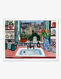
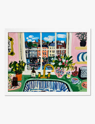
Parisian Kitchen Window Art Print
Sale price From €16,95€23,95 -

Sunlit Kitchen Still Life Art Print
Sale price From €16,95€23,95 -
Kitchen Window onto the Square Art Print
Sale price From €16,95€23,95 -

Wine and Wildflowers Supper Art Print
Sale price From €16,95€23,95 -

Wavy Vase Kitchen Charm Canvas Print
Sale price From €65,95€93,95 -

Kitchen Table with Tomatoes Art Print
Sale price From €16,95€23,95 -

Bold Ampersand Art Print
Sale price From €16,95€23,95 -

City View Kitchen Canvas Print
Sale price From €65,95€93,95 -

Sunlit Kitchen Still Life Canvas Print
Sale price From €65,95€93,95 -

Tomatoes on a Striped Cloth Art Print
Sale price From €16,95€23,95 -

Tomatoes on a Striped Cloth Canvas Print
Sale price From €65,95€93,95


More from The Frame

The Best Wall Art for Plant Lovers (That Doesn'...
You already have too many plants. You know it, your partner knows it, the fiddle leaf fig blocking the window knows it. But your walls are still bare, and there's...

Are Botanical Prints Still in Style? The Trend ...
Botanical prints have been declared "over" roughly every three years since 2015, and yet they keep hanging on more walls than ever. The truth is they're not a trend at...

Room-by-Room or Whole-Home? Styling Botanical P...
Most botanical prints are hung wrong. They're too small for the wall, glossy in rooms that need calm, and floating at eye level above sofas they should be anchoring. This...