
 Order today for delivery by
 Vintage Rose Prints: From Botanical Illustrations to Modern Walls
A guide to Redouté, chromolithographs, and making 200-year-old florals feel completely at home on a modern wall.


Vintage rose prints are having a proper moment. Not the dusty, chintzy kind your nan had over the settee, but the considered, well-framed kind that anchor a modern room and give it soul. This is the guide we wish existed before you started scrolling.
What makes a rose print 'vintage' (and why the style is everywhere right now)
A rose print earns the "vintage" label through a combination of age, technique, and aesthetic. Genuine vintage typically means the original artwork was produced between the late 1700s and mid-1900s, using techniques like hand-coloured engravings, chromolithographs, or watercolour studies. Most of what you can buy today is a high-quality reproduction of these originals, which is a good thing: it means the artwork is preserved, printed sharply, and available in sizes that suit contemporary walls.
The style is surging for a few interconnected reasons. Grandmillennial and cottagecore aesthetics have made florals cool again after a decade of grey minimalism. Slow living and sustainability values reward things that feel timeless rather than trend-driven. And there is a broader appetite for warmth, pattern, and craftsmanship that abstract wall art simply cannot deliver in the same way.
Vintage roses tick every one of those boxes. They are romantic without being twee, detailed without being fussy, and they carry the quiet authority of something that has already survived 150 years of taste changes.

Botanical illustration vs. painterly vs. photographic: the key styles explained
Understanding the three main styles will make shopping infinitely easier. Once you can name what you are looking at, you can find more of it. There are really three families of vintage rose prints worth knowing.
Scientific botanical illustration
This is the Pierre-Joseph Redouté school. Redouté was a Belgian-born artist working in the courts of Marie Antoinette and Empress Joséphine in the early 1800s, and his rose plates from Les Roses (1817-1824) remain the reference point for the entire genre. The style is precise, elegant, and slightly restrained: a single stem or bloom rendered against a plain background, often with a small script caption in Latin or French.
You will also see work in this tradition from artists like Elizabeth Blackwell (an 18th-century Scottish botanist whose Curious Herbal predates Redouté) and various Belgian and French periodicals published between roughly 1868 and 1923. The vibe is scholarly, calm, and quietly luxurious. These work brilliantly in rooms where you want florals without frilliness.
Romantic painterly
This is the school of Catherine Klein and Paul de Longpré, active around the turn of the 20th century. Their roses are lush, sometimes overblown, painted in oil or watercolour with dramatic shadow and abundant petals. You often see full bouquets, cabbage roses, or blooms draped across a table.
The vibe here is emotional and generous. If Redouté is a haiku, Klein is a love letter. These prints hold their own as a single statement piece and are ideal if you want your art to bring the drama.
Vintage photographic and chromolithograph
A chromolithograph is a colour print produced from multiple lithographic stones, one per colour, popular from the 1840s through the early 1900s. It was the first mass-market way to reproduce colour art, and vintage rose chromolithographs have a distinctive slightly grainy, layered quality that feels warmer than modern printing. Early rose photography from the 1920s onward brings a similar vintage warmth but with a different, more documentary feel.
Both styles read as nostalgic without being saccharine, and they work particularly well in eclectic or maximalist rooms.
How vintage rose prints pair with modern interiors (not just period homes)
Here is where most guides fall apart. They present vintage florals as if they only belong in a Victorian townhouse with William Morris wallpaper. They do not.
The trick to making vintage roses work in a modern space is contrast. If the artwork is soft, romantic, and detailed, the environment around it should be clean, restrained, and contemporary. A single large Redouté rose above a low-slung Scandinavian sofa looks incredible precisely because the styles are in conversation, not competition.
Some formulas that consistently work: pair blush and cream roses with pale oak, linen upholstery, and warm white walls for a soft contemporary look. Set deep crimson or burgundy roses against off-black or clay-painted walls for something moodier and more grown-up. Or hang a scientific botanical against a sage or olive wall in a minimalist room and let the specificity of the illustration do the heavy lifting.
Avoid over-styling. If your sofa is already floral and your curtains are patterned, adding a Klein bouquet will tip the room into pastiche. Vintage roses work best when they are the loudest thing in the room.
The best frame and mount choices for a classic botanical look
Framing is where good vintage rose prints get ruined. The instinct is to reach for something ornate and gilt, but that almost always ages the artwork by another 50 years and pushes it towards grandmother territory. There are three frame directions that actually work.
Thin black metal or slim black wood. The most modern option. Creates a gallery-like frame that lets the botanical illustration read as art rather than decoration. Especially good for Redouté-style scientific prints.
Natural oak or ash. Warm, contemporary, and honest. Works with almost every interior style from Scandi to Japandi to modern country. This is our default recommendation if you are unsure.
White wood. Fresh, clean, and slightly coastal. Excellent in bedrooms and bathrooms, particularly with pale rose or cream palettes.
Only go ornate if the rest of your room is genuinely period-appropriate, and even then, a thin gilt frame will read more elegant than a heavy carved one.
On mounts: a cream or off-white mount reads more traditional and museum-like, which suits scientific botanicals beautifully. A crisp white mount looks more contemporary. Double mounting (two layers of card) adds depth and a considered feel, worth it for larger prints where you want gravitas. For a modern edge, skip the mount entirely and let the print fill the frame.
All Fab framed prints arrive with the print properly fitted, no warping, no bubbling, and the frame and print ship together in one box. The frames are solid FSC-certified wood (not MDF), and the glazing is UV-protective acrylic rather than glass, so your rose prints will not fade even in a sunny room.

Colour palettes that bring out the best in vintage florals
Vintage rose prints are more versatile than they look. The colour palette of the print itself gives you natural pairings to build a room around.
Blush and cream roses love pale sage, warm white, pale oak, unbleached linen, and soft terracotta. This is the modern romantic palette and it feels effortlessly current.
Deep red and crimson roses thrive against darker, richer backdrops: clay, chocolate, deep olive, burgundy walls, or off-black joinery. Add brass hardware and it starts to feel properly grown-up.
Yellow and apricot roses (less common but stunning) pair beautifully with dusty blue, warm greige, and honey-toned wood. They bring a sunlit, slightly Provençal quality to a room.
White roses on a dark ground are the sleeper hit. They look extraordinary against pale walls with a black metal frame and instantly modernise the whole style.
Multi-coloured bouquets in the Klein tradition are trickier. Let them lead. Pull one colour from the bouquet and echo it in a cushion or a lamp, then keep everything else neutral.
The palette that most reliably fails is trying to match vintage roses to cool greys and stark whites. The prints have warmth built into their ageing, and they need warmth around them to sing.
Creating a botanical gallery wall with rose prints as the anchor
A rose-led gallery wall is one of the best applications for botanical rose art prints, and it is easier to get right than a random mixed gallery.
Start with an anchor. This is your largest print, ideally a single dramatic rose in a 50x70cm or 70x100cm format. Everything else builds around it. Around the anchor, mix in smaller botanicals (other flowers, ferns, herbs), one or two abstract or textural pieces for breathing room, and keep the palette tight: no more than three dominant colours across the whole wall.
Some layout formulas that work:
The salon hang. Asymmetric, densely packed, 7 to 12 prints of varying sizes. Feels collected and slightly maximalist. Best for larger walls and above sofas.
The tight grid. Six or nine prints of identical size in matching frames, arranged in a perfect rectangle. Very modern, very controlled. Works well in hallways and above beds.
The pair or trio. Two or three prints of the same size, hung in a row with equal spacing. The easiest to execute and the hardest to get wrong.
Frame coordination is critical. Use no more than two frame finishes across the whole wall. All oak, or oak plus black, but not oak plus black plus white plus gilt. Consistency in framing is what stops a gallery wall looking like a jumble sale.
For spacing, allow 5 to 8cm between frames. Any tighter feels cramped, any wider and the prints stop reading as a group. You can browse a mix of styles in the wider floral art prints collection if you want to build out from a rose-led anchor.

Where to hang vintage rose art for maximum impact
Not every room wants roses. Here is where they genuinely shine and the sizes that tend to work.
Bedrooms. The most natural home for vintage roses. Blush and cream palettes above the bed create instant softness. Go large: 60x80cm or bigger for a single print, or a pair of 50x70cm prints side by side.
Dining rooms. Deep red or crimson roses above a sideboard or on the wall opposite the table bring warmth and formality without stuffiness. Ideal for the salon hang here.
Hallways and staircases. Long walls beg for a grid or a rhythmic sequence of botanicals. Smaller sizes work: 30x40cm or 40x50cm, repeated at eye level.
Living rooms. A single oversized rose print above a sofa is a proper statement. Size to the sofa: the artwork should be roughly two-thirds the width of the furniture below it.
Bathrooms and cloakrooms. Vintage roses are unexpectedly brilliant in small bathrooms, adding pattern and personality to a functional space. Small prints (20x30cm or 30x40cm) work best. Because Fab uses acrylic glazing rather than glass, the prints handle humid rooms much better than traditional framing would.
Kitchens. A single botanical near a breakfast nook or above open shelving softens hard surfaces without competing with tile and joinery.
Hang everything at proper eye level: the centre of the artwork should sit around 145 to 150cm from the floor, or roughly 15 to 20cm above a piece of furniture if you are hanging above a sofa or console.
A final thought before you buy
Buy the rose print you actually love, not the one you think is safest. Vintage florals are having their moment because they carry emotion, and emotion is what rooms have been missing. Pick a single print that stops you scrolling, frame it in oak or slim black, and hang it somewhere you will see it every day. Everything else, the palette, the pairings, the gallery walls, can be built around that one honest choice.


Fab products featured in this blog
-
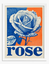
Retro Pop Rose Poster Art Print
Sale price From €16,95€23,95 -

Wild Roses Floral Collection Poster Art Print
Sale price From €16,95€23,95 -

Wild Roses Floral Collection Poster Canvas Print
Sale price From €65,95€93,95 -

Roses by Vincent van Gogh Art Print
Sale price From €16,95€23,95 -

Roses by Vincent van Gogh Art Print
Sale price From €16,95€23,95 -

Vintage Garden Blooms Art Print
Sale price From €16,95€23,95 -

The Flowers — Pink Vase Botanical Art Print
Sale price From €16,95€23,95 -

Wild Rose Garden Watercolour Art Print
Sale price From €16,95€23,95 -

Spring Botanical Medley Art Print
Sale price From €16,95€23,95 -

Retro Pop Rose Poster Canvas Print
Sale price From €65,95€93,95 -

Vase of Roses by Renoir Art Print
Sale price From €16,95€23,95 -

Tokyo Rose Retro Poster Art Print
Sale price From €16,95€23,95 -

Bluebirds and Wild Rose Art Print
Sale price From €16,95€23,95 -

The Botanical House — Burgundy Bloom Art Print
Sale price From €16,95€23,95


More from The Frame

Why Rose Print Decor Works Better Without the C...
Why Roses Are the One Floral That Never Truly Goes Out of Style Roses have been painted, printed and photographed for centuries, and they still turn up in the work...

Beyond the Fruit Bowl: Kitchen Wall Art Ideas T...
The kitchen is the most photographed, most lived-in room in your home, and yet it's usually decorated like an afterthought. A print of lemons here, a chalkboard-style coffee poster there,...

Vintage Botanical Prints in Modern Homes: How t...
Botanical prints have a reputation problem. Done badly, they read as chintzy, twee, or straight out of a 1980s guest bedroom. Done well, they're one of the most timeless things...