Transform One Wildflower Print into a Stunning Gallery Wall
The practical system for turning one beloved wildflower print into a gallery wall that actually looks intentional.

You bought a wildflower print. You love it. Now it's leaning against the wall because you suspect it wants company, but you don't know what kind of company, or how much, or where it goes. This guide is for that exact moment.
Why wildflower subjects are perfect for gallery walls
Wildflowers are forgiving in a way that very few subjects are. A meadow doesn't follow rules of symmetry or palette, so your wall doesn't have to either. A cornflower next to a poppy next to a sprig of yarrow looks correct because that's how they grow.
Compare this to architectural prints or geometric abstracts, where one piece slightly off-axis ruins the whole composition. Wildflowers absorb imperfection. They also span an enormous range of illustration styles, from precise Victorian botanical plates to loose watercolour gestures, which gives you room to mix without it feeling chaotic.
The other quiet advantage: wildflowers tend to share a colour vocabulary. Soft greens, dusty pinks, ochres, muted blues. Even prints from completely different artists usually agree on at least two or three of those tones, which makes building a cohesive arrangement much easier than with, say, abstract art.

Choosing a layout: grid, salon hang, or horizontal line
Before you buy a second print, pick a layout. The layout decides everything else: how many prints you need, what sizes, and what spacing.
The grid
Three across, two down. Or two by two. Or four in a row. All prints the same size, all frames identical, equal spacing between them (usually 5cm to 8cm). The grid is the most formal option and works beautifully in dining rooms, hallways, and above sideboards.
Use a grid when your wall is rectangular and uninterrupted, and when you want the arrangement to feel quiet rather than busy. It's also the easiest layout to plan because every measurement repeats.
The salon hang
An organic cluster of different sizes and orientations, arranged around an invisible centre line. This is the layout that looks "collected over time" even when you bought everything in one afternoon. Salon hangs handle five to nine prints comfortably, with anywhere from 4cm to 7cm between frames.
Salon hangs suit lounges, stairwells, and bedroom walls behind a bed. They're harder to plan but more forgiving once installed, because the eye doesn't expect perfect alignment.
The horizontal line
Three to five prints in a single row, all at the same height, evenly spaced. Usually hung above a sofa, console, or bed. Frames can be identical sizes or alternate (one large, two small, one large) but they share a top or centre line.
This layout solves the "long sofa, no idea what to do above it" problem better than anything else. It also reads as deliberate without demanding the visual weight of a full salon wall.
The sizes that work together (and the combinations that don't)
The biggest mistake in gallery walls is using prints that are all roughly the same size but not exactly the same size. Two prints at 30x40cm and 40x50cm look like a mistake. Two prints at 30x40cm and 50x70cm look intentional.
Contrast is your friend. So is repetition. What doesn't work is the middle ground.
Three reliable size formulas
The classic five-print salon: one 50x70cm anchor, two 30x40cm, two 21x30cm. Arrange with the anchor slightly off-centre, balanced by the medium prints on the opposite side, with the smaller pieces tucked into gaps.
The horizontal three: three prints at 40x50cm or 50x70cm, spaced 6cm apart, hung with centres aligned. Works above any sofa from 180cm wide upward.
The symmetrical grid: six prints at 30x40cm in a 3x2 arrangement, 5cm spacing. Reads as one large piece from a distance.
If you started with a 50x70cm print, that's your anchor. Build downward in size from there. If you started with a 30x40cm, you have two options: buy more at the same size for a grid, or buy one larger piece to anchor a salon hang and a smaller piece to balance it.
Avoid mixing three or more sizes that are all within 10cm of each other. You want clear hierarchy or clear repetition.
Mixing styles: pairing detailed botanicals with loose painterly pieces
Mixing illustration styles is where most people freeze, and it's also where the most interesting gallery walls live. The principle: contrast in style, agreement in subject and palette.
A tightly rendered Victorian-style botanical plate looks fantastic next to a loose watercolour poppy, as long as they share a colour family. A pen-and-ink line drawing of a thistle pairs beautifully with a soft gouache meadow scene because the precision of one makes the looseness of the other feel deliberate.
What doesn't work is mixing three or more styles in equal proportions. Pick a dominant style (say, watercolour) and use one or two prints in a contrasting style as accents. A 70/30 ratio reads as curated. A 33/33/33 ratio reads as confused.
A few combinations we keep returning to:
- Detailed botanical illustration as the anchor, with two or three loose watercolours surrounding it
- A pressed-flower-style print paired with line drawings, all in the same palette
- Vintage botanical plates mixed with modern minimalist single-stem prints
Browse wildflower art prints and botanical art prints side by side to get a feel for which styles speak to each other in your palette.

The one-colour-thread rule that ties everything together
If you remember one thing from this article, remember this: every print in your gallery wall needs to share at least one colour with at least two other prints.
Not the same dominant colour. Just one repeating colour somewhere in the image. A muted sage that appears in the stem of one print and the background wash of another. A dusty terracotta that shows up in a poppy here and a tiny detail there.
This is what makes mixed-style gallery walls feel cohesive when nothing else about them matches. The eye picks up the repeated colour and reads the arrangement as connected, even if the styles, sizes, and subjects are wildly different.
To apply it practically: pull up your existing print, identify two or three colours you can clearly point to, and only buy new prints that contain at least one of those colours visibly. Not as a hint, not as an undertone. Visibly.
This rule also tells you when to stop. If you can no longer add a print without introducing a fourth colour, your gallery wall is finished.
Frames: why consistency matters more than you think
Frame consistency matters more than subject matter, more than size, and more than style. It is the single biggest factor in whether a mixed gallery wall looks intentional or accidental.
When the frames match, the eye reads the arrangement as one composition. When they don't, the eye reads each print as a separate object and the wall feels cluttered. This is true even if every print is a wildflower in the same palette by the same artist.
Pick one frame finish for the entire wall. Natural oak, black, or white are the safest. Natural oak is warm and casual, black is graphic and modern, white disappears into pale walls and lets the art lead.
Frame quality matters too. Cheap frames warp, especially in rooms with any humidity, and prints shipped separately from their frames almost always arrive misaligned or bubbling under the glass. Our framed prints ship fully assembled in one box with FSC-certified solid wood frames and UV-protective acrylic glaze, which means no glare, no fading in sunny rooms, and nothing for you to align. They arrive ready to hang.
If you're working with a budget, you can mix framed and unframed prints, but only if you commit to it. Three framed and one unframed canvas looks like you ran out of money. Three framed and three unframed, alternating, looks like a choice.
How to plan your layout on the floor before touching a drill
Do not, under any circumstances, start drilling first. Plan on the floor, then plan on the wall with paper, then drill.
Step one: floor layout
Clear a floor space the same shape as your wall. Lay your prints out in the arrangement you're considering. Move them around. Take a photo from directly above so you can see the composition flat.
Start with the anchor piece roughly central, then build outward. For salon hangs, work from the inside out and keep gaps between frames consistent (4cm to 7cm). For grids and lines, measure twice.
Step two: paper templates
Cut paper rectangles the exact size of each frame. Use masking tape (the low-tack kind, not regular tape) to stick them to the wall in your planned arrangement. Live with it for a day. Walk past it. See how it feels in morning light, evening light, when you're sitting on the sofa.
Adjust before you commit. The paper template stage is where you catch the "the whole thing is sitting too low" problem before you've made any holes.
Step three: spacing and height
Standard advice: centre the arrangement at 145cm to 150cm from the floor (eye level for most adults). Above furniture, leave 15cm to 25cm of clear space between the top of the furniture and the bottom of the lowest frame. Too much gap and the art floats. Too little and it feels cramped.
For spacing between frames, 5cm to 6cm works for most arrangements. Go tighter (3cm to 4cm) for grids you want to read as a single block. Go wider (8cm to 10cm) only if your prints are very large.
Step four: marking and drilling
Mark hanging points through the paper templates, then remove the paper and drill. This way your measurements are already on the wall.

Adapting to awkward walls
Not every wall is a clean rectangle. Walls with light switches, radiators, sloped ceilings, or windows need adjusted layouts.
For walls broken by a feature, treat each section as a separate mini-arrangement. Two prints stacked vertically on one side of a window, two on the other, can read as a single horizontal composition if the heights match.
For walls above radiators or low furniture where you can't go too low, use a horizontal line layout and accept that the arrangement will be shallow. Don't try to force a salon hang into a space that's only 60cm tall.
For sloped walls and stairwells, follow the line of the slope with your top frame edges. A staggered line that follows the staircase looks intentional. A flat horizontal line on a sloped wall looks like a mistake.
Our favourite wildflower gallery wall combinations
A few real combinations we've seen work beautifully:
The cottage kitchen wall: five prints in a salon hang, all in natural oak frames. One 50x70cm meadow watercolour as the anchor, two 30x40cm vintage botanical plates, two 21x30cm line drawings of single stems. Sage and ochre as the shared colours.
The minimalist bedroom: three 40x50cm prints in a horizontal line, all in black frames, above the bed. Loose watercolour wildflowers in dusty pink, terracotta, and pale blue. Identical spacing, identical heights.
The dining room grid: six 30x40cm botanical illustrations in white frames, 3x2 arrangement, 5cm spacing. All from the same illustration style, varied subjects. Reads as one large piece.
The hallway horizontal: four 30x40cm prints in oak frames, alternating between detailed botanical and loose painterly, all sharing a sage and cream palette. Above a console table.
If you'd rather skip the curation step entirely, our wall art sets are pre-paired arrangements designed to work together. You can also browse our wider floral art prints to find pieces that share a palette with your existing print.

Knowing when you're done
The hardest part of decorating with wildflower prints is stopping. Here's the test: stand across the room, look at the wall, and ask whether adding one more print would clarify the composition or clutter it.
If your arrangement has a clear anchor, a balanced shape, and a consistent colour thread running through every piece, you're done. Resist the urge to fill every gap. Negative space between frames is part of the composition, not a problem to solve.
A finished gallery wall feels settled. If yours still feels like it's asking for something, it probably needs one more piece. If it feels calm, leave it alone.

Fab products featured in this blog
-

Stroll Through Wildflowers Art Print
Translation missing: en.products.product.sale_price From €19,95€33,25 -

Wildflower Sketch Bloom Art Print
Translation missing: en.products.product.sale_price From €19,95€33,25 -

Wild Herb Garden Botanical Art Print
Translation missing: en.products.product.sale_price From €19,95€33,25 -

Stroll Through Wildflowers Canvas Print
Translation missing: en.products.product.sale_price From €64,95€92,95 -

Soft Wildflower Gathering Canvas Print
Translation missing: en.products.product.sale_price From €64,95€92,95 -

Whispering Wildflowers Canvas Print
Translation missing: en.products.product.sale_price From €64,95€92,95 -
Wildflower Harmony by Morris Canvas Print
Translation missing: en.products.product.sale_price From €64,95€92,95 -

Wildflower Whimsy Art Print
Translation missing: en.products.product.sale_price From €19,95€33,25 -

Wildflower Tapestry by William Morris Art Print
Translation missing: en.products.product.sale_price From €19,95€33,25 -

Wild Meadow Blooms Art Print
Translation missing: en.products.product.sale_price From €19,95€33,25 -
Vibrant Wildflower Path Art Print
Translation missing: en.products.product.sale_price From €19,95€33,25 -

Wild Meadow Blooms Canvas Print
Translation missing: en.products.product.sale_price From €64,95€92,95 -

Soft Wildflower Bouquet Canvas Print
Translation missing: en.products.product.sale_price From €64,95€92,95 -

Botanical Wild Blooms Canvas Print
Translation missing: en.products.product.sale_price From €64,95€92,95 -
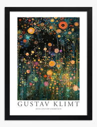
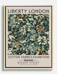
Klimt Floral Art Print
Translation missing: en.products.product.sale_price From €19,95€33,25 -

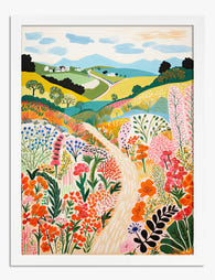
Wildflower Meadow Landscape Art Print
Translation missing: en.products.product.sale_price From €19,95€33,25 -

Gustav Klimt Wild Flower Garden Art Print
Translation missing: en.products.product.sale_price From €19,95€33,25 -

William Morris Wallflower Art Print
Translation missing: en.products.product.sale_price From €19,95€33,25 -
Botanical Muse Art Print
Translation missing: en.products.product.sale_price From €19,95€33,25


More from The Frame

The Abstract Tree Art Edit: 12 Curated Picks fo...
Tree art has a reputation problem. For years it's been associated with rustic cabins, woodland nurseries, and the kind of soft botanical prints that whisper "country kitchen." But abstract tree...

Going Big: How to Use Large Vintage Sea Art Pri...
A large vintage seascape does something a cluster of small prints never can: it stops you at the doorway. The trick is choosing the right print, hanging it at the...

Why Matching Frames Make Botanical Gallery Wall...
Botanical gallery walls have a higher failure rate than almost any other style. Too many leaf varieties, mismatched frames, and guesswork spacing turn what should feel like a calm indoor...