Every Flower in William Morris's World: A Guide to His Botanical Designs
A pattern-by-pattern field guide to the daisies, strawberries, lilies and honeysuckle that defined Morris's gardens and his greatest designs.

William Morris designed roughly 50 wallpapers and around 30 chintzes across his career, and almost every single one features a plant. If you've ever stood in front of a Morris print and wondered what you're actually looking at, this is the guide. We'll go pattern by pattern, flower by flower, and finish with practical advice on choosing the right one for your wall.
Morris and the garden: why flowers were central to everything he made
Morris grew up roaming Epping Forest, and by the time he commissioned Red House in Bexleyheath in 1859, he was designing the garden before the building was finished. He laid it out in medieval style, with separate enclosed plots full of roses, lilies, sunflowers, and fruit trees. That garden became the source material for his earliest patterns.
Later, at Kelmscott Manor in Oxfordshire, the willow-lined Thames, the kitchen garden, and the surrounding meadows fed directly into his mature designs. Morris wasn't inventing flowers from a textbook. He was drawing what he walked past every morning.
His preference for British wildflowers (daisies, honeysuckle, willow, fritillaries) over the exotic hothouse blooms beloved by Victorian designers was political as well as personal. Morris believed beauty should be democratic, drawn from common hedgerows rather than imperial greenhouses. That ideology runs through every leaf he drew.

The early florals: Daisy, Fruit, and Trellis
Morris's first three wallpapers, all designed between 1862 and 1864, are the genetic code for everything that followed. They're simpler, flatter, and more open than his later work, which makes them surprisingly easy to live with in modern interiors.
Daisy (1864)
Despite the name, Daisy isn't really about daisies alone. It features small clumps of meadow flowers (daisies, of course, but also fritillaries with their distinctive nodding bell shapes, and small primrose-like blooms) scattered across a plain background. Morris took the composition almost directly from a medieval illuminated manuscript he'd been studying.
It was the first Morris wallpaper ever printed and remains one of the most wearable. The open background gives walls room to breathe.
Fruit (also called Pomegranate, 1866)
Fruit is heavier and denser. Pomegranates, lemons, oranges, and peaches sit among broad leaves in a symmetrical, almost tapestry-like arrangement. It's the first hint of the layered complexity Morris would develop in the 1870s.
Trellis (1864)
Trellis is the famous one from this period: climbing roses, both pink and white, winding through a wooden lattice, with birds perched among the thorns. The birds were drawn by Philip Webb, Morris's architect friend, not by Morris himself. This collaboration set a precedent. Morris was the gardener; others added the wildlife.
The roses are recognisably old English garden roses, not the tight modern hybrids you'd find in a florist. They sprawl.
The iconic middle period: Strawberry Thief, Golden Lily, and Chrysanthemum
The 1870s and 1880s are when Morris hit his stride. The patterns got denser, the colours richer (now made possible by his rediscovered indigo discharge printing technique), and the flower lists got longer.
Strawberry Thief (1883)
The most famous Morris pattern, full stop. It came directly from his Kelmscott Manor kitchen garden, where thrushes kept stealing his strawberries. The pattern features ripe red strawberries, white strawberry blossoms, curling acanthus leaves, and two thrushes facing each other in mirror image.
Look closely and you'll spot small blue flowers (likely forget-me-nots or harebells) tucked between the larger forms. Strawberry Thief is dense, layered, and reads as deep green and indigo from a distance.
Golden Lily (1897, designed by J.H. Dearle)
Worth flagging straight away: Golden Lily is often credited to Morris but was actually designed by John Henry Dearle, Morris's protégé who took over as chief designer at Morris & Co. The pattern features tall stems of golden lilies, lily of the valley, tulips, and fritillaries arranged in vertical drifts.
It's one of the best examples of how seamlessly Dearle absorbed Morris's botanical vocabulary. If you love it, you love it for good reason, but it's not technically a Morris original.
Chrysanthemum (1877)
Chrysanthemum is one of Morris's densest compositions: huge blowsy chrysanthemum heads in pink, gold, and cream, surrounded by acanthus-like foliage that fills every gap. There's almost no negative space. It's a maximalist's dream and a small room's challenge.

The late masterpieces: Compton, Wandle, and the large-scale designs
By the late 1880s, Morris was designing patterns that were less about a single flower and more about an entire ecosystem in one repeat. These are the ambitious, sprawling works that define his legacy.
Wandle (1884)
Named after the River Wandle in south London, where Morris & Co.'s Merton Abbey works was based. The pattern features a tangled mass of British meadow plants: willow leaves, irises, marsh marigolds, and small pink florets. The repeat is enormous (around 86cm vertically), which Morris described as a fitting tribute to the slow, winding river.
Compton (1896)
Compton was Morris's last major wallpaper design, completed the year of his death. It features bold tulips, peonies, and curling foliage in a rhythm that's almost art nouveau. The flowers are larger and looser than his middle-period work, more confident, less filigreed.
Honeysuckle (1876)
Designed by May Morris, William's daughter, when she was just seventeen. Trailing honeysuckle vines weave through small wildflowers and broad leaves. It's softer and more delicate than her father's work, with a distinct emphasis on movement and trailing forms. Worth knowing about, because it's often misattributed.
Blackthorn (1892, by J.H. Dearle)
White blackthorn blossom, violets, fritillaries, and daisies packed into a tight spring meadow composition. One of the most botanically diverse patterns in the Morris & Co. catalogue, and another Dearle.
You can explore the full range of William Morris flower patterns to see how these designs translate to wall art.
Recurring flowers and what they meant to Morris
Certain plants appear again and again across Morris's work. Knowing them helps you read the patterns.
Acanthus: The curling, deeply lobed leaf borrowed from classical and medieval ornament. Morris's standalone Acanthus pattern (1875) is built entirely around it, but the leaf shows up as supporting cast in dozens of other designs, including Strawberry Thief.
Willow: Inspired by the willows along the Thames at Kelmscott. Willow Bough (1887) is the purest expression: slender leaves and catkins on slim branches, no flowers at all. It reads as almost wallpaper-as-foliage.
Tulips: A medieval and Islamic favourite, and one of Morris's most-used flowers. They appear in Tulip and Willow (1873), Golden Lily, Compton, and many others. Morris loved their architectural simplicity.
Fritillaries: The nodding, chequered snake's head fritillary grew wild in the Kelmscott meadows. It appears in Daisy, Blackthorn, and Golden Lily, often as a small accent rather than a star.
Honeysuckle, jasmine, and trailing climbers: Used to add movement and softness, especially in Morris's later, more open designs. Jasmine (1872) is one of the most underrated patterns, with delicate white star-shaped flowers on dark green foliage.
Roses: Old English garden roses, never modern hybrids. They appear in Trellis, Rose (1883), and as background detail throughout.
Morris was largely indifferent to Victorian flower symbolism (the elaborate "language of flowers" coding that the era loved). For him, flowers meant what they were: beautiful, native, alive.
How to choose between dense and open floral compositions for your wall
This is where most Morris guides stop being useful. Let's get specific.
Open compositions for smaller or busier rooms
If your room already has a lot going on (patterned rug, full bookshelves, a sofa with cushions, a small footprint) pick a pattern with visible background. Daisy, Willow Bough, Honeysuckle, and Jasmine all have breathing room between the botanical elements. They add the Morris signature without overwhelming.
These work brilliantly at smaller sizes too. A 50x70cm framed Daisy print over a bedside table feels considered, not chaotic.
Dense compositions for larger walls and minimalist rooms
Counterintuitively, the busiest Morris patterns (Strawberry Thief, Chrysanthemum, Blackthorn, Compton) work best in rooms with less clutter elsewhere. They want to be the event. Hang one large piece (70x100cm or bigger if you're going to canvas) on a plain wall in a room with neutral upholstery, and it becomes the focal point.
Stick a dense Morris print above a busy patterned sofa and the whole thing fights itself.
Pattern scale matters as much as composition
Morris designed for wallpaper, which means the repeat size matters when you crop a pattern into a single print. Large-scale patterns like Wandle and Compton tend to look better at bigger print sizes (80x120cm and up) where the full repeat can breathe. Smaller-scale patterns like Daisy and Willow Bough are happy at any size.
For framed prints, we'd suggest a simple oak or black frame for dense patterns (Strawberry Thief, Chrysanthemum) and either a warmer wood or a slim white frame for the airier designs. The frame should support the pattern, not compete with it.
A note on quality: the biggest disappointment with Morris prints is poor reproduction. Faded colours, blown-out detail, warped frames that arrive separately and need assembling. Giclée printing on thick matte paper preserves the indigo discharge depth Morris worked so hard to perfect, and a properly fitted UV-protective frame means the colours won't fade even on a sunny wall. Browse the full William Morris collection if you want to see the difference detail makes.

Pairing William Morris botanical prints with real plants and natural interiors
Morris designs sit beautifully alongside real greenery, but there's a knack to it.
Echo, don't match
If you've got a trailing pothos or ivy on a shelf, a trailing Morris pattern (Honeysuckle, Jasmine, Willow Bough) creates lovely visual rhyme without being literal. You don't need a strawberry plant under Strawberry Thief.
Lean into texture contrasts
Morris's flat, graphic style sits brilliantly against the irregular, three-dimensional texture of real plants. A monstera or a fiddle leaf fig next to a framed Morris print emphasises both: the print becomes more graphic, the plant becomes more sculptural.
Match the mood, not the colour palette
Morris's reds and golds (Strawberry Thief, Golden Lily) feel autumnal and grounding. Pair them with terracotta pots, dried grasses, and warm woods. His greens and blues (Willow Bough, Wandle, Trellis) feel cool and meadowy. Pair them with ferns, linen, and pale oak.
Don't overcrowd
One large Morris print and two or three well-placed plants will always look more considered than four small prints and a jungle. Morris's patterns are already dense gardens in themselves.
For broader inspiration on combining florals with foliage-focused art, our botanical art prints collection sits naturally alongside Morris designs, and if you're building a wider Arts and Crafts or heritage-style wall, our vintage art prints range gives you complementary period pieces to work with.

A quick guide to pattern attribution
If you want to be sure you're buying a true William Morris design rather than a Morris & Co. piece by someone else, here's the short version:
By William Morris: Daisy, Trellis, Fruit, Jasmine, Larkspur, Acanthus, Willow Bough, Wandle, Strawberry Thief, Chrysanthemum, Honeysuckle (the wallpaper, not the embroidery), Compton.
By J.H. Dearle: Golden Lily, Blackthorn, Compton textile colourways, many later florals.
By May Morris: Honeysuckle embroidery, Horn Poppy, and various smaller works.
All three are legitimately Morris & Co. and all three are beautiful. But if attribution matters to you, it's worth checking.
Where to start
If you're new to Morris, start with Willow Bough or Daisy. They're forgiving, work in almost any room, and let you live with the style before committing to something denser. If you already know you love maximalism, go straight to Strawberry Thief or Chrysanthemum and give it the wall it deserves.
Either way, hang it where you'll actually look at it. Morris designed these patterns to reward close attention, and the longer you live with one, the more flowers you'll find.

Fab products featured in this blog
-

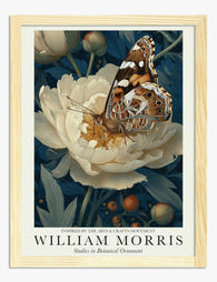
Studies in Botanical Ornament by William Morris Art Print
Translation missing: en.products.product.sale_price From €19,95€33,25 -

Studies in Botanical Ornament by William Morris Art Print
Translation missing: en.products.product.sale_price From €19,95€33,25 -

Studies in Botanical Ornament by William Morris Art Print
Translation missing: en.products.product.sale_price From €19,95€33,25 -

Studies in Botanical Ornament by William Morris Art Print
Translation missing: en.products.product.sale_price From €19,95€33,25 -

Flower Garden Textile by William Morris Art Print
Translation missing: en.products.product.sale_price From €19,95€33,25 -

Garden Tulip by William Morris Art Print
Translation missing: en.products.product.sale_price From €19,95€33,25 -

Tulip and Willow by William Morris Art Print
Translation missing: en.products.product.sale_price From €19,95€33,25 -

Studies in Botanical Ornament by William Morris Art Print
Translation missing: en.products.product.sale_price From €19,95€33,25 -

Studies in Botanical Ornament by William Morris Art Print
Translation missing: en.products.product.sale_price From €19,95€33,25 -

Studies in Botanical Ornament by William Morris Art Print
Translation missing: en.products.product.sale_price From €19,95€33,25 -

Studies in Botanical Ornament by William Morris Canvas Print
Translation missing: en.products.product.sale_price From €64,95€92,95 -

Studies in Botanical Ornament by William Morris Art Print
Translation missing: en.products.product.sale_price From €19,95€33,25 -

Studies in Botanical Ornament by William Morris Art Print
Translation missing: en.products.product.sale_price From €19,95€33,25 -

Studies in Botanical Ornament by William Morris Art Print
Translation missing: en.products.product.sale_price From €19,95€33,25 -

Wild Tulip by William Morris Art Print
Translation missing: en.products.product.sale_price From €19,95€33,25 -

William Morris Floral Exhibition Art Print
Translation missing: en.products.product.sale_price From €16,95€23,95 -

Studies in Botanical Ornament by William Morris Art Print
Translation missing: en.products.product.sale_price From €19,95€33,25 -
Studies in Botanical Ornament by William Morris Art Print
Translation missing: en.products.product.sale_price From €19,95€33,25 -

Garden Tulip by William Morris Art Print
Translation missing: en.products.product.sale_price From €19,95€33,25 -

Studies in Botanical Ornament by William Morris Art Print
Translation missing: en.products.product.sale_price From €19,95€33,25


More from The Frame

From Dutch Masters to Modern Minimalism: The Ke...
Search "types of flower bouquet art" and you'll get wedding centrepieces, posy guides, and cascading bridal arrangements. Useful if you're getting married. Useless if you're trying to choose what goes...

What Colours Go With Bouquet Prints? Pairings I...
You've found a bouquet print you love. Now you need to know if it will actually work above your sofa, opposite that mustard armchair, next to the curtains you spent...

Boho Sun Wall Art: How to Nail the Look Without...
Boho sun art has a reputation problem. Done badly, it screams student halls and macramé overload. Done well, it's one of the warmest, most grounding aesthetics you can put on...