William Morris Gallery Wall Ideas That Actually Work (Without Looking Cluttered)
The honest guide for people who love Morris but are nervous about turning their wall into pattern soup.

William Morris prints are stunning. They're also dense, intricate, and capable of overwhelming a room if you hang them wrong. Most gallery wall guides ignore this problem entirely, so here's a specific, opinionated approach that solves it.
Why Morris prints are trickier for gallery walls than minimal art
A gallery wall of minimal line drawings or muted abstracts is forgiving. Empty space inside each print does most of the work, and your eye glides from one piece to the next without resistance. Morris prints don't behave that way.
Every Strawberry Thief, every Willow Bough, every Pimpernel is packed corner to corner with leaves, birds, fruit, and curling stems. Each individual print is already a complete composition. Stack three or four of them next to each other without thinking, and you're effectively layering wallpaper on top of wallpaper. The eye has nowhere to rest.
The solution isn't to avoid Morris on gallery walls. It's to treat his prints with stricter rules than you'd apply to minimal art: fewer pieces, tighter colour palettes, generous breathing room, and frames that quietly contain rather than compete. Get those four things right and the result is genuinely beautiful. Get them wrong and you've made a Victorian fever dream.

The best layout: our recommended 3-print arrangement
If you take one thing from this article, take this. Three prints. Same size. Hung in a horizontal row. That's the layout we'd recommend nine times out of ten for Morris.
Specifically: three 40x50cm framed prints, hung in portrait orientation, with 5cm of space between each frame. The total arrangement comes out to roughly 130cm wide, which sits beautifully above a standard three-seater sofa (typically 200 to 220cm) and respects the two-thirds rule, where your art should span around two-thirds of the furniture beneath it.
Why three? Two prints feel like bookends and lack the gentle rhythm a gallery wall needs. Four or more starts to feel like pattern soup, especially with Morris designs already doing so much visual work. Three is the magic number. It creates a focal point with enough variation to feel curated but enough restraint to feel calm.
If you're working with a smaller wall, say above a console table or in a hallway, scale down to three 30x40cm prints with the same 5cm spacing. For a larger wall above a king bed or a generous sofa, step up to three 50x70cm prints, or consider a single large William Morris print at 70x100cm instead. Sometimes one large piece beats a row of three.
You can find ready-made trios in our wall art sets collection if you'd rather not build the arrangement yourself.
Mixing subjects: pairing cat prints with florals and birds
This is where most people go wrong. They fall in love with Strawberry Thief, then add Pimpernel because it's also Morris, then throw in a cat print because it's cute, and somehow end up with a wall that looks like a charity shop window.
The rule we'd use: pick one dominant subject and let the others support it. If birds are your hero, build the trio around birds. If florals are your hero, keep the supporting prints tonally aligned rather than thematically chaotic.
Three combinations we know work:
The bird trio: Strawberry Thief in the centre, flanked by Bird & Pomegranate on one side and Trellis on the other. All three share the same dusky blue and warm cream palette, and birds appear in each, so the eye has a thread to follow.
The tonal floral trio: Willow Bough on the left, Pimpernel in the middle, Acanthus on the right. Cool greens throughout, similar pattern density, no competing focal points. This one is foolproof.
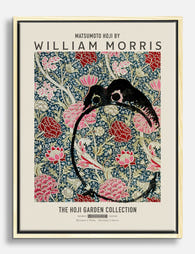
The cat-led trio: A Morris cat print as your centre piece, flanked by two quieter floral designs in the same colour family. The William Morris cat prints collection works particularly well here because the cats are bold enough to anchor the arrangement, and you only need supporting florals to do half the work.
What we wouldn't do: mix a warm-toned print (think the rich reds and golds of some Morris designs) with cool sage and indigo prints in the same arrangement. The temperature clash makes the wall feel disjointed even when the patterns are technically harmonious.

Frame colour matters: why we'd pick black or natural oak
Frame colour does more than you think with Morris prints. The pattern is already busy, so the frame's job is to contain, not contribute. That rules out anything ornate, gold, or coloured.
Black frames work because they create a hard boundary between the busy print and the wall, which gives the eye somewhere to land. They also tend to pull out the darker outlines in Morris's designs, sharpening the overall composition. Black suits modern interiors, dark walls, and any room where you want the prints to feel a bit more graphic and less twee.
Natural oak works for the opposite reason. It softens the edges, blends with the organic subject matter (leaves, fruit, birds), and feels at home in calmer, more traditional rooms. Oak is our pick for bedrooms, neutral lounges, and anywhere with lots of linen, wool, and warm wood furniture.
What we wouldn't pick: white frames (they disappear into pale walls and leave the pattern floating without a boundary), gold or brass (too much competing decoration), or stained dark wood (reads as fussy and Victorian, which fights the considered modern feel you're going for).
Whichever you choose, all three frames in your arrangement should match. Mixing frame finishes across a Morris trio is the fastest way to make the wall look accidental. Our William Morris framed prints come in both black and natural oak with FSC-certified solid wood (no MDF or veneers), and they ship ready to hang with fixtures already attached, which sidesteps one of the genuine annoyances of buying prints and frames separately.
Spacing and alignment: the measurements that look right on a standard UK wall
Here are the numbers we'd actually use.
Between frames: 5cm (2 inches) is the minimum. Anything tighter and the prints fight each other. Anything wider than 8cm and the trio stops reading as a group.
Above the sofa: The bottom of the frames should sit 15 to 20cm above the back of the sofa. Closer than that and the art looks crammed. Higher than 25cm and it floats away from the furniture, breaking the visual connection.
Centre line height: The middle of your arrangement (not the middle of each print, but the middle of the whole grouping) should sit at roughly 145 to 150cm from the floor. This is gallery standard eye level for the average UK adult and looks right in almost every room.
Width relative to furniture: Your total arrangement should span around two-thirds of the width of the sofa or bed below it. For a 200cm sofa, aim for roughly 130 to 140cm of art width. Three 40x50cm portrait frames with 5cm gaps lands almost exactly there.
Empty wall space: Leave at least 30cm of clear wall on either side of the arrangement. Morris prints need negative space around them to breathe. Crowding them into a corner or pushing them to the edge of the wall undoes everything else you've done right.
Common gallery wall mistakes with patterned prints
A few specific failures we see repeatedly:
Too many patterns. Four, five, or six Morris prints jammed together. Even if they're all the same colour family, the cumulative pattern density becomes exhausting. Stop at three.
Mixed pattern scales without thought. Putting a tiny, tightly repeating pattern next to a huge, sweeping design can work, but only if the colour palette is rigorously controlled. If you're new to this, stick with three prints of similar pattern scale.
Warm and cool together. A red-and-gold Morris print next to a sage-and-indigo Morris print looks like two different rooms collided. Pick a temperature and stay there.
Different frame depths. A slim modern frame next to a chunky traditional one breaks the rhythm even if the prints inside are perfect. Match your frames in finish, depth, and mount style.
Hanging too high. The single most common gallery wall mistake, Morris or otherwise. If you can't comfortably look at the centre of the arrangement without tilting your head up, it's too high.
Cheap framing on expensive prints. This is a particular Morris problem. The intricate detail in his designs only sings when the print is high resolution and the frame doesn't warp. Museum-grade giclée printing on thick matte paper preserves the fine line work that makes Morris Morris. A blurry print or a frame that bows after a month in a humid lounge undermines the whole exercise.

Step-by-step hanging guide for perfectly level results
Here's how we'd actually hang the recommended trio of three 40x50cm portrait frames with 5cm spacing.
1. Lay it out on the floor first. Arrange your three frames face up, with 5cm between each, exactly how you want them on the wall. Step back and check the order. Once they're on the wall, rearranging is a hassle.
2. Measure your total width. For three 40x50cm portrait frames with 5cm gaps, the total width is 130cm (40 + 5 + 40 + 5 + 40).
3. Find the centre of your sofa or bed. Mark it lightly on the wall in pencil. This is the centre point of your arrangement.
4. Mark your hanging height. The centre of each frame should sit at roughly 145 to 150cm from the floor. For a portrait frame that's 50cm tall, the top of the frame will be around 170cm and the bottom around 120cm. If hanging above a sofa, prioritise getting the bottom of the frames 15 to 20cm above the sofa back, even if it shifts your centre line slightly.
5. Find the position of each frame's hanging point. Most framed prints have a sawtooth hanger or D-rings about 5 to 8cm down from the top. Measure exactly where on your specific frame.
6. Mark each nail position. Your centre frame's nail goes directly above the centre point you marked. The two outer frames' nails sit 45cm to either side of the centre nail (40cm frame width plus 5cm gap).
7. Use a spirit level (or your phone's level app). Lay it across your three pencil marks before driving any nails. If they're not level, adjust before you commit.
8. Hang the centre frame first. Then the outer two. Step back after each one. Trust your eye over the tape measure for the final tweaks. A millimetre off centre is invisible. A frame hung from its picture wire that hasn't been pulled taut, on the other hand, will sit visibly crooked.
9. Use proper fixtures for the wall type. Plasterboard needs hollow wall anchors. Solid masonry needs a drill and rawl plug. A picture hook nailed into nothing will eventually pull out, especially with framed prints, which weigh more than canvas.
A spirit level, a tape measure, a pencil, and patience are all you need. Don't trust eyeballing it across three frames. Even a 2mm difference in nail height becomes a visibly wonky arrangement once the frames are up.
A final thought
If you're nervous, start with one trio in one room. Live with it for a week before deciding whether to extend Morris to other walls. Three 40x50cm prints, matching frames, 5cm apart, hung at eye level above your sofa is a layout that almost cannot fail. Once you've seen it work in your own space, you'll have a much better instinct for whether to push further or leave well alone.


Fab products featured in this blog
-
William Morris Garden Blooms Canvas Print
Translation missing: en.products.product.sale_price From €64,95€92,95 -

William Morris Floral Pattern Canvas Print
Translation missing: en.products.product.sale_price From €64,95€92,95 -

William Morris Floral Elegance Canvas Print
Translation missing: en.products.product.sale_price From €64,95€92,95 -

William Morris Floral Elegance Art Print
Translation missing: en.products.product.sale_price From €19,95€33,25 -

William Morris Floral Canvas Print
Translation missing: en.products.product.sale_price From €64,95€92,95 -

William Morris Wallflower Canvas Print
Translation missing: en.products.product.sale_price From €64,95€92,95 -

William Morris Classic Cats Canvas Print
Translation missing: en.products.product.sale_price From €64,95€92,95 -

William Morris, Original Flower Garden Art Print
Translation missing: en.products.product.sale_price From €19,95€33,25 -

William Morris Floral Elegance Art Print
Translation missing: en.products.product.sale_price From €19,95€33,25 -

William Morris, Original Floral Pattern Art Print
Translation missing: en.products.product.sale_price From €19,95€33,25 -

William Morris Floral Bird Art Print
Translation missing: en.products.product.sale_price From €19,95€33,25 -

Morris Birds & Flowers Art Print
Translation missing: en.products.product.sale_price From €19,95€33,25 -

Wildflower Tapestry by William Morris Art Print
Translation missing: en.products.product.sale_price From €19,95€33,25 -

William Morris Birds Art Print
Translation missing: en.products.product.sale_price From €19,95€33,25 -

William Morris Bee Bloom Art Print
Translation missing: en.products.product.sale_price From €19,95€33,25 -

William Morris Countryside Art Print
Translation missing: en.products.product.sale_price From €19,95€33,25 -

William Morris Birds & Blossom Canvas Print
Translation missing: en.products.product.sale_price From €64,95€92,95 -

William Morris Floral Elegance Canvas Print
Translation missing: en.products.product.sale_price From €64,95€92,95 -

William Morris Wallflower Art Print
Translation missing: en.products.product.sale_price From €19,95€33,25 -

Morris Botanical Elegance Canvas Print
Translation missing: en.products.product.sale_price From €64,95€92,95


More from The Frame

Why Impressionist Art Looks Incredible in Moder...
There's a quiet contradiction in how we decorate now. We chase clean lines and quiet palettes, then hang 150-year-old paintings of poppy fields above the sofa. It works, beautifully, and...

How to Build a Floral Gallery Wall Around Bouqu...
You bought a bouquet print. You hung it up. You love it. And now the wall around it looks emptier than before. This guide is for that exact moment, with...

How to Decorate with Cat Art Without It Looking...
You love cats. You also love your interiors. These two things are not in conflict, but a lot of cat-themed decorating advice acts like they are, pushing you towards either...