Art for Green Walls: What Works, What Fights
A shade-by-shade decoder for pairing prints with sage, olive, and forest walls without the Christmas-tree clash.

You painted the walls green. Maybe sage, maybe forest, maybe something in between. Now the room feels half-finished and the art you owned before suddenly looks wrong against it. Green is one of the trickiest backdrops to hang art on because it has more undertone variation than almost any other paint colour, and the wrong pairing reads as either Christmas decor or camouflage.
This guide breaks down what actually works for each shade of green, what fights it, and how to use frame colour, contrast, and subject matter to land the room.
First, diagnose your green
Before you pick any art, you need to know what you're working with. Green divides into three useful categories, and each one demands a different approach.
Light greens (sage, eucalyptus, pale mint). These are soft, often dusty, and behave almost like neutrals. They flatter most art but disappear behind anything too pale.
Mid-tones (olive, moss, sea green). These have personality. They're warm or cool in ways that matter, and they will clash with art that pulls the opposite direction.
Deep greens (forest, emerald, hunter, British racing green). These are dramatic and absorb light. Art needs to be bold enough to hold its own or it will vanish into the wall.
The second diagnostic question: is your green warm or cool? Hold a sheet of white paper next to it. If the green looks yellowish or earthy against the white, it's warm. If it looks bluish or crisp, it's cool. This single observation will save you from the most common pairing mistake.

What art works with sage green walls
Sage is the easiest green to work with and the hardest to ruin. It has a soft, slightly grey quality that acts as a neutral backdrop, which means you've got more freedom than you think.
What works
Warm-toned art sings against sage. Think terracotta, ochre, dusty pink, soft rust, cream, and warm browns. Botanical illustrations in muted palettes look considered rather than themed. Vintage portraiture, abstract figurative work, and quiet still lifes all have the tonal warmth sage wants.
Black and white photography is a strong move here too, particularly architectural or landscape work. The lack of competing colour lets the wall breathe while the contrast keeps the art from disappearing. Browse black and white prints if you want a safe, sophisticated option that won't fight the wall.
What fights
Cool blue-based art on a warm sage wall looks dirty. The undertones cancel each other out and both end up looking duller than they should. Anything in a similar pale-green palette also fails because there's not enough contrast to register as a separate object on the wall.
Frame choice
Warm woods like oak, walnut, and natural ash extend sage's earthy quality. Black frames work but feel more graphic and modern. Avoid cool greys and chrome, which fight the warmth.
What art works with olive and mid-tone greens
Olive is where people get into trouble. It's a warm, yellowish, slightly muddy green that pulls towards earth tones. It's also moodier than sage, which means it needs art with more presence.
What works
Lean into the warmth. Rich oranges, deep reds (used carefully, more on this below), mustard yellow, burnt sienna, and cream all harmonise beautifully. Mid-century abstracts, vintage travel posters, and warm-palette landscapes are natural fits.
Photography of warm landscapes (deserts, Tuscany, autumn woodland) feels intentional rather than literal. Figurative work with skin tones reads well because olive flatters human warmth the way it flatters certain green-undertoned skin.
What fights
Cool greens, icy blues, and lavender clash with olive's yellow base. Pastels of any kind tend to look washed out. And this is where the Christmas problem rears its head.
The red and green trap
Red and green are complementary colours, which in theory makes them ideal pairs. In practice, equal amounts of true red and true green on a wall reads as Christmas decoration every time. The brain pattern-matches the combination instantly.
You can still use red against green walls. You just need to follow two rules. First, shift the red away from primary. Burgundy, terracotta, oxblood, dusty rose, and brick all work. Second, give it a neutral buffer. A wide cream mat, an off-white frame, or surrounding negative space within the artwork itself breaks the seasonal association.
A red-heavy abstract with cream passages and a thick white mat in an oak frame will look sophisticated on olive. A bright red holly print will not.

What art works with forest, emerald, and dark green walls
Dark greens are dramatic backdrops, and they require dramatic art. The single biggest mistake on deep green walls is choosing prints that are too subtle, too pale, or too low-contrast. They simply disappear.
What works
High-contrast art with strong dark and light passages holds its own. Bold botanical illustrations on cream backgrounds, classical paintings, dramatic abstracts with white space, and saturated photography all read clearly against forest green.
Gold, brass, mustard, blush pink, and ivory pop beautifully. Vintage botanical plates (the kind with detailed scientific drawings on aged paper) are almost a cliché against forest green for good reason: they were often produced and displayed in exactly this kind of moody, library-like environment.
Vintage art prints and classical reproductions are a particularly strong category here. The cream paper backgrounds give you the contrast you need, and the historical mood matches dark green's traditional richness.
What fights
Anything pale, dusty, or low-contrast vanishes. Watercolours with lots of white space look weak. Pastel palettes get swallowed. Even a strong image can fail if it doesn't have enough internal contrast to fight the wall.
The other failure mode is matchy green-on-green. Hanging a forest landscape on a forest wall creates a flat, single-tone blur. If you want a green subject on a green wall (and it can work), the print needs significant tonal variation, ideally a creamy sky, water, or negative space to separate the subject from the background.
Frame choice
Dark green walls are one of the rare situations where metallic frames genuinely shine. Brass, gold, and antique bronze add depth and warmth without competing. Black frames look sharp and modern. Pale woods like ash can feel jarring against the depth of the wall, so favour walnut if you want timber.
Scale, placement, and proportion on green walls
Colour gets all the attention but scale matters just as much. Saturated walls visually shrink the space and demand art that has presence.
On a forest or emerald wall, one large statement piece almost always beats a gallery wall of smaller works. Aim for art that fills at least two-thirds of the width of the furniture beneath it. A 70x100cm or 100x150cm print above a sofa lands properly. A 30x40cm print in the same spot looks lost.
Sage gives you more flexibility. Gallery walls work beautifully because the soft backdrop unifies disparate pieces. If you're going this route, give yourself a 5-7cm gap between frames and stick to a consistent frame finish so the arrangement reads as one composition.
Olive walls suit medium-to-large pieces hung slightly lower than you might think. The warm depth of the colour pairs well with a slightly grounded, gallery-style placement at 145-150cm to centre rather than the standard 155-160cm.

Room by room
Bedrooms
Green bedrooms (especially sage and eucalyptus) call for restful, low-stimulation art. Soft landscapes, abstract figurative work, quiet portraits, and minimal line drawings all support sleep. Save the dramatic high-contrast pieces for the living room.
For pale sage in a bedroom, warm-toned botanical prints in a similar muted register create a tonal, spa-like effect. Use frames in oak or warm ash to maintain the soft mood.
Living rooms
Living rooms can handle bolder choices because they're communal, active spaces. Mid-century abstracts, large-scale photography, and graphic prints all work. This is the room where forest green walls earn their drama, paired with a single oversized statement piece.
Kitchens and dining rooms
Olive and sage are popular kitchen choices. Food-adjacent subjects (still lifes, vintage botanical prints, market scenes) feel right without being themed. Avoid anything too precious because kitchens have humidity and grease in the air. Canvas can be a sensible choice here because it handles humidity better than glazed frames and won't show condensation marks.
Hallways and bathrooms
Narrow spaces benefit from vertical art and tight, considered groupings. A series of three small prints in matching frames reads as intentional in a way a single odd-sized piece doesn't.
The monochromatic approach: green art on green walls
It can be done, but it's harder than it looks. The trick is tonal variation. You need significant contrast between the wall green and the art green, plus a third element (cream, ochre, white, black) inside the artwork to break the field.
A pale sage wall with a forest-toned landscape print works because the tonal jump is large. A sage wall with a sage-toned print does not, because everything blurs into one wash.
Texture helps too. Canvas adds a subtle physical depth that framed prints under acrylic don't, which can save a tonal pairing that would otherwise fall flat. If you're committed to green on green, canvas is often the better format.
Style crossover
Your existing interior style should steer your choices more than the green itself.
Mid-century modern rooms with green walls love graphic abstracts, bold geometric work, and warm-palette figurative prints. Walnut frames, slim profiles.
Farmhouse and country interiors with sage or olive walls suit botanical illustrations, landscapes, and vintage-inspired prints in warm wood frames.
Maximalist spaces with deep green walls can take ornate, layered gallery walls, classical portraits, and richly saturated work. Brass and gold frames amplify the drama.
Minimalist rooms with green walls do best with one or two oversized pieces, generous negative space, and clean black or pale wood frames. Resist the urge to fill every wall.

Lighting changes everything
Green walls shift dramatically under different light. North-facing rooms make greens look cooler and greyer. South-facing light warms them up. Warm-toned bulbs (2700K) push greens towards olive and yellow. Cool bulbs (4000K and above) make even warm greens look icy.
Before you commit to art, look at the wall at the time of day you use the room most. The "true" colour of your wall is whatever it looks like under the lighting you actually live with. Pair art to that, not to the paint chip.
This also matters for the art itself. Direct sunlight fades cheap inks within a year or two. Museum-grade giclée prints with UV-protective glazing hold colour for decades even on sun-facing walls, which matters because green rooms are often designed around natural light.
A short checklist before you buy
- Identify your green's depth (light, mid, dark) and undertone (warm or cool).
- Match art warmth to wall warmth, or contrast intentionally with a buffer.
- On dark greens, prioritise high contrast and strong tonal range.
- Choose frame colour to extend the wall's mood: warm wood for sage and olive, brass or black for forest.
- Scale up. Saturated walls eat small art.
- If you're tempted by red and green together, shift the red away from primary and add a cream buffer.
Pick the green you actually live with, not the green on the tin, and let the art respond to what's really on the wall.

Fab products featured in this blog
-

Strolling the Greens Art Print
Translation missing: en.products.product.sale_price From CHF 16.00CHF 22.00 -

Green Striped Muse Art Print
Translation missing: en.products.product.sale_price From CHF 16.00CHF 22.00 -

Morris-Inspired Botanical Moth Study Art Print
Translation missing: en.products.product.sale_price From CHF 16.00CHF 22.00 -

Strolling the Greens Canvas Print
Translation missing: en.products.product.sale_price From CHF 61.00CHF 87.00 -
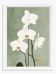
Quiet Orchid on Sage Art Print
Translation missing: en.products.product.sale_price From CHF 16.00CHF 22.00 -

Artichoke Study in Greens Art Print
Translation missing: en.products.product.sale_price From CHF 16.00CHF 22.00 -

Gardens of the World Botanical Art Print
Translation missing: en.products.product.sale_price From CHF 16.00CHF 22.00 -

Vibrant Windowsill Greenery Art Print
Translation missing: en.products.product.sale_price From CHF 16.00CHF 22.00 -

Studies in Botanical Ornament by William Morris Art Print
Translation missing: en.products.product.sale_price From CHF 16.00CHF 22.00 -

Green Striped Muse Canvas Print
Translation missing: en.products.product.sale_price From CHF 61.00CHF 87.00 -

Green Frog in the Foliage Art Print
Translation missing: en.products.product.sale_price From CHF 16.00CHF 22.00 -

Pastel Green Fields Art Print
Translation missing: en.products.product.sale_price From CHF 16.00CHF 22.00 -

Light Green Botanical Elegance Art Print
Translation missing: en.products.product.sale_price From CHF 16.00CHF 22.00 -

Morris-Inspired Botanical Moth Study Canvas Print
Translation missing: en.products.product.sale_price From CHF 61.00CHF 87.00 -

Royal Botanic Garden, Edinburgh Art Print
Translation missing: en.products.product.sale_price From CHF 16.00CHF 22.00 -
Urban Green Abstract Art Print
Translation missing: en.products.product.sale_price From CHF 16.00CHF 22.00 -

Greenhouse Photography Art Print
Translation missing: en.products.product.sale_price From CHF 16.00CHF 22.00 -
Silhouette Serenity Art Print
Translation missing: en.products.product.sale_price From CHF 16.00CHF 22.00 -

Golfers on the Green Art Print
Translation missing: en.products.product.sale_price From CHF 16.00CHF 22.00 -

Into the Water I Go Art Print
Translation missing: en.products.product.sale_price From CHF 16.00CHF 22.00


More from The Frame

What to Put in a Stairwell: The Hardest Wall in...
Stairwells are the wall everyone postpones. The ceiling is too high, the angle is wrong, the lighting is bad, and every nail hole feels like a permanent mistake on a...

Art at the Top and Bottom of a Staircase
Staircases are the most overlooked walls in the house. They are also the trickiest, because the top of the stairs, the bottom of the stairs, and the landing in between...

Above the Toilet, Above the Bath: Bathroom Art ...
Bathrooms are the most overlooked walls in the house, and the trickiest to get right. Steam, splash, awkward sightlines and tiled surfaces all conspire against the kind of art advice...