How to Build a Cityscape Gallery Wall That Tells a Story
From Tokyo at dusk to seven cities of your life: how to arrange cityscape prints with confidence and intent.

A gallery wall of cityscapes is one of the few decorating projects that gets better the more personal it becomes. The cities you've lived in, the skylines you've watched from hotel windows, the streets you walked once and never forgot. This guide walks you through the entire process, from picking prints that hang together visually to laying them out on the floor before a single nail goes in.
Why cityscapes make unusually good gallery walls
Most gallery walls suffer from a coherence problem. You hang a botanical print next to an abstract next to a family photo and the wall ends up reading as a scrapbook. Cityscapes solve this almost automatically because they share a built-in visual grammar: horizon lines, architectural geometry, and a consistent sense of scale.
That shared grammar is why cityscape art ideas tend to work even when the prints themselves are wildly different in mood. A monochrome shot of Manhattan and a dusky illustration of Lisbon will still feel like cousins on the wall, because the eye reads them both as "view of a city" before it reads anything else.
The other reason cityscapes punch above their weight: narrative. A tree print is just a tree. A skyline is a place you've been, want to go, or grew up in. That story makes the wall worth looking at long after the novelty of new art wears off.

One city or many: building a cohesive theme
Before you buy anything, decide which story you're telling. There are really only two good answers, and the difference matters more than people think.
One city, multiple perspectives
Pick a single city and show it from different angles, times of day, or scales. London at dawn, London at street level, London from above. This approach feels considered and intimate, and it works particularly well in bedrooms, hallways, and home offices where the wall is read slowly.
The trick is variation within constraint. Same city, but mix a tight architectural detail (a single bridge, a doorway) with a wide skyline and a mid-range street scene. Three different focal lengths reading the same place.
Many cities, one mood
The wanderlust route. Five cities, ten cities, a personal map of where you've been or want to go. The risk here is chaos, so you need a unifying thread that isn't the subject matter. Usually that means one of three things:
- A consistent palette. All golden hour. All blue and grey. All black and white.
- A consistent medium. All photography, or all line illustration, or all watercolour.
- A consistent time of day. Every city at night, every city in fog.
We'd nudge most people toward the palette route. It's the most forgiving and gives you the widest pool of cityscape art prints to choose from while still feeling deliberate.
The best layout for 3, 5, and 7 cityscape prints
There's no single correct layout, but there are layouts that consistently work for cityscape subject matter specifically. Here's what we recommend.
Three prints
The cleanest option is a horizontal row of three same-size prints, evenly spaced, with 5 to 7cm between frames. This works because cityscapes naturally have horizon lines, and aligning three skylines at the same height creates a panoramic effect even when the cities are different.
If you want more drama, try one large landscape-oriented print on the left and two smaller portrait-oriented prints stacked to the right. Keep the total height of the stacked pair equal to the height of the large print.
Five prints
Five is the sweet spot for cityscapes. Our preferred layout is a 2-1-2 grid: two prints on the left, one larger anchor in the middle, two on the right. The middle print should be your strongest image and ideally larger (60x80cm flanked by 40x50cm works beautifully).
Alternatively, a long horizontal row of five prints in matching sizes makes a stunning panorama above a sofa or bed. Spacing should be tight, around 4 to 5cm, so the eye reads them as one continuous piece.
Seven prints
Seven is where things get ambitious, and where planning becomes non-negotiable. The most reliable layout is a salon-style cluster anchored by one large central print (around 70x100cm) with six smaller prints arranged around it. Keep gaps consistent at 5cm throughout.
A grid of seven rarely works because it's an awkward number, so don't fight it. Embrace asymmetry, but balance the visual weight: if you have a heavy dark print top-left, balance it with a similarly weighted print bottom-right.

Mixing photography, illustration, and abstract city art
This is where most gallery walls go wrong. The instinct is to mix freely because variety feels exciting, but visually it almost always reads as cluttered.
Our rule: pick two styles maximum. Photography plus minimalist line illustration works. Watercolour plus abstract geometric works. Photography plus watercolour plus illustration plus abstract does not work, no matter how good the individual prints are.
If you're mixing photography art prints with illustrated cityscapes, keep the photography black and white. Colour photography next to colour illustration creates two competing realities, and your eye doesn't know which one to trust. Black and white photography reads as neutral and lets the illustrated work carry the colour.
Abstract city art (think geometric reductions of skylines, colour-blocked architectural shapes) is best used as a single accent piece within a wall of more representational work. One abstract among five photographs gives the wall a moment of breath. Three abstracts among three photographs reads as confused.
Size combinations that create visual rhythm
A wall of identically sized prints is calm but can feel a bit municipal, like a corporate lobby. Mixed sizes give you rhythm, but only if there's a logic underneath.
The simplest logic is a clear hierarchy: one large anchor print, two medium supporting prints, and any number of smaller accent prints. The anchor should be at least 50% larger than the next size down, otherwise the eye reads them as roughly equal and the hierarchy collapses.
Our most-recommended size combinations:
- Three prints: one 60x80cm anchor, two 40x50cm supporters
- Five prints: one 70x100cm anchor, four 40x50cm supporters
- Seven prints: one 70x100cm anchor, two 50x70cm seconds, four 30x40cm accents
For canvas, you can scale up further. Our XL canvas goes to 100x150cm, which makes a stunning solo anchor on a large wall flanked by smaller framed prints.
Horizon line alignment
This is the cityscape-specific tip that separates a good wall from a great one. When you have multiple skyline prints at the same eye level, try to align the horizon lines across the prints, not just the frame edges. Hold prints up and check where the skyline sits within each frame. If they match, the wall reads as one continuous city even when the cities are different.
This won't always be possible, especially when mixing tight architectural shots with wide panoramas. But on rows of similarly composed skylines, it's transformative.
Keeping frames consistent: our recommendations
The single biggest decision after choosing the prints is the frames. Get this right and even an imperfect layout looks intentional. Get it wrong and a perfect layout looks chaotic.
The rule: pick one frame style for the entire wall, or two at most if you have a deliberate reason. Three or more frame styles never works. We've never seen it work.
Our default recommendation for cityscape walls is a slim black frame in solid wood. It disappears around the image, which lets the cityscape do the work, and it pairs with virtually any interior. Black is particularly good for photography and high-contrast illustration.
Natural oak is the second-best option, and our preference for warmer rooms or any wall with a lot of greenery. Oak works exceptionally well with golden hour cityscapes, watercolour cities, and any palette that leans warm.
White frames are the third option, mostly for very light, airy interiors. They tend to wash out against a white wall, so use them only when the wall behind is colour or wallpaper.
Our framed prints arrive ready to hang with proper UV-protective acrylic glaze rather than glass, which matters for two reasons: they're lighter (so seven of them on one wall won't pull the plaster off), and the prints won't fade in direct sunlight, which is exactly the kind of detail people forget about until a year in.
When to break the one-frame rule
The exception is the deliberate anchor. If you're using one large central print as the visual anchor, you can frame it differently to emphasise it. A natural oak anchor surrounded by black-framed supporting prints can look fantastic, provided the contrast is intentional and isolated to one piece.

How to plan your layout before putting a single nail in the wall
This is the part most people skip and most people regret. Plan everything on the floor first, then on the wall in paper, then commit.
Step 1: Floor mockup
Clear a section of floor roughly the size of your wall area. Lay your prints out exactly as you intend to hang them, with measured gaps. Use a tape measure, not your eyes. Live with the arrangement for a day. Walk past it. Move pieces. The floor is free and forgiving.
Step 2: Paper templates
Cut sheets of newspaper or kraft paper to the exact dimensions of each frame. Tape them to the wall using painter's tape (low-tack, won't damage paint). Mark where the picture hook would go on each piece of paper before you tape it up. Step back. Squint. Take a photo, because your phone camera will reveal misalignment your eye misses.
This is also when you check eye-level alignment. The professional consensus is that the centre of a gallery wall should sit roughly 145 to 152cm from the floor, which is average eye level. For cityscape walls specifically, we'd suggest erring slightly higher if you're hanging above a sofa or sideboard, because cityscapes reward being looked up at slightly.
Step 3: The 2/3 rule
If your gallery wall is hanging above a piece of furniture, the total width of the arrangement should be roughly two-thirds the width of the furniture. A 240cm sofa wants a gallery wall around 160cm wide. Wider than the furniture looks unbalanced; much narrower looks lost.
Step 4: Hang from the centre out
Once you've committed, start with the anchor print and work outward. This way any small spacing errors get distributed to the edges where they're least noticeable, rather than compounding through the middle of the wall.
Gallery walls we've seen our customers create
A few real combinations that have come back to us as photographs, with notes on why each one works. These are good starting points if you're stuck.
The single-city evolution wall. Five prints of New York: a vintage-toned shot of the Brooklyn Bridge, a black-and-white skyline from the 1980s, a contemporary aerial, a tight architectural detail of the Chrysler Building, and a watercolour of Central Park. All in matching black frames. It works because the city anchors it; the variety of mediums tells the story of how the city itself has been seen over time.
The honeymoon wall. Three prints, all golden hour: Florence, Rome, Venice. Same warm palette, same time of day, same photographic style, oak frames. Simple, personal, instantly cohesive. This is the easiest cityscape gallery wall to pull off and one we recommend to anyone nervous about mixing.
The wanderlust seven. Tokyo, London, Paris, New York, Marrakech, Lisbon, Sydney. All converted to black and white photography, all the same slim black frame. Without the unifying treatment this would be visual chaos; with it, it reads as a single passport. Many of these started as part of travel art prints collections.
The mixed-medium trio. Three prints of one city (Berlin) in three different mediums: a photograph, a line illustration, a colour-blocked abstract. Same frame, same approximate palette, deliberately staggered sizes. This works because the constraint (one city) gives the variety (three mediums) something to push against.
If you want to skip the curation step entirely, our pre-curated wall art sets are designed with this kind of cohesion already built in: matching palettes, matching frames, sizes calibrated to work together.

A few common mistakes to avoid
Hanging too high is the number one error. If your wall feels disconnected from the room, it's almost always because the centre point is closer to 170cm than 150cm. Drop it.
Inconsistent mat sizes between prints. If your prints have white borders, make sure those borders are consistent across the wall, otherwise the spacing will look uneven even when the frames are perfectly aligned.
Buying prints without checking your room's existing colours. Hold the print mock-up against the wall and the nearest furniture before committing. A cityscape with a dominant teal cast will fight a terracotta sofa no matter how good the print is.
Finally: don't rush. The best cityscape walls are built over months, not afternoons. Start with three prints, live with them, add a fourth when you find the right one. The wall that tells your story is the one you've taken time to build.

Fab products featured in this blog
-

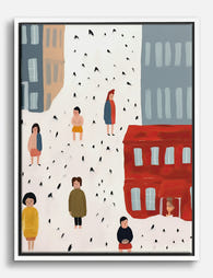
Vibrant City Streets Canvas Print
Translation missing: en.products.product.sale_price From CHF 62.00CHF 88.00 -
City Strolls in Red and Grey Canvas Print
Translation missing: en.products.product.sale_price From CHF 62.00CHF 88.00 -

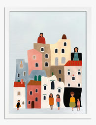
City Strolls and Skylines Art Print
Translation missing: en.products.product.sale_price From CHF 16.00CHF 22.00 -
Little Town, Tall Houses Art Print
Translation missing: en.products.product.sale_price From CHF 16.00CHF 22.00 -

New York Skyline in Black and White Canvas Print
Translation missing: en.products.product.sale_price From CHF 62.00CHF 88.00 -
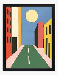
Sunny City Street Cut-Out Art Print
Translation missing: en.products.product.sale_price From CHF 16.00CHF 22.00 -

Street Lamp Cut-Out Cityscape Canvas Print
Translation missing: en.products.product.sale_price From CHF 62.00CHF 88.00 -

City Skyline with Fireworks Art Print
Translation missing: en.products.product.sale_price From CHF 16.00CHF 22.00 -
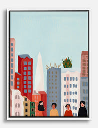
Colourful City Life Canvas Print
Translation missing: en.products.product.sale_price From CHF 62.00CHF 88.00 -

City Strolls in Soft Hues Canvas Print
Translation missing: en.products.product.sale_price From CHF 62.00CHF 88.00 -
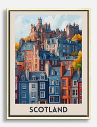
Scotland Edinburgh Travel Poster Canvas Print
Translation missing: en.products.product.sale_price From CHF 62.00CHF 88.00 -
Colourful City Stroll Canvas Print
Translation missing: en.products.product.sale_price From CHF 62.00CHF 88.00 -

City Strolls and Soft Skies Canvas Print
Translation missing: en.products.product.sale_price From CHF 62.00CHF 88.00 -

Painted Ladies, San Francisco Art Print
Translation missing: en.products.product.sale_price From CHF 16.00CHF 22.00 -
City Blocks, Everyday Magic Canvas Print
Translation missing: en.products.product.sale_price From CHF 62.00CHF 88.00


More from The Frame

Every Animal in William Morris's Designs: The C...
Most people know the thrush in Strawberry Thief and stop there. But Morris's wider body of work contains foxes, hares, peacocks, ravens, lions, herons, woodpeckers, deer, and doves, often half-buried...

Countryside Decor Ideas: How to Bring Rural Cal...
Countryside art has quietly become one of the most versatile choices in modern interiors. Not the chintz-and-bunting version, but the kind of soft, considered pastoral scenes that bring the outside...

Arts and Crafts Animal Prints: The Victorian De...
The Arts and Crafts revival: why Victorian animal prints are trending again Scroll through any interior design hashtag right now and you'll see them everywhere: hares peering through curling foliage,...