Building a Gallery Wall with Flat Design Prints: Sizes, Layout, and What to Mix In
A foolproof system for building a flat design gallery wall, with exact layouts, measurements, and pre-planned combinations.

Flat design is the most forgiving art style for gallery walls, and almost nobody talks about why. Clean shapes, limited palettes, and consistent visual weight mean the prints do half the styling work for you. This guide gives you the exact templates, measurements, and combinations to copy.
Why flat design prints are gallery wall gold
Most gallery wall failures come from mismatched visual weight. One print is a moody oil painting, another is a delicate line drawing, a third is a saturated photograph, and the eye doesn't know where to land. Flat design solves this by default.
Flat illustration uses bold shapes, restricted colour palettes, and no gradients or texture-heavy detail. That means every print in the style already shares a visual language. Pair a flat landscape with a flat geometric abstract and they read as siblings, even if the subjects are unrelated.
The matte, ink-forward nature of the work also matters. Flat designs lose their punch on glossy surfaces because the appeal lives in clean colour blocks and crisp edges. Printed on thick matte paper with giclée inks, the colours stay flat in the right way: even, saturated, no glare bouncing off them. This is the format the style was built for.

Choosing a centrepiece: size and subject
Every gallery wall needs an anchor. Without one, the eye scans the wall left to right with nowhere to rest, and the arrangement feels like a checkerboard.
Pick your largest print first. For a wall above a standard 3-seater sofa (around 200cm wide), your centrepiece should be 50x70cm or 60x80cm. Above a sideboard or console (120-140cm wide), drop to 40x50cm or 50x70cm. In a hallway or narrow wall, 30x40cm is enough.
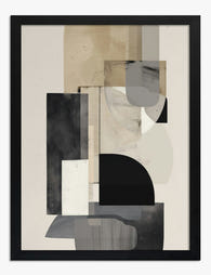
The centrepiece should also be your most graphically confident piece. A bold figurative flat illustration, a strong geometric composition, or a high-contrast landscape. Save subtle, paler prints for the supporting roles. If you're browsing the flat design collection, the rule of thumb is: pick the one you'd happily hang on its own, then build around it.
A practical tip on subject. Centrepieces with a clear focal point (a sun, a figure, a single architectural form) anchor better than all-over patterns. Save the busy patterns for the supporting positions where they soften the edges of the arrangement.
The 3-print, 5-print, and 7-print layouts that always work
These are the three layouts we'd recommend for nine out of ten flat design walls. Each has a fixed configuration, fixed sizes, and fixed spacing. Copy them.
The 3-print horizontal (best for above sofas, beds, sideboards)
One 50x70cm centrepiece, two 30x40cm prints flanking it. Hang the smaller prints centred vertically against the larger one, so the midpoints align. Gap between frames: 5cm.
Total wall width covered: roughly 130cm. Sits comfortably above any sofa from 180cm and up. The asymmetry between the centrepiece and the side prints stops it feeling like a school photo, which is the trap with three identical sizes.
The 5-print cross (best for square-ish walls, alcoves, end-of-corridor walls)
One 50x70cm centrepiece, four 30x40cm prints, one above, one below, one left, one right. Gap between frames: 6cm.
Total area: about 130cm wide by 160cm tall. This is the most balanced layout and the easiest to plan because it's symmetrical. It works brilliantly above a small console or in a narrow lounge alcove. Use the top and bottom positions for landscape orientations and the left and right for portraits.
The 7-print salon (best for tall walls, staircases, statement walls)
One 60x80cm centrepiece (positioned slightly left of centre), one 50x70cm, two 40x50cm, three 30x40cm. Gaps: 5-6cm throughout.
This one needs planning. Lay it out on the floor first. The centrepiece anchors the lower-left quadrant, the 50x70cm sits upper right, and the smaller prints fill the gaps. The aim is an irregular outer edge with a tight, consistent inner spacing. Total area: roughly 180cm wide by 200cm tall.
If laying out seven prints sounds like work, our pre-curated wall art sets take the planning out of it.

Mixing flat illustration with geometric and abstract prints
The best flat design gallery walls aren't 100% flat illustration. They borrow from neighbouring styles to add texture and stop the wall feeling like a children's book spread.
Two styles mix beautifully with flat design.
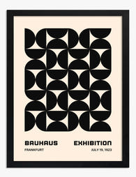
Geometric prints share flat design's love of clean shapes and limited palettes, but bring a more architectural, mathematical feel. A grid of triangles, a Bauhaus-style composition, a single circle on a coloured ground. They add structure. Aim for one geometric print per three flat illustrations. Browse geometric flat art prints for options that bridge both worlds.
Abstract prints with flat colour fields (think Rothko-influenced colour blocks, not gestural brushwork) add quietness. Where flat illustrations have content, abstracts have mood. They give the eye somewhere to rest between the busier pieces. Use one abstract per five prints, maximum. The abstract art prints collection has plenty that work in this register.
What we'd avoid mixing in: photography, watercolours, detailed pen-and-ink work, or anything with heavy texture. They sit at a different visual weight and the contrast becomes jarring rather than interesting.
The visual weight rule. Bold, saturated flat illustrations carry more weight than pale geometrics. If your centrepiece is a punchy red and navy figure, balance it with quieter geometric pieces in the supporting positions. If your centrepiece is a soft sage and cream landscape, you can afford a louder geometric print as a counterpoint.
Frame colour and consistency: our rules
We have firm opinions here. Inconsistent framing is the single most common reason gallery walls look amateur.
Rule 1: pick one frame colour for the whole wall. Black, white, or natural oak. That's it. Mixing frame colours across a gallery wall almost never works for flat design because the prints already have varied palettes. The frames need to be the consistent element.
Rule 2: match the frame to the room's dominant tone. Black frames in rooms with dark furniture or moody walls. White frames in bright, minimalist rooms with pale walls. Natural oak in warmer schemes with timber furniture and earth tones. Oak is the most forgiving, black is the most graphic, white is the most invisible.
Rule 3: keep all frames the same depth and profile. Even if you've matched the colour, mixing a chunky 4cm-deep frame with a slim 2cm one will read as a mistake. Order all frames from the same range.
This is where shipping matters more than people realise. The biggest disappointment with framed prints is when frames arrive separately from the print, or warp in transit, or the print isn't fitted properly inside. Our framed prints ship as one unit, fitted, with the UV-protective acrylic glaze already in place and fixtures attached. You hang them, you're done.
A note on glazing. We use acrylic rather than glass. For a gallery wall this matters: glass over six or seven prints adds significant weight, increases breakage risk, and creates more glare. Acrylic is lighter, doesn't shatter, and the UV protection means the inks won't fade even on a sunny wall.
Spacing and hanging: exact measurements for standard UK and US walls
Spacing is where most guides go vague. Here are the numbers.
Between frames: 5-8cm (2-3 inches). Stick to 5cm for tight, contemporary layouts and 8cm for a more relaxed feel. Whatever you pick, use the same gap throughout. Inconsistent gaps are the second-biggest gallery wall mistake after frame inconsistency.
Centre height of the arrangement: 145cm (57 inches) from the floor. This is gallery standard and it works for almost every room. The centre point of the entire arrangement (not the centrepiece print) should sit at this height.
Above furniture: 15-20cm (6-8 inches) between the top of the furniture and the bottom of the lowest frame. Closer than 15cm feels cramped. Further than 25cm and the art floats away from the furniture and stops feeling related to it.
Distance from ceiling and adjacent walls: minimum 30cm (12 inches). Gallery walls need breathing room. If your wall is too small to give the arrangement 30cm of clearance on all sides, you've picked the wrong wall or the wrong size prints.
The planning method we'd actually use
Skip the digital mockup tools. They're more work than they save. Instead:
- Cut paper templates to the exact size of each print (newspaper, brown paper, anything).
- Tape them to the wall using painter's tape (low-tack, won't damage paint).
- Stand back. Adjust until the proportions feel right.
- Mark the top centre of each template with a pencil dot on the wall.
- Take down the templates. Hang from the dots.
Allow yourself an hour. It's faster than redoing badly placed nail holes.
For renters, Command strips work for prints up to about 3kg. Most 30x40cm and 40x50cm framed prints fall under this. Larger framed prints need proper fixings, but the picture-hanging strip system can hold a 50x70cm if you use four strips.

Common gallery wall mistakes and how to fix them
Mistake: hanging too high. If you're craning your neck, it's wrong. Drop the centre point to 145cm and the whole arrangement comes down with it.
Mistake: prints too small for the wall. A cluster of 30x40cm prints on a 4-metre wall looks like postage stamps. Either go larger, add more prints, or pick a smaller wall.
Mistake: too many colours. Flat design walls work best with a constrained palette. Pick three or four colours that recur across the prints (a navy, a terracotta, a cream, a sage, for example). If a print introduces a fifth colour that appears nowhere else, swap it.
Mistake: ignoring the 60-30-10 rule. Across the whole arrangement, aim for one dominant colour at 60% of the visual area, a secondary colour at 30%, and an accent at 10%. This is what makes the wall feel cohesive rather than chaotic.
Mistake: lighting that kills the colour. Bold flat designs look different under warm 2700K lighting versus cool 4000K. Warm lighting flatters terracottas, mustards, and creams. Cool lighting flatters blues, sages, and monochrome schemes. Match your bulb temperature to your palette.
Mistake: treating the wall as finished. Flat design is modular. The whole point of consistent frame colours and confident spacing is that you can swap a single print out next year without rebuilding the whole arrangement. Start with five prints, add two more in six months when you find the right ones.
Ready-made combinations from our flat design collection
If you want to skip the planning entirely, these three combinations are ones we'd put on our own walls.
The Warm Minimalist (5 prints, 5-print cross layout, oak frames). A central terracotta and cream abstract landscape, two flat illustrated still lifes (a vase, a fruit composition) in muted ochres, a geometric sun motif, and a soft sage colour-field abstract. Palette: terracotta, ochre, sage, cream. Works in: living rooms, bedrooms with timber furniture.
The Graphic Modernist (3 prints, 3-print horizontal, black frames). A bold central Bauhaus-style geometric in primary colours, flanked by two simpler flat illustrations in matching tones. Palette: red, navy, mustard, white. Works in: home offices, dining rooms, hallways with white or pale grey walls.
The Quiet Scandinavian (7 prints, salon layout, white frames). A central flat landscape in pale blues and creams, two geometric prints in soft greys, two minimalist figurative illustrations, two abstract colour fields in dusty pink and pale ochre. Palette: pale blue, cream, dusty pink, soft grey. Works in: bedrooms, nurseries, bright apartments.
Each of these can be assembled from a single browse through the flat design and geometric collections.

A final word on getting started
Don't try to plan the perfect wall in your head. Pick your centrepiece, pick your frame colour, pick one of the three layouts above, and commit. The paper template method takes an hour and tells you everything the spreadsheet never will. Hang it, live with it for a week, then decide if anything wants swapping. Flat design walls are built to evolve, which means the only real mistake is not starting.

Fab products featured in this blog
-

Bauhaus Geometry Poster Canvas Print
Translation missing: en.products.product.sale_price From CHF 61.00CHF 87.00 -

Bauhaus Geometry Poster Canvas Print
Translation missing: en.products.product.sale_price From CHF 61.00CHF 87.00 -

Bauhaus Modern Minimal Canvas Print
Translation missing: en.products.product.sale_price From CHF 61.00CHF 87.00 -
Urban Neutral Geometry Art Print
Translation missing: en.products.product.sale_price From CHF 16.00CHF 22.00 -

Bauhaus Modern Geometry Art Print
Translation missing: en.products.product.sale_price From CHF 16.00CHF 22.00 -

Balanced Neutral Geometry Canvas Print
Translation missing: en.products.product.sale_price From CHF 61.00CHF 87.00 -

Bauhaus Modern Geometry Canvas Print
Translation missing: en.products.product.sale_price From CHF 61.00CHF 87.00 -

Neutral Organic Flow Art Print
Translation missing: en.products.product.sale_price From CHF 16.00CHF 22.00 -

Bauhaus Modern Geometry Art Print
Translation missing: en.products.product.sale_price From CHF 16.00CHF 22.00 -

Modern Neutral Geometry Art Print
Translation missing: en.products.product.sale_price From CHF 16.00CHF 22.00 -

Modern Neutral Geometry Canvas Print
Translation missing: en.products.product.sale_price From CHF 61.00CHF 87.00 -

Bauhaus Modern Geometry Art Print
Translation missing: en.products.product.sale_price From CHF 16.00CHF 22.00 -

Bauhaus Modern Geometry Art Print
Translation missing: en.products.product.sale_price From CHF 16.00CHF 22.00 -

Bauhaus Modern Geometry Art Print
Translation missing: en.products.product.sale_price From CHF 16.00CHF 22.00 -

Bauhaus Geometric Modern Canvas Print
Translation missing: en.products.product.sale_price From CHF 61.00CHF 87.00 -

Modern Geometric Home Art Print
Translation missing: en.products.product.sale_price From CHF 16.00CHF 22.00 -

Bauhaus Graphic Geometry Art Print
Translation missing: en.products.product.sale_price From CHF 16.00CHF 22.00 -
Modern Bauhaus Grid Art Print
Translation missing: en.products.product.sale_price From CHF 16.00CHF 22.00 -

Bauhaus Geometric Grid Art Print
Translation missing: en.products.product.sale_price From CHF 16.00CHF 22.00


More from The Frame

Why Do Most London Gallery Walls Look Like Tour...
A red phone box. A Beefeater. Big Ben in cartoon watercolour. You've seen this wall a hundred times, and it never looks like someone actually lives there. The good news...

Living Room Urban Art Ideas: Building a Gallery...
A blank living room wall is an opportunity, but it's also where most gallery walls go wrong. Urban art gives you something that floral prints and abstract pastels can't: a...

Why Do Most Travel Gallery Walls Look So Clutte...
Most travel gallery walls fail for the same reason: they try to show everything. Every trip, every favourite shot, every poster picked up at a museum gift shop, all crammed...