How to Build a Frida Kahlo Gallery Wall That Actually Works
The pairing rules, layout templates and frame choices that turn a stack of Kahlo prints into a coherent wall.

Most gallery walls fail in the same way: too many competing ideas, mismatched frames, prints that look great alone but argue with each other on the wall. Kahlo's work raises the stakes because her colour and symbolism are already loud. Done right, a Frida wall becomes the most memorable thing in your home. Done wrong, it looks like a notice board.
Start with one anchor: choosing your hero Kahlo print
Every gallery wall needs a single piece that does the heavy lifting. With Kahlo, this is almost always a portrait. The face is what your eye locks onto, and it sets the emotional temperature for everything around it.
Three works function brilliantly as anchors. The Two Fridas is symmetrical, narrative, and reads well at scale because the doubled figure gives your eye somewhere to travel. Self-Portrait with Thorn Necklace and Hummingbird is the most iconic single-figure choice, with deep greens and a coral-red that essentially hand you a colour palette for the rest of the wall. The Broken Column is more confrontational and works best in spaces where you want the wall to feel serious rather than decorative.
Size your anchor generously. For a living room focal wall, go for 70x100cm if you can. Bedrooms can take 50x70cm comfortably. The rule we follow: your anchor should be at least 30% larger than any other single piece on the wall. If everything is the same size, nothing is the hero.

A quick word on print quality, because Kahlo specifically rewards it. Her palette relies on saturated reds, deep teals, and the kind of warm yellows that go muddy on cheap paper. Museum-grade giclée printing on thick matte paper holds those colours properly and shows the texture in her brushwork. If the print looks flat, the wall will feel flat. Browse the full range of Frida Kahlo art prints before you commit to your anchor, because the piece you choose will dictate every decision that follows.
Complementary pairings: botanical, folk art and bold colour
Kahlo doesn't need much help, but she does need company that speaks her language. There are three pairing categories that consistently work.
Botanicals. Kahlo's own paintings are full of leaves, vines, monkeys, parrots and fruit. Tropical foliage prints, monstera, banana leaf, and especially marigold or cactus studies sit beside her work like they were always meant to be there. Avoid pale, washed-out botanicals though. You want prints with depth and saturation, not the dusty pinks and beiges that have dominated print shops for the last five years. The botanical art prints collection is a good starting point if you want pieces with proper colour density.
Mexican folk art motifs. Talavera tile patterns, papel picado-inspired graphics, Otomi embroidery patterns, Day of the Dead imagery handled tastefully. These echo Kahlo's cultural context without competing with her face. One folk art piece per wall is usually enough. Two starts to feel like a theme park.
Bold colour blocks and abstracts. A pure colour study, a saturated abstract, or a mid-century-style geometric piece can act as visual breathing room between the more detailed work. Pull the colours directly from your anchor. If your hero print has that thorn-necklace combination of forest green and coral, find an abstract that uses one or both of those colours and let it do nothing else.
How to extract a colour palette from your Kahlo print
Stand a metre back from your chosen print and squint. The three or four colours you still see are your palette. Everything else on the wall should pull from those colours. If your anchor is mostly deep green, terracotta and cream, then a print with hot pink and electric blue will fight it. The squint test sounds silly. It works.
What NOT to pair with Kahlo
This is where most gallery walls go wrong, and the mistakes are predictable.
Inspirational quote prints. "Live, Laugh, Love" next to a woman painting her own broken spine is comedy. Kahlo's work is autobiographical and often painful. Generic affirmations cheapen it instantly.
Minimalist line drawings. Single-line face sketches and abstract nudes have their place, but next to Kahlo they look like they wandered in from a different flat. Her work is dense, layered and symbolic. Pairing it with sparse line work creates a visual mismatch that reads as accidental, not curated.
Too many other portraits. One portrait anchor is powerful. Three or four portraits start to feel like a hall of fame, and your eye doesn't know where to land. Rule: one face per wall, unless you're doing The Two Fridas, which counts as one composition.
The Diego Rivera question. People ask this a lot. Putting Diego prints next to Frida prints almost always backfires. Their styles compete rather than complement, and the biographical baggage turns your wall into a soap opera. If you love Rivera, give him his own space in another room.
Beige filler. The biggest failure mode is hedging. Shoppers pick a bold Kahlo, panic, and surround her with neutral abstract prints to "balance" the wall. This doesn't balance anything. It just makes the Kahlo look stranded. Lean into the colour. That's the whole point.
Layout templates that work
Three arrangements consistently deliver. Pick one based on your wall size and how much commitment you're ready for.
The 3-piece horizontal
Best for: above a sofa, sideboard or bed. Wall width: 1.8m or wider.
Anchor in the centre at 70x100cm portrait orientation. Flank with two 50x70cm prints, one on each side. Keep 5-7cm between frames. The bottom edges should align horizontally. This is the most foolproof Kahlo arrangement and the one we recommend if you've never built a gallery wall before.
The 5-piece salon style
Best for: a full focal wall in a living room or hallway. Wall width: 2.2m or wider.
Anchor at 70x100cm, positioned slightly left of centre. Two medium prints (40x50cm or 50x70cm) stacked to the right of the anchor. Two smaller prints (30x40cm) below or offset to the lower left. The trick: imagine an invisible rectangle around the whole arrangement. Every print should sit inside it, with roughly equal margins to the rectangle's edges. Frame spacing stays at 5-7cm throughout.

The asymmetric triangle
Best for: awkward walls, stairwells, or anyone who finds grids boring.
Anchor in the upper left at 60x80cm. Mid-size print lower right at 40x50cm. Smaller print upper right at 30x40cm. The three centre points should form a rough triangle. This arrangement feels intentional rather than accidental, but it requires confidence. Tape paper templates to the wall first.
For pre-planned combinations that take the guesswork out, the wall art sets collection groups pieces designed to hang together.
Size mixing done right
Uniform grids of nine identical prints look great with photography or botanicals. They flatten Kahlo. Her work is too dense and too varied for a grid to do it justice.
The formula that works: one large, two medium, two small. The large piece is your anchor. The mediums create visual weight on either side. The smalls add detail and rhythm.
Specifically: 70x100cm anchor, 40x50cm mediums, 30x40cm smalls. The size jumps are deliberate. If your medium is too close in size to your anchor, the hierarchy collapses and the wall reads as flat. You want each tier to feel distinctly different.
For a smaller wall or a bedroom, scale everything down proportionally: 50x70cm anchor, 30x40cm mediums, 20x30cm smalls. Keep the ratios.
Frame consistency: why matching frames make a Kahlo wall sing
This is the single most important decision after choosing your anchor. Kahlo's imagery already brings drama, colour, symbolism and texture. If your frames also bring variety, the wall tips into chaos.
Pick one frame finish and commit to it across every piece. Three options work for Kahlo:
Matte black is the most contemporary and the safest choice. It frames her colour without competing, and it works in modern, minimalist, and traditional interiors equally well.
Natural oak or ash is warmer and more relaxed. Best for rooms with wooden floors, rattan, linen, or any kind of mid-century furniture. The wood pulls out the earth tones in Kahlo's palette.
Ornate gold is the boldest choice and the most period-appropriate to Kahlo's own era. It's also the hardest to pull off because it demands the rest of your room to be relatively restrained. If your sofa is already velvet and your wallpaper is already patterned, gold frames will tip the room over.
Whichever you choose, every frame on the wall must match. Same colour, same profile, same width. This is where shipping matters. Frames that arrive separately from prints, or frames that warp because they're made from MDF, will visibly differ even when they're nominally the same. Solid wood frames with the print fitted properly at source give you genuine consistency. UV-protective acrylic glazing is also worth specifying because Kahlo's saturated pigments are exactly the sort of colours that fade fastest in sunlight.
Hanging tips for renters and homeowners
If you can drill
Use a laser level. Mark your anchor's centre point first, typically 145-150cm from the floor to the centre of the print (gallery standard eye level). Position every other piece relative to the anchor.
Cut sheets of kraft paper or newspaper to the exact size of each print. Tape them to the wall first and live with the arrangement for 48 hours before hanging anything. You'll catch problems your eye misses on day one.
Frames that arrive ready to hang with fixtures already attached save genuine hours here. Measure twice, drill once.
If you can't drill
Command strips work better than people give them credit for, but you have to respect the weight limits. A 30x40cm framed print weighs roughly 1-1.5kg and four large strips will hold it comfortably. A 50x70cm framed print is closer to 3-4kg and needs the heavy-duty velcro variants, used in pairs along the top edge.
For the 70x100cm anchor, we'd be honest: Command strips are at their limit. Either go canvas (significantly lighter than framed prints, and can be hung on a single picture hook or even strong adhesive hooks) or have a chat with your landlord about a single picture hook. Most are fine with one small hole.

Canvas is genuinely useful for renters. It's lighter, doesn't need glazing, and works well in humid rooms like bathrooms or kitchens where framed prints can struggle. The trade-off: framed prints look more polished and more formal. Canvas reads as casual. For Kahlo specifically, we lean framed for the anchor and would consider canvas for the supporting pieces if weight is a concern.
Spacing and eye level
Frames should sit 5-7cm apart. Closer than that and they merge into one shape. Further apart and the wall stops reading as a single composition.
Centre of arrangement at 145-150cm from floor. If you're hanging above a sofa, the bottom of the lowest frame should be 15-20cm above the back of the sofa. Any higher and the art floats. Any lower and it collides.

A final thought
The thing that separates a great Kahlo gallery wall from a mediocre one isn't the prints you choose. It's the discipline you bring to everything around them. Pick one anchor. Pull your colours from it. Match your frames. Resist the urge to soften the wall with neutral filler. Kahlo's work was never quiet, and your wall shouldn't be either. If you find more inspiration in colourful art prints that share her palette, you're already on the right track.

Fab products featured in this blog
-

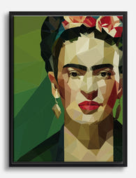
Frida Kahlo Geometric Muse Art Print
Translation missing: en.products.product.sale_price From CHF 16.00CHF 23.00 -

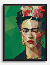
Frida Kahlo Geometric Muse Canvas Print
Translation missing: en.products.product.sale_price From CHF 62.00CHF 89.00 -

Frida Kahlo Geometric Muse Art Print
Translation missing: en.products.product.sale_price From CHF 16.00CHF 23.00 -

Frida in Pink Geometry Canvas Print
Translation missing: en.products.product.sale_price From CHF 62.00CHF 89.00 -

Frida Kahlo Geometric Muse Art Print
Translation missing: en.products.product.sale_price From CHF 16.00CHF 23.00 -
Frida Kahlo Geometric Muse Canvas Print
Translation missing: en.products.product.sale_price From CHF 62.00CHF 89.00 -

Frida Kahlo Geometric Muse Art Print
Translation missing: en.products.product.sale_price From CHF 16.00CHF 23.00 -

Frida Kahlo Geometric Muse Art Print
Translation missing: en.products.product.sale_price From CHF 16.00CHF 23.00 -

Frida Kahlo Geometric Muse Canvas Print
Translation missing: en.products.product.sale_price From CHF 62.00CHF 89.00 -

Frida in Pink Geometry Art Print
Translation missing: en.products.product.sale_price From CHF 16.00CHF 23.00 -

Frida Kahlo Geometric Muse Art Print
Translation missing: en.products.product.sale_price From CHF 16.00CHF 23.00 -

Frida in Facets Art Print
Translation missing: en.products.product.sale_price From CHF 16.00CHF 23.00 -
Frida Kahlo Geometric Muse Canvas Print
Translation missing: en.products.product.sale_price From CHF 62.00CHF 89.00 -

Frida Kahlo Geometric Muse Canvas Print
Translation missing: en.products.product.sale_price From CHF 62.00CHF 89.00 -

Frida Kahlo Geometric Muse Canvas Print
Translation missing: en.products.product.sale_price From CHF 62.00CHF 89.00 -

Frida and the Black Cat Canvas Print
Translation missing: en.products.product.sale_price From CHF 62.00CHF 89.00 -

Frida in Facets Canvas Print
Translation missing: en.products.product.sale_price From CHF 62.00CHF 89.00 -

Frida, Unseen Canvas Print
Translation missing: en.products.product.sale_price From CHF 62.00CHF 89.00 -

Frida Kahlo Botanical Muse Canvas Print
Translation missing: en.products.product.sale_price From CHF 62.00CHF 89.00 -

Frida and Her Cats Art Print
Translation missing: en.products.product.sale_price From CHF 16.00CHF 23.00


More from The Frame

Every Bird in William Morris's Designs: The Sto...
Why birds obsessed William Morris more than any other motif Morris designed acanthus leaves, willow boughs, strawberries, tulips and pomegranates, but he kept coming back to birds. Between the 1870s...

The Best Beige Art Prints for Bedrooms (And Exa...
Most guides tell you how to hang art, but not which beige prints actually suit a bedroom, or what size to buy for your specific bed. This one does both....

The Most Famous William Morris Designs, Ranked:...
William Morris designed over 50 patterns in his lifetime, and roughly six of them get all the attention. That's mostly fair, but not entirely. Here's our honest ranking of the...