Klimt's Beech Forest and Birch Forest Paintings: A Buyer's Guide to His Best Tree Art
A practical buyer's guide to choosing between Beech Forest I, Beech Grove, and Birch Forest for your walls.

Klimt's forests are having a moment, and the search results are a mess. People type in "beech forest poster" and end up looking at three different paintings with overlapping German names, no idea which one they actually want. This guide sorts it out and tells you which one belongs on your wall.
Klimt's forest paintings at a glance: which is which?
Gustav Klimt painted his forest landscapes between roughly 1900 and 1903, mostly during summers at Lake Attersee in Austria. They're square canvases (a format he favoured, partly tied to the Vienna Secession's decorative aesthetic) and they all share his pointillist-influenced technique of layered, dotted brushwork that makes the foliage shimmer.
Three paintings dominate the search results, and they get confused constantly:
- Beech Forest I (1902, sometimes listed as Buchenwald I): warm autumn palette, orange and rust leaves carpeting the ground, slim pale trunks rising vertically.
- Beech Grove (often called Beech Grove I, also Buchenwald): deeper, denser, far greener. A summer canopy with a moodier, almost overwhelming green-on-green effect.
- Birch Forest (1903, sometimes called Birken im Wald or Birch Trees): paler trunks with distinctive white bark, golden ground, more delicate and airier than the beech paintings.
The naming chaos comes from translation drift between German and English, plus the fact that Klimt himself painted multiple beech forest variants. When you search "klimt beech forest poster" you'll see Beech Forest I most often. When you search "klimt beech grove print" you'll get the greener one. Both are correct paintings. They're just different works.

Beech Forest I: the most popular choice and why
Beech Forest I is the one most people end up buying, and there's a clear reason. The palette does something rare in landscape art: it reads as both calming and warm at the same time. The trunks are cool, pale, slightly blue-grey. The ground is a riot of burnt orange, ochre, and rust. The contrast pulls your eye in without ever feeling busy.
It works almost anywhere because the colour story is so balanced. If your room has any wood furniture, terracotta, mustard, sage green, or warm neutrals, this print will lock into the palette immediately. It's particularly strong in living rooms, hallways, and bedrooms with natural light, where the orange tones glow rather than darken.
The composition is also forgiving. The vertical trunks give your eye clean structure, which means the print holds up even when viewed from across the room. That's important if you're hanging it above a sofa or in a large open-plan space.
If you want to browse the full set in one place, our Klimt forest collection groups all the variants together so you can compare side by side rather than hunting through product pages.
Birch Forest: lighter, more delicate, and surprisingly versatile
Birch Forest is the underrated one. People skip past it because it looks quieter in thumbnails, but in person at a decent size it does something the beech paintings can't: it lifts a room rather than weighting it.
The palette is white birch bark against a golden-green ground, with small flecks of red, yellow, and brown leaves scattered through. It's the most luminous of the three, which makes it the right pick if your room runs short on natural light. North-facing rooms, basement conversions, narrow hallways, anywhere that needs visual brightness will benefit from the white trunks and golden floor.
It also pairs unusually well with modern, pared-back interiors. The beech paintings can feel slightly maximalist next to a Scandinavian-style room. Birch Forest, with its whites and pale golds, works alongside oak floors, linen, and off-white walls without competing.
A note for anyone searching "klimt birch trees print": this is the same painting. The white bark detail is the giveaway. If the trunks are pale and the ground is gold-green, you're looking at Birch Forest.

Beech Grove: the deep green option for moody rooms
Beech Grove is the one to buy if you've committed to a darker, more atmospheric interior. The whole canvas is soaked in greens: forest green, moss, deep emerald, with the trunks reading darker and the canopy pressing down rather than opening up. There's no autumn colour relief here. It's high summer in deep woodland.
This makes it the right print for moody rooms. Dark green walls, navy walls, anything in the deep-and-saturated category. It also works brilliantly in studies, libraries, snugs, and dining rooms where you want the lights low and the atmosphere held in.
Some buyers use it in professional spaces (consulting rooms, therapy practices, treatment rooms) because the immersive green has a genuinely calming effect at scale. The repetition of the brushwork is almost hypnotic up close, which is part of why these paintings reward large sizes and proper viewing distance.
It's not the print for a bright, white, breezy living room. It'll fight the space. But in the right setting, it's the most striking of the three.
How to choose between them based on your wall and light
Here's the short version of how we'd advise picking one:
Choose Beech Forest I if:
- Your room has warm undertones (oak, walnut, terracotta, mustard, cream walls)
- You want a print that works year-round and pairs with most furniture
- You have decent natural light and want the orange tones to glow
- You're nervous about commitment and want the safest of the three
Choose Birch Forest if:
- Your room is low on natural light or has cool walls (white, pale grey, soft blue)
- Your interior is minimal, Scandinavian, or modern
- You want lift and brightness rather than density
- You're hanging it in a bedroom or hallway and want a softer presence
Choose Beech Grove if:
- You have dark or saturated walls (green, navy, charcoal, burgundy)
- You want maximum atmosphere and drama
- The room is for reading, dining, or working rather than active socialising
- You're styling a space that can carry visual weight
If you're still torn, the wall colour is usually the deciding factor. Cool or pale walls take Birch Forest. Warm or neutral walls take Beech Forest I. Dark or saturated walls take Beech Grove. It really is that simple in most cases.

Framed print vs canvas: our recommendation for these compositions
This is where we'd push back gently on the default instinct. Most people add Klimt to basket and click "framed" without thinking. For these particular paintings, we think canvas is often the better call, and here's why.
Klimt's forest paintings are built from thousands of small, layered dots and dabs. The surface texture is part of what makes them work. On a matte canvas, that texture sits naturally. The mirrored edge wrapping carries the image around the sides without cropping anything important, so even unframed it looks intentional rather than unfinished. Our canvases go up to 100x150cm, which gives you proper scale.
That said, framed prints have their own argument. A solid wood frame around a Klimt landscape gives you a more formal, gallery-feel presentation, which is sometimes exactly what you want, particularly in period properties or more traditional interiors. Our framed prints use UV-protective acrylic glaze rather than glass, which matters for two reasons: no glare destroying the image from across the room, and the inks won't fade even in direct sunlight. The frames are solid FSC wood, not MDF with a veneer wrapper.
The trade-off is weight and polish. Framed is heavier and more polished. Canvas is lighter, more textural, and (we'd argue) more sympathetic to Klimt's brushwork.
Our default recommendation:
- Beech Forest I: framed in natural oak or black, or canvas. Both work.
- Birch Forest: framed in white or natural oak for the gallery feel, or canvas for a softer effect.
- Beech Grove: canvas, almost always. The density of the green benefits from the matte canvas surface rather than the slight sheen of acrylic glaze.
The thing to actually worry about, regardless of which you pick, is build quality. The big failure in this category is frames shipped separately from prints, prints that arrive warped or bubbled, or framed pieces that look fine in the listing photo and cheap in person. Our prints and frames ship together, properly fitted, in one box, ready to hang. That's the bit most buyers don't think about until it goes wrong.
For more context on framing decisions across the full Klimt range, the same principles apply to most of his landscapes, though the portraits (The Kiss in particular) lean more strongly toward framed.
Size guide: why Klimt forests reward going large
The single most common buyer regret in this category is going too small. We hear it constantly. People order a 30x30cm print, hang it on a big wall, and the dotted brushwork that makes Klimt's forests feel immersive just disappears into the distance.
Klimt painted these as square canvases at roughly 100x100cm originals. The pointillist technique is designed to be seen at scale. From across the room, the dots merge into a shimmering field. Up close, they resolve into individual brush marks. You need size to get both experiences.
Our minimum recommended sizes:
- Above a sofa or bed (3-seater or king): 70x70cm absolute minimum, 80x80cm or 100x100cm ideal
- Hallway or stairwell focal wall: 60x60cm minimum, 80x80cm preferred
- Bedroom dressing area or smaller wall: 50x50cm minimum
- Above a console table or sideboard: 70x70cm minimum
For canvas, we'd actively recommend going bigger. The 100x100cm and larger sizes are where these paintings genuinely sing. Customers regularly tell us the canvas looks better than they expected, partly because the scale finally matches what Klimt was painting for.
The square format also gives you flexibility most landscape paintings don't. A square print works above square or rectangular furniture, in narrow or wide walls, in pairs, or on its own. It's harder to get the proportions wrong than with a long horizontal landscape.
If you're not sure your wall can take a large square, measure first. The rule of thumb most professional stylists use is that your print should fill roughly two-thirds of the width of the furniture below it. So a 180cm sofa wants a print around 120cm wide, which means an 80x80cm or 100x100cm Klimt square sits perfectly.

A note on price and accessibility
Klimt's portraits (The Kiss above all) tend to be the gateway drug, but the forests are often the better long-term buy. They're more liveable, less recognisable as a "famous painting," and they coordinate with a wider range of interiors. They also tend to sit at more accessible price points than the gold-leaf portrait prints, which makes them a reasonable entry point if you're starting to build a collection rather than buying a single statement piece.
If you're broadening the search beyond Klimt specifically, our tree art prints and forest art prints collections include other artists working in similar moods, which can be useful for pairing or for finding a second piece that complements your Klimt without echoing it too directly.
Final advice
Pick the painting that matches your wall colour and light first. Worry about frame versus canvas second. Go one size larger than you instinctively want to. Measure the wall before you order, not after.
And if you're still genuinely torn between Beech Forest I and Birch Forest, buy Beech Forest I. It's the most versatile of the three and the one you're least likely to outgrow when you redecorate.

Fab products featured in this blog
-

Beech Grove I by Gustav Klimt Canvas Print
Translation missing: en.products.product.sale_price From CHF 62.00CHF 88.00 -

Beech Grove I by Gustav Klimt Art Print
Translation missing: en.products.product.sale_price From CHF 16.00CHF 22.00 -

Golden Forest Abstract Art Print
Translation missing: en.products.product.sale_price From CHF 16.00CHF 22.00 -

Klimt Floral Symphony Exhibition Print Art Print
Translation missing: en.products.product.sale_price From CHF 16.00CHF 22.00 -

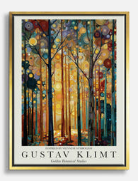
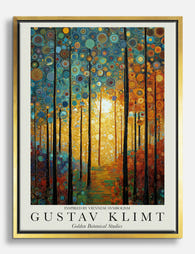
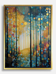
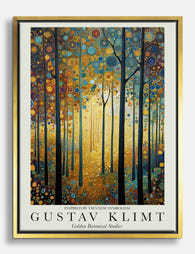
Golden Botanical Studies by Gustav Klimt Canvas Print
Translation missing: en.products.product.sale_price From CHF 62.00CHF 88.00 -

Gustav Klimt Sunset Forest Art Print
Translation missing: en.products.product.sale_price From CHF 16.00CHF 22.00 -
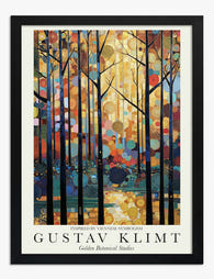
Golden Botanical Studies — Klimt Inspired Art Print
Translation missing: en.products.product.sale_price From CHF 16.00CHF 22.00 -

Sunlit Forest by Gustav Klimt Art Print
Translation missing: en.products.product.sale_price From CHF 16.00CHF 22.00 -

Golden Botanical Studies by Klimt Art Print
Translation missing: en.products.product.sale_price From CHF 16.00CHF 22.00 -
Golden Forest after Klimt Canvas Print
Translation missing: en.products.product.sale_price From CHF 62.00CHF 88.00 -
Golden Botanical Studies by Gustav Klimt Canvas Print
Translation missing: en.products.product.sale_price From CHF 62.00CHF 88.00 -
Spring Forest Glow, Klimt-inspired Canvas Print
Translation missing: en.products.product.sale_price From CHF 62.00CHF 88.00 -

Klimt Enchanted Forest Exhibition Poster Art Print
Translation missing: en.products.product.sale_price From CHF 16.00CHF 22.00 -

Klimts Golden Forest Canvas Print
Translation missing: en.products.product.sale_price From CHF 62.00CHF 88.00 -

Klimt Golden Birch Forest Exhibition Poster Art Print
Translation missing: en.products.product.sale_price From CHF 16.00CHF 22.00 -
Klimt-Inspired Golden Forest Canvas Print
Translation missing: en.products.product.sale_price From CHF 62.00CHF 88.00 -

Golden Botanical Studies — Klimt Inspired Canvas Print
Translation missing: en.products.product.sale_price From CHF 62.00CHF 88.00 -

Golden Botanical Studies by Gustav Klimt Art Print
Translation missing: en.products.product.sale_price From CHF 16.00CHF 22.00 -

Klimt-Inspired Golden Birch Forest Art Print
Translation missing: en.products.product.sale_price From CHF 16.00CHF 22.00 -

Golden Botanical Studies by Gustav Klimt Art Print
Translation missing: en.products.product.sale_price From CHF 16.00CHF 22.00


More from The Frame

Office and Study: Art That Helps You Focus or A...
The art you hang in a workspace isn't neutral decoration. It either supports the kind of thinking you do at your desk, or it quietly works against it. The trick...

Dining Room Art That Holds the Room Together
The dining room is the most underestimated wall in the house. It's where people sit still for an hour, eyes wandering, and yet most of us treat it as an...

Hallway Art: The Most Overlooked Surface in the...
Your hallway is the most-viewed room in your home. You pass through it every time you make coffee, take a shower, answer the door, or go to bed. And yet...