Building a Gallery Wall Around Kusama-Inspired Art Prints
How a single statement print solves the gallery wall problem most people create for themselves.

Most gallery walls fail because every print is competing for attention. A Kusama-inspired centrepiece fixes that instantly. The bold pattern becomes your anchor, and everything else gets to relax around it.
Why a bold anchor print makes gallery walls easier, not harder
The instinct when you fall for a pattern-heavy print is to assume it's going to be difficult. Too loud, too busy, impossible to pair. So you either hang it alone (fine, but it can feel marooned) or you panic-buy four equally bold prints and end up with a wall that looks like a jumble sale.
Here's what actually happens when you build a gallery wall around one statement piece: the bold print does all the heavy lifting. It pulls the eye, sets the colour palette, and tells everything else what to do. Your job with the remaining prints is just to support it, not match its energy. That's much easier than trying to balance five equally loud voices.
This is the same principle interior designers use when they put a single bold sofa in a quiet room. One thing shouts, everything else murmurs. The result reads as confident rather than chaotic.
Kusama-inspired prints, with their dense polka dots, repeating motifs and saturated colour, are unusually good anchors because the pattern is so consistent. There's a rhythm to them. Even when they feel maximalist, they're internally orderly, which gives the rest of your wall something steady to lean against.

Choosing your Kusama-inspired centrepiece: size and subject
Size first. For a centrepiece role, you want the print to clearly read as the largest piece on the wall. We'd suggest 50x70cm as the minimum and 70x100cm if you have the wall space. Anything smaller and it stops functioning as an anchor. It just becomes another print in the cluster.
If you're working above a sofa, the rule we use is that the centrepiece should be roughly two thirds the width of the furniture below it. Above a 200cm sofa, a 70x100cm framed print sits beautifully. Above a sideboard or console, you can often go larger.
Subject matters too. Kusama-inspired work runs the gamut from infinity-room photography to pumpkin motifs to dense abstract dot fields. For a gallery wall, we think the cleaner compositions work best. A single pumpkin on a coloured ground, or a tightly cropped dot field with one or two dominant colours, will give your companion prints somewhere to breathe. Avoid centrepieces with multiple competing focal points if you're planning to add more prints around them.
Browse the Kusama-inspired art prints collection with this in mind. The pieces with two or three dominant colours and a clear central form are far easier to build around than ones with eight colours fighting for attention.
Picking companion prints that complement without competing
This is where most gallery walls go wrong. People pick companion prints that are equally bold, assuming the wall needs more energy. It doesn't. The centrepiece has already provided enough.
Your companion prints need to be quiet. We mean that in a specific way. Look for:
- Solid colour fields or large negative space. A print that's mostly cream with a small graphic element gives the eye somewhere to rest.
- Simple line drawings. Single-line figure studies, botanical sketches, or minimalist architectural drawings.
- Black and white photography. Particularly architectural, still life, or landscape photography with strong tonal contrast.
- Muted abstracts. Soft, washed colourful abstract prints with two or three colours pulled directly from your centrepiece.
The trick with colour is to echo, not match. If your Kusama-inspired piece is red and white, a companion print doesn't need to be red. It can be a dusty pink, a terracotta, or a deep burgundy. You're building a family of related tones, not a uniform.
One useful test: hold each potential companion print up next to your centrepiece (or place them side by side on a screen). If your eye keeps darting between them, they're competing. If your eye lands on the centrepiece and the companion settles into the background, you've got it right.
Avoid pairing two pattern-heavy prints. One bold pattern per gallery wall. That's the rule we'd defend.
The layout: a simple 3 or 5 print arrangement that works every time
Odd numbers. Always odd numbers. Three or five prints. Even-number arrangements (four, six) tend to feel symmetrical in a way that flattens the energy of a bold centrepiece.
The 3-print arrangement
Centrepiece in the middle, two smaller companions flanking it. The companion prints should be roughly half the size of the centrepiece. If your anchor is 70x100cm, your companions can be 30x40cm or 40x50cm.
Hang the centrepiece first. Then position the companion prints so their vertical centres align with the centrepiece's vertical centre. Keep 5 to 8cm of space between frames.
This arrangement is best above sofas, beds, and consoles. It's symmetrical without being boring, because the centrepiece is doing all the visual work.
The 5-print arrangement
Centrepiece in the middle, two companions on each side, stacked. So you have a column of two on the left, the large centrepiece, and a column of two on the right. The companion prints are smaller still, around 30x40cm.
This works particularly well in narrow spaces like hallways or above narrower furniture. The vertical stacking adds height without spreading the wall out too much.
Off-centre variations
If you want something less formal, try the centrepiece slightly left of centre with three companion prints clustering to its right at varying heights. This is harder to get right (you need to plan it on the floor first), but it has more movement and feels less like a Victorian portrait gallery.

Frame consistency: why matching frames matter more than matching art
When the art varies, the frames have to unify. This is the single most important rule for gallery walls built around bold prints.
If your centrepiece is a riot of colour and your companions are quiet line drawings, mixing frame styles on top of that adds another layer of visual difference your eye has to process. Matching frames remove that layer entirely. They tell the eye "these belong together," even when the art itself is wildly varied.
Three frame finishes work reliably:
- Matte black. Sharp and modern. Pulls out graphic elements, especially in pop art and photography. Works on white walls and saturated colour walls.
- Natural wood. Warmer and softer. Brilliant with sage green, terracotta, or cream walls. Lets the colour in the art come forward without competing.
- White. The quietest option. Best on richly coloured walls where you don't want the frames to register at all.
We'd avoid mixing all three. Pick one and commit. If you must mix, limit yourself to two finishes (say, matte black for the centrepiece and natural wood for the companions, or vice versa).
A note on frame quality, because this is the bit nobody talks about until their print arrives warped. Cheap framing often ships in pieces or with the print loose inside, so the paper buckles and the corners gap. Fab's framed prints arrive ready to hang, with the print fitted properly inside a solid FSC wood frame and protected by UV-resistant acrylic glaze rather than glass. Lighter, safer, and the colours stay true even in direct sunlight.
You can browse contemporary art prints and order them with consistent framing across the whole set, which solves the matching problem before it starts.
Spacing, height, and hanging tips for a professional finish
Gallery walls live or die on the small stuff. A few principles to follow.
Eye level is 145cm to the centre of the artwork. This is the gallery standard, sometimes called the 57-inch rule. It assumes an average eye height. For gallery walls, treat the visual centre of the entire arrangement as the point that should sit at 145cm, not any individual print.
Above furniture, leave 15 to 25cm between the top of the furniture and the bottom of the lowest frame. Closer than 15cm and the art looks crammed. Further than 25cm and it floats away from the furniture, looking unrelated.
Frame spacing should be consistent. 5 to 8cm between frames is the sweet spot for most gallery walls. Tighter (3 to 5cm) feels more contemporary and dense. Wider (10cm+) feels more formal and museum-like. Pick a spacing and apply it consistently across the entire arrangement.
Plan it on the floor first. Lay everything out on the floor or on a large piece of paper. Take a photo. Move things around. This costs you 20 minutes and saves you from filling a wall with unnecessary holes.
Use paper templates. Cut paper rectangles to the exact size of each frame and tape them to the wall. Stand back. Adjust. Only then start drilling.
Hang the centrepiece first, then work outwards. This way, if you have to make small adjustments to the companions, you're working around a fixed point rather than recalculating the whole arrangement.

Gallery wall combinations we love right now
A few pairings we keep coming back to, with notes on why they work.
The pumpkin and the pared-back pair
A red and white polka dot pumpkin centrepiece at 70x100cm, flanked by two minimalist black ink figure drawings on cream backgrounds at 40x50cm. All three in matte black frames. The figure drawings have huge negative space, so the pumpkin gets to dominate. The graphic black outlines tie back to the dot pattern without repeating it.
Works on: white walls, cream walls, soft grey walls.
The infinity dot and architecture
A dense yellow and black polka dot field at 60x80cm as the anchor, with three black and white architectural photographs of stark concrete buildings in a vertical column to one side. Natural oak frames throughout. The photography's geometric lines and tonal restraint balance the chaos of the dot field beautifully.
Works on: warm white walls, terracotta walls, sage green walls.
The maximalist trio
A pink and red Kusama-inspired centrepiece at 70x100cm, plus two soft botanical watercolours in dusty pink and sage at 50x70cm on either side. Natural wood frames. This one leans more romantic and feminine, with the botanicals echoing the centrepiece's softness while the line work stays simple enough not to compete.
Works on: cream walls, blush pink walls, deep green walls.
If you'd rather skip the curation and pick something already coordinated, the wall art sets collection includes pre-matched groupings designed to work together, which removes a lot of the decision-making.
A note on anchor alternatives
Kusama-inspired work isn't the only anchor that follows these rules. The same principles apply to any pattern-heavy or graphically bold print. Memphis design pieces, maximalist florals, contemporary pop art prints, and large-scale abstract expressionist works all behave the same way: they want quiet companions, matching frames, and an odd-numbered arrangement.
The lesson is structural, not stylistic. One bold thing, several quiet things, consistent framing, odd numbers.
Wall colour matters more than you think
Two quick recommendations. Polka dot and pop art prints look sharpest against white, soft warm grey, or sage green walls. These tones let the saturated colours in the art come forward without competing.
Avoid hanging bold pattern prints on walls that are themselves patterned or in colours that clash with the dominant tones in the print. A red Kusama-inspired piece on a saturated mustard wall, for instance, will create real tension. Sometimes that's the look you want, but for most rooms, quieter walls give the art more room to perform.

Get started
Buy the centrepiece first. Live with it on the wall for a few days before you commit to companion prints. You'll learn quickly which colours and tones the room needs, and the companions will pick themselves.

Fab products featured in this blog
-

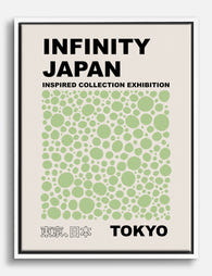
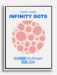
Infinity Dots Tokyo — Kusama Inspired Art Print
Translation missing: en.products.product.sale_price From CHF 16.00CHF 22.00 -

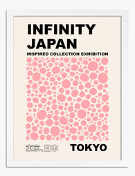
Infinity Japan Tokyo Exhibition Art Print
Translation missing: en.products.product.sale_price From CHF 16.00CHF 22.00 -

Neko Collection — Kusama-Inspired Cat Canvas Print
Translation missing: en.products.product.sale_price From CHF 62.00CHF 88.00 -

Kusama-Inspired Neko Collection Art Print
Translation missing: en.products.product.sale_price From CHF 16.00CHF 22.00 -

Kusama-Inspired Neko Collection Art Print
Translation missing: en.products.product.sale_price From CHF 16.00CHF 22.00 -

Infinity Dots Tokyo — Kusama Inspired Canvas Print
Translation missing: en.products.product.sale_price From CHF 62.00CHF 88.00 -
Infinity Japan Tokyo Exhibition Canvas Print
Translation missing: en.products.product.sale_price From CHF 62.00CHF 88.00 -

Kusama-Inspired Polka Dot Cat Art Print
Translation missing: en.products.product.sale_price From CHF 16.00CHF 22.00 -

Infinity Dots Tokyo Poster Art Print
Translation missing: en.products.product.sale_price From CHF 16.00CHF 22.00 -

Kusama-Inspired Neko Collection Canvas Print
Translation missing: en.products.product.sale_price From CHF 62.00CHF 88.00 -

Infinity Dots Japan 1998 — Kusama-Inspired Art Print
Translation missing: en.products.product.sale_price From CHF 16.00CHF 22.00 -

Infinity Dots Japan 1998 — Kusama-Inspired Canvas Print
Translation missing: en.products.product.sale_price From CHF 62.00CHF 88.00 -
Infinity Dots Tokyo Poster Canvas Print
Translation missing: en.products.product.sale_price From CHF 62.00CHF 88.00 -
Infinity Japan Tokyo Exhibition Poster Art Print
Translation missing: en.products.product.sale_price From CHF 16.00CHF 22.00 -

Infinity Japan Exhibition Poster Art Print
Translation missing: en.products.product.sale_price From CHF 16.00CHF 22.00 -

Infinity Dots Tokyo 1998 (Kusama-Inspired) Art Print
Translation missing: en.products.product.sale_price From CHF 16.00CHF 22.00 -

Kusama-Inspired Neko Collection Canvas Print
Translation missing: en.products.product.sale_price From CHF 62.00CHF 88.00 -

Kusama-Inspired Polka Dot Cat Canvas Print
Translation missing: en.products.product.sale_price From CHF 62.00CHF 88.00 -

Infinity Japan Exhibition Poster Canvas Print
Translation missing: en.products.product.sale_price From CHF 62.00CHF 88.00 -

Serene Ocean Escape Art Print
Translation missing: en.products.product.sale_price From CHF 16.00CHF 22.00


More from The Frame

Every Flower in William Morris's World: A Guide...
William Morris designed roughly 50 wallpapers and around 30 chintzes across his career, and almost every single one features a plant. If you've ever stood in front of a Morris...

What Colours Go With Bouquet Prints? Pairings I...
You've found a bouquet print you love. Now you need to know if it will actually work above your sofa, opposite that mustard armchair, next to the curtains you spent...

Boho Sun Wall Art: How to Nail the Look Without...
Boho sun art has a reputation problem. Done badly, it screams student halls and macramé overload. Done well, it's one of the warmest, most grounding aesthetics you can put on...