
 Order today for delivery by
 Lemon Art for the Kitchen: Where to Hang It, What Size to Pick, and Why It Works
A practical, measurement-first guide to picking, placing, and protecting lemon prints in the one room that eats art for breakfast.


Lemon art has quietly become the most-requested kitchen subject of the last few years, and for good reason. This guide skips the styled-shelf inspiration and gets straight to the decisions you're actually stuck on: where it should go, how big it should be, and whether it will survive the steam from your pasta water.
Why lemons became the go-to kitchen art subject
Lemons work in kitchens because they hit three notes at once: they're food (so the subject makes sense), they're graphically bold (a strong yellow-and-green silhouette that reads from across the room), and they carry Mediterranean warmth without committing you to a full tiled-mural aesthetic. You get the sunshine reference without the theme-park feel.
There's a colour theory element too. Yellow sits opposite blue-grey on the wheel, which is why lemon art looks so alive against the cool tones most modern kitchens are painted in (soft greys, off-whites, sages, navies). It's a shot of warmth in a room that's often dominated by hard, cool surfaces like stone, stainless steel, and tile.
The other reason is more practical. Kitchens are busy visual environments already, with cabinetry, appliances, tiling, and open shelving competing for attention. Lemons are a subject the eye recognises instantly, so the art still reads clearly even when it's surrounded by clutter. Abstracts and landscapes tend to get lost in a working kitchen. A bowl of lemons doesn't.
One concern worth addressing early: yes, lemons feel summery, but they're not seasonal in the way a beach scene is. Citrus has been a still-life subject for 400 years of European painting for a reason. A well-chosen lemon print reads as classic, not July-specific.

The three best spots for lemon prints in a kitchen
Not every wall in a kitchen is a good wall for art. Grease, steam, and direct heat rule out several obvious spots. Here are the three that consistently work.
Above the dining area or breakfast nook
This is the strongest position in almost any kitchen. The wall behind a kitchen table or banquette is usually the largest uninterrupted surface in the room, and it sits far enough from cooking zones to avoid the worst of the grease and steam. It's also where people spend the most time looking, which means your art actually gets seen.
Aim for the centre of the artwork to sit around 145 to 150cm from the floor when there's no furniture beneath it. If you're hanging above a table or bench, drop it so the bottom edge is roughly 20 to 25cm above the surface.
On the wall between upper cabinets and worktop
If your kitchen has a section of open wall between the worktop and the underside of the upper cabinets (often where a window or a break in cabinetry sits), this is prime real estate for a smaller print. Keep the bottom edge at least 15 to 20cm above the worktop so it's clear of splashes, and make sure you're at least 45cm away from the hob.
The end-of-run or return wall
Galley kitchens and L-shaped layouts almost always have one short end wall that ends up as dead space. This is often the best place for a single statement piece because it draws the eye down the length of the kitchen and gives the whole room a focal point. In a narrow galley, this wall does more visual work than any other.
Two zones to avoid: directly behind the hob (heat, grease, and even the best UV-protective glaze doesn't love long-term steam exposure) and inside the immediate sink splash zone (roughly 30cm either side of the taps). Beyond those, most kitchen walls are fair game.
Choosing the right size: small kitchens vs. open-plan spaces
Sizing is where most people go wrong, and they almost always go too small. A print that looked substantial on your laptop screen can look like a postage stamp on a real wall. Here are concrete guidelines by scenario.
Galley kitchen, wall between cabinet and worktop: you're usually working with a 40 to 60cm vertical space. Go for a 30x40cm print, portrait orientation, framed. Anything smaller disappears.
Galley kitchen end wall (the short return): if the wall is 80 to 120cm wide, a single 50x70cm print hits the right proportions. If it's wider, step up to 60x80cm or 70x100cm.
Breakfast nook or dining wall in a small kitchen: a wall of 150cm wide or more can happily take a single 60x80cm framed print, or a pair of 40x50cm prints hung 5 to 8cm apart.
Open-plan kitchen-diner, main dining wall: don't be shy. A 70x100cm print is the minimum for a wall over 200cm wide. Above a six-seater dining table, consider going to 100x150cm on canvas, which gives you real presence without the weight of a large framed piece.
Above-cabinet soffit or a run of open shelving: a set of three small prints, each 20x30cm or 30x40cm, spaced evenly, works better than one large piece. This is one of the rare kitchen scenarios where small prints earn their keep.
The rule of thumb from professional interior designers is that art should occupy roughly two-thirds to three-quarters of the width of whatever is beneath it (worktop run, dining table, bench). If your table is 160cm wide, your art (single piece or grouping) should span 105 to 120cm. Undersizing is the single most common mistake in kitchen art, and it's the one that makes rooms feel unfinished.
Browse lemon art prints with your specific wall measurements in mind rather than falling in love with an image first and hoping it fits.

Framed vs. unframed: what works best in a kitchen environment
Kitchens are the hardest room in the house on artwork. Humidity swings, temperature changes, airborne cooking oils, and long stretches of afternoon sun through unshaded windows all conspire against your art. The format you choose matters more here than anywhere else.
Framed art prints with a UV-protective glaze are the safest choice for most kitchen walls. The glaze protects the paper from airborne grease and moisture and prevents fading from direct sun. Our framed prints use acrylic rather than glass, which has two advantages in a kitchen: it's lighter (so you can hang a larger piece without worrying about the fixings), and it won't shatter if a cabinet door clips it or a pan handle catches it. The frames are solid FSC-certified wood, so they don't warp when the humidity shifts every time you boil a kettle.
Canvas prints are the right choice in two specific scenarios: when you want a larger piece than the 70x100cm maximum available in a framed print, and when you're hanging in a particularly steamy zone (near a dishwasher, above a boiler cupboard). Canvas doesn't have a glazed surface to fog up, and the poly-cotton weave handles humidity swings better than paper. The trade-off is that the surface itself is exposed, so it will accumulate more airborne grease over time. A soft dry cloth once a month keeps it looking clean.
Unframed prints pinned or clipped up look great on Instagram and terrible six months in. Unglazed paper in a kitchen will yellow, warp, and pick up grease spots. Don't do this in a room where anyone cooks regularly.
One thing worth flagging: the most common failure in the framed print category generally is warping and poor fitting, because most retailers ship the frame and print separately for you to assemble. We ship the whole thing pre-fitted in one box, ready to hang, which matters more in a kitchen than anywhere else because a poorly sealed frame is the first thing to fail in a humid room.
Colour pairing: lemons with white, green, blue, and wood-tone kitchens
Lemon art is easier to place than most subjects because yellow is a warm neutral in disguise. Still, the pairing you pick sets the tone of the whole room.
White kitchens with brass or gold hardware: this is the classic modern-farmhouse setup, and lemons look like they were designed for it. Pick a print with a warm cream or off-white background rather than pure white so it doesn't fight the cabinetry. Watercolour styles with soft edges work beautifully here.
Sage green or olive kitchens: the strongest pairing on this list. Yellow and green are next to each other on the colour wheel, and lemon leaves already contain green, so the palette is doing half the work for you. Go slightly bolder with the print (a graphic vintage botanical rather than a soft watercolour) because sage kitchens can take the contrast.
Navy or deep blue kitchens: this is the coastal-Mediterranean move, and it's stunning when it works. The trick is warmth: pick a lemon print with visible leaves and a hint of terracotta or aged-paper background rather than a cool white one. A single large piece works better than a set here because navy kitchens tend to be already visually rich.
Wood-tone or oak kitchens: avoid overly stylised or graphic prints, which fight the natural grain. Botanical illustrations with fine linework and muted colour palettes sit beautifully against wood. Consider an oak or natural-finish frame to echo the cabinetry.
Cool grey kitchens: these need the warmth desperately, so go for the yellowest, sunniest lemon print you can find. This is the one scenario where a bright, saturated citrus image genuinely transforms the room rather than just accessorising it.
If you're browsing more broadly, our kitchen art prints collection groups food-and-drink subjects that pair well with these same colour schemes, and botanical art prints work particularly well in wood-tone and sage kitchens.

One print or a set? When to go solo and when to group
The single-vs-set decision usually comes down to wall shape, not personal preference.
Go solo when: the wall is roughly square or portrait-oriented, when there's a natural focal point (above a range, behind a dining table, on an end wall), or when the kitchen already has a lot of visual busyness (patterned tiles, open shelving crammed with dishes). One strong piece calms a busy room. Five smaller ones will make it feel chaotic.
Go for a set of two when: you have a long horizontal wall (over 180cm) with nothing beneath it, or you're working with a very tall, narrow gap. Matched pairs hung with 5 to 10cm between them read as one composition and feel more considered than a single undersized print.
Go for a set of three or more when: you have a horizontal run of dead wall (above a doorway, along a soffit, above a run of lower cabinets with no uppers) and want to create rhythm. Threes work better than fours in most kitchens because odd numbers feel less formal.
A grouping tip: if you're mixing lemon prints with other subjects, keep the palette consistent (all citrus, or all Mediterranean botanicals) and vary the composition. Mixing a lemon print, an orange print, and a fig print reads as a considered edit. Mixing a lemon print with an abstract and a landscape reads as leftovers. Our fruit art prints collection is built for exactly this kind of tonal grouping.
How to make sure your kitchen art lasts (UV protection, humidity, and placement)
Three factors will kill kitchen art faster than anything else: UV light, humidity, and grease. Here's what actually matters.
UV protection: if any part of your art gets direct or reflected sunlight for more than an hour a day, UV protection is non-negotiable. Our framed prints use a UV-protective acrylic glaze that prevents fading even in direct sunlight, and the prints themselves use pigment inks rated to last hundreds of years without shifting colour. Standard inkjet prints without UV protection can visibly fade within 12 months in a sunny south-facing kitchen.
Humidity and steam: the worst offenders are the extractor hood zone, the wall above a kettle or coffee machine, and the wall opposite a dishwasher door. Give these zones a clearance of at least 60cm. Sealed, properly fitted frames handle humidity fine. Poorly fitted frames (where the backing board isn't flush against the print) trap moisture and cause the paper to buckle.
Grease: airborne grease travels further than you'd think. If you cook a lot with oil, keep art at least 1.5 metres from the hob and expect to wipe the front of the frame down with a soft dry cloth every couple of months. Canvas needs the same treatment.
Fixings: kitchens often have skim-coat plaster over tile or older masonry walls. Use proper wall plugs rated for the weight of your piece rather than the picture hooks that came in a drawer. A 70x100cm framed print weighs more than you think.
A final piece of advice worth more than any of the rest: measure your wall, tape a piece of newspaper cut to the size you're considering, and live with it for two days before you buy. Nine times out of ten you'll go up a size, and you'll be right.


Fab products featured in this blog
-

Lemon Branch Study Art Print
Sale price From CHF 16.00CHF 23.00 -

Lemon Branch Linework Art Print
Sale price From CHF 16.00CHF 23.00 -

Fruit Market Lemons Art Print
Sale price From CHF 16.00CHF 23.00 -

Amalfi Lemons Art Print
Sale price From CHF 16.00CHF 23.00 -

Fruit Market Lemons Canvas Print
Sale price From CHF 63.00CHF 89.00 -

Lemon Branch Linework Canvas Print
Sale price From CHF 63.00CHF 89.00 -

Big Yellow Lemon and Slice Art Print
Sale price From CHF 16.00CHF 23.00 -
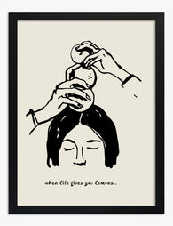
When Life Gives You Lemons Art Print
Sale price From CHF 16.00CHF 23.00 -

Lemon Branch Study Art Print
Sale price From CHF 16.00CHF 23.00 -

Lemons in a Blue and White Bowl Art Print
Sale price From CHF 16.00CHF 23.00 -

Single Lemon Art Print
Sale price From CHF 16.00CHF 23.00 -

Lemon Stamp Art Print
Sale price From CHF 16.00CHF 23.00 -

Sunlit Lemons Still Life Art Print
Sale price From CHF 16.00CHF 23.00 -

Lemons in Yellow and Blue Art Print
Sale price From CHF 16.00CHF 23.00 -

Lemon Branch Sketch Art Print
Sale price From CHF 16.00CHF 23.00 -

Disco Lemon Delight Art Print
Sale price From CHF 16.00CHF 23.00 -

Fruit Market Lemons Art Print
Sale price From CHF 16.00CHF 23.00 -

Amalfi Lemons Canvas Print
Sale price From CHF 63.00CHF 89.00 -

Single Lemon Canvas Print
Sale price From CHF 63.00CHF 89.00 -

Sunny Lemons on Plate Art Print
Sale price From CHF 16.00CHF 23.00


More from The Frame

Beyond the Kitchen: 5 Unexpected Rooms Where Le...
Lemon art has a branding problem. Search for it online and you'll drown in kitchen shots: farmhouse signs, fruit bowls, tea towels with slogans. But a good lemon print is...

Why Do Palm Prints Work So Well in Minimalist B...
Palm prints have a reputation problem. Say the words and most people picture tiki bars, holiday postcards, and hot pink flamingos. Done properly, though, palm art is one of the...

9 Vintage House Decor Ideas That Start With Wha...
Most vintage decor advice starts with the wrong thing. It tells you to hunt flea markets, install crown moulding, or refinish a dresser before you've decided what the room is...