How to Create an Eclectic Gallery Wall That Looks Intentional (Not Chaotic)
The design-theory-backed antidote to Pinterest chaos, with the specific techniques that separate curated from cluttered.

You love a botanical line drawing, a moody abstract, and a vintage portrait, and you want them all on the same wall. The fear is that it'll look like a charity shop window. The fix isn't restraint, it's knowing the small set of compositional rules that make eclectic feel curated.
Why eclectic gallery walls are having a moment (and why matchy-matchy is dead)
The matching set of three identical frames in a perfect row has had its day. It looks safe, which is fine, but safe rarely looks personal. Eclectic walls work because they read like a record of taste, the kind of arrangement someone built up slowly because they actually cared about each piece.
The problem is that "eclectic" gets confused with "random." Random looks like noise. Eclectic, done properly, has structure underneath the variety. There's an anchor, a thread, a rhythm, and a sense of weight balance, even if you can't immediately spot any of them. That's what we're going to build.
If you're starting from scratch or filling gaps, browsing a focused selection like our eclectic art prints gives you a head start, because the pieces are already chosen to play well with others.

The anchor piece: choosing your largest print and placing it first
Every good gallery wall has one piece your eye lands on first. This is your anchor. Without it, your eye bounces around looking for somewhere to rest, which is the exact feeling people describe as "cluttered."
Your anchor should be either the largest piece (a 60x80cm or 70x100cm print is a good benchmark for most living room walls) or the most visually loud, meaning the most saturated colour, the highest contrast, or the most arresting subject. Ideally it's both. A muted abstract that's huge can still anchor. A small but very red painting can anchor. A medium-sized neutral landscape cannot.
Place the anchor first, and place it near the centre of your composition or just slightly off-centre. The middle of the anchor should sit at roughly 145 to 152cm from the floor, which is gallery eye-level. Everything else radiates outward from there.
Why off-centre often works better
Dead-centre placement creates a symmetrical wall, which fights the eclectic vibe. Pushing your anchor 10 to 20cm off-centre, then balancing the other side with two or three smaller pieces, creates the asymmetric tension that makes the wall feel collected rather than installed.
The 3-5-7 rule and why odd numbers create better visual rhythm
Designers default to odd numbers because the eye processes them as more dynamic. With four pieces, the brain keeps trying to pair them up into two tidy halves. With five, there's no clean pairing, so your eye moves through the composition instead of resting on a grid.
Three is the minimum for a gallery wall to feel like a gallery wall. Five is the sweet spot for most rooms. Seven is for statement walls behind a sofa or above a long sideboard. Nine and above starts to require serious planning, but it's where the most show-stopping walls live.
If you have an even number of pieces you love, add one more. Don't subtract. The cure for almost every gallery wall problem is one more well-chosen piece, not fewer.
How to mix art styles without losing cohesion: the single-thread method
Mixing art styles on walls only works if there's one connecting thread running through everything. Just one. Most people try to enforce three or four threads and end up with nothing distinctive.
A thread can be any of these:
Colour echo. A specific colour (rust, ochre, ink blue) appears in at least three pieces, even as a small detail. This is the most forgiving thread because the colour doesn't need to dominate, it just needs to recur.
Subject link. Every piece references something natural, or every piece features a human figure, or every piece is architectural. The subject matter doesn't need to be identical, just adjacent.
Mood or era. All pieces feel calm, or moody, or playful. Or they all feel like they could've come from the 1970s, even if some are contemporary reinterpretations.
Repeated shape. Circles inside frames. Strong horizontals. A repeated diagonal. Shape-based threads are subtle and high-impact.
Tonal range. All pieces are muted, or all are saturated. Mixing one neon piece into a wall of dusty tones almost never works unless that neon piece is your deliberate anchor.
Pick one thread and audit every piece against it. If a print doesn't carry the thread, it doesn't belong on this wall, even if you love it. Save it for the bedroom.
How to know when a piece doesn't belong
Lay everything out on the floor and squint at it. The pieces that disappear when you blur your eyes are working with the others. The piece that suddenly screams at you, the one that looks like it's been pasted in from a different wall, is the one to remove. Trust the squint.

Choosing frames that unify the chaos (and why quality framing matters more here)
Frames are the strongest unifying tool you have, and most people underuse them. The rule we'd recommend: limit yourself to three frame styles maximum across the whole wall.
Three combinations that consistently work:
- Black, natural oak, and brass. The most flexible. Black grounds the wall, oak warms it, brass adds a small note of polish.
- All wood in varying tones. Light oak, mid walnut, darker stained wood. Reads as collected over time without feeling chaotic.
- Ornate vintage plus minimal modern. A traditional gilt frame next to a thin black profile. Tension that looks deliberate.
Within those three styles, group like with like in pairs or trios across the wall. Two black frames diagonally across from each other. A pair of oak frames flanking the anchor. This creates micro-rhythms inside the larger composition.
The reason quality framing matters more for eclectic walls is that you're already asking the eye to absorb a lot of variety. If the frames are warped, the prints are bubbling under the glaze, or the proportions look cheap, those flaws compound. With a matching set you can sometimes get away with mediocre framing because the symmetry distracts. Eclectic gives you nowhere to hide.
This is where the way prints are made matters. Solid wood frames hold their shape, UV-protective acrylic glaze keeps colour true even on a sunlit wall, and prints that arrive properly fitted in the frame (not shipped separately to assemble yourself) save you from the warped, off-square look that ruins so many gallery walls. If you're combining multiple framed prints, consistency in build quality across the set is what makes the whole thing read as intentional.
The matting question
White mats around your prints are an underrated unifier. A 4 to 5cm white mat creates breathing room around each image and makes wildly different art styles feel like they belong to the same family. Use mats when your pieces vary heavily in style. Skip them when you want a denser, more contemporary look or when most of your art is already strong on negative space.
Spacing, alignment, and the case for going tighter than you think
The standard advice is 5 to 8cm between frames. For an eclectic wall, go tighter. Aim for 4 to 6cm, and don't be scared to push some pairs to 3cm.
Tight spacing is what makes a wall read as a single composition rather than a series of separate pieces. The gaps between frames are negative space, and large negative spaces create visual gaps that fragment the wall. Smaller gaps weld everything into one shape.
For alignment, pick at least one invisible line your pieces share. The most common is a horizontal line running through the centre of the anchor, with other pieces sitting either entirely above or entirely below it. Or a vertical line down one edge of the anchor that another piece's edge aligns to. Even one shared line stops the wall from looking like it was thrown up in a hurry.
Visual weight distribution
Visual weight is how heavy a piece feels, regardless of physical size. A small, dense, saturated piece can weigh as much as a large pale one. The mistake almost everyone makes is grouping all the dark or saturated pieces on one side, which makes the wall feel like it's tipping over.
Distribute your "heavy" pieces across the composition. If your anchor is dark and bold, put another dark or bold piece on the opposite side and lower or higher to balance it. Treat colour the same way. Don't clump all the blues on the left.
Step-by-step: mapping your layout on the floor before touching the wall
Don't hammer anything until you've done this.
- Trace each frame onto craft paper or newspaper. Cut out the templates and label each one (anchor, oak frame, etc.).
- Lay them on the floor in front of the wall, in roughly the arrangement you're considering. Start with the anchor in the centre.
- Arrange and rearrange. Move pieces until the squint test passes. Take a phone photo every few minutes, because looking at the layout through a screen reveals imbalances you can't see in person.
- Lock in spacing. Use a ruler to set 4 to 6cm gaps between every piece. Adjust until the negative space looks even, not mathematically equal.
- Transfer to the wall. Tape each paper template to the wall using painter's tape, in the exact arrangement from your floor layout. Live with it for 24 hours if you can.
- Mark hanging points through the paper, hammer in your fixtures, then tear away the templates as you hang each piece.
If you prefer digital, photograph your wall, drop the image into any basic design app, and place scaled images of your prints over it. Useful for renters and anyone who hates measuring.

Real eclectic gallery wall arrangements by room size
Small wall (under 1.5m wide): hallways, nooks, between windows
Three to five pieces, tightly spaced. One small anchor (40x50cm or 50x70cm), with two to four smaller pieces (21x30cm, 30x40cm) clustered around it. Keep frame styles to two maximum. Hallways are forgiving because people pass through quickly, so you can be a little bolder with colour.
Medium wall (1.5 to 2.5m wide): above a sofa, sideboard, or bed
Five to seven pieces. This is where the classic eclectic gallery wall lives. Anchor at 60x80cm or 70x100cm, supporting cast in 30x40cm and 50x70cm. Three frame styles. Make sure your anchor is roughly two-thirds of the way up the wall above furniture, with the bottom edge sitting 15 to 25cm above the sofa back or sideboard.
A pre-curated wall art set is a useful shortcut here, especially if you want a base of three or four pieces designed to work together, then add two or three of your own to bring in the eclectic edge.
Large wall (over 2.5m wide): living room feature walls, stairwells
Seven to eleven pieces. Two anchors are fine on a wall this size, placed asymmetrically rather than mirroring each other. Use the full size range, including XL canvas pieces up to 100x150cm if the wall takes ceiling-height art. Stairwells should follow the diagonal of the staircase, with each piece's centre stepping up at roughly the same angle.
Botanical prints work particularly well as connective tissue across larger walls because they bring organic shapes that soften the geometry. A few pieces from a botanical art collection scattered through a wall of abstract pieces can be exactly the thread that pulls everything together.

When to break the rules
Once you've built one gallery wall using this framework, you'll start to see when bending the rules works. A perfectly symmetrical grid of nine identical-frame botanicals can look stunning in a formal dining room. A single 100x150cm canvas can beat any gallery wall in a small bedroom. Two pieces hung very tightly, almost touching, can be more striking than five with proper spacing.
The rules exist to give you a starting point, not to box you in. Your goal is a wall that feels like you, edited.
The shortcut to "looks intentional" is honestly just this: pick your thread, place your anchor, balance the visual weight, go tighter on spacing than feels natural, and remove anything that doesn't belong. Do that, and the wall will look like you've been collecting for years, even if the box arrived last week.

Fab products featured in this blog
-
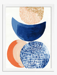
Stacked Shapes in Navy and Orange Art Print
Translation missing: en.products.product.sale_price From €16,95€23,95 -

Botanical Stairway Art Print
Translation missing: en.products.product.sale_price From €16,95€23,95 -
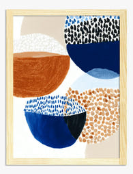
Bowl Study in Navy and Rust Art Print
Translation missing: en.products.product.sale_price From €16,95€23,95 -
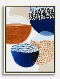
Bowl Study in Navy and Rust Canvas Print
Translation missing: en.products.product.sale_price From €64,95€92,95 -

Modern Shapes Harmony Canvas Print
Translation missing: en.products.product.sale_price From €64,95€92,95 -
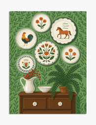
Folk Plates Home Sweet Home Art Print
Translation missing: en.products.product.sale_price From €16,95€23,95 -

Mediterranean Plant Parade Canvas Print
Translation missing: en.products.product.sale_price From €64,95€92,95 -

Neutral Organic Flow Art Print
Translation missing: en.products.product.sale_price From €16,95€23,95 -

Boho Botanical Harmony Art Print
Translation missing: en.products.product.sale_price From €16,95€23,95 -

Eclectic Potted Greens Art Print
Translation missing: en.products.product.sale_price From €16,95€23,95 -

Earth Tones Harmony Canvas Print
Translation missing: en.products.product.sale_price From €64,95€92,95 -

Chromatic Chaos Art Print
Translation missing: en.products.product.sale_price From €16,95€23,95 -

Earthy Stack Shapes Canvas Print
Translation missing: en.products.product.sale_price From €64,95€92,95 -

Historically Unbothered Canvas Print
Translation missing: en.products.product.sale_price From €64,95€92,95 -

Chic Evening In Canvas Print
Translation missing: en.products.product.sale_price From €64,95€92,95 -

Stacked Vessels Study Canvas Print
Translation missing: en.products.product.sale_price From €64,95€92,95 -

Modern Boho Balance Canvas Print
Translation missing: en.products.product.sale_price From €64,95€92,95


More from The Frame

Every Flower in William Morris's World: A Guide...
William Morris designed roughly 50 wallpapers and around 30 chintzes across his career, and almost every single one features a plant. If you've ever stood in front of a Morris...

What Colours Go With Bouquet Prints? Pairings I...
You've found a bouquet print you love. Now you need to know if it will actually work above your sofa, opposite that mustard armchair, next to the curtains you spent...

Boho Sun Wall Art: How to Nail the Look Without...
Boho sun art has a reputation problem. Done badly, it screams student halls and macramé overload. Done well, it's one of the warmest, most grounding aesthetics you can put on...