How to Create a Gallery Wall: Templates, Spacing, and the Mistakes Everyone Makes
The prescriptive, no-fluff guide to layouts, spacing, and the small mistakes that separate amateur from intentional.

Most gallery walls fail not from lack of taste but from lack of a system. The good ones follow rules: specific spacing, a deliberate layout, considered colour. This guide gives you all of them, plus the five mistakes that quietly ruin everything.
The 4 gallery wall layouts that actually work
There are dozens of layouts on Pinterest. Four of them genuinely work in real homes. Pick one before you do anything else, because the layout dictates how many prints you need, what sizes to buy, and whether your frames should match.
The grid
Two, three or four columns of identical sizes, arranged in perfect alignment. A 2x2, 2x3 or 3x3 grid is the most foolproof gallery wall layout you can attempt. It looks intentional even when the art itself is quite simple, which is why it works so well above sofas, beds and dining tables.
Grids demand precision. The frames must be identical in size, colour and width. The spacing must be uniform. If you cannot commit to that level of consistency, do not pick a grid.
The salon hang
The dense, organic, slightly chaotic arrangement you see in old European drawing rooms. Mixed sizes, mixed frame styles, often filling a wall corner to corner. Salon hangs look effortless but are the hardest layout to execute well, because what looks "random" is actually carefully balanced.
Pick this if you have a generous wall, at least seven prints, and patience for planning.
The linear row
A single horizontal line of three to five prints, all the same size, evenly spaced. Brilliant above a sideboard, console, headboard or in a hallway where you want length without height. Quick to plan, hard to get wrong.
The staircase
Prints that ascend at the same angle as your stairs, following the diagonal of the handrail. The trick most people miss: each frame's centre should sit at the same height above the step it hangs over, not at a fixed height from the floor. That parallel ascent is what makes it look architectural rather than scattered.

How many prints do you need? The formula based on wall size
Most articles dodge this question. Here is actual maths.
Measure the wall area you want to fill (width x height in cm). The arrangement should cover roughly two thirds of the width of the furniture below it, and the total artwork footprint (including spacing) should occupy about 60 to 75 percent of the available wall space between furniture and ceiling.
For a sofa that is 220cm wide, your gallery wall should span roughly 145 to 165cm across. From there:
- Grid (3x3) at A3 size: fits a span of about 100cm. Good for narrow walls.
- Grid (3x3) at medium 40x50cm: spans roughly 135cm. Good for standard sofas.
- Salon hang covering 160 x 120cm: plan for 9 to 13 prints in mixed sizes.
- Linear row of 3 large prints (50x70cm): spans about 165cm.
A useful rule of thumb: aim for one print per 30 to 40cm of horizontal wall space in a salon arrangement, and one large or two medium prints per metre in a linear hang. If you are planning a wall art set, the work has been done for you. The pieces are designed to scale together.
Choosing prints that work together: the 60-30-10 colour rule
Interior designers borrow this rule from fashion, and it works beautifully on gallery walls. Across all your prints combined:
- 60 percent should share a dominant colour (your base, often a neutral or muted tone).
- 30 percent should be a secondary colour that ties the prints together.
- 10 percent should be an accent: the pop, the contrast, the thing that makes it sing.
In practice, this means if you are choosing seven prints, five should lean into a shared palette (warm cream, terracotta, soft black), two should bring in a complementary tone (sage, dusty blue), and one should carry the accent (mustard, deep burgundy, a flash of coral).
This is the difference between "matchy" and "cohesive". Matchy is when every print uses the exact same three colours. Cohesive is when the eye reads them as belonging together without being able to say why.
The mistake people make is choosing prints individually rather than as a set. Lay every option out together (digitally is fine) before buying. If one print fights the others, replace it now, not after it arrives.
Spacing: 5cm between frames is not a suggestion
Here is the rule competitors will not commit to: 5cm (2 inches) between every frame, measured edge to edge. Not 3cm, not 8cm, not "whatever feels right".
Five centimetres is the sweet spot where the eye reads multiple prints as a single composition. Closer than that, frames feel cramped and the art competes. Wider than that, the arrangement disintegrates into separate floating pieces with no relationship to each other.
How to measure it consistently
Cut a rectangle of cardboard exactly 5 x 15cm. This is your spacer. When positioning each new frame, hold the spacer between it and its neighbour. Every gap, every time, identical. This single tool is the difference between a gallery wall that looks professional and one that looks like you guessed.
When to break the rule
In a tight salon hang where you are deliberately going for density, you can drop to 3cm. In a very large arrangement (over 2m wide), you can stretch to 7cm to give the composition room to breathe. Outside those scenarios, stick to 5cm.
Grid spacing vs salon spacing
In a grid, spacing must be identical in every direction: 5cm horizontally, 5cm vertically. Any deviation will be obvious and look like an error. In a salon hang, the 5cm rule applies to the closest point between any two frames, but the frames themselves can be at different heights and orientations.

The paper template trick: plan your layout without making a single hole
Every guide mentions this. Almost none explain it properly. Here is how to do it so it actually works.
Step 1. Cut a piece of brown paper or newspaper to the exact outer dimensions of each frame. Write the print's name on the front so you do not lose track.
Step 2. On the back of each paper template, mark where the hanging hook or wire will sit. Most framed prints from us hang from a fixture that sits 8 to 10cm down from the top edge. Measure your specific frame and mark the exact spot.
Step 3. Lay all your templates on the floor in front of the wall. Arrange and rearrange until the composition feels balanced. This is the time to experiment, not later.
Step 4. Tape the templates to the wall using low-tack masking tape. Step back. Live with it for a day if you can. Walk past, glance at it, see how it feels at different times of day.
Step 5. When you are ready, hammer the nail or fix the hook directly through the marked spot on the paper. Then tear the paper away. Your fixings are now placed perfectly, and you have not made a single unnecessary hole.
This method also forces you to use the cardboard spacer. While taping templates up, slide the 5cm spacer between each one to keep gaps consistent.
Mixing sizes: which combinations look intentional and which look random
Sizes need a relationship. Random sizes look random. Deliberate sizes look designed.
The most reliable approach: pick two or three sizes maximum and repeat them. For example, two large prints (50x70cm), three medium (40x50cm), two small (30x40cm). The repetition creates visual rhythm, even when the prints themselves are different.
What does not work: one of every size, all different. Eight prints in eight different dimensions reads as accidental. Even if each piece is beautiful, the eye cannot find a pattern, and the wall feels unsettled.
A second principle: anchor with one large piece. The largest print becomes the visual centre of gravity. Place it slightly off-centre in a salon hang (true centre is too symmetrical and looks stiff), then build outwards with progressively smaller pieces. This is how most well-composed gallery walls are actually structured, even when they appear spontaneous.
Visual weight also matters. A large dark abstract carries more weight than a small pale botanical. If you place a heavy piece on the left, balance it with two or three lighter pieces on the right. The arrangement should feel like it is sitting on a level fulcrum, not tipping to one side.
Frame matching vs frame mixing: when to do each
The decision is mostly dictated by your layout.
Match your frames when:
- You are doing a grid. Identical frames are non-negotiable.
- You are doing a linear row. Matching frames keep the eye moving smoothly.
- The art itself is varied and busy. Matching frames provide calm.
- The room is minimal or modern.
Mix your frames when:
- You are doing a salon hang. Mixed frames add personality and depth.
- The art is tonally consistent. Varied frames stop it feeling flat.
- The room is eclectic, period, or maximalist.
- You want the wall to look collected rather than purchased.
If you mix, mix with discipline. Pick two or three frame styles maximum (for example: black, natural oak, and a brass or off-white) and repeat them across the arrangement. Random one-off frames look like clutter.
The most important rule when mixing: frame widths should be similar. A chunky 5cm wide frame next to a thin 1cm frame looks like an accident, even if both are beautifully made. Keep frame depth and width within a narrow range.
Our framed art prints come in matching profiles across sizes, which makes building a cohesive set considerably easier. The frames are solid FSC wood with UV-protective acrylic glaze, so even prints in direct sunlight from a south-facing window will hold their colour.

The 5 gallery wall mistakes that make it look amateur
Most failed gallery walls fail for the same handful of reasons. Fix these and your arrangement will already be in the top 10 percent.
Mistake 1: Hanging too high
The single most common error. The centre of your arrangement (not each individual print) should sit at 145 to 152cm (57 to 60 inches) from the floor. That is gallery height: roughly average eye level.
Above furniture, adjust slightly: the bottom of the lowest frame should sit 15 to 25cm above the top of the sofa or sideboard. Any higher and the art appears to be floating, disconnected from the room.
The fix: Mark 150cm on the wall with low-tack tape before you start. Build the composition so its centre lines up with that mark.
Mistake 2: Spacing too wide
Frames placed 10cm or more apart stop functioning as a gallery wall. They become a row of separate, unrelated pieces. The eye has to travel too far between them, and the composition fragments.
The fix: The 5cm rule. Cardboard spacer. Every gap, every time.
Mistake 3: Mismatched frame widths in grids
A grid is held together by visual repetition. If three of your frames are 2cm wide and one is 4cm wide, the eye locks onto the odd one out and the grid is ruined.
The fix: When buying for a grid, buy all frames at once from the same source, in the same profile.
Mistake 4: Forgetting negative space
A gallery wall does not need to fill the entire wall. The empty space around the arrangement is part of the composition. If your wall is 3m wide and your gallery is 2.8m wide, it looks crammed in. The art has nowhere to breathe.
The fix: Aim for at least 30cm of clear wall on either side of the arrangement, and 20cm above and below.
Mistake 5: Too much symmetry in a salon hang
Salon walls fail when people try to make them perfectly balanced: large piece centre, two mediums on each side, small piece in each corner. The result feels stiff and contrived, like a coat of arms.
The fix: Place the anchor piece off-centre. Cluster smaller pieces on one side and let larger pieces do the work on the other. Asymmetry is what gives salon walls their lived-in charm.
Subject mixing: how to combine botanical, abstract, and photography without chaos
Mixing subjects is what makes a gallery wall feel curated rather than themed. A wall of nine botanical prints is beautiful but predictable. A wall that mixes botanical, abstract, and photography is more interesting, but only if you mix it with rules.
The 3-subject formula
Pick three subject categories and assign them rough proportions:
- 50 percent botanical or organic (florals, leaves, landscapes)
- 30 percent abstract (shapes, colour fields, line drawings)
- 20 percent photography or figurative (portraits, architecture, still life)
This ratio creates variety without confusion. The dominant category sets the overall mood, the secondary adds visual rhythm, and the smallest category provides the surprise.
What clashes
Photorealistic photography next to highly stylised illustration tends to fight, because the eye reads them as belonging to different worlds. Bright, saturated graphic prints next to soft, muted watercolours feel discordant. Religious iconography next to abstract minimalism rarely works.
The fix is the colour rule from earlier: even if subjects vary wildly, a shared palette will hold them together. A vintage botanical illustration, a black-and-white architectural photograph, and a soft abstract can absolutely live on the same wall, as long as their tones overlap.
Style families that genuinely work together
- Vintage botanical + modern abstract + black-and-white photography: the classic editorial mix.
- William Morris + muted landscape + line drawing: rich, English, layered.
- Landscape photography + minimal type + tonal abstract: calm, modern, gallery-like.
For living rooms, this mixed approach tends to work better than rigid themes. For bedrooms, lean towards calmer, more tonal mixes. For dining rooms, denser salon hangs with richer subjects suit the room's evening lighting.

A few extra rules worth knowing
Shop your house first
Before buying anything new, audit what you already own. Pull every framed piece off every wall, plus anything stashed in cupboards. Lay it all out on the floor. You will almost always find that you have three or four pieces that will work as anchors. Buy only what you need to complete the set.
The bracelet test
Once your arrangement is up, stand back and let your eye travel around it as if reading the beads on a bracelet. Does your gaze move smoothly from piece to piece, or does it snag? If it snags, something is wrong with that piece's placement, scale, or colour relationship to its neighbours. Move it or replace it.
Leave room to grow
A great gallery wall is rarely finished in one go. Plan your initial arrangement at about 70 percent of your eventual ambition, leaving room to add pieces over months or years. The best gallery walls grow slowly, with each new addition reflecting something the owner has actually lived with.
Command strips vs nails
For frames under 2kg on plasterboard or painted plaster, heavy-duty Command strips are perfectly reliable and forgiving for renters. For frames over 2kg, or for any frame on masonry, use proper picture hooks or wall plugs. Solid wood frames with glazed fronts can be heavier than they look. Check the weight before deciding.

Where to start
If you have never built a gallery wall before, start with a linear row of three identical-sized prints. It is almost impossible to get wrong, and it teaches you the spacing, the eye-level rule, and the value of the cardboard spacer.
Once that feels easy, try a 2x3 grid. Once a grid feels easy, attempt a salon hang. Skipping straight to a salon wall as your first project is the single biggest reason people give up halfway through. Build your confidence in the easier formats first, then graduate.
And measure twice. Always.
Fab products featured in this blog
-

You Are The Greatest Project Canvas Print
Translation missing: en.products.product.sale_price From €65,95€92,95 -

Graceful Balance Art Print
Translation missing: en.products.product.sale_price From €16,95€23,95 -

Bauhaus Ausstellung 1923 Pink Lines Canvas Print
Translation missing: en.products.product.sale_price From €65,95€92,95 -

Garden Welcome Art Print
Translation missing: en.products.product.sale_price From €16,95€23,95 -

Take Up Space Heart Canvas Print
Translation missing: en.products.product.sale_price From €65,95€92,95 -

Red Tower on Dusty Blue Art Print
Translation missing: en.products.product.sale_price From €16,95€23,95 -

Who We Have In Our Life Quote Art Print
Translation missing: en.products.product.sale_price From €16,95€23,95 -

Bauhaus Ausstellung 1919 Dot Grid Canvas Print
Translation missing: en.products.product.sale_price From €65,95€92,95 -
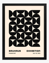
Bauhaus Exhibition Frankfurt 1923 Art Print
Translation missing: en.products.product.sale_price From €16,95€23,95 -

Botanical Stairway Canvas Print
Translation missing: en.products.product.sale_price From €65,95€92,95 -

Bathroom Rules Art Print
Translation missing: en.products.product.sale_price From €16,95€23,95 -

Boho Staircase Botanicals Canvas Print
Translation missing: en.products.product.sale_price From €65,95€92,95 -

Bla Retro Typography Canvas Print
Translation missing: en.products.product.sale_price From €65,95€92,95 -
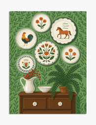
Folk Plates Home Sweet Home Art Print
Translation missing: en.products.product.sale_price From €16,95€23,95 -

Golfers on the Green Art Print
Translation missing: en.products.product.sale_price From €16,95€23,95 -

Red Tower on Dusty Blue Canvas Print
Translation missing: en.products.product.sale_price From €65,95€92,95 -

Effortless Woman Silhouette Canvas Print
Translation missing: en.products.product.sale_price From €65,95€92,95


More from The Frame

Every Animal in William Morris's Designs: The C...
Most people know the thrush in Strawberry Thief and stop there. But Morris's wider body of work contains foxes, hares, peacocks, ravens, lions, herons, woodpeckers, deer, and doves, often half-buried...

Countryside Decor Ideas: How to Bring Rural Cal...
Countryside art has quietly become one of the most versatile choices in modern interiors. Not the chintz-and-bunting version, but the kind of soft, considered pastoral scenes that bring the outside...

Arts and Crafts Animal Prints: The Victorian De...
The Arts and Crafts revival: why Victorian animal prints are trending again Scroll through any interior design hashtag right now and you'll see them everywhere: hares peering through curling foliage,...