How to Build a Jungle Gallery Wall That Looks Curated, Not Cluttered
The specific layout templates, frame rules, and subject mixing ratios that turn busy botanicals into a wall worth staring at.

Jungle prints are gorgeous on their own and chaotic in groups. The leaves are big, the colours are saturated, and the wildlife is detailed, so throwing five of them on a wall without a plan tends to look like a garden centre exploded. This guide gives you the layouts, ratios, and measurements that make a jungle gallery wall feel intentional.
Why jungle subjects make surprisingly great gallery walls
Most gallery wall advice assumes you're working with calm subjects: black and white photography, line drawings, abstract pastels. Jungle prints break those rules because they're already busy. A single monstera leaf print has more visual information than three minimalist posters combined.
That sounds like a problem, but it's actually an advantage. Busy prints carry a wall on their own, so you don't need ten of them to fill space. Three well-chosen jungle themed prints for wall display can hold a 2 metre stretch above a sofa, where you'd need six minimalist pieces to do the same job.
The catch is that the rules change. With busy prints, you trade frame variety for frame consistency, and you trade quantity for scale. Get those two things right and the rest is just measuring.
The 3-print horizontal: the easiest layout that always works
If you've never built a gallery wall before, start here. Three prints of the same size, hung in a horizontal row, evenly spaced. It's the layout that fails the least and looks the most deliberate.
The format works because the eye reads it as one composition rather than three separate decisions. Use three 50x70cm prints in matching frames with 5cm of space between them and you've covered roughly 170cm of wall, which sits perfectly above a standard 3-seater sofa or a 180cm sideboard.
For subject choice, the safest combination is three variations on a single theme. Three different leaf studies (monstera, banana, palm), three tropical birds, or three abstract botanicals in the same colour family. The repetition is the point.

If you want a tiny bit more interest, try the "two and one" rule: two prints with similar subjects (say, two leaf studies) plus one slightly different piece (a toucan, a tiger, an abstract). Place the odd one in the centre or on the right. Don't put it on the left, because we read left to right and your eye will land on the outlier first instead of building up to it.
Going bigger: a 5 to 7-print salon-style arrangement
Salon style is the dense, slightly asymmetric arrangement you see in old European drawing rooms. It looks effortless, which is misleading because it requires the most planning of any layout.
Here's the structure that works for jungle prints specifically:
- One anchor piece, 60x80cm or larger, placed slightly off-centre
- Two medium pieces, around 40x50cm, balanced on either side of the anchor
- Two to four small pieces, 30x40cm or smaller, filling gaps and creating rhythm
The anchor does the heavy lifting. Make it your boldest print: a dramatic canopy scene, a large leopard, a saturated palm. Everything else is supporting cast.
The mistake people make with salon style is treating every piece as equally important. You end up with seven medium prints competing for attention and the wall looks like a noticeboard. Scale variation is what separates curated from cluttered.
Spacing in salon style is tighter than in a horizontal row. Aim for 4 to 6cm between frames. Any wider and the arrangement breaks apart into individual pieces. Any tighter and it looks crowded.
Mixing subjects within the jungle theme
The biggest question with botanical jungle prints is how to mix subjects without it looking like a rainforest threw up on your wall. The answer is ratios.
The 70/30 rule for subject mixing
Choose one dominant subject category and let it occupy 70% of your wall. The remaining 30% is your accent. So in a 5-print arrangement, that's three or four leaf prints plus one or two wildlife pieces. Not three leaves, one bird, one monkey, one abstract, one canopy. That's five categories fighting for the lead.
Combinations we think work
- 2 leaf prints + 1 wildlife: classic, balanced, works in any room
- 3 abstract botanicals + 1 realistic leaf: more contemporary, good for modern interiors
- 1 canopy scene + 2 leaf studies + 1 bird: cinematic, works at larger scales
- 4 leaf prints in different species + 1 abstract: the "botanical study" look, very curated
Combinations we'd avoid
Mixing multiple wildlife species (a tiger, a parrot, and a monkey in one wall) tends to look like a children's book illustration. Pick one animal or none. Similarly, mixing photography with watercolour with line drawing in the same gallery rarely lands. Pick a medium and stick with it.
Colour palette cohesion
Greens are not interchangeable. Sage, olive, emerald, and forest read as different colours and clash if you mix them carelessly. Pick a green family and check that all your prints sit within it.
Accent colours should be limited to one or two. Terracotta, blush, mustard, and warm cream all work with jungle greens. Adding bright pink, turquoise, and orange to the same wall is where things go wrong.

Frame consistency: why matching frames hold everything together
For most gallery walls, mixed frames are charming. For jungle gallery walls, they're chaos. Here's why.
Busy prints already have a lot going on inside the frame: dense foliage, multiple colours, fine detail. If you then vary the frame colour, width, and material, you're adding a second layer of visual noise on top of a wall that's already saturated. The eye has nowhere to rest.
Matching frames create a calm border that lets the busy contents breathe. They function like a uniform: they remove a variable so the artwork can do the talking.
Our recommendation is to pick one frame and stick to it across every print. Black works for almost everything and especially well with saturated tropical colours. Natural oak softens the look and suits sage and olive palettes. White can work but tends to disappear against pale walls.
Frame quality matters more than people realise. Cheap frames warp, especially in humid rooms or near radiators, and warped frames ruin a gallery wall faster than any styling mistake. Solid wood frames from reputable makers stay flat for decades. Our framed art prints use solid FSC-certified wood with UV-protective acrylic glaze instead of glass, which means they're lighter to hang in groups and won't fade even if your wall gets afternoon sun.
If you prefer a softer, frameless look for some pieces, canvas prints work well as the anchor in a salon arrangement, with smaller framed prints around them. The mirrored edge wrapping means the image isn't cropped, and the matte finish sits comfortably alongside framed pieces without looking inconsistent.
Spacing and height: the practical measurements you need
Measurements are where most gallery walls go wrong. Here are the numbers we use.
Spacing between frames: 5 to 7cm for horizontal rows, 4 to 6cm for salon arrangements. Consistent spacing is more important than the exact figure. If you commit to 5cm, every gap should be 5cm.
Centre height: the centre point of the entire arrangement should sit at 145 to 150cm from the floor. This is gallery standard and matches average eye level. The mistake people make is hanging too high, especially above sofas, which leaves the art floating disconnected from the furniture.
Distance above furniture: 15 to 25cm between the top of your sofa or sideboard and the bottom of the lowest frame. Closer than 15cm looks cramped. Further than 25cm and the art stops feeling related to the furniture below it.
Width relative to furniture: the total width of your gallery wall should be roughly two-thirds the width of the furniture beneath it. A 200cm sofa wants a gallery wall around 130 to 140cm wide. Going wider than the sofa itself looks unbalanced, and going narrower than half the sofa looks undersized.
How many pieces: for a 3-print horizontal, three. For salon style, five to seven. We don't recommend going beyond seven for a single jungle gallery, because the busyness compounds. If you want more art, build a second arrangement on a different wall.
How to plan your layout before making a single nail hole
Skip this step and you'll regret it. Every quality gallery wall starts on the floor, not the wall.
Step 1: Floor layout
Clear a section of floor roughly the size of your wall area. Lay out all your prints in the arrangement you're considering. Move them around. Try the anchor on the left, then the right, then off-centre. Try tighter spacing, then looser.
Take a photo from directly above. Looking at a flat photo strips away the in-person bias and shows you what the wall will actually feel like. If the photo looks unbalanced, the wall will too.
Step 2: Kraft paper templates
Once you've settled on a layout, cut a piece of kraft paper or newspaper to the exact size of each frame. Mark where the hanging hardware will sit on the back of each template (measure from the top of the frame to the hanging point).
Step 3: Tape templates to the wall
Use low-tack painter's tape and stick the templates exactly where you plan to hang each frame. Live with it for a day. Walk past it. Sit on the sofa and look at it. Adjust until it feels right.
Step 4: Hammer through the templates
Drive your nails through the marked points on the kraft paper, then tear the paper away. Your holes are now in exactly the right places, and the frames will hang where you planned.
This method takes an hour and prevents the fifteen unnecessary holes that come from "just eyeballing it."

Where jungle gallery walls work best
Jungle galleries thrive in living rooms and bedrooms, where you spend time looking at walls slowly. They struggle in kitchens, where grease and humidity are hard on paper-based art and the visual busyness clashes with cabinetry and tile.
Hallways can work beautifully for a 3-print horizontal because the corridor format suits a horizontal row. Bathrooms are risky unless you have excellent ventilation. If you do hang art in a bathroom, canvas prints handle humidity better than framed paper prints, since there's no glazing to trap moisture.
Home offices are an underrated spot. A salon arrangement of tropical jungle wall art behind your desk reads beautifully on video calls and gives you something interesting to stare at when you're thinking.
Common mistakes that make jungle walls look cluttered
- Too many colours: more than two accent colours alongside greens will fight
- Mixed frame styles: black, oak, and gold together is too much variation for busy prints
- Random spacing: even 1cm of inconsistency is visible and looks careless
- No scale variation: five medium prints with no anchor reads as flat
- Too many subjects: leaves, birds, monkeys, tigers, and abstracts in one wall is a zoo
- Hanging too high: centre height should be 145 to 150cm, not 165cm
- Going too wide: a gallery wider than the furniture below it looks ungrounded
Our recommended jungle gallery wall sets
If you'd rather skip the curation step, pre-matched sets remove the hardest part of the process. We've put together wall art sets where the prints are designed to hang together, with consistent palettes and complementary subjects.
For a first gallery wall, a three-piece set of jungle leaf prints in matching frames is the lowest-risk starting point. For something more ambitious, look for a five-piece botanical set with a clear anchor piece and varied scales already built in.

A final word on restraint
The hardest part of a jungle gallery wall is stopping. The prints are beautiful individually and it's tempting to keep adding. Resist. A five-piece wall with disciplined spacing, consistent frames, and a clear subject ratio will always look better than a nine-piece wall that tried to include everything.
Pick your anchor, choose your ratio, match your frames, measure twice, and hang once. The wall does the rest.

Fab products featured in this blog
-

Jungle Gathering Canvas Print
Translation missing: en.products.product.sale_price From €65,95€93,95 -

Mediterranean Plant Parade Canvas Print
Translation missing: en.products.product.sale_price From €65,95€93,95 -

Jungle Gathering Art Print
Translation missing: en.products.product.sale_price From €16,95€23,95 -

Jungle Tiger in Bloom Art Print
Translation missing: en.products.product.sale_price From €16,95€23,95 -

Botanic Garden, Rio de Janeiro Art Print
Translation missing: en.products.product.sale_price From €16,95€23,95 -

Jungle Stroll Art Print
Translation missing: en.products.product.sale_price From €16,95€23,95 -

Jungle Tiger in Bloom Canvas Print
Translation missing: en.products.product.sale_price From €65,95€93,95 -

Tropical Garden Gathering Art Print
Translation missing: en.products.product.sale_price From €16,95€23,95 -

The Equatorial Jungle by Henri Rousseau Art Print
Translation missing: en.products.product.sale_price From €16,95€23,95 -
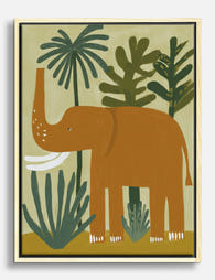
Little Jungle Elephant Canvas Print
Translation missing: en.products.product.sale_price From €65,95€93,95 -

Aerial Jungle Coastline Art Print
Translation missing: en.products.product.sale_price From €16,95€23,95 -

Exotic Landscape by Henri Rousseau Art Print
Translation missing: en.products.product.sale_price From €16,95€23,95 -

Jungle Stroll Canvas Print
Translation missing: en.products.product.sale_price From €65,95€93,95 -

Tiger in the Sunroom Art Print
Translation missing: en.products.product.sale_price From €16,95€23,95 -

Midnight Tiger Haven Canvas Print
Translation missing: en.products.product.sale_price From €65,95€93,95 -

Tiger and Roses Morris Exhibition Poster Art Print
Translation missing: en.products.product.sale_price From €16,95€23,95 -

Longwood Gardens Pennsylvania Travel Poster Canvas Print
Translation missing: en.products.product.sale_price From €65,95€93,95 -
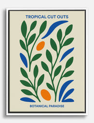
Tropical Cut Outs Botanical Paradise Canvas Print
Translation missing: en.products.product.sale_price From €65,95€93,95 -

Swimming with Tigers Art Print
Translation missing: en.products.product.sale_price From €16,95€23,95


More from The Frame

Urban Jungle Interiors: Using Wall Art Instead ...
The urban jungle look is having a moment that refuses to end. But most of the people pinning those plant-drenched living rooms will never own 47 monsteras, and that's fine....

Room by Room: How to Hang William Morris Floral...
You've fallen for Morris. The question now is which floral goes where, at what size, in what frame. This guide skips the Arts and Crafts lecture and gets straight to...

Jungle Bedroom Ideas for Adults: Grown-Up Ways ...
Jungle bedrooms have a reputation problem. Search the term and you'll find nursery mood boards, cartoon monkeys, and bright kelly green walls that would keep anyone awake. The grown-up version...