The Most Distinctive Art Print Styles Right Now (And How to Use Them)
A field guide to the freshest art print aesthetics of 2024/25, with opinionated room pairings and hanging advice you can actually use.

Most art print guides confuse style with technique, listing lithography next to surrealism as if they're the same kind of thing. They're not. This article is about visual style, the way a print actually looks on your wall, and which aesthetics feel genuinely distinctive right now rather than recycled from 2018.
Why 'unique' doesn't mean weird: reframing distinctive art
Distinctive art prints aren't loud for the sake of being loud. They have a specific point of view, a recognisable visual language, and they reward attention. The opposite isn't classical or restrained, it's generic: the beige watercolour mountains, the vague gold geometric shapes, the inoffensive line-drawn face you've seen in fifty rentals.
What makes art prints unique is usually a combination of three things: an unexpected subject (a vase of vegetables, not flowers), a strong handling of medium (visible brush texture, collage seams, dense linework), and a clear authorial voice you can read across an artist's body of work. None of this requires the art to be strange or difficult. A botanical illustration can be deeply distinctive if it commits hard enough to its own logic.
The styles below are the ones we think feel freshest in 2024/25. They sit at the intersection of current design movements, grandmillennial maximalism, quiet luxury restraint, dopamine decor, without belonging entirely to any of them.

Surrealist and collage prints: controlled chaos for statement walls
Surrealist collage is having a proper moment. You'll recognise it instantly: cut-out figures floating against flat colour fields, body parts swapped with fruit or architecture, scale playing fast and loose so a hand is bigger than a building. The visual code is Magritte by way of Tumblr, often rendered in muted dusty pinks, ochres, terracotta, and dove grey.
What makes this style feel current rather than dated is the restraint in the palette. Older surrealist work leaned psychedelic. The new wave is quieter, more curated, almost editorial. Think of the kind of image that could open a magazine feature.
Where it works. Above a console in an entryway, in a home office, or anchoring a sofa wall in a lounge that already has confident colour elsewhere. Surrealist collage rewards a space where you actually sit and look at the wall, so it's wasted in corridors.
Where it doesn't. A baby's room or a bedroom you fall asleep facing. Disembodied eyes and floating limbs are not what you want at 3am. Also avoid it in kitchens with lots of visual noise already, the print needs breathing room.
Hanging advice. Frame it. Properly. Surrealist collage looks weak unstretched or pinned, because the precision of the cut shapes needs the precision of a clean border. A natural oak or warm black frame with a small white margin gives the work the editorial quality it's reaching for. Go bigger than you think: 50x70cm minimum, ideally 70x100cm if you're using it as a statement piece.
Artists worth searching as starting points: Jordy van den Nieuwendijk, Magnus Voll Mathiassen, and the broader Scandinavian collage scene.
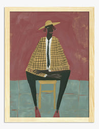
Bold graphic and pop art styles: high impact in minimal spaces
Graphic art prints, big flat blocks of colour, confident typography, simplified figurative shapes, are the cheat code for minimalist interiors that feel cold. A single bold graphic print does the work of three softer pieces and leaves the rest of the room to breathe.
The version of pop art that feels distinctive now isn't the comic-book Lichtenstein pastiche of the 2000s. It's more European, more design-led: think exhibition posters, screenprint aesthetics, Bauhaus-adjacent geometry. Saturated cobalt, tomato red, mustard, set against off-white or putty backgrounds.
Where it works. Open-plan kitchens, hallways with high ceilings, home offices where you want to feel sharp rather than soothed, kids' rooms (the saturated colour reads as joyful rather than aggressive at smaller scales). They pair brilliantly with mid-century furniture and concrete or polished plaster walls.
Where it doesn't. Already-busy maximalist rooms with patterned wallpaper. Bold graphic work needs negative space around it to land.
Scale matters more here than anywhere else. A small bold graphic looks like a postcard. You need 70x100cm or larger for it to register as art rather than decoration. This is the one style where we'd push you toward the upper end of what your wall can hold.
The contemporary art prints collection is a good hunting ground if you want to see where bold graphic work is heading right now.

Textural and tactile abstract work: the new alternative to generic abstracts
Most abstract prints are bad. They're algorithmic gradients in blush and beige, sold by the million, and they say nothing. The antidote is textural abstraction: work that shows the hand of the artist, visible brush marks, palette knife scrapes, paper grain, ink bleeds, the physical evidence that someone made this.
This is the style where print quality matters most, and where it's easiest to get burned. A textured abstract reproduced at low resolution looks like a photo of a painting, flat and dead. Reproduced properly with high-resolution giclée printing on thick matte paper, you can read individual brush strokes from across the room. The paper itself matters: matte stock holds detail in the darker pigments where gloss would create glare and flatten the depth.
Where it works. Bedrooms, lounges, dining rooms, anywhere you want warmth and softness without committing to a literal subject. Textural abstracts are the quiet luxury workhorse: they fill wall space confidently without demanding the room organise itself around them.
Where it doesn't. Don't use them as filler in a gallery wall of louder pieces. They get drowned out. And don't buy small textural abstracts, anything under 40x50cm loses the texture that makes the style work in the first place.
Hanging advice. This is the rare style where unframed canvas often beats framed paper. The mirrored edge wrapping on a canvas print extends the texture around the sides of the frame, which suits the painterly feel. Hang at eye level, slightly lower than you would a graphic piece, because the surface invites you to step closer.
Browse the abstract art prints collection with a critical eye: look for visible mark-making, not just colour fields.
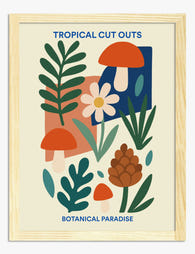
Detailed illustrative prints: art that rewards a closer look
The opposite end of the spectrum, and arguably the most undervalued category right now. Detailed illustrative prints are dense with linework, narrative, and small visual jokes. Botanical maximalism, fantastical cityscapes, cross-section drawings of houses and animals, antique-style natural history plates reimagined in contemporary palettes.
What makes this work feel fresh is the commitment to detail in an age of minimalism. The grandmillennial movement, the resurgence of chintz, William Morris, and pattern-on-pattern decorating, has made room for prints that take half an hour to fully absorb. You hang one, and six months later you're still noticing things in it.
Where it works. Reading nooks, libraries, downstairs loos (genuinely, the small enclosed space rewards detail because you're close to the wall), dining rooms where guests have time to look, children's rooms where the narrative quality holds attention. They suit traditional and transitional interiors more than strict modernism.
Where it doesn't. Above a sofa you sit on with your back to. The detail is wasted if no one's facing it. Also avoid hanging detailed illustrative prints too high, the standard "centre at 145-150cm" rule applies, but for these, err slightly lower so the linework is properly readable.
Scale guidance. This is the one style that works smaller. A detailed illustrative print at 30x40cm rewards close inspection in a way a bold graphic at the same size couldn't. That said, a 70x100cm botanical maximalist piece in a dining room is showstopping if the room can take it.
A note on framing. Detailed illustrative work benefits from a more traditional frame: a slim natural oak or warm walnut profile, occasionally with a small mount if the composition has dense edges. Skip the chunky black frame, it fights the linework.

How to match a distinctive style to your room's personality
Rooms have personalities, and they're usually shaped by three things: how much natural light they get, how much time you spend in them, and what you do there. Match the print to those, not to a Pinterest aesthetic.
High-light, high-traffic rooms (open-plan kitchens, lounges with big windows) can take bold graphic work and saturated colour. The light won't wash the colour out, and the activity in the room matches the energy of the print. UV-protective acrylic glazing keeps colour stable even in direct sunlight, so south-facing walls aren't off-limits the way they used to be.
Low-light, slow rooms (bedrooms, reading corners, snugs) suit textural abstracts and detailed illustrative work. You're in these spaces longer, often sitting still, so the slow-burn rewards of texture and detail pay off.
Transitional spaces (hallways, entryways, landings) want surrealist or bold graphic work. You're walking past, you need something that lands in a glance. Save the detailed botanical for the room you sit in.
A statement wall or full room? If your chosen style is loud (surrealist collage, bold graphics), one wall is plenty. The rest of the room should support, not compete. If your style is quieter (textural abstracts, detailed illustration), you can distribute three or four pieces across the room because none of them are shouting.
For rooms where you want a coordinated look without it feeling matchy, the wall art sets collection takes the matching guesswork out. They're designed to live together.
Mixing unique styles in a gallery wall without it feeling chaotic
Gallery walls go wrong for one reason: too many competing voices. Five distinctive styles together is visual cacophony. The fix isn't to use boring prints, it's to find a thread.
Pick one anchor and let it lead. The largest print sets the tone. Everything else either echoes its palette, its scale of mark-making, or its subject matter. If your anchor is a moody textural abstract in oxblood and charcoal, a tiny detailed botanical works alongside it only if it shares the palette. A bright pop art print won't.
Limit yourself to two or three styles maximum. A workable mix: one textural abstract (your anchor), one detailed illustrative print (for slow looking), one bold graphic piece (for energy). Three voices, in conversation, not five voices shouting.
Keep framing consistent or deliberately varied, never random. All-oak frames across mixed styles work because the frame becomes the unifier. Random framing (one black, one gold, one unframed, one chunky white) reads as accidental. Solid wood frames in a single timber tone are the easiest way to pull a mixed-style gallery wall together.
Hang tight, not sprawling. 5-7cm between frames keeps the wall reading as one composition. Spread them out and they become individual prints competing for attention.
Mix scales aggressively. Three medium prints in a row is boring. One large piece (70x100cm), two medium (40x50cm), and a small (30x40cm) gives the wall rhythm. Lay it out on the floor first.
The unique art prints collection is worth browsing specifically because the visual range there makes it easier to test combinations before you commit.

A final word on quality
Distinctive styles only work if the print itself holds up. Textural abstracts need high-resolution printing to keep the brushwork legible. Detailed illustrative prints need paper that holds fine linework without bleeding. Bold graphics need pigments that won't fade to a sad pastel in two years of sunlight. These aren't extras, they're the difference between art on your wall and a poster.
Buy the size up from what you think you need, frame it properly the first time, and commit to the style. Distinctive art rewards conviction. The worst thing you can do is hedge.

Fab products featured in this blog
-

Floral Statement Style Art Print
Translation missing: en.products.product.sale_price From €16,95€23,95 -

Bold Botanical Vases Art Print
Translation missing: en.products.product.sale_price From €16,95€23,95 -

Visual Arts Muse by Sommese Art Print
Translation missing: en.products.product.sale_price From €16,95€23,95 -
Botanical Tropics Collage Art Print
Translation missing: en.products.product.sale_price From €16,95€23,95 -

Blue Botanical Fusion Art Print
Translation missing: en.products.product.sale_price From €16,95€23,95 -
The Modern Muse Art Print
Translation missing: en.products.product.sale_price From €16,95€23,95 -

Bold Modern Floral Burst Art Print
Translation missing: en.products.product.sale_price From €16,95€23,95 -

Modern Floral Still Life Art Print
Translation missing: en.products.product.sale_price From €16,95€23,95 -

Teal Botanical Heritage Art Print
Translation missing: en.products.product.sale_price From €16,95€23,95 -

Modern Botanical Bloom Art Print
Translation missing: en.products.product.sale_price From €16,95€23,95 -

Fresh Botanical Vibes Art Print
Translation missing: en.products.product.sale_price From €16,95€23,95 -

Modern Botanical Burst Art Print
Translation missing: en.products.product.sale_price From €16,95€23,95 -

Bold Swing, Maximal Style Art Print
Translation missing: en.products.product.sale_price From €16,95€23,95 -

Botanical Perfume Bottle Art Print
Translation missing: en.products.product.sale_price From €16,95€23,95 -

Vibrant Botanical Burst Art Print
Translation missing: en.products.product.sale_price From €16,95€23,95 -

Grecian Still Life Fusion Art Print
Translation missing: en.products.product.sale_price From €16,95€23,95 -

Modern Botanical Pop Art Print
Translation missing: en.products.product.sale_price From €16,95€23,95 -

Modern Green Botanical Burst Art Print
Translation missing: en.products.product.sale_price From €16,95€23,95


More from The Frame

Matching Prints for Your Bedroom: Sets That Mak...
You've been in the house six months. The lounge is sorted, the kitchen has its rhythm, and the bedroom walls are still completely bare. The reason is almost always the...

Creating a Gallery Wall with Matisse Prints: Si...
Matisse's cut-outs are the rare bit of art history that works as hard in a modern flat as it does in a museum. The shapes are bold, the palettes are...

Why Do Most London Gallery Walls Look Like Tour...
A red phone box. A Beefeater. Big Ben in cartoon watercolour. You've seen this wall a hundred times, and it never looks like someone actually lives there. The good news...