


 Order today for delivery by
 7 Mid Century Gallery Wall Ideas That Look Professionally Curated
A tactical guide to mixing prints, choosing frames, and nailing the spacing so your wall looks intentional, not improvised.


A blank wall and a vague vision of "something mid century" is how most gallery walls go wrong. The style relies on restraint, proportion, and a confident colour palette, which means winging it rarely works. This guide gives you the exact measurements, layouts, and combinations that produce a polished result first time.
1. Start with the wall: measuring up and using the 2/3 rule
Before you buy anything, measure the wall you're working with. Width and height in centimetres, plus the dimensions of any furniture sitting beneath it (sofa, sideboard, console, bed).
The 2/3 rule is the single most useful sizing guideline in wall art. Your art arrangement should span roughly two-thirds of the width of the furniture below it, or two-thirds of the wall if it's a standalone wall. A 220cm sofa wants an arrangement around 145cm wide. A 180cm sideboard wants around 120cm. Go smaller and the art floats awkwardly. Go wider and it overpowers the piece below.
For mid century interiors, this rule matters even more. The style is built on proportional balance (think Eames lounge chair next to a slim teak side table), so undersized art reads as an afterthought immediately.
Sketch your wall to scale on paper, or use masking tape on the wall itself to outline a 2/3 zone. That's your canvas. Everything else gets planned inside it.

2. Choosing your anchor piece: one large print that sets the tone
Every well-composed gallery wall has an anchor: one print noticeably larger than the others, which dictates the colour palette and visual weight of everything around it. Without an anchor, you get a scattered, indecisive cluster.
For mid century walls, your anchor should be at least 50x70cm if the surrounding pieces are A3 (30x40cm), or 70x100cm if the surrounding pieces are 40x50cm or larger. The anchor needs to be at least 1.5 times the size of the next biggest piece. Anything closer and the hierarchy collapses.
Pick an anchor that does the heavy lifting on colour. A bold abstract in burnt orange, mustard, teal, or olive sets the palette. Everything else should pull two or three colours from that anchor and nothing more. This is how you avoid the "shop window" effect where every print is competing.
We'd reach for something painterly and slightly abstract for the anchor rather than a graphic geometric piece. Geometrics work brilliantly as supporting cast, but they're often too rigid to anchor a whole wall. Browse the mid century art prints collection and shortlist three candidates before committing.
3. The best print mix: pairing mid century abstracts with geometric and graphic pieces
Mid century modern wall art lives at the intersection of three print types: abstract organic shapes (think Calder, Miró influence), hard-edge geometric compositions (circles, arches, grids), and graphic typographic or illustrative prints (atomic motifs, line-drawn figures, vintage travel posters).
A balanced wall uses all three, weighted roughly 50/30/20. Half abstracts, just under a third geometric, the remainder graphic or illustrative. Skew too heavily toward geometric and the wall feels cold and clinical. Skew too heavily toward abstract and it loses the structural rhythm that defines the style.
A working five-piece example:
- 1 large abstract anchor (the heavy lifter on colour)
- 1 medium abstract in a complementary tone
- 1 medium geometric print (arches, circles, or a Bauhaus-influenced composition)
- 1 small geometric in black and white or muted tones
- 1 small graphic piece (atomic starburst, line illustration, or text-based print)
On atomic and starburst motifs specifically: one is charming, three is a theme park. Use them sparingly and always alongside more restrained pieces. Our geometric art prints and abstract art prints collections are where most of the mixing happens.
For colour pairings that actually work together: burnt orange with teal and cream. Mustard with olive and chocolate brown. Rust with sage and bone. Avocado green with terracotta and warm white. Pick one pairing and stick to it across all five prints. Bright MCM colours go wrong when you try to use all of them at once.
4. Frame consistency vs. deliberate contrast (and why we'd pick consistency)
There's a real divide in gallery wall advice. Some designers say match every frame. Others say mix up to three styles for character. For mid century walls, we come down firmly on consistency, and here's why.
The style is already doing a lot of work with colour, shape, and pattern. Adding frame variation on top creates visual noise that fights against the clean-lined ethos of the era. Consistent frames let the prints themselves do the talking.
Our default recommendation: solid wood frames in natural oak or warm walnut, matching across every piece. Oak feels lighter and more Scandinavian. Walnut feels richer and more American mid century (think Knoll, Florence Knoll, George Nelson). Black frames work too, but only if your prints lean graphic and high-contrast. Skip white frames for MCM unless your wall colour is dark and you want the frames to pop.
If you genuinely want contrast, allow yourself one exception: the anchor piece in a different frame to everything else. Walnut anchor, oak supporting cast. That's it. Any more variation and the wall starts to look accidental.
A practical note on framing quality: poorly fitted frames are the single biggest failure point in this category. Warped MDF, prints that aren't properly mounted, frames shipped separately and assembled at home. The whole effect collapses if the frames don't sit flat. Worth checking that whatever you buy arrives properly fitted and ready to hang.

5. Layout templates: the 3-piece horizontal, the salon cluster, and the stacked pair
Three layouts cover ninety percent of mid century gallery walls. Pick one based on the wall and furniture you're working with.
The 3-piece horizontal
The cleanest and most forgiving layout. Three prints of equal size in a single row, evenly spaced. Best above sofas, sideboards, and beds.
Sizing: three 40x50cm prints with 5cm spacing covers about 130cm of width. Three 50x70cm prints with 6cm spacing covers about 162cm. Match this to your 2/3 calculation from step one.
Mix: two abstracts flanking one geometric, or one abstract anchor in the centre flanked by two geometric supporters. We prefer the second arrangement for visual rhythm.
The salon cluster
A loosely organised group of five to seven prints, anchored by one large piece (usually positioned slightly left of centre or in the lower-left of the cluster) with smaller prints orbiting around it. The MCM version of this layout is tighter and more restrained than a traditional salon wall. Less Parisian chaos, more considered composition.
Sizing: one 70x100cm anchor, two 40x50cm mediums, two to four 30x40cm smalls. Total footprint roughly 160cm wide by 130cm tall.
The trick is keeping the outer edges of the cluster following an imaginary rectangle. Inside that rectangle, you can vary positioning, but the silhouette stays disciplined.
The stacked pair
Two prints of equal size, one directly above the other. Brilliant for narrow walls, hallways, or beside a doorway. Works particularly well with vertical abstracts.
Sizing: two 50x70cm prints stacked vertically with 5cm between them gives you a 145cm tall arrangement. Pairs beautifully with a tall plant or floor lamp nearby.
Before committing to any layout, cut newsprint or brown paper to the exact size of each frame and tape them to the wall. Live with it for 24 hours. Adjust. This is the single best trick for getting it right first time, and most people skip it.
A pre-curated wall art set takes the guesswork out of the mixing if you'd rather not assemble piece by piece.
6. Spacing, alignment, and hanging height for mid century gallery walls
Three numbers worth memorising.
Spacing between frames: 5 to 7cm. Tighter than this and the prints crowd each other. Wider than this and the arrangement looks unrelated. For larger prints (70x100cm and above), push toward 7cm. For smaller prints, 5cm is the sweet spot. Keep the spacing consistent across every gap in the arrangement. Inconsistent gaps are the fastest way to make a gallery wall look amateurish.
Centre point: 145 to 152cm from the floor. This is the gallery standard (roughly average eye level) and works in nearly every room. Measure to the centre of the entire arrangement, not the centre of any individual piece. If you have very high ceilings, you can push up to 155cm, but rarely higher.
Above furniture: 15 to 20cm from the top of the furniture to the bottom of the lowest frame. Closer than 15cm and the art looks like it's resting on the sofa. Further than 20cm and the relationship between art and furniture breaks. This rule overrides the eye-level rule when you're hanging above a sofa or sideboard.
For alignment, pick one axis and commit. In a 3-piece horizontal, align the centre line of every frame. In a stacked pair, align the vertical centre. In a salon cluster, align the outer edges of the cluster to an invisible rectangle, then organise internally around the anchor.
Negative space matters more in MCM than in other styles. The era prized breathing room. Leave at least 30cm of clear wall on either side of the arrangement. A gallery wall pushed up against a doorframe or corner loses all its composure.

7. Common gallery wall mistakes and how to fix them
Mistake: Everything the same size. A row of identical frames looks like a hotel corridor. Fix: introduce one print at least 1.5 times the size of the others as your anchor.
Mistake: Too many colours competing. If you're using more than four colours across the wall, you've overcorrected. Fix: pull the palette back to one dominant colour, one supporting, and one or two accents drawn from the anchor.
Mistake: Hung too high. The most common error, especially above sofas. Fix: the bottom of the lowest frame should sit 15 to 20cm above the sofa back. If it's higher, lower it.
Mistake: Inconsistent spacing. Some gaps are 4cm, others are 9cm, and the eye can tell instantly. Fix: pick one spacing measurement and use a spacer (a folded piece of cardboard cut to exact width) when hanging.
Mistake: Frames that don't sit flat. Warping, bubbling, or prints that shift inside the frame. This is a quality issue, not a layout issue. Fix: only buy framed prints that arrive fully assembled and properly fitted, not flat-packed components you assemble yourself.
Mistake: Wall too small for the arrangement. Gallery walls need breathing room on both sides. Fix: if you can't leave 30cm of clear wall either side, the arrangement is too big for the space. Drop a piece or size down.
8. Our favourite mid century print combinations right now
A few combinations we keep coming back to, all of which can be assembled from the mid century art prints range.
The warm desert palette: an abstract anchor in burnt orange and cream, two geometric supporters in rust and bone, one small graphic in chocolate brown. Frame in walnut. Works above a low sideboard or a tan leather sofa.
The Scandinavian quiet: muted abstract anchor in sage and oat, two minimal geometric pieces in cream and charcoal, one line-drawn figurative print. Frame in light oak. Works in bedrooms and home offices.
The bold collector: abstract anchor in teal and mustard, one strong geometric in black and white, one starburst or atomic-motif print used as the smallest piece (not the focal point), one painterly piece pulling teal back through. Frame in walnut. Works in lounges with plenty of wood furniture.
The graphic study: three Bauhaus-influenced geometric prints, one abstract piece for softness, all in tightly controlled red, blue, yellow, and black. Frame in black. Works in hallways and stairwells where the wall is long and narrow.

Final thought
A polished gallery wall is mostly a measurement exercise dressed up as a creative one. Get the 2/3 rule right, pick one anchor, commit to a palette, keep the frames consistent, and mock the whole thing up in paper before you put a single nail in the wall. The taste comes through in the restraint, not the variety.

Fab products featured in this blog
-

Neutral Shapes & Earth Blocks Art Print
Sale price From €16,95€23,95 -

Poolside Modernist House Canvas Print
Sale price From €66,95€94,95 -

Quiet Curve in Green and Teal Art Print
Sale price From €16,95€23,95 -

Bauhaus 1919 Green Geometry Art Print
Sale price From €16,95€23,95 -

Yellow Modernist House Art Print
Sale price From €16,95€23,95 -

Modern Balance Shapes Art Print
Sale price From €16,95€23,95 -

Bauhaus Ausstellung 1919 Dot Grid Canvas Print
Sale price From €66,95€94,95 -

Half Moon Lines Minimal Art Print
Sale price From €16,95€23,95 -

Cubist Muse in Warm Neutrals Art Print
Sale price From €16,95€23,95 -

Modern Geometric Haven Art Print
Sale price From €16,95€23,95 -
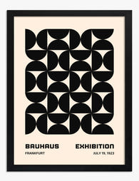
Bauhaus Exhibition Frankfurt 1923 Art Print
Sale price From €16,95€23,95 -

Bauhaus 1919 — Half-Circle Geometry Art Print
Sale price From €16,95€23,95 -

Bauhaus Arches & Sun Art Print
Sale price From €16,95€23,95 -
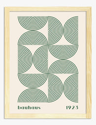
Bauhaus 1923 Green Arcs Art Print
Sale price From €16,95€23,95 -

Bauhaus Ausstellung 1923 Teal Arch Art Print
Sale price From €16,95€23,95 -

Half Moon and Dots Art Print
Sale price From €16,95€23,95 -

Flea Market Mid-Century Poster Canvas Print
Sale price From €66,95€94,95 -
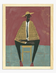
The Modern Muse Art Print
Sale price From €16,95€23,95 -

Bauhaus Ausstellung 1919 in Deep Green Canvas Print
Sale price From €66,95€94,95


More from The Frame

Vintage Botanical Prints: A No-Nonsense Guide t...
Vintage botanical prints are having a moment, and the internet is flooded with them. Most are terrible. Here's how to tell the real craftsmanship from the glossy, over-filtered reproductions, and...

The Greenhouse Aesthetic: How to Bring Victoria...
The greenhouse aesthetic has quietly taken over interiors Pinterest, design magazines and the walls of some very photogenic flats. The catch: almost every guide you'll find assumes you own an...

The Best Art for Conservatory Walls (That Won't...
Most people leave their conservatory walls bare, and it's not because they don't want art there. It's because they're quietly worried about fading, warping, and whether anything will look right...