Art for Warm Neutral Walls: Cream, Beige, and Taupe
A practical pairing guide for cream, beige, and taupe walls, with the colour theory to back it up.

Warm neutrals are forgiving, but they're not effortless. The wrong art will sink into a beige wall like it was never hung, while the right piece can make the whole room feel considered. This guide tells you exactly what works with cream, beige, and taupe, and why.
Start with your undertone, not your paint name
Before you look at a single print, identify what your wall is actually doing. "Warm neutral" covers dozens of undertones, and the undertone is what decides whether a print sings or sulks.
Hold a sheet of pure white printer paper against your wall in daylight. If your wall looks pink next to the paper, you have a rosy beige. If it looks yellow, you have a buttery cream. If it looks slightly green or grey, you're in taupe territory.
Pink-leaning warm neutrals clash with orange-heavy art and flatter sage, dusty blue, and burgundy. Yellow-leaning creams welcome terracotta, olive, and deep navy but fight with cool pastels. Grey-green taupes love warm rust, ochre, and chocolate, and look muddy next to anything mustard.
This single test will save you more decorating mistakes than any rule about sofa width.
Art for cream walls
Cream walls (think soft buttery off-whites, ivory, paint colours in the "Edgecomb" or "Swiss Coffee" family) read as light and slightly yellow. They're the most flexible warm neutral, but they have one weakness: pale art disappears.
What to look for
Reach for prints with genuine contrast. Cream walls need something to push against, so a high-contrast black and white photograph, a botanical illustration with deep green foliage, or an abstract with confident dark passages will all earn their place.
Colour-wise, cream loves its analogous neighbours: warm ochre, soft terracotta, faded coral, dusty pink. For complementary contrast, deep teal, navy, and forest green all look beautifully grown-up against cream without going gothic.
Black and white prints are particularly strong here because the cream warmth stops them feeling clinical. A grainy black and white landscape on a cream wall has more depth than the same print on stark white.

What to avoid
Anything in the same value range as your wall. Sand-coloured abstracts, pale beige minimalist line art, washed-out watercolours: these all vanish on cream. If you love that quiet aesthetic, you need to introduce contrast through the frame or matting.
Also avoid cool blue-grey art unless your cream has a slight grey undertone. Pure cool tones against yellow-leaning cream can look like a mistake rather than a choice.
Frame strategy for cream walls
A natural oak or light walnut frame disappears slightly into cream, which works beautifully for botanical and landscape prints where you want the image to lead. For graphic, modern, or high-contrast work, a black frame is the sharper choice. White frames almost never work on cream because the cream makes the white look dingy.
Art for beige walls
Beige is the trickiest of the three because it spans such a wide range. A pinky-beige (sometimes called "greige" when it goes cooler) behaves very differently from a yellow-heavy tan. Do the paper test before you buy anything.
What to look for
Beige walls are flattered by tonal layering: art that uses multiple shades of warm neutral plus one accent. A print featuring camel, cream, soft black, and a single hit of rust will look effortlessly designed on a beige wall.
For colour, beige loves earth tones. Burnt sienna, mustard (only on yellow-beige, never pink-beige), olive, oxblood, and chocolate brown all sit happily against beige walls. Cool contrast works too if you commit: deep navy, charcoal, and emerald green provide proper architectural contrast without fighting the warmth.
Abstract expressionist work, vintage-inspired posters, and warm-toned landscape photography all suit beige rooms. Abstract art in particular shines here because the gestural, painterly quality adds visual interest where beige walls offer none.
What to avoid
Pastel art is the great enemy of beige walls. Soft pink, mint, lavender, and baby blue all turn chalky and slightly sad against a warm beige background. If you want pastels in a beige room, treat them as cushions or throws, not wall art.
Also be careful with golden yellow art on yellow-beige walls. Same-family tones without enough contrast create a flat, hotel-corridor feeling.
Frame strategy for beige walls
Wood frames in mid tones (walnut, dark oak) are the safest bet on beige because they echo the warmth without trying to compete. A black frame works brilliantly on beige if the print itself has strong contrast. White frames can work on beige but only if the white has a warm undertone, otherwise it looks like a printing error.
A generous off-white or cream mount can also rescue a print that feels too small or quiet for the wall. The mount essentially extends the image's visual footprint.
Art for taupe walls
Taupe is sophisticated and unforgiving. It has a grey-brown character that can lean cool or warm depending on the light, and it reads as more formal than cream or beige. Get it right and your room looks like a Belgian design magazine. Get it wrong and it looks like a waiting room.
What to look for
Taupe walls handle drama beautifully. Deep, moody art with rich blacks, oxblood, forest green, and burnt umber looks luxurious against taupe. This is the wall colour where dark, atmospheric landscape photography truly comes into its own.
Lean into rich, saturated colours rather than pastels. A botanical print with deep green foliage, a still life with dark backgrounds, or an abstract with confident colour-blocking will all anchor a taupe wall.
Botanical and floral prints in moody, dark-background styles look particularly elegant on taupe. The grey-brown undertone makes botanical greens read as more refined than they would on a brighter wall.

What to avoid
Anything with a chalky, washed-out palette will look weak on taupe. Pale watercolours, soft pencil sketches with lots of negative space, and minimalist line art on cream backgrounds all struggle because taupe absorbs subtlety.
Bright, primary colours can also clash. A pure red, a pure cobalt, or a school-bus yellow will look cartoonish against taupe's sophistication. If you want strong colour, take it deeper: oxblood instead of red, navy instead of cobalt, ochre instead of yellow.
Frame strategy for taupe walls
Black frames are the default here, and for good reason. They give taupe the structural edge it needs. Dark walnut also works. Light wood frames can feel slightly underwhelming on taupe unless the artwork itself is very bold.
Avoid white frames entirely on taupe. The contrast is too sharp and the white looks accidental rather than considered.
How room light changes everything
Your wall colour changes throughout the day, and warm neutrals are particularly chameleon-like.
North-facing rooms (in the northern hemisphere) get cool, blue-grey light. This pushes warm neutrals slightly grey and makes them look less warm than the paint chip suggested. In these rooms, lean further into warm-toned art to rebalance the cool light. Ochre, terracotta, and rust will glow.
South-facing rooms get warm, golden light all day. Cream and beige walls can start to look yellow, almost orange in late afternoon. Cool-toned art (deep teal, navy, sage green) provides relief and stops the room feeling overheated.
East-facing rooms get warm morning light then cool afternoon shadow. West-facing rooms reverse this. In both, hang your art and live with it for a few days at different times before committing to frame choices.
Artificial lighting matters too. Warm bulbs (2700K and below) push neutrals towards yellow. Cooler bulbs (3000K and above) cool them down. If your art looks great in daylight but disappointing at night, your bulbs are probably the culprit.
Sizing and visual weight on warm neutrals
Warm neutral walls flatten visual weight, which means art often needs to be larger than you think. The usual rule of "two-thirds the width of the furniture below" is a minimum on neutral walls, not a target.
For a standard three-seater sofa around 200cm wide, aim for a single piece at least 90x120cm, or a pair of 50x70cm prints hung close together. On taupe especially, undersized art looks marooned.
Canvas prints can be a smart choice here. The slight depth they sit at, around 4cm proud of the wall, creates a shadow line that gives warm neutral walls extra dimensionality. Our canvas goes up to 100x150cm, which is the kind of statement scale a large living room often needs.
For framed prints, our maximum size of 70x100cm is plenty for most spaces, particularly when paired or grouped. The UV-protective acrylic glaze (rather than glass) means a 100cm print isn't dangerously heavy, which matters when you're hanging anything substantial on plasterboard.

Gallery walls on warm neutrals
Warm neutral walls are forgiving gallery wall backgrounds because they unify mixed art styles. The trick is committing to a frame strategy.
The mixed-tone approach
For a collected, slightly bohemian look on beige or cream, mix three frame finishes: black, natural oak, and dark walnut. Avoid white frames in the mix. Keep the artwork itself loosely connected through one repeated colour: rust, ochre, or deep green tends to read well.
The unified frame approach
For taupe, or for a more formal cream or beige room, use identical frames throughout. Black is the strongest choice. This lets you mix art styles wildly (photography next to abstract next to typography) while the frames hold it all together.
Grid vs salon arrangements
Grids of identical sizes look architectural and intentional, which suits taupe particularly well. Salon-style arrangements (mixed sizes, asymmetrical) look relaxed and collected, which suits cream and beige.
Whatever you choose, mock it up on the floor first or cut newspaper templates and tape them to the wall. Warm neutrals are unforgiving of wonky spacing.
Common mistakes to avoid
Matching art too closely to wall colour. Beige art on beige walls is the single biggest mistake. You need contrast somewhere: tone, frame, or colour.
Choosing art for the paint chip, not the room. Your wall in the shop and your wall at home are different colours. Always make decisions in your actual room.
Forgetting the frame is part of the art. On warm neutrals, the frame often does as much heavy lifting as the print. A good print in the wrong frame can look cheap, while a simple print in the right frame can look gallery-worthy.
Hanging too small. When in doubt, size up. Warm neutrals swallow small art.
Ignoring the trim. If you have white skirting and architrave, your art will be read in relation to them, not just the wall. Pure white mounts can pick up the trim and feel cohesive; warm white mounts can look slightly off.
How to test before you commit
Order one print at the size you're considering and live with it for a few days before adding more. Move it around. See it in morning light, afternoon light, evening lamplight. Our 99-day returns policy exists specifically so you can do this without anxiety.
If you're building a gallery wall, start with the anchor piece (the largest) and add around it over weeks, not in one go. Warm neutrals reward patience because they hide nothing.
The shortcut, if you only remember one thing
On cream walls, contrast wins. On beige walls, tonal layering with one earthy accent wins. On taupe walls, depth and drama win. Identify your undertone, choose a frame that gives the art a proper edge, and hang it bigger than feels comfortable. The wall will do the rest.


Fab products featured in this blog
-
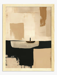
Warm Minimal Dusk Art Print
Sale price From €16,95€23,95 -

Cubist Muse in Warm Neutrals Canvas Print
Sale price From €65,95€93,95 -

Terracotta Muse Art Print
Sale price From €16,95€23,95 -

Warm Terracotta Layers Art Print
Sale price From €16,95€23,95 -

Warm Minimal Dusk Canvas Print
Sale price From €65,95€93,95 -

Warm Rustic Layers Art Print
Sale price From €16,95€23,95 -

Pastel Barcelona Facades Art Print
Sale price From €16,95€23,95 -

Earth Tones Harmony Art Print
Sale price From €16,95€23,95 -

Quiet Geometry No. 2 Art Print
Sale price From €16,95€23,95 -
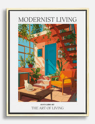
Modernist Living — The Art of Living Canvas Print
Sale price From €65,95€93,95 -
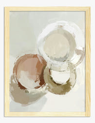
Soft Circles in Clay and Cream Art Print
Sale price From €16,95€23,95 -

Terracotta Muse Canvas Print
Sale price From €65,95€93,95 -

Neutral Flow Art Print
Sale price From €16,95€23,95 -

Terracotta Flow Art Print
Sale price From €16,95€23,95 -
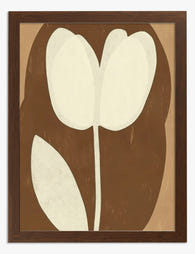
Neutral Tulip Art Print
Sale price From €16,95€23,95 -

Pastel Barcelona Facades Canvas Print
Sale price From €65,95€93,95 -

Soft Neutrals Still Life Art Print
Sale price From €16,95€23,95 -

Modernist Living — The Art of Living Art Print
Sale price From €16,95€23,95 -

Soft Shapes in Blush Art Print
Sale price From €16,95€23,95 -

Sunlit Italian Villa Path Art Print
Sale price From €16,95€23,95


More from The Frame

The Best Water Lily Prints for Every Room (And ...
Water lily art has a rare quality: it slots into almost any room without asking the rest of the decor to change around it. The tricky part is knowing which...

The Best Wall Art for Plant Lovers (That Doesn'...
You already have too many plants. You know it, your partner knows it, the fiddle leaf fig blocking the window knows it. But your walls are still bare, and there's...

Are Botanical Prints Still in Style? The Trend ...
Botanical prints have been declared "over" roughly every three years since 2015, and yet they keep hanging on more walls than ever. The truth is they're not a trend at...