Best Art for Hallways: 7 Styles That Make an Entrance
Firm recommendations for the trickiest wall in your home, organised by style and matched to how hallways are actually used.

Hallways are the most overlooked walls in the house and the hardest to get right. You walk past them in seconds, the light is usually poor, and the sightlines are narrow. This guide gives you firm style-matched recommendations rather than another vague list of options.
What makes hallway art different from living room art
You sit with living room art. You glance at hallway art. That single difference should shape every choice you make.
In a lounge, a print can reward close inspection, reveal new details over time, and hold its own across a 4 metre viewing distance. In a hallway, you have roughly 2 to 3 seconds of passing attention, often in dim light, often from an awkward angle. Art that depends on subtle detail, complex composition, or close reading will simply not register.
The principle that matters most is the quick read. Big shapes, clear contrast, confident colour. If you have to stop and study it to understand it, it is the wrong piece for a hallway.
Lighting is the second constraint. Most hallways have one ceiling pendant, no windows, and walls that swallow what little light there is. This means dark, moody pieces disappear. Light backgrounds and warm tones do the heavy lifting in spaces like these.
Orientation matters too. Portrait prints suit narrow hallways because they echo the vertical proportions of the wall and let you stand close without craning. Landscape prints work in wider entrance halls and at the ends of corridors where you have viewing distance. For sizing, A3 (30x42cm) and A2 (42x59cm) work in tight passages, while A1 (59x84cm) or larger anchors a wider wall or a feature spot at the end of a long hall.

Bold botanicals: colour and life in a space that often lacks both
Hallways tend to be the most neutral rooms in the house, partly because they connect to everything else and need to play nicely. The cost of that neutrality is that they often feel lifeless. Botanicals fix this without committing to a colour scheme.
The trick is to choose bold rather than delicate. Pressed-flower studies and fine botanical illustrations are beautiful but they are detail-led, which makes them better suited to bedrooms and studies. For hallways, look for botanicals with confident silhouettes: a single oversized monstera leaf, a graphic palm, a painterly tulip in deep sage and ochre.
We particularly like botanicals with cream, off-white or warm sand backgrounds in hallways. They reflect what light you have, they lift dark corridors, and they sit comfortably alongside almost any wall colour. Strong green tones add the freshness most hallways are missing.
If you want a starting point, browse the botanical art prints collection and filter for pieces with simple compositions and high contrast. A single large botanical at 70x100cm at the end of a corridor draws the eye and gives the space a clear visual destination.
Two botanicals in matching frames also work well, hung side by side rather than stacked, on a wall that runs perpendicular to your walking direction. Avoid running a long row of small botanicals down a corridor. It looks busy in passing and never reads as a coherent display.
Architectural and cityscape prints for modern hallways
If you live in a newer build or a flat with clean lines and minimal mouldings, architectural prints are one of the smartest hallway choices going. They suit the geometry of modern hallways and they read instantly even at speed.
What works: line drawings of iconic buildings, abstracted architectural studies, minimalist cityscape prints with two or three flat colours, and brutalist photography with strong shapes. What doesn't: highly detailed urban illustrations packed with tiny windows and signage. Same reason as the botanicals. Detail dies in a hallway.
A single architectural print at A1 size in a black frame on a white wall has a confident, slightly editorial feel. It is the closest you can get to a gallery look without the gallery wall. For longer hallways in modern homes, we recommend a series of three architectural prints in identical frames, spaced generously rather than crammed together. Give each piece room to breathe.
Colour palette wise, think charcoal, ink blue, terracotta, and warm white. These read well under poor lighting and connect easily to other rooms.
Abstract art: big shapes that read fast in passing
Abstract is arguably the most hallway-friendly genre because the best abstract work is built around the quick read principle by design. Big shapes, confident colour relationships, no narrative to puzzle out.
The version of abstract that works in hallways is the one with restraint. One or two dominant shapes, a clear focal point, two or three colours doing most of the work. Mid-century inspired abstracts, Matisse-style cutouts, and large colour-field pieces all hit this brief. Busy gestural abstracts with dozens of overlapping marks do not.

Scale up rather than down with abstract. A small abstract print can look apologetic. A 70x100cm abstract in a slim oak or black frame anchors a hallway the way a single sofa anchors a living room. Browse the abstract art prints collection if you want to see how this plays out across different colour palettes.
One opinionated take: skip the gallery wall of mixed abstract prints unless your hallway is genuinely generous in width. In tight corridors, gallery walls read as visual noise and make the space feel narrower. A single large piece almost always beats five small ones in a hallway.
Black and white photography for period homes and minimal spaces
There are two contexts where black and white photography is the obvious choice: Victorian and Edwardian period homes, and aggressively minimal modern interiors. Both benefit from the timelessness and the visual quiet.
In a period hallway with original tiles, deep skirtings and a coloured wall, black and white photography sits comfortably without competing. The frame becomes part of the architecture. We tend to recommend solid wood frames in black or natural oak here, with a generous white border around the image. UV-protective glazing matters in hallways that catch any sunlight from a front door panel, because fading shows up quickly in photographic work.
In minimal modern hallways, black and white photography provides depth and warmth that a graphic print cannot. Look for images with a clear single subject: a single tree, a coastline, a single figure, an empty interior. Avoid crowd scenes, busy street photography, and images that depend on caption-level context to make sense.
For inspiration on what sort of compositions hold up in low light, the photography art prints collection is a good starting point. Filter for high-contrast images with a clear focal subject and you cannot go far wrong.
One subject we would steer away from: black and white portraits of strangers, particularly close-up faces with direct eye contact. They have a tendency to feel watched, which is not the energy you want greeting visitors at the front door.
Warm-toned landscapes for welcoming entrance halls
If your hallway is the first thing people see when they walk into your home, the question to ask is not what looks good but what feels good. Warm-toned landscape prints do this better than anything else.
We mean warm in the literal sense: ochre, terracotta, dusty pink, golden hour light, sun-bleached earth tones. Italian hillside studies, desert landscapes, soft pastoral scenes with cream skies, atmospheric mountain prints in muted warm palettes. They make people feel welcomed before they have taken their coat off.
Landscapes work best in entrance halls where you can hang them on the wall facing the front door, ideally above a console table or bench. The standard guidance is to leave roughly 15 to 20cm between the top of the furniture and the bottom of the frame. A 60x80cm or 70x100cm landscape at eye level here does more for the feel of a home than almost any other decorating decision.
Skip the dramatic stormy seascapes and atmospheric forest scenes for hallways. They are gorgeous pieces of art, but they are too moody for a space that is meant to welcome you. Save them for the lounge or bedroom.

Matching your hallway art to the rooms it connects
This is the part most guides skip and it is the most important. Your hallway does not exist in isolation. It is the connective tissue between rooms, and the art on its walls should help those rooms talk to each other.
The simplest method: identify the one colour that appears in every adjacent room, then choose hallway art that uses that colour as one of its main tones. If your lounge has sage cushions, your kitchen has sage tea towels, and your bedroom has sage bedding, then sage-toned art in the hallway will pull the whole floor together.
The second method is to match the style temperature rather than the colour. A hallway connecting a minimal modern kitchen and a soft traditional lounge needs art that bridges both. Often this means abstract or botanical work with clean composition but warm palette. It does not need to match either room exactly. It needs to feel plausible walking out of one and into the other.
For long corridors with multiple doors, treat the corridor like a transition rather than a destination. The art should feel calmer and quieter than the art inside each room. The rooms are where you dwell. The corridor is where you pass.
Have a look through the dedicated hallway art prints selection if you want pieces specifically curated for transitional spaces.
Subjects to avoid in hallways (and why)
Most guides will not tell you this part because they want to sell you anything. We would rather you buy one piece that works than three that don't.
Highly detailed art. Maps with tiny place names, illustrations packed with hidden objects, intricate line drawings of botanical specimens with hundreds of small marks. The detail is wasted. You will not stop to look at it, and at speed it reads as visual clutter.
Dark and moody pieces. Stormy seas, gothic interiors, deep forest scenes, anything with a black or near-black background. Hallways already lack light. Dark art absorbs what little there is and makes the corridor feel like a tunnel.
Portraits with direct eye contact. This sounds superstitious but it is genuinely about comfort. A face that locks eyes with you every time you walk past becomes uncomfortable quickly. Portraits with averted gazes or abstracted faces are fine. Direct stares are not.
Busy repeat patterns. Tessellated geometrics, dense floral repeats, anything that vibrates in peripheral vision. Hallways are seen sideways more often than head-on, and busy patterns are exhausting at that angle.
Anything text-heavy. Quote prints, typography pieces, lyric posters. You cannot read them at speed, so they end up feeling like signage that nobody actually reads.
Oversized gallery walls in narrow corridors. Gallery walls are the default recommendation everywhere and they are wrong for most hallways. In a corridor narrower than about 1.2 metres, a gallery wall creates a cluttered, claustrophobic feeling. One confident piece beats a wall of small ones almost every time in a tight hallway.

A few practical notes before you commit
Framed prints almost always look more finished in hallways than unframed canvases, partly because the frame echoes the architectural detailing of door frames and skirtings. That said, a large canvas at 100x150cm at the end of a long corridor can be spectacular if the rest of your decor is on the minimal side.
If your hallway gets any direct sunlight from a front door panel or skylight, prioritise prints with UV-protective glazing and inks rated for longevity. Fading happens faster than most people expect in entrance halls.
And finally, hallway art is one of the few places where you can swap pieces seasonally without redoing a whole room. Because you pass it daily, it gets stale faster than living room art. Rotating one or two prints twice a year keeps the space feeling considered.
Pick one piece, hang it well, give it space. That single choice will do more for your hallway than any amount of layering.

Fab products featured in this blog
-
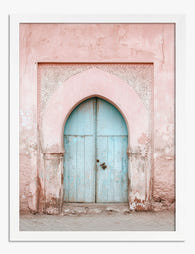
Pastel Archway Entrance Art Print
Translation missing: en.products.product.sale_price From €16,95€23,95 -

Vibrant Urban Entryway Canvas Print
Translation missing: en.products.product.sale_price From €64,95€92,95 -

Sunflower Serenity Art Print
Translation missing: en.products.product.sale_price From €16,95€23,95 -

Eclectic Botanical Stairway Art Print
Translation missing: en.products.product.sale_price From €16,95€23,95 -

Vibrant Stairway Canvas Print
Translation missing: en.products.product.sale_price From €64,95€92,95 -

Pastel Archway Entrance Canvas Print
Translation missing: en.products.product.sale_price From €64,95€92,95 -

Garden Welcome Art Print
Translation missing: en.products.product.sale_price From €16,95€23,95 -

Vibrant Urban Doorway Art Print
Translation missing: en.products.product.sale_price From €16,95€23,95 -

Pastel Portal Art Print
Translation missing: en.products.product.sale_price From €16,95€23,95 -

Lush Staircase Sanctuary Art Print
Translation missing: en.products.product.sale_price From €16,95€23,95 -

Bright Path Through the Woods Art Print
Translation missing: en.products.product.sale_price From €16,95€23,95 -

Sunlit Italian Alleyway Art Print
Translation missing: en.products.product.sale_price From €16,95€23,95 -

Garden Path to Home Art Print
Translation missing: en.products.product.sale_price From €16,95€23,95 -

Sunlit Forest Pathway Art Print
Translation missing: en.products.product.sale_price From €16,95€23,95 -

The Yellow House by Van Gogh Art Print
Translation missing: en.products.product.sale_price From €16,95€23,95 -

Vibrant Hillside Journey Art Print
Translation missing: en.products.product.sale_price From €16,95€23,95 -

Autumn Pathway Glow Art Print
Translation missing: en.products.product.sale_price From €16,95€23,95 -

Plants on the Landing Art Print
Translation missing: en.products.product.sale_price From €16,95€23,95


More from The Frame

Art for Green Walls: What Works, What Fights
You painted the walls green. Maybe sage, maybe forest, maybe something in between. Now the room feels half-finished and the art you owned before suddenly looks wrong against it. Green...

What to Put in a Stairwell: The Hardest Wall in...
Stairwells are the wall everyone postpones. The ceiling is too high, the angle is wrong, the lighting is bad, and every nail hole feels like a permanent mistake on a...

Art at the Top and Bottom of a Staircase
Staircases are the most overlooked walls in the house. They are also the trickiest, because the top of the stairs, the bottom of the stairs, and the landing in between...