Best Prints for Bathroom Walls: What Works, What Doesn't, and Why
A style-first guide to bathroom art that actually looks good, with opinionated picks for every aesthetic.

Bathroom art is the most overlooked wall in the house, which is strange because it's the room you stare at while brushing your teeth, soaking in the bath, and waking up. Done well, it transforms the space from utilitarian to genuinely lovely. Done badly, it looks like a hotel corridor from 2004.
This guide skips the usual "calming nature scenes" advice and tells you exactly what to put on your walls based on the bathroom you actually have.
The subjects that always work in a bathroom (and the ones that never do)
Some subjects are bathroom-proof. Botanical illustrations, abstract line art, black and white photography, ocean and coastal imagery, architectural prints, and minimal figure studies all earn their place. They feel intentional without trying too hard, and they sit comfortably alongside towels and tiles rather than competing with them.
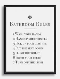
The subjects that never work are the ones that lean into the room's function. Anything with rubber ducks, bathroom puns ("wash your hands", "soak"), cartoon bathtubs, or vintage soap advertisements turns your wall into a gift shop. Heavy, dark oil paintings are wrong too. They feel oppressive in a small, often windowless room. Anything with extreme detail tends to get lost, because you rarely view bathroom art from more than two metres away.
The rule: pick art you'd hang in a bedroom or hallway. If it works there, it works here. If it only works in a bathroom, it doesn't really work anywhere.

Modern minimalist bathrooms: line art, monochrome photography, and clean abstracts
A modern minimalist bathroom is usually built on a palette of white, off-white, warm grey, or black, with chrome, brushed brass, or matte black fixtures. The mistake people make here is choosing minimal art that's actually quite busy, like a small geometric pattern in five colours. Minimal means restrained, not detailed.
What works: single-line figure drawings (a face, a torso, a hand), abstract ink shapes in one or two colours, and high-contrast black and white photography. Architectural photography of staircases, doorways, or arches also looks brilliant in a clean bathroom because it picks up on the geometry of tiles and fixtures.
For framing, go thin. A 1.5cm to 2cm black or natural oak frame, no mat, keeps the line art feeling architectural. Anything chunkier fights the minimalism. If your bathroom is mostly white, a black frame creates the punctuation the room needs. If you have warmer tones, oak softens everything.
Size matters more than you think. One large print at 50x70cm or 70x100cm above the bath or vanity will always look more considered than three small prints in a row. Minimalism rewards a single confident gesture.
Coastal and beachy bathrooms: ocean photography, muted blues, and sandy palettes
Coastal bathrooms have a specific failure mode: they tip into theme park. Anchors, starfish, ropes, "Beach This Way" signs, and aqua-and-coral colour schemes all read as costume rather than style. A proper coastal bathroom feels like a converted boathouse in Cornwall, not a souvenir shop in Margate.
The trick is to choose imagery that suggests the sea rather than illustrates it. Black and white ocean photography. A horizon line where you can barely tell where the water ends and the sky begins. Aerial shots of coastline. A single sail. Misty, muted seascapes in pale blue, soft grey, and sand.
Avoid bright turquoise, primary blue, and anything saturated. Coastal palettes work because they're washed out, like a photograph left in the sun. Look for prints with chalky whites, dusty blues, oatmeal, and the occasional rust or terracotta accent for warmth.
Our beach and coastal art prints lean into this restrained palette rather than the cartoon version of the seaside. Pair them with natural wood frames for a slightly weathered, driftwood feel, or with white frames if your bathroom is already light and you want the art itself to be the focal point.
For larger coastal bathrooms with a freestanding tub, consider a horizontal canvas at 100x150cm. The mirrored edge wrapping on canvas means the horizon doesn't get cropped at the edges, which matters more than people realise on landscape work.
Traditional and classic bathrooms: botanical illustrations and vintage-feel prints
Traditional bathrooms (think roll-top baths, panelled walls, brass taps, encaustic tiles, perhaps a chequerboard floor) want art that feels like it could have been there for a hundred years. This is where botanical illustration earns its reputation.
Vintage-feel botanical prints (think Pierre-Joseph Redouté roses, antique fern studies, hand-drawn herbarium pages) bring a library or apothecary quality to the room. They look intentional and slightly scholarly, which suits the formality of a traditional bathroom. Modern watercolour plants don't work nearly as well here. They feel too contemporary against panelling and brass.
What else works: architectural etchings, classical figure studies, old maps (especially nautical ones if you can find restrained versions), and muted still lifes. Our botanical art prints collection leans heavily on this vintage aesthetic.
Framing is critical for traditional bathrooms. Thin frames look wrong. You want a wider profile, ideally with a generous white mat around the print. A 4-5cm mat lifts a botanical illustration from "print" to "framed artwork," and the mat protects the image from any moisture that does reach the frame.
A set of three or four small botanicals in matching frames above a vanity is a classic move that genuinely works. The repetition feels considered, and the small individual prints suit the cabinet-of-curiosities mood.

Black and white bathroom art: why it's the safest bet for any style
If you're paralysed by choice, the answer is almost always black and white. It's the closest thing to a universal solution in bathroom artwork, and there's a reason every interior designer leans on it.
Black and white works because bathrooms are already busy with material. Tiles, grout lines, mirrors, towels, plants, and fixtures all compete for attention. Colour art adds another layer to manage. Monochrome work simplifies the room and lets your tiles and fixtures be the colour story.
Specifically, three types of black and white art consistently work:
Photography. Architectural shots, portraits, ocean horizons, and street scenes all read beautifully in monochrome. High contrast is best. Anything too grey and flat will disappear against pale bathroom walls.
Line drawings. Single-line figure work, botanical line art, or simple ink illustrations have a calmness that suits the room. They're decorative without being demanding.
High-contrast abstracts. Bold black brushstrokes on white, ink blots, or graphic shapes give energy without colour chaos.
Browse our black and white art prints if you want the safest, most flexible option. They'll outlast tile trends, towel changes, and any future repaint.
Frame black and white work in either black (for graphic punch) or natural oak (for warmth). Avoid white frames against white walls; the print will look like it's floating awkwardly.
Colour matching your art to tiles, grout, and towels (without going matchy-matchy)
The biggest mistake in bathroom art is matching colours too literally. If your tiles are sage green, you do not want sage green art. You want art that has a small amount of sage somewhere in it, or art that complements sage (terracotta, warm white, muted pink, charcoal).
Think in three layers when choosing colours:
Dominant. The colour you see most. Usually tile, walls, or panelling. Don't match this in your art. Echo it subtly at most.
Secondary. Grout, fixtures, vanity. Brass, chrome, black, oak. This is what you want to pick up in your frame choice. Brass taps pair beautifully with warm oak frames. Matte black fixtures want a black frame. Chrome is flexible.
Accent. Towels, plants, soap dispensers. This is where your art can build a relationship. If your towels are mustard, find art with a small mustard note. If your towels are charcoal, choose art with charcoal somewhere in the composition.
The aim is what designers call "colour conversation." Your art should feel like it belongs to the same family as your bathroom, not like it was paint-matched at the shop. One or two shared notes is enough. Three is too many.
A quick formula: white subway tile bathroom, chrome fixtures, white towels. Choose a black and white photograph in a thin black frame. Done. Nothing else is needed.
Another: sage green tiled bathroom, brass fixtures, oatmeal towels. Choose a vintage botanical print with a cream mat in a warm oak frame. Done.
One print or a set? How to decide based on your bathroom's personality
The single print vs. gallery wall decision comes down to two things: the size of your bathroom and the personality of the space.
Choose one large print if: your bathroom is small to medium, your style is modern or minimalist, you have one obvious wall (above the bath, above the vanity, opposite the door), or you want the room to feel calmer.
Choose a set of two or three if: you have a horizontal wall above a vanity or bath, your style is traditional or eclectic, or your bathroom has architectural features (like a window or radiator) that break up the wall.
Choose a gallery wall of four or more if: your bathroom is large, your style is maximalist, you have a long uninterrupted wall, or you genuinely enjoy curating. Maximalist bathrooms are the one place where more art is better, but every piece still needs to earn its spot.
For sizing, the standard rule applies: art should fill roughly two thirds of the wall it sits on. Above a 60cm vanity, a single print at 50x70cm is about right. Above a 150cm bath, you want either one print at 70x100cm or a set totalling around 100cm wide.
Hang at eye level when standing, which is usually around 145-150cm from floor to centre of the print. If the art is meant to be viewed from the bath, drop it slightly lower. Art opposite the mirror has the most visual impact because you see it every time you look up.

How framing quality makes or breaks the final look
Bathrooms are the hardest test for framed art. Humidity, temperature swings, and steam will expose any weakness in materials within months. Cheap MDF frames swell. Veneers peel. Glass fogs. Prints warp away from cardboard backings. The whole thing starts to look sad.
This is where most bathroom art fails, and it's almost always a materials problem rather than a style problem. Solid wood frames behave far better than MDF or veneer in damp conditions. Acrylic glaze stays clearer than glass, doesn't shatter, and weighs less, which matters when you're hanging on tiled walls with limited fixing options.
Our framed prints use solid FSC-certified wood and UV-protective acrylic glaze rather than glass, which means they hold up in bathrooms far better than the standard high street alternative. The print, mat, and frame ship together in one box, properly fitted, with the fixtures already attached. No assembling, no warping, no bubbling between print and backing.
A few framing principles specifically for bathrooms:
Ventilate. Even the best frame benefits from a bathroom with an extractor fan or window. If your bathroom has neither and gets very steamy, consider canvas instead. Canvas is lighter, has no glass to fog, and the poly-cotton surface handles humidity well.
Avoid the splash zone. Don't hang framed work directly above the bath taps or beside the shower. A metre of clearance is enough.
Match frame weight to print weight. Thin prints want thin frames. Heavy botanical prints with mats want a wider profile. A 70x100cm print in a chunky frame on a small bathroom wall will look comically overdressed.
Mat or no mat? Mats add formality and protect the print edges. Use them for traditional bathrooms and anything botanical or vintage. Skip them for modern minimalist line art and photography, where the image should sit right to the edge.

A final word
Bathroom art isn't a technical problem to be solved with waterproof claims and moisture-resistant materials. It's a style decision that happens to need decent framing. Choose the subject your room actually wants (not the one bathroom convention tells you to buy), match your frame to your fixtures rather than your tiles, and commit to one strong piece over three weak ones. The best bathrooms feel like rooms first and bathrooms second, and the art is what does that work.

Fab products featured in this blog
-

Classic Bathroom Rules Guide Art Print
Translation missing: en.products.product.sale_price From €16,95€22,95 -
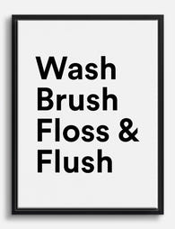
Stylish Bathroom Reminders Canvas Print
Translation missing: en.products.product.sale_price From €64,95€91,95 -

Splish Splash Bold Bathroom Quote Art Print
Translation missing: en.products.product.sale_price From €16,95€22,95 -

Everyday Bath Rituals Art Print
Translation missing: en.products.product.sale_price From €16,95€22,95 -

Playful Bathroom Typography Canvas Print
Translation missing: en.products.product.sale_price From €64,95€91,95 -

Bathroom Bloom Pop Art Print
Translation missing: en.products.product.sale_price From €16,95€22,95 -

Otter Bathroom Humor Canvas Print
Translation missing: en.products.product.sale_price From €64,95€91,95 -

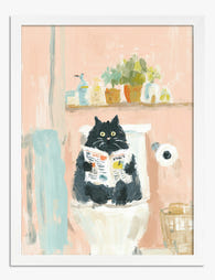
Bathroom Cat Reader Canvas Print
Translation missing: en.products.product.sale_price From €64,95€91,95 -

Everyday Bath Rituals Canvas Print
Translation missing: en.products.product.sale_price From €64,95€91,95 -

The Best Seat In The House Bold Quote Art Print
Translation missing: en.products.product.sale_price From €16,95€22,95 -
Fresh Start Bathroom Quote Canvas Print
Translation missing: en.products.product.sale_price From €64,95€91,95 -
Cat’s Bathroom Break Art Print
Translation missing: en.products.product.sale_price From €16,95€22,95 -

Curious Cat in the Bathroom Canvas Print
Translation missing: en.products.product.sale_price From €64,95€91,95 -

Curious Cat in the Bathroom Canvas Print
Translation missing: en.products.product.sale_price From €64,95€91,95 -

Curious Cat in Bathroom Art Print
Translation missing: en.products.product.sale_price From €16,95€22,95 -

Cat Reading in the Bathroom Art Print
Translation missing: en.products.product.sale_price From €16,95€22,95 -

Tiger in the Tub Art Print
Translation missing: en.products.product.sale_price From €16,95€22,95


More from The Frame

Modern Floral Prints That Don't Look Dated: 7 S...
Floral prints have a reputation problem. Mention them to anyone under 40 and they picture chintz curtains, peach watercolour bouquets in oval frames, or those identical rose prints that haunted...

The Best Flower Prints for Every Room in Your H...
Flowers are one of the few subjects that work in almost any interior, which is exactly why most flower prints end up feeling forgettable. The trick is matching the style,...

What Colours Go with Floral Prints? Pairings Th...
Most floral art looks beautiful on screen and then lands awkwardly in your actual room. The fix isn't more neutral walls or playing it safer with your art choice. It's...