
 Order today for delivery by
 Farmhouse Kitchen Wall Art: 7 Ideas That Go Beyond the Obvious
How to nail the aesthetic without a single 'Gather' sign or distressed rooster in sight.


Farmhouse kitchens have a problem, and it's not the aesthetic itself. It's what happens when the aesthetic gets flattened into a shopping list of signs, sayings and stencilled roosters. The good news is that the actual farmhouse tradition, the one rooted in old agricultural prints, hand-drawn botanicals and useful objects hung on plaster walls, is quietly beautiful and holds up brilliantly in a modern home if you make the right calls.
What makes wall art feel 'farmhouse' without tipping into kitsch
The tell for kitsch is almost always literalism. A wooden sign that says KITCHEN in a kitchen, a print of a chicken above a hen-themed tea towel, a chalkboard shaped like a pig hung near the fridge. Farmhouse style was never meant to explain itself. Old country houses accumulated art because someone found it useful or beautiful, not because it matched a mood board.
Authentic farmhouse art tends to share four qualities. It references the natural world without cartoonifying it. It has visible craft in the drawing or printing. It sits in a muted, slightly aged colour palette. And it avoids typography almost entirely, or uses Latin plant names and vintage labels that feel functional rather than decorative.
The easiest rule to hold onto: if the art tells you it's farmhouse, it isn't. If it just looks like something a botanist, gardener or market seller would have owned in 1890, you're on the right track.

Vintage vegetable prints: the obvious choice done right
Vegetable prints are the backbone of good farmhouse kitchen wall art, and they're obvious for a reason. Nineteenth-century seed catalogues, French potager illustrations and Victorian horticultural plates were extraordinarily well drawn, printed in soft, layered colour and are still in the public domain. That's a genuine design gift.
The trick is choosing prints that look like plates from a book, not like a themed decor collection. Look for illustrations with a light, slightly aged paper background, botanical Latin names in small type, and a naturalistic drawing style. Bright, saturated cartoon carrots don't count. Neither do stylised graphic vegetables in flat block colour, which read as modern nursery art rather than farmhouse.
For farmhouse vegetable prints that anchor a wall properly, we think you want at least one hero print at 50x70cm or 70x100cm and, ideally, a matching second print of similar vintage. Pumpkins, artichokes, leeks, cabbages and beetroots all photograph beautifully and read as farmhouse without needing a caption. Tomatoes and peppers work but skew slightly more Mediterranean, which isn't wrong, just worth knowing.
If you want the wall to look collected rather than bought, mix scales. One large print, one medium, and a smaller one clustered together looks like something you've built up over years. Three identical mid-sized prints in a neat row looks like a shop display.
Vintage or vintage-style?
Genuine antique prints are lovely but temperamental in a kitchen. They fade, they buckle in humidity, and the good ones cost real money. A high-quality giclée reproduction on thick matte paper gives you the same illustration, sharper colour, and doesn't panic every time you boil pasta. For a working kitchen, reproductions are the smarter call.
Botanical herb illustrations for a more subtle approach
If vegetable prints feel a step too on-the-nose, herb illustrations do most of the same work with a lighter touch. A single detailed drawing of rosemary, bay laurel or sage reads as considered rather than themed, and it slots into a kitchen without announcing anything.
Botanical prints for the kitchen also expand your options beyond edible plants. Old-fashioned illustrations of wildflowers, ferns, seed pods and grasses share the same visual DNA as vegetable plates and pair with them cleanly. A wall that mixes a single artichoke print with two smaller wildflower studies looks more like a country house and less like a restaurant.
Herb prints work particularly well in vertical stacks. Two or three narrow botanicals stacked one above the other, at around 30x40cm each, fill the awkward strip of wall between a cabinet and a doorway that always seems to end up bare. That's a space most people ignore, and it's one of the easiest wins in a farmhouse kitchen.
One quiet warning: avoid herb prints that come pre-styled with rustic wooden backgrounds, faux paper tears or ribbon flourishes. The illustration should stand on its own. Anything with a pre-baked 'rustic' filter has done the styling job for you, badly.
Fruit and vegetable prints together: pairing without clashing
This is where most farmhouse kitchens go wrong. Vegetables on one wall, fruits on another, a rooster over the door, a lemon print by the sink, and suddenly the room reads like a market stall. Pairing takes a little more care.
The simplest working formula: pick one dominant category and let the other play a supporting role. If your hero wall is vegetables, use one fruit print elsewhere in the room as a counterpoint, not a competitor. A single large pear or fig study on the wall opposite a vegetable gallery gives the eye somewhere to travel to without duplicating the effect.
If you want them properly mixed, keep the illustration style consistent. Vintage botanical plates pair with other vintage botanical plates. A hand-drawn line-art lemon does not pair with a nineteenth-century pumpkin engraving, even if you love both. Style trumps subject.
Three practical ratios that work:
- One large vegetable print (70x100cm) with two small fruit prints (30x40cm) below or beside it.
- A grid of four prints at matching size, two vegetables and two fruits, all from the same visual era.
- A run of five to seven small prints along a longer wall, mostly vegetables with one or two fruits interrupting the rhythm.
Avoid identical numbers of each. A wall that's exactly 50/50 vegetables and fruits looks like an inventory. Weighted groupings look like taste.

Frame and material choices that suit rustic interiors
Framing decisions do more work than people realise. The wrong frame turns a beautiful print into something that looks bought in a hurry. The right one makes a modest print feel considered.
For farmhouse kitchens, three frame options do almost all the heavy lifting:
Natural oak. Warm, honest, and reads as country without being try-hard. Oak suits vegetable and botanical prints better than almost anything else, particularly against painted walls in cream, chalk white or sage. It also ages gracefully in a kitchen, which matters.
Simple black. Counter-intuitive but often the smartest choice, particularly if your cabinets are painted a strong colour like dark green, navy or deep clay. Black frames stop botanical prints from disappearing into a busy palette and give the whole wall a slight gallery formality that offsets the rustic setting.
Off-white or bone. Best in kitchens with a lot of pale wood, exposed stone, or heavily painted walls. Works particularly well for pale, faded botanical prints where you don't want the frame to compete with the illustration.
What we'd actively avoid: heavily distressed frames, whitewashed 'shabby chic' wood, ornate gilt, and anything with a printed 'reclaimed' finish. Distressed frames are the wall art equivalent of a Gather sign. They do the work of telling you it's rustic, and the whole point is that you shouldn't need telling.
A note on the frames themselves. Poor framing is the single biggest failure in the print category. Frames that arrive separately, prints that warp inside them, glazing that cracks in transit, mounts that slip. If you're buying framed prints, buy from somewhere that ships everything fitted together, properly. Ours use solid FSC-certified wood rather than MDF, and the glazing is UV-protective acrylic rather than glass, which matters in a kitchen for two reasons: acrylic doesn't shatter, and it stops prints fading in sunlight. Kitchens tend to be the brightest room in the house.
Canvas is worth considering too, particularly for larger pieces above an island or breakfast table. It's lighter, it doesn't glare, and the mirrored edge wrap on a properly stretched canvas means you don't lose any of the illustration. In a working kitchen with steam and temperature changes, canvas holds up well.
Where to hang art in a farmhouse kitchen
'Above the stove' is the advice everyone gives, and it's often wrong. Directly above a gas or induction hob is a high-grease, high-heat zone that will slowly wreck any paper print, even behind glazing. If you have an extractor hood that vents properly and a decent gap, you can get away with it. If you have an open hob or a range with no hood, don't.
Better places to hang art in a farmhouse kitchen:
The Aga wall. If you have an Aga or a range cooker set into a chimney breast, the wall above and to the sides is usually large, warm, and slightly awkward to fill. A single large botanical print at around 70x100cm centred above the cooker, with the base of the frame at least 40cm above the hob surface, works beautifully. Alternatively, a pair of medium prints flanking the chimney breast reads as very traditional country.
Beside a plate rack. The wall next to a wall-mounted plate rack is one of the most overlooked surfaces in a farmhouse kitchen. A stack of two or three narrow botanicals here echoes the vertical rhythm of the plates without competing with them.
Above the farmhouse sink. If your sink sits under a window, you obviously can't hang anything there. If it doesn't, this is prime real estate for a wide horizontal print or a triptych of three matching herb studies at around 40x50cm each.
The breakfast nook. A dedicated dining corner is where you can be a bit bolder. A larger vegetable print, or a small gallery wall of four to six mixed prints, gives the nook its own identity and makes the transition from cooking space to eating space feel considered.
Narrow walls beside cabinets. Almost every kitchen has a strip of wall about 30 to 40cm wide between a run of cabinets and a corner or doorway. A single tall, narrow botanical print here does more for a room than people expect.

Colour palettes that tie farmhouse art into your existing room
The palette advice you'll find everywhere, cream, sage, faded red, butter yellow, warm brown, isn't wrong, but it's useless without a strategy. What matters is which colours in your art echo colours already in the room.
Look at your kitchen and pick out three anchor tones: the cabinetry colour, the worktop tone, and one textile or accessory colour that recurs (tea towels, an Aga, a runner, dining chairs). Your art should pick up at least two of these, and ideally not the third.
A worked example. If your cabinets are sage green, your worktop is warm oak, and your tea towels are faded terracotta, look for botanical prints where the leaves echo the sage and the pot, fruit or root vegetable echoes the terracotta. The oak worktop is already carrying the warm brown, so you don't need it repeated in the art.
The mistake is picking art that matches everything. If every colour in the print appears somewhere in the room, the wall goes flat. You want one or two connections and one slight surprise. A faded ultramarine blue in a botanical illustration against a sage and cream kitchen adds life. Perfect tonal matching drains it.
For very neutral kitchens, all cream and pale wood, your art can carry more colour. Rich beetroot purples, deep artichoke greens and burnt-orange squash prints all sing against a pale backdrop. For kitchens that already have a strong painted colour, pull the art back to more muted, aged tones so it settles rather than shouts.
If you're browsing broader kitchen art prints, it helps to shortlist by palette first and subject second. A beautifully drawn vegetable print in the wrong colours will always look worse than a slightly less exciting subject in exactly the right ones.

A quick word on seasonal rotation
You don't need to redecorate every three months, but swapping one or two prints between summer and winter keeps a farmhouse kitchen feeling alive. Lighter herb studies and stone fruit prints in spring and summer, deeper root vegetables, squashes and game-adjacent botanicals in autumn and winter. Keep the frames and the core arrangement the same. Rotate the contents.
Store the off-season prints flat, in the boxes they came in, somewhere dry. If you buy prints that arrive properly fitted in solid frames rather than flimsy assemblies, they'll survive being taken down and re-hung several times without issue.
The short version
Farmhouse kitchen wall art works when it feels found rather than themed. Choose vintage-style vegetable and botanical prints with genuine illustrative quality, frame them in oak, black or bone rather than distressed wood, mix scales instead of matching everything, and hang them somewhere other than directly above the hob. Pick up two colours from your existing room, leave one alone, and stop before you add the sign.

Fab products featured in this blog
-

Vintage Vegetable Harvest Study Art Print
Sale price From €16,95€23,95 -

Fresh Finds, Everyday Joy Art Print
Sale price From €16,95€23,95 -

Sunday Farmers Market Art Print
Sale price From €16,95€23,95 -

Whimsical Kitchen Essentials Art Print
Sale price From €16,95€23,95 -

Sunday Farmers Market Canvas Print
Sale price From €65,95€93,95 -
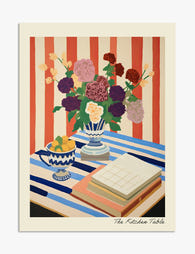
The Kitchen Table Art Print
Sale price From €16,95€23,95 -
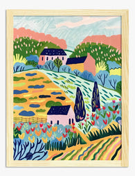
Sunlit Country Retreat Art Print
Sale price From €16,95€23,95 -

Whimsical Kitchen Essentials Canvas Print
Sale price From €65,95€93,95 -

Kitchen Window, Pink Wall Art Print
Sale price From €16,95€23,95 -

Vintage Vegetable Harvest Study Canvas Print
Sale price From €65,95€93,95 -

Vintage Vegetable Basket Still Life Art Print
Sale price From €16,95€23,95 -

Sunlit Kitchen Still Life Art Print
Sale price From €16,95€23,95 -
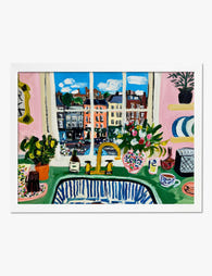
Kitchen Window onto the Square Art Print
Sale price From €16,95€23,95 -

Pumpkin and Half — Folk Kitchen Study Art Print
Sale price From €16,95€23,95 -

Harvest Harmony Art Print
Sale price From €16,95€23,95 -
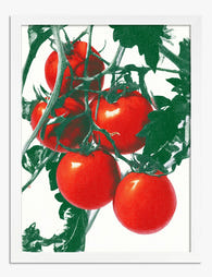
Tomatoes on the Vine Art Print
Sale price From €16,95€23,95 -

The Kitchen Table Canvas Print
Sale price From €65,95€93,95 -

Farm Garden with Sunflowers by Gustav Klimt Art Print
Sale price From €16,95€23,95 -
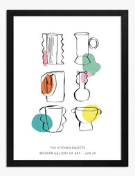
The Kitchen Objects Exhibition Print Art Print
Sale price From €16,95€23,95 -

Kitchen Cupboard Classics Art Print
Sale price From €16,95€23,95


More from The Frame

5 Rooms Where Vegetable Prints Look Better Than...
Why we need to stop thinking of vegetable art as kitchen-only Vegetable prints have been exiled to the kitchen for so long that most people can't picture them anywhere else....

Vegetable Art for Kitchens: What Actually Works...
Vegetable art is one of the few genres that improves the room it's hung in and gets read differently every time you walk past it. But kitchens are hostile places...

What to Actually Hang on Your Kitchen Walls (An...
Most kitchen art is too small, too generic, and hung too high. It fades within two years because the frame was cheap, the glazing was thin, and nobody thought about...