How to Display Portrait Prints: Placement, Grouping and Hanging Tips
Exact measurements, spacing rules and room-by-room advice for making vertical art look properly considered.

Portrait prints solve problems landscape art can't. They fit narrow walls, draw the eye upward, and bring presence to spaces a horizontal piece would swim in. Get the placement right and they look intentional; get it wrong and they look stranded.
The single statement portrait: where and how high to hang it
A solo portrait print earns its keep by anchoring a wall on its own. For this to work, the print needs enough scale. On a bare wall, aim for something at least 50x70cm. On a wall above a sofa, sideboard or bed, go bigger: 70x100cm is the sweet spot for most rooms, and if you have the ceiling height, 100x150cm in canvas makes a genuine statement.
The centre of the print should sit roughly 145-152cm (57-60 inches) from the floor. That's gallery standard, and it works because it puts the visual midpoint at average adult eye level. For portrait orientation specifically, this rule matters more than for landscape, because the extra height means a print hung too high will float away from everything below it.
Above furniture, ignore the floor measurement and use the furniture instead. Leave a 20-25cm gap between the top of the sofa or sideboard and the bottom of the frame. Any less and the art feels squashed onto the furniture. Any more and they stop reading as a pair.
For scale above furniture, the print should be between half and two-thirds the width of the piece below it. A 70x100cm portrait works beautifully above a 180cm sofa. Above a narrower 120cm console, drop to 50x70cm.

Pairing two portrait prints: symmetry, spacing and alignment
Two portrait prints almost always look better side by side than stacked. Stacking two vertical prints creates a tall, narrow column that fights the natural horizontal flow of most rooms, and it tends to draw the eye into an awkward elongated shape. Side by side, two portraits read as a considered pair and fill wall space more generously.
Spacing between the frames matters more than people think. For medium and large prints (50x70cm and above), leave 5-7cm (2-3 inches) of wall between the inside edges of the frames. For smaller prints around 30x40cm, tighten to 4-5cm (1.5-2 inches). Too much gap and the pair stops reading as one composition. Too little and they feel cramped.
When to align by centre, when to align by bottom
On a bare wall with no furniture below, align the prints by their vertical centres. Both prints should share the same horizontal midline, which keeps the eye moving across them smoothly.
Above furniture, align the bottoms instead. The eye reads the lower edge first when art sits above a sofa or bed, so a clean horizontal bottom line creates calm. This matters especially when pairing two prints of slightly different sizes.
If your two portraits are exactly the same dimensions and frame, you can align both centres and bottoms simultaneously, which is the cleanest possible look. Matching sets are forgiving and almost always work.
Building a gallery wall with portrait art as the anchor
Portrait prints make the best anchors for gallery walls because their height creates a vertical spine the rest of the arrangement can balance around. Start with one large portrait print, around 60x80cm or 70x100cm, and build outward.
Place the anchor slightly off-centre on the wall, with its centre at standard hanging height. Then add smaller pieces around it: a couple of landscape prints, a square print, maybe one more small portrait. Keep frame spacing consistent at 5-7cm throughout. Inconsistent gaps are the single fastest way to make a gallery wall look chaotic.
Mixing portrait and landscape orientations
The trick is balancing visual weight, not matching shapes. A large portrait print on the left can be balanced by two stacked landscape prints on the right, or by a square print plus a smaller landscape. Treat the whole arrangement as a rectangle and try to fill that imaginary outer rectangle without huge gaps or jutting corners.
Lay the entire arrangement out on the floor first. Take a phone photo from directly above, then move pieces around digitally before committing a single nail to the wall. This saves hours of patching plaster.
If you're working with a matching set, our wall art sets take the guesswork out of pairing pieces that work together visually.

Triptychs and diptychs
A diptych (two prints) or triptych (three prints) treated as a single piece works best when all prints are identical in size and frame style. Space them tightly: 3-4cm between frames is enough. The prints should read as fragments of one composition, so any larger gap breaks the spell.
For a vertical triptych of three portrait prints stacked, only do this on a tall narrow wall, like beside a staircase or in a double-height entryway. On standard 2.4m ceilings, three stacked portraits will look top-heavy.
Best rooms and walls for portrait-oriented prints
Portrait prints excel in spaces where vertical emphasis solves a problem.
Hallways are the obvious win. Narrow walls between doors are almost always taller than they are wide, and a portrait print fits this geometry naturally. A single 50x70cm print, or a series of three matching portraits spaced evenly down a corridor, transforms a forgotten transit space. Browse our hallway art prints for ideas suited to narrow walls.
Above the bed is the second great use case. Portrait orientation draws the eye up, which makes ceilings feel taller and beds feel grander. A single large portrait centred above the headboard works better than a small landscape print struggling to fill the space. For a king-size bed (150cm wide), use a 70x100cm portrait. For a super-king (180cm), go to 100x150cm in canvas, or pair two 50x70cm portraits side by side. Our bedroom wall art collection skews toward calmer compositions that suit this placement.
Narrow walls between windows or doors are made for portraits. Landscape art looks pinched in these spots; a vertical print fills the wall properly.
Flanking larger pieces is the underused trick. Two slim portrait prints either side of a fireplace, mirror or large landscape painting create symmetry without competing for attention.
Bathrooms and entryways also benefit. The narrow wall beside a bathroom mirror is portrait territory. The wall above a slim console table in an entryway needs vertical emphasis to feel grand.
Dining rooms with a buffet or sideboard work well with two portrait prints flanking a central element, like a mirror or pendant light. This creates a triptych composition without the matching prints.
Hanging height rules that actually work (and when to break them)
The 145-152cm centre rule is genuinely useful, but it's not absolute. Here's when to break it.
Break it for tall ceilings. In rooms with ceilings above 2.7m, the standard height makes art feel like it's slumping toward the floor. Raise the centre to 160-165cm. The proportion to the wall matters more than the proportion to the floor.
Break it above furniture. Ignore the floor measurement entirely. Use the 20-25cm gap above the furniture as your reference point. The art is now in conversation with the sofa, not the floor.
Break it in hallways. In narrow corridors, you don't view art from a static seated position; you walk past it. Hanging slightly higher (centre at 155-160cm) accommodates standing eye level for most adults.
Break it for very large prints. A 100x150cm canvas centred at 152cm puts its top edge at 227cm, which can crowd a standard 240cm ceiling. Drop the centre to around 140cm so the top has breathing room.
How to actually measure
Measure the height of your print. Halve it. Add this to your desired centre height. Subtract the distance from the top of the print to the hanging hardware (usually 5-8cm for framed prints, often shown on the back). The number you're left with is where the nail goes.
For framed prints arriving with fixtures already attached, this is straightforward. The hardware is properly aligned, so your measurement translates directly to the wall.

Framed vs unframed display: what suits each look
Framed portrait prints feel finished. The frame creates a clean border that separates the art from the wall, which makes everything around it look more considered. Solid wood frames in oak, walnut or black work in almost any room. Framed prints are heavier, but they arrive ready to hang with fixtures attached, which removes the most fiddly part of the job.
Unframed canvas portraits feel softer and more contemporary. The mirrored edge wrap means the image continues around the sides, so there's no visible cropping or white border. Canvas is lighter, easier to hang on plasterboard, and forgiving in humid rooms like bathrooms or kitchens. The trade-off: canvas reads as more casual. In a formal dining room or a polished bedroom, framed almost always wins.
For gallery walls, commit to one approach. Mixing framed and unframed pieces in the same arrangement looks unintentional unless you're very confident with composition. Pick framed across the board for a polished gallery, or unframed canvas for a relaxed, modern grid.
For long-lasting display, look for UV-protective glazing. Acrylic glaze (rather than glass) prevents fading even on walls that get direct afternoon sun, which matters for portraits hung opposite windows. Our portrait art prints come with this as standard on framed options.
Common display mistakes and how to avoid them
Hanging too high. The most common mistake by a wide margin. People hang art at their own eye level while standing, which puts it 15-20cm above where it should sit for a seated viewer in a lounge or bedroom. Use 145-152cm centre as your default and adjust down for low furniture.
Stacking two portraits vertically without a reason. Two portrait prints stacked on a standard wall almost always look unbalanced. The combined shape is too tall and narrow. Side by side is the safer choice. Only stack if the wall is genuinely tall and narrow, like in a stairwell.
Using a print that's too small for the wall. A 30x40cm portrait above a three-seater sofa looks lost. The art should be at least half the width of the furniture below. If you only have small prints, group them into a pair or trio rather than stranding one in the middle of a big wall.
Using a portrait that's too narrow for wide furniture. A single thin portrait above a 200cm sideboard creates an awkward T-shape. Either go bigger, pair two portraits side by side, or build a small gallery arrangement.
Inconsistent spacing in pairs and groups. Eyeballing the gap between frames produces wonky results. Measure once and commit. 5-7cm for medium prints, 4-5cm for small ones.
Forgetting the gap above furniture. Hanging art directly on top of a sofa back or headboard kills the composition. The 20-25cm breathing room is non-negotiable.
Hanging frames that arrived with poor fittings. A surprising number of framed prints ship with the print loose inside the frame, or with the frame and print sold separately. The result is warping, bubbling or misaligned mounts. Buy from sellers who ship the frame and print fitted together in one box, properly aligned and ready to hang.
The short version
Hang single portraits with their centre at 145-152cm, or 20-25cm above furniture. Pair two portraits side by side, not stacked, with 5-7cm between frames. Use portrait orientation where vertical emphasis helps: hallways, above beds, between windows, flanking larger pieces. Match your scale to the furniture below, lay gallery walls out on the floor first, and measure twice before you reach for a nail.


Fab products featured in this blog
-

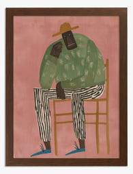
Boy in a Striped Jumper Art Print
Translation missing: en.products.product.sale_price From €16,95€23,95 -

Young Man in a Ruff Art Print
Translation missing: en.products.product.sale_price From €16,95€23,95 -

Striped Shirt Portrait Canvas Print
Translation missing: en.products.product.sale_price From €65,95€93,95 -
Striped Reflection Art Print
Translation missing: en.products.product.sale_price From €16,95€23,95 -

Bold Blue Portrait Art Print
Translation missing: en.products.product.sale_price From €16,95€23,95 -

The Thoughtful Footballer Art Print
Translation missing: en.products.product.sale_price From €16,95€23,95 -

Striped Dress with Peony Art Print
Translation missing: en.products.product.sale_price From €16,95€23,95 -

Spotted Shirt Portrait Art Print
Translation missing: en.products.product.sale_price From €16,95€23,95 -

Blue Spot Footballer Art Print
Translation missing: en.products.product.sale_price From €16,95€23,95 -

Modern Muse Portrait Art Print
Translation missing: en.products.product.sale_price From €16,95€23,95 -

Nadia with Smooth Hair by Henri Matisse Art Print
Translation missing: en.products.product.sale_price From €16,95€23,95 -

Man in a Yellow Striped Shirt Canvas Print
Translation missing: en.products.product.sale_price From €65,95€93,95 -

Modern Muse Portrait Canvas Print
Translation missing: en.products.product.sale_price From €65,95€93,95 -

Silent But Judging Art Print
Translation missing: en.products.product.sale_price From €16,95€23,95 -
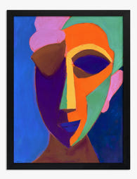
Colour-Block Face in Blue and Orange Art Print
Translation missing: en.products.product.sale_price From €16,95€23,95 -

Spotted Shirt Portrait Canvas Print
Translation missing: en.products.product.sale_price From €65,95€93,95 -
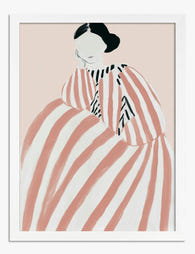
Girl in a Striped Pink Dress Art Print
Translation missing: en.products.product.sale_price From €16,95€23,95 -

The Thoughtful Footballer Canvas Print
Translation missing: en.products.product.sale_price From €65,95€93,95 -

Striped Shirt Portrait Art Print
Translation missing: en.products.product.sale_price From €16,95€23,95 -

Striped Muse Portrait Canvas Print
Translation missing: en.products.product.sale_price From €65,95€93,95


More from The Frame

Urban Jungle Interiors: Using Wall Art Instead ...
The urban jungle look is having a moment that refuses to end. But most of the people pinning those plant-drenched living rooms will never own 47 monsteras, and that's fine....

Room by Room: How to Hang William Morris Floral...
You've fallen for Morris. The question now is which floral goes where, at what size, in what frame. This guide skips the Arts and Crafts lecture and gets straight to...

Jungle Bedroom Ideas for Adults: Grown-Up Ways ...
Jungle bedrooms have a reputation problem. Search the term and you'll find nursery mood boards, cartoon monkeys, and bright kelly green walls that would keep anyone awake. The grown-up version...