From Line Drawing to Digital: Illustration Art Styles You'll Actually Want on Your Walls
A buyer's guide to the illustration styles you'll keep seeing online, and how to tell which one is actually yours.

Illustration is having a proper moment in interiors. After years of photography and abstract dominating walls, hand-drawn and digitally-drawn work has crept back in, partly because it feels more personal and partly because it does things a photograph simply can't. This guide is for you, the person shopping, not the person drawing.
A quick, no-nonsense tour of illustration styles
Most guides to illustration art styles are written for illustrators learning to make the work. That's not what you need. You need to know what you're looking at when you're scrolling through prints at 11pm and trying to work out why you keep saving certain ones.
Illustration as wall art roughly splits into four camps you'll actually encounter: line and ink work (minimal, drawn, often monochrome), bold digital illustration (flat, colour-forward, graphic), editorial and mid-century influenced (textured, character-driven, slightly retro), and botanical and nature illustration (detailed, scientific or romantic). There are sub-genres within each, but if you can recognise these four, you can shop with intent.
The rest of this guide walks through each, then covers how printing affects how they actually look on your wall, and how to match style to room. We'll finish with a starting point if you've never bought illustration before.

Line and ink illustration: minimal spaces, maximum impact
Line art is the style most people can picture immediately. A continuous black line on white paper, often a figure, a face, or a piece of architecture, drawn with confidence and very little else. The appeal is that it does enormous work with tiny means. A single curved line suggesting a back, a hand, a vase.
It's the style that rewards minimalism most. In a room with a lot going on, line art gets lost. In a room with breathing space, plain walls, neutral textiles, considered furniture, a large line drawing becomes architectural. It draws the eye without shouting.
Where it works
Line illustration suits Scandi-leaning interiors, Japandi, and any space built around negative space. It also works surprisingly well in older homes with high ceilings and decorative cornicing, where a clean modern drawing creates productive contrast against the period detail.
Scale matters more here than in any other illustration style. A small line drawing in a big room looks lonely. Go bigger than your instinct tells you: 60x80cm or 70x100cm is usually the right answer over a sofa or a bed. The white space in the print needs room to breathe on the wall.
What to look for
Quality line work has weight variation: lines that thicken and thin to suggest pressure and movement. Mass-market posters often print line art too thin or too uniform, which makes it feel flat and graphic in the wrong way. Look at the line itself. Is there life in it?
You'll find this style across our line art prints collection, where the focus is on drawings that hold their character at scale.
Bold digital illustration: colour-forward and confident
This is the opposite end of the illustration spectrum. Flat planes of saturated colour, strong shapes, often with no outlines at all. Think confident terracotta against deep teal, mustard against ivory, shapes that read clearly from across the room.
Bold digital illustration is sometimes called vector art, flat illustration, or graphic illustration. The names don't matter much. What matters is the visual energy: colour doing the heavy lifting, with form simplified down to essentials.
Why it works on walls
A bold digital print acts like a colour anchor for a room. If your sofa is grey, your rug is neutral, and your walls are off-white, a single colour-saturated print can pull a whole scheme together. It also photographs well, which is partly why this style took off through social media.
The trade-off is that bold digital is less forgiving in busy rooms. If you already have a patterned rug, patterned cushions, and decorative wallpaper, adding a high-contrast graphic print can tip the room into visual chaos. Use it as the loudest thing in the room, or don't use it.
Print quality matters here more than you think
Flat colour is where cheap printing gets exposed. Banding (visible stripes where colour gradients should be smooth), dull pigments, and uneven coverage all show up immediately on a large block of solid colour. This is one reason giclée printing matters: it lays down colour densely and evenly, so a sage green stays sage green from edge to edge.

Editorial and mid-century influenced illustration
This is the underserved category, and probably the most interesting one if you're new to buying illustration prints. Editorial illustration borrows from magazine and book illustration: stylised figures, textured backgrounds, slightly imperfect lines, a sense of narrative. Mid-century influenced work pulls from the visual language of the 1950s and 60s: muted but warm palettes, geometric simplification, characterful figures.
The two often overlap. What unites them is a feeling of being drawn by a human, not generated by software, even when the underlying tool is digital. You'll see grainy textures, scratchy edges, slightly off-register colour blocks that mimic old printing techniques.
Where it belongs
Editorial and mid-century styles are remarkably flexible. They work in mid-century modern interiors obviously, but they also soften modern minimalist spaces, add personality to rentals, and look right at home in eclectic, slightly maximalist rooms.
They're particularly good in lounges, kitchens, and home offices: rooms where you want some warmth and character but don't want to commit to a strong colour statement. A small editorial print can carry a whole gallery wall, because there's enough going on within the image itself.
Spotting the good stuff
Look for prints where the texture feels intentional, not like a filter. Real editorial illustration uses texture to suggest mood, material, atmosphere. Generic mass-market work slaps a grain overlay on flat artwork and hopes it looks vintage. You can usually tell at a glance whether the artist actually thought about why the texture is there.
Browse the full illustration art prints collection for a feel of where editorial and mid-century styles sit alongside other contemporary illustration prints.
Botanical and nature illustration: the grown-up alternative to photography
Botanical illustration deserves its own category. It's the style with the longest history (think Victorian scientific drawings of ferns and seedpods) and the most contemporary applications. Modern botanical prints range from precise, almost diagrammatic studies to looser, more painterly interpretations of leaves, branches, and grasses.
Why choose botanical illustration over a botanical photograph? Photography flattens. A photograph of a fig leaf gives you the leaf. A good botanical illustration gives you the structure of the leaf, the veins, the way it folds, the artist's attention to it. It feels considered in a way a photograph rarely does.
Where it works
Botanical illustration works almost anywhere, which is partly its problem. It can drift into safe and forgettable if you choose generic prints. The trick is to pick botanicals with strong composition: an oversized single leaf, an unusual specimen, an unexpected palette.
It suits bathrooms (especially canvas, which handles humid rooms better than paper behind glass), bedrooms, hallways, and kitchens. It's the style most likely to please a household with mixed taste, because it reads as decorative without being demanding.
Pairing botanicals
A single large botanical works on its own. A trio of related but not identical botanicals (three different leaves, three different grasses) makes a strong wall arrangement, particularly above a bed or sofa. Avoid identical sets of three. They look like hotel art.
Our botanical art prints collection is worth a slow scroll if this is your direction.

How printing method affects the way each style looks on your wall
This is the bit no one talks about, and it matters more than the style choice itself.
Giclée printing
Giclée (pronounced jee-clay) is the standard for serious art prints. It uses pigment inks sprayed onto thick matte paper, building colour density that flat digital printing can't match. Detail stays crisp at large sizes. Colours stay true rather than shifting toward magenta or yellow over time.
This matters most for bold digital illustration (where flat colour needs density) and botanical work (where fine detail needs resolution). It matters less for very minimal line art, where any decent printer can reproduce a black line on white, though giclée still gives you a richer black.
Matte paper vs. canvas
Matte paper, framed under acrylic glaze, suits line art, editorial illustration, and detailed botanicals. The flatness of the paper preserves the drawn quality. Glare is minimal, especially with acrylic rather than glass, so you can see the work properly from any angle.
Canvas suits bold digital illustration and looser botanical work particularly well. The texture of the canvas adds warmth to flat colour and softens digital crispness in a way that often flatters the work. Canvas also handles humid rooms better than framed paper, which matters in bathrooms and kitchens. The trade-off: very fine line work can lose some sharpness on canvas weave.
The framing question
Line art almost always benefits from a frame. The frame acts as a visual border that contains the white space and stops the print disappearing into the wall. A slim black or natural oak frame is usually the right call.
Bold digital illustration can go either way. Framed feels more polished and gallery-like. Unframed canvas feels more relaxed and contemporary. Both work. Choose based on the rest of the room.
Botanical and editorial illustrations look beautiful framed, especially with a small white border (mat) around the image. The mat gives the artwork breathing room and lifts it visually.
A note on what often goes wrong: the biggest failure in framed prints is the frame itself, warped wood, prints that bubble inside, frames shipped separately from prints and assembled at home with predictably mixed results. The whole point of buying a framed print is that you don't have to think about any of that. The frame should arrive properly fitted, the print flat, the fixtures attached, ready to go on the wall.
Matching illustration style to your room's personality
Style your room first, then choose art that agrees with it. Here's the rough mapping.
Scandi and Japandi: line art, minimal botanicals, occasional restrained editorial. Avoid bold digital.
Mid-century modern: mid-century influenced illustration obviously, but also bold digital in warm palettes (mustard, rust, olive). Botanicals work too if the palette is muted.
Contemporary minimalist: large-scale line art, single bold digital prints as statements, oversized botanicals. Keep it to one or two pieces.
Eclectic or maximalist: editorial illustration leads here, mixed with abstract art prints, photography, and the occasional botanical. The more variety the better, as long as something ties it together (a colour, a frame finish, a tonal range).
Industrial: bold digital in moody palettes, line art (especially architectural), high-contrast botanicals. Avoid anything too soft or pastel.
Period properties: mix-and-match. Line art for contrast with cornicing, botanicals for traditional feel, editorial illustration for warmth in formal rooms.
Where to start if you're new to buying illustration art prints
Buy one piece first. Resist the temptation to plan a six-print gallery wall before you've lived with a single illustration print.
Pick the style you keep gravitating toward, not the style you think suits your room. The two often align anyway, and if they don't, your gut is usually right. You're going to look at this every day for years.
Go larger than you think. The single most common mistake is buying small. A 30x40cm print over a sofa looks like a postage stamp. A 70x100cm framed print over the same sofa looks intentional. If you're nervous, measure the wall and tape a piece of paper up at the size you're considering. You'll almost always go up a size.
Live with it before adding more. Once one piece is on the wall for a few weeks, you'll know whether you want to build around it or whether something else needs to lead. That's how rooms get coherent: one decision at a time, not all at once.


Fab products featured in this blog
-
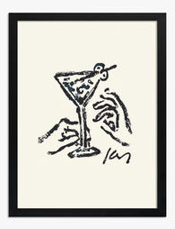
Martini Line Sketch Art Print
Translation missing: en.products.product.sale_price From €16,95€23,95 -

Bold Linear Statement Art Print
Translation missing: en.products.product.sale_price From €16,95€23,95 -

Woman Abstract Line Flow Art Print
Translation missing: en.products.product.sale_price From €16,95€23,95 -

Still Beating Heart Illustration Art Print
Translation missing: en.products.product.sale_price From €16,95€23,95 -

Teeny by Henri Matisse Art Print
Translation missing: en.products.product.sale_price From €16,95€23,95 -

Modern Neutral Black Brown Brushstrokes Art Print
Translation missing: en.products.product.sale_price From €16,95€23,95 -

Bold Linear Minimalist Canvas Print
Translation missing: en.products.product.sale_price From €64,95€92,95 -

Modern Striped Portrait Art Print
Translation missing: en.products.product.sale_price From €16,95€23,95 -
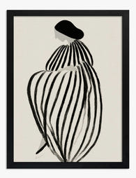
Striped Silhouette Art Print
Translation missing: en.products.product.sale_price From €16,95€23,95 -

Colorjoy Brushstrokes Art Print
Translation missing: en.products.product.sale_price From €16,95€23,95 -
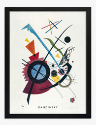
Violet by Wassily Kandinsky Art Print
Translation missing: en.products.product.sale_price From €16,95€23,95 -

Split Arch in Terracotta and Cream Art Print
Translation missing: en.products.product.sale_price From €16,95€23,95 -

Open Hand Palmistry Chart, 1887 Art Print
Translation missing: en.products.product.sale_price From €16,95€23,95 -

Effortless Botanical Lines Art Print
Translation missing: en.products.product.sale_price From €16,95€23,95 -

Lunar Lines Art Print
Translation missing: en.products.product.sale_price From €16,95€23,95 -

Folk Modern Face with Leaves and Bird Art Print
Translation missing: en.products.product.sale_price From €16,95€23,95


More from The Frame

7 Ways to Style William Morris Tree Prints in Y...
Tree of Life. Woodpecker. The towering, tangled branches that made Morris famous. These prints have a vertical pull and a visual density that other Morris designs don't, which means hanging...

Why Art Prints Make the Most Meaningful Housewa...
Most housewarming gifts get consumed, regifted, or shoved in a cupboard within a month. Art does something different. It hangs on a wall in the new home for years, quietly...

Hosting at Christmas: Three Small Changes That ...
Most Christmas hosting advice asks you to do too much. You don't need a complete seasonal overhaul, you need your rooms to feel finished. The difference between a space that's...